Hjust를 사용하고 ggplot2에서 요소를 이동하는 방법
hjust 및 vjust 인수를 사용하여 ggplot2에서 요소를 각각 가로 및 세로로 이동할 수 있습니다.
다음 예에서는 다양한 시나리오에서 hjust 및 vjust를 사용하는 방법을 보여줍니다.
예 1: ggplot2에서 제목 위치 이동
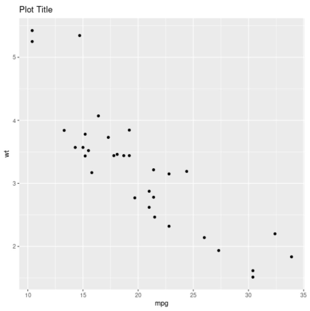
다음 코드는 기본 위치(왼쪽 정렬)에 제목을 사용하여 ggplot2에서 산점도를 생성하는 방법을 보여줍니다.
 library (ggplot2)

#create scatter plot with title in default position
ggplot(data=mtcars, aes(x=mpg, y=wt)) +
  geom_point() +
  ggtitle(" Plot Title ")
다음 코드는 hjust=0.5 를 사용하여 제목을 중앙에 배치하는 방법을 보여줍니다.
 library (ggplot2)

#create scatter plot with title center-aligned
ggplot(data=mtcars, aes(x=mpg, y=wt)) +
  geom_point() +
  ggtitle(" Plot Title ") +
  theme(plot. title = element_text(hjust= .5 ))
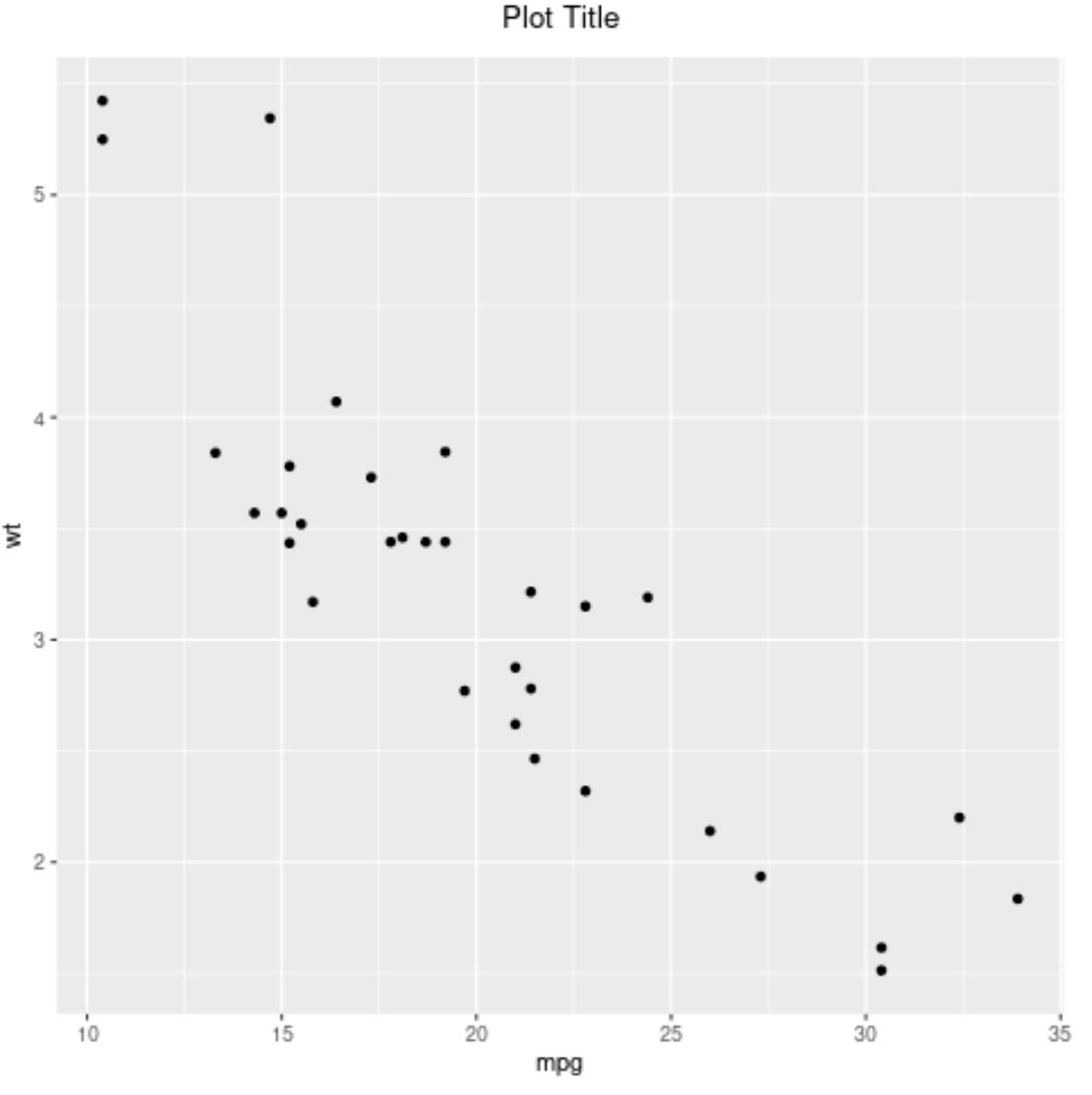
참고 : hjust=1을 사용하여 제목을 오른쪽으로 정렬할 수도 있습니다.
예 2: ggplot2에서 축 레이블 위치 이동
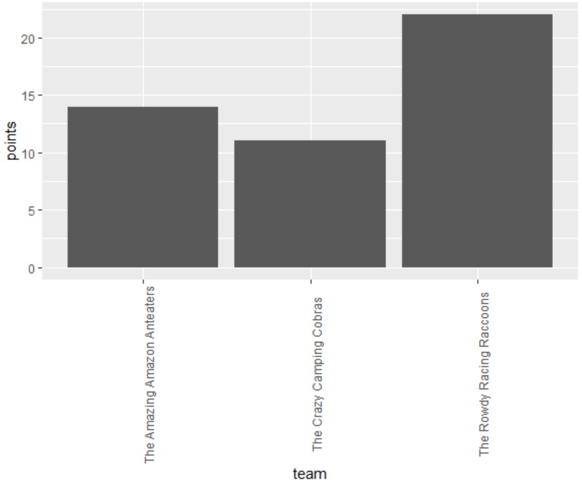
다음 코드는 ggplot2에서 x축 레이블이 90도 회전되어 읽기 쉽도록 막대 차트를 만드는 방법을 보여줍니다.
 library (ggplot2)

#create data frame
df = data. frame (team=c('The Amazing Amazon Anteaters',
                       'The Rowdy Racing Raccoons',
                       'The Crazy Camping Cobras'),
                dots=c(14, 22, 11))

#create bar plot to visualize points scored by each team
ggplot(data=df, aes(x=team, y=points)) +
  geom_bar(stat=' identity ') +
  theme(axis. text . x = element_text(angle= 90 ))
hjust 및 vjust 인수를 사용하여 x축 눈금 표시에 더 가깝게 정렬되도록 x축 레이블을 조정할 수 있습니다.
 library (ggplot2)

#create data frame
df = data. frame (team=c('The Amazing Amazon Anteaters',
                       'The Rowdy Racing Raccoons',
                       'The Crazy Camping Cobras'),
                dots=c(14, 22, 11))

#create bar plot to visualize points scored by each team
ggplot(data=df, aes(x=team, y=points)) +
  geom_bar(stat=' identity ') +
  theme(axis. text . x = element_text(angle= 90 , vjust= .5 , hjust= 1 )

예 3: ggplot2에서 텍스트 위치 이동
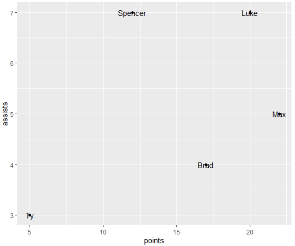
다음 코드는 플롯의 각 지점에 대해 주석이 달린 텍스트를 사용하여 ggplot2에서 산점도를 생성하는 방법을 보여줍니다.
 library (ggplot2)

#create data frame
df <- data. frame (player=c('Brad', 'Ty', 'Spencer', 'Luke', 'Max'),
                 dots=c(17, 5, 12, 20, 22),
                 assists=c(4, 3, 7, 7, 5))

#create scatter plot with annotated labels
ggplot(df) +
  geom_point(aes(x=points, y=assists)) +
  geom_text(aes(x=points, y=assists, label=player))
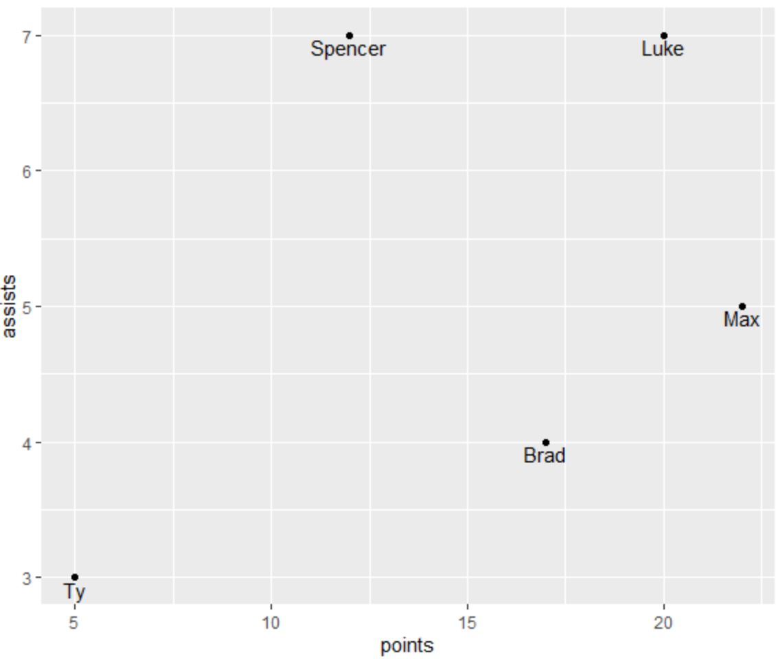
vjust 인수를 사용하면 읽기 쉽도록 텍스트 요소를 수직으로 이동할 수 있습니다.
 library (ggplot2)

#create data frame
df <- data. frame (player=c('Brad', 'Ty', 'Spencer', 'Luke', 'Max'),
                 dots=c(17, 5, 12, 20, 22),
                 assists=c(4, 3, 7, 7, 5))

#create scatter plot with annotated labels
ggplot(df) +
  geom_point(aes(x=points, y=assists)) +
  geom_text(aes(x=points, y=assists, label=player), vjust= -.6 )
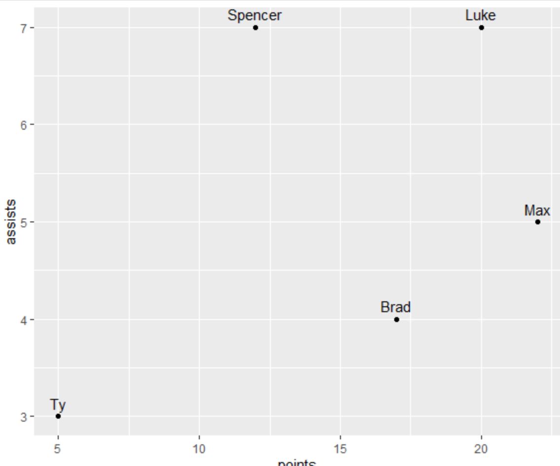
vjust 에 양수 값을 사용하여 텍스트 요소를 수직으로 아래로 이동할 수도 있습니다.
 library (ggplot2)

#create data frame
df <- data. frame (player=c('Brad', 'Ty', 'Spencer', 'Luke', 'Max'),
                 dots=c(17, 5, 12, 20, 22),
                 assists=c(4, 3, 7, 7, 5))

#create scatter plot with annotated labels
ggplot(df) +
  geom_point(aes(x=points, y=assists)) +
  geom_text(aes(x=points, y=assists, label=player), vjust= 1.2 )
이제 주석이 달린 텍스트가 플롯의 각 지점 아래에 위치합니다.
추가 리소스
다음 튜토리얼에서는 ggplot2에서 다른 일반적인 작업을 수행하는 방법을 설명합니다.
ggplot2에서 범례 제목을 변경하는 방법
ggplot2에서 축 레이블을 회전하는 방법
R에서 수정하는 방법: “ggplot” 함수를 찾을 수 없습니다.
저자 소개
벤자민 앤더슨
안녕하세요. 저는 통계학 교수를 퇴직하고 전임 통계 교사로 변신한 벤자민입니다. 통계 분야의 광범위한 경험과 전문 지식을 바탕으로 Statorials를 통해 학생들에게 힘을 실어주기 위해 지식을 공유하고 싶습니다. 더 알아보기