Ggplot2를 사용하여 roc 곡선을 그리는 방법(예제 포함)
로지스틱 회귀는 응답 변수가 이진일 때 회귀 모델을 맞추는 데 사용하는 통계 방법입니다. 로지스틱 회귀 모델이 데이터 세트에 얼마나 잘 맞는지 평가하기 위해 다음 두 가지 측정항목을 살펴볼 수 있습니다.
- 민감도: 결과가 실제로 긍정적일 때 모델이 관찰에 대한 긍정적인 결과를 예측할 확률입니다.
- 특이성: 결과가 실제로 부정적일 때 모델이 관찰에 대해 부정적인 결과를 예측할 확률입니다.
이 두 측정항목을 시각화하는 간단한 방법은 로지스틱 회귀 모델의 민감도와 특이성을 표시하는 그래프인 ROC 곡선을 만드는 것입니다.
이 튜토리얼에서는 ggplot2 시각화 패키지를 사용하여 R에서 ROC 곡선을 생성하고 해석하는 방법을 설명합니다.
예: ggplot2를 사용한 ROC 곡선
R에 다음과 같은 로지스틱 회귀 모델을 적합하다고 가정합니다.
 #load Default dataset from ISLR book
data <- ISLR::Default

#divide dataset into training and test set
set.seed(1)
sample <- sample(c( TRUE , FALSE ), nrow (data), replace = TRUE , prob =c(0.7,0.3))
train <- data[sample, ]
test <- data[!sample, ]

#fit logistic regression model to training set
model <- glm(default~student+balance+income, family=" binomial ", data=train)

#use model to make predictions on test set
predicted <- predict(model, test, type=" response ")
테스트 세트에서 로지스틱 회귀 모델의 성능을 시각화하기 위해 pROC 패키지 의 ggroc() 함수를 사용하여 ROC 플롯을 만들 수 있습니다.
 #load necessary packages
library (ggplot2)
library (pROC)

#define object to plot
rocobj <- roc(test$default, predicted)

#create ROC plot
ggroc(rocobj)
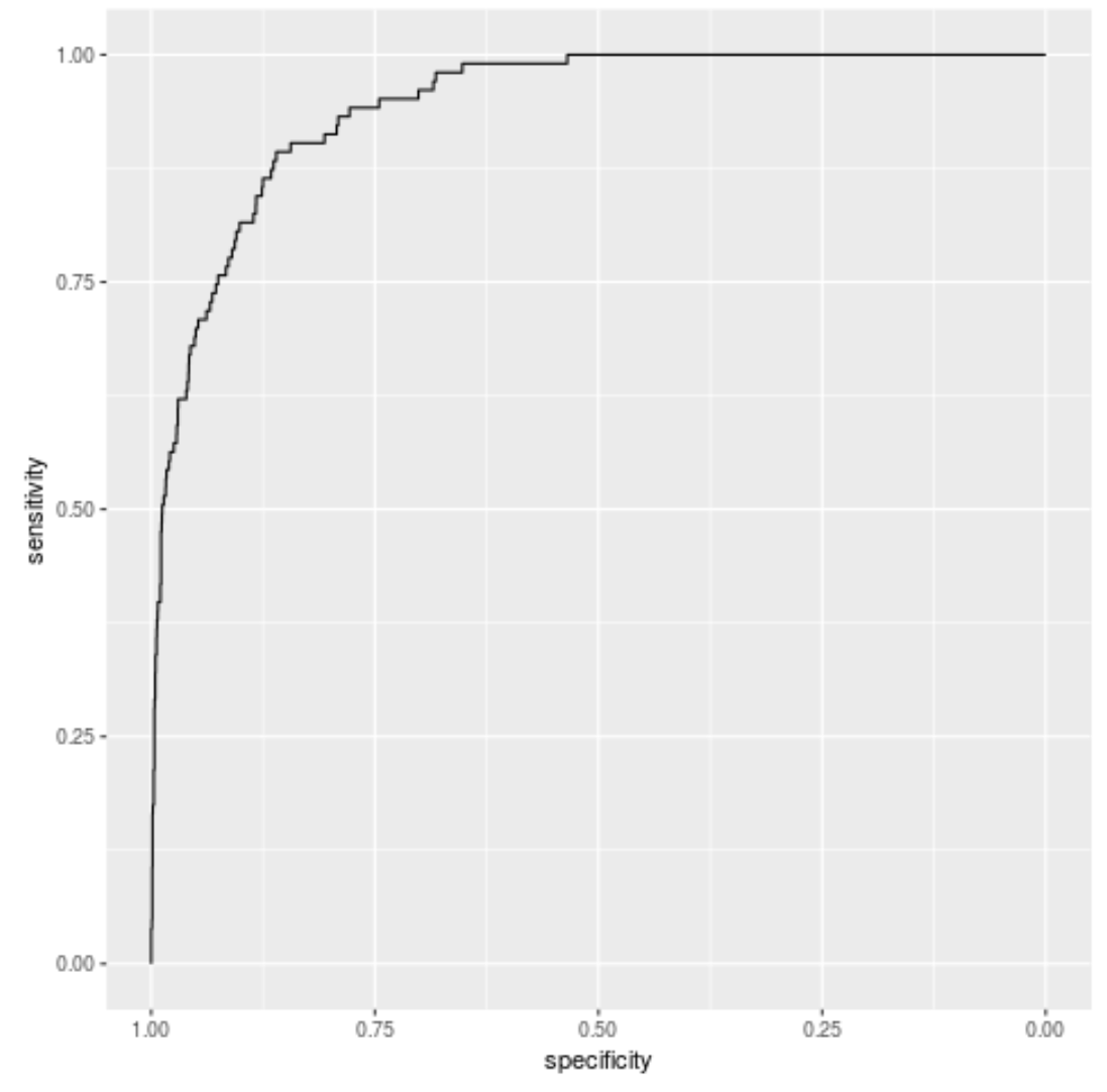
y축은 모델의 민감도(진양성률)를 표시하고 x축은 모델의 특이성(진음성률)을 표시합니다.
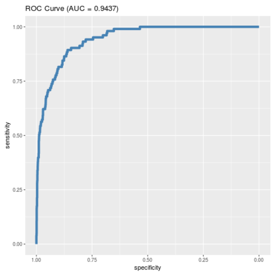
플롯에 스타일을 추가하고 플롯의 AUC(곡선 아래 영역)를 포함하는 제목도 제공할 수 있습니다.
 #load necessary packages
library (ggplot2)
library (pROC)

#define object to plot and calculate AUC
rocobj <- roc(test$default, predicted)
auc <- round (auc(test$default, predicted), 4 )

#create ROC plot
ggroc(rocobj, color = ' steelblue ', size = 2 ) +
  ggtitle( paste0 (' ROC Curve ', ' (AUC = ', auc, ' ) '))
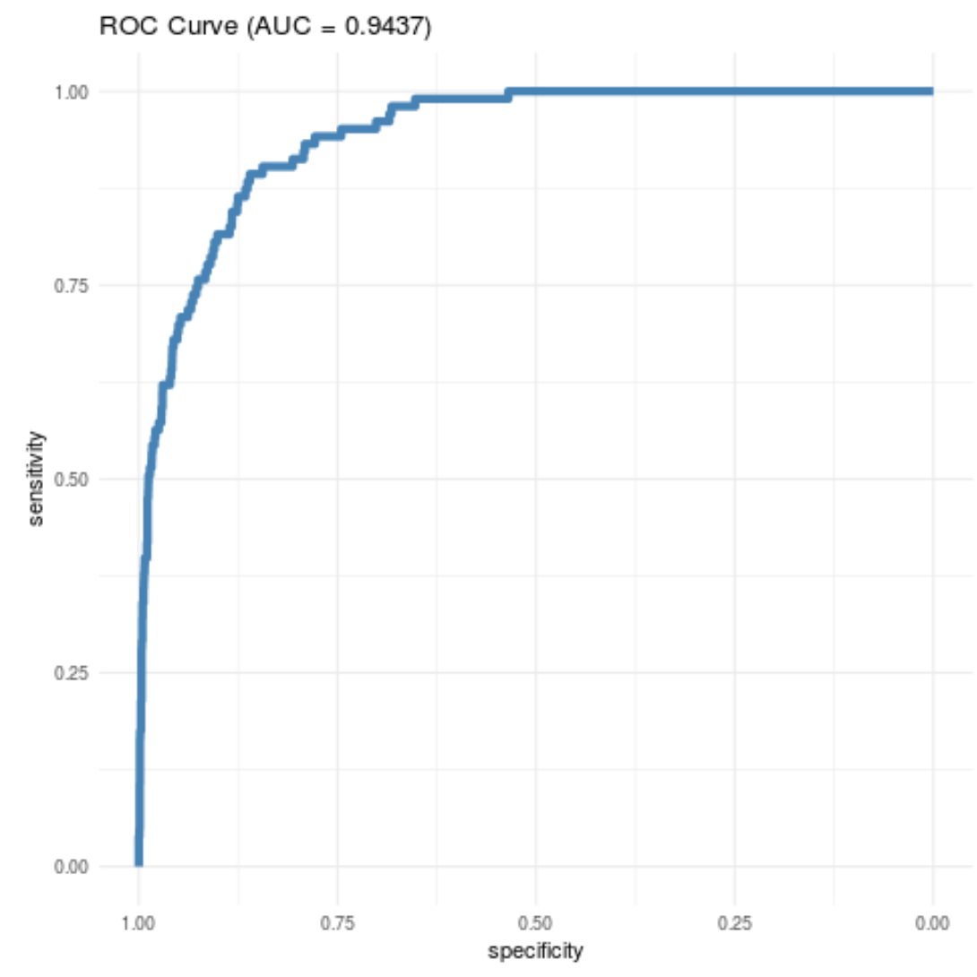
플롯의 테마를 수정할 수도 있습니다.
 #create ROC plot with minimal theme
ggroc(rocobj, color = ' steelblue ', size = 2 ) +
  ggtitle( paste0 (' ROC Curve ', ' (AUC = ', auc, ' ) ')) +
  theme_minimal()
최고의 ggplot2 테마에 대한 가이드는 이 문서를 참조하세요.
저자 소개
벤자민 앤더슨
안녕하세요. 저는 통계학 교수를 퇴직하고 전임 통계 교사로 변신한 벤자민입니다. 통계 분야의 광범위한 경험과 전문 지식을 바탕으로 Statorials를 통해 학생들에게 힘을 실어주기 위해 지식을 공유하고 싶습니다. 더 알아보기