Python에서 인구 피라미드를 만드는 방법
인구 피라미드는 특정 인구의 연령과 성별 분포를 보여주는 그래프입니다. 이는 인구 구성과 인구 증가 추세를 이해하는 데 유용합니다.
이 튜토리얼에서는 Python에서 다음 인구 피라미드를 만드는 방법을 설명합니다.
Python의 연령 피라미드
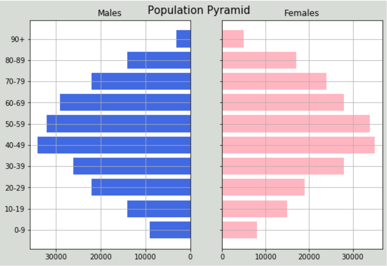
특정 국가의 연령 그룹별 남성과 여성의 전체 인구를 표시하는 다음 데이터 세트가 있다고 가정합니다.
 #import libraries
import numpy as np
import pandas as pd
import matplotlib.pyplot as plt

#create dataframe
df = pd.DataFrame({'Age': ['0-9','10-19','20-29','30-39','40-49','50-59','60 -69','70-79','80-89','90+'],
                    'Male': [9000, 14000, 22000, 26000, 34000, 32000, 29000, 22000, 14000, 3000],
                    'Female': [8000, 15000, 19000, 28000, 35000, 34000, 28000, 24000, 17000, 5000]})
#view dataframe
df

    Age Male Female
0 0-9 9000 8000
1 10-19 14000 15000
2 20-29 22000 19000
3 30-39 26000 28000
4 40-49 34000 35000
5 50-59 32000 34000
6 60-69 29000 28000
7 70-79 22000 24000
8 80-89 14000 17000
9 90+ 3000 5000
다음 코드를 사용하여 데이터에 대한 인구 피라미드를 만들 수 있습니다.
 #define x and y limits
y = range(0, len(df))
x_male = df['Male']
x_female = df['Female']

#define plot parameters
fig, axes = plt.subplots(ncols=2, sharey=True, figsize=(9, 6))

#specify background color and plot title
fig.patch.set_facecolor('xkcd:light grey')
plt.figtext(.5,.9,"Population Pyramid", fontsize=15, ha='center')

#define male and female bars
axes[0].barh(y, x_male, align='center', color='royalblue')
axes[0].set(title='Males')
axes[1].barh(y, x_female, align='center', color='lightpink')
axes[1].set(title='Females')

#adjust grid parameters and specify labels for y-axis
axes[1].grid()
axes[0].set(yticks=y, yticklabels=df['Age'])
axes[0].invert_xaxis()
axes[0].grid()

#displayplot
plt.show()
그래프를 보면 남성과 여성의 분포가 상당히 대칭적이며 인구의 대부분이 중년층에 속함을 알 수 있습니다. 이 그래프만 보면 이 특정 국가의 인구 통계를 대략적으로 파악할 수 있습니다.
matplotlib 색상 목록 에서 색상을 지정하여 플롯 배경과 개별 막대의 색상을 조정할 수 있습니다.
예를 들어, “베이지색” 배경과 함께 사용하기 위해 “hotpink” 및 “dodgerblue”를 지정할 수 있습니다.
 fig.patch.set_facecolor('xkcd: beige ')

axes[0].barh(y, x_male, align='center', color=' dodgerblue ')

axes[1].barh(y, x_female, align='center', color=' hotpink ')

plt.show()

자신에게 가장 잘 어울리는 색상 팔레트를 자유롭게 변경해 보세요.
저자 소개
벤자민 앤더슨
안녕하세요. 저는 통계학 교수를 퇴직하고 전임 통계 교사로 변신한 벤자민입니다. 통계 분야의 광범위한 경험과 전문 지식을 바탕으로 Statorials를 통해 학생들에게 힘을 실어주기 위해 지식을 공유하고 싶습니다. 더 알아보기