Pandas: 상위 10개 값을 시각화하기 위해 막대 차트를 만드는 방법
다음 기본 구문을 사용하여 특정 열에서 가장 빈번한 10개의 값만 포함하는 pandas의 막대 차트를 만들 수 있습니다.
 import pandas as pd
import matplotlib. pyplot as plt

#find values with top 10 occurrences in 'my_column'
top_10 = (df[' my_column ']. value_counts ()). iloc [:10]

#create bar chart to visualize top 10 values
top_10. plot (kind='bar')
다음 예에서는 실제로 이 구문을 사용하는 방법을 보여줍니다.
예: 상위 10개 값을 시각화하기 위해 Pandas에서 막대 차트 만들기
팀 이름과 500명의 농구 선수가 득점한 점수에 대한 정보가 포함된 다음과 같은 pandas DataFrame이 있다고 가정합니다.
 import pandas as pd
import numpy as np
from string import ascii_uppercase
import random
from random import choice

#make this example reproducible
random. seeds (1)
n.p. random . seeds (1)

#createDataFrame
df = pd. DataFrame ({' team ': [choice(ascii_uppercase) for _ in range(500)],
                   ' points ': np. random . uniform (0, 20, 500)})

#view first five rows of DataFrame
print ( df.head ())

  team points
0 E 8.340440
1 S 14.406490
2 Z 0.002287
3 Y 6.046651
4 C 2.935118
다음 구문을 사용하여 팀 열에서 가장 자주 사용되는 10개의 값을 표시하는 막대 차트를 만들 수 있습니다.
 import matplotlib. pyplot as plt

#find teams with top 10 occurrences
top_10_teams = (df[' team ']. value_counts ()).[:10]

#create bar chart of top 10 teams
top_10_teams. plot (kind=' bar ')
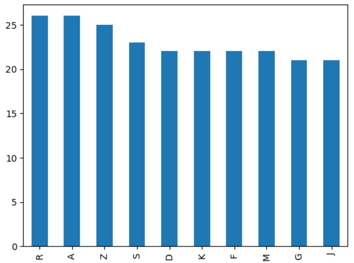
막대 그래프에는 가장 자주 등장하는 10개 팀의 이름만 포함됩니다.
x축은 팀 이름을 표시하고 y축은 빈도를 표시합니다.
미학적으로 더 보기 좋게 만들기 위해 플롯을 사용자 정의할 수도 있습니다.
 import matplotlib. pyplot as plt

#find teams with top 10 occurrences
top_10_teams = (df[' team ']. value_counts ()).[:10]

#create bar chart of top 10 teams
top_10_teams. plot (kind=' bar ', edgecolor=' black ', rot=0)

#add axis labels
plt. xlabel (' Team ')
plt. ylabel (' Frequency ')
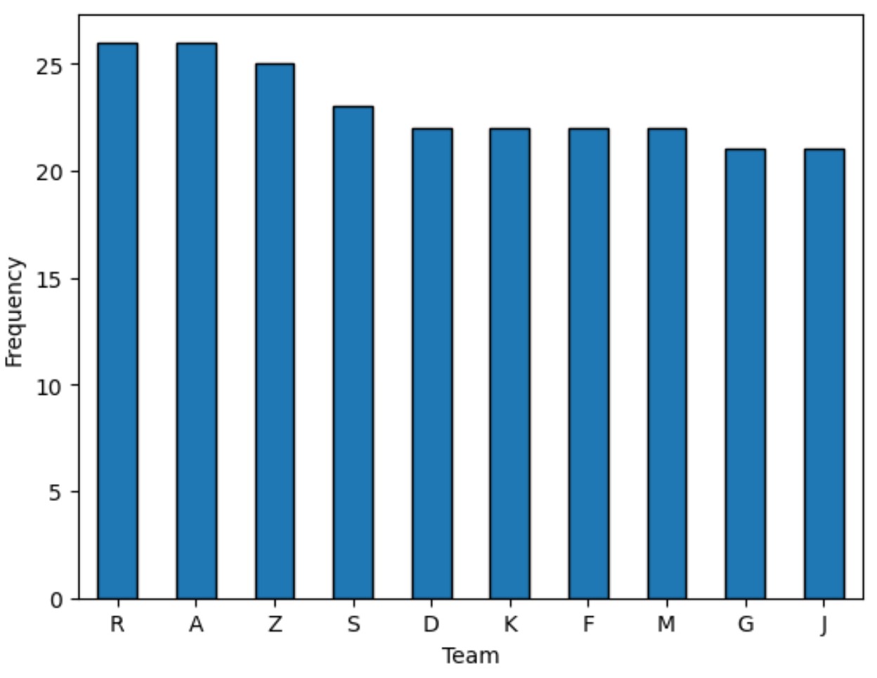
edgecolor 인수는 각 막대 주위에 검은색 테두리를 추가했고 rot 인수는 읽기 쉽도록 x축 레이블을 90도 회전했습니다.
추가 리소스
다음 튜토리얼에서는 Pandas에서 다른 일반적인 작업을 수행하는 방법을 설명합니다.
Pandas: 누적 막대 차트를 만드는 방법
Pandas: 막대 그래프에서 막대에 주석을 추가하는 방법
Pandas: 막대 차트에 여러 열을 그리는 방법
저자 소개
벤자민 앤더슨
안녕하세요. 저는 통계학 교수를 퇴직하고 전임 통계 교사로 변신한 벤자민입니다. 통계 분야의 광범위한 경험과 전문 지식을 바탕으로 Statorials를 통해 학생들에게 힘을 실어주기 위해 지식을 공유하고 싶습니다. 더 알아보기