Pandas 시리즈를 그리는 방법(예제 포함)
팬더 시리즈의 값을 그리는 일반적인 방법에는 두 가지가 있습니다.
방법 1: Pandas 계열에서 선 그림 만들기
 import pandas as pd
import matplotlib. pyplot as plt

plt. plot ( my_series.index , my_series.values )
방법 2: Pandas 시리즈에서 히스토그램 만들기
 import pandas as pd
import matplotlib. pyplot as plt

my_series. plot (kind=' hist ')
다음 예에서는 각 방법을 실제로 사용하는 방법을 보여줍니다.
예 1: Pandas 시리즈에서 선 플롯 생성
다음 코드는 Pandas 시리즈에서 선 플롯을 생성하는 방법을 보여줍니다.
 import pandas as pd
import matplotlib. pyplot as plt

#create pandas Series
my_series = pd. Series ([2, 2, 2, 3, 3, 4, 5, 7, 8, 9, 12, 12, 14, 15, 16, 16, 18,
                       19, 22, 22, 22, 25, 26, 27, 30, 33, 33, 33, 34, 35])

#create line plot to visualize values in Series
plt. plot ( my_series.index , my_series.values )
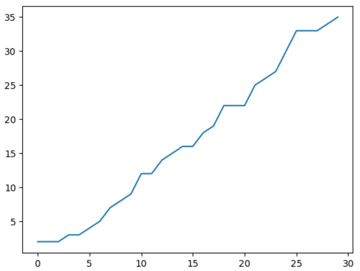
x축은 팬더 시리즈의 인덱스 값을 나타내고, y축은 시리즈의 실제 값을 나타냅니다.
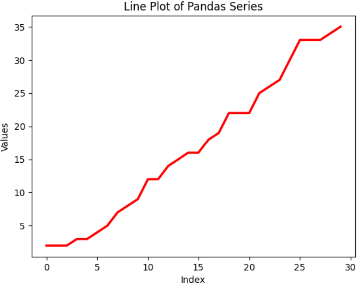
다양한 pandas 및 matplotlib 함수를 사용하여 선의 모양과 축 레이블 및 플롯 제목을 사용자 정의할 수도 있습니다.
 #create customized line plot
plt. plot (my_series. index , my_series. values , color=' red ', linewidth= 2.5 )

#add axis labels and title
plt. xlabel (' Index ')
plt. ylabel (' Values ')
plt. title (' Line Plot of Pandas Series ')
예 2: 일련의 팬더에서 히스토그램 만들기
다음 코드는 Pandas 시리즈에서 히스토그램을 만드는 방법을 보여줍니다.
 import pandas as pd
import matplotlib. pyplot as plt

#create pandas Series
my_series = pd. Series ([2, 2, 2, 3, 3, 4, 5, 7, 8, 9, 12, 12, 14, 15, 16, 16, 18,
                       19, 22, 22, 22, 25, 26, 27, 30, 33, 33, 33, 34, 35])

#create histogram visualize distribution of values in Series
my_series. plot (kind=' hist ')
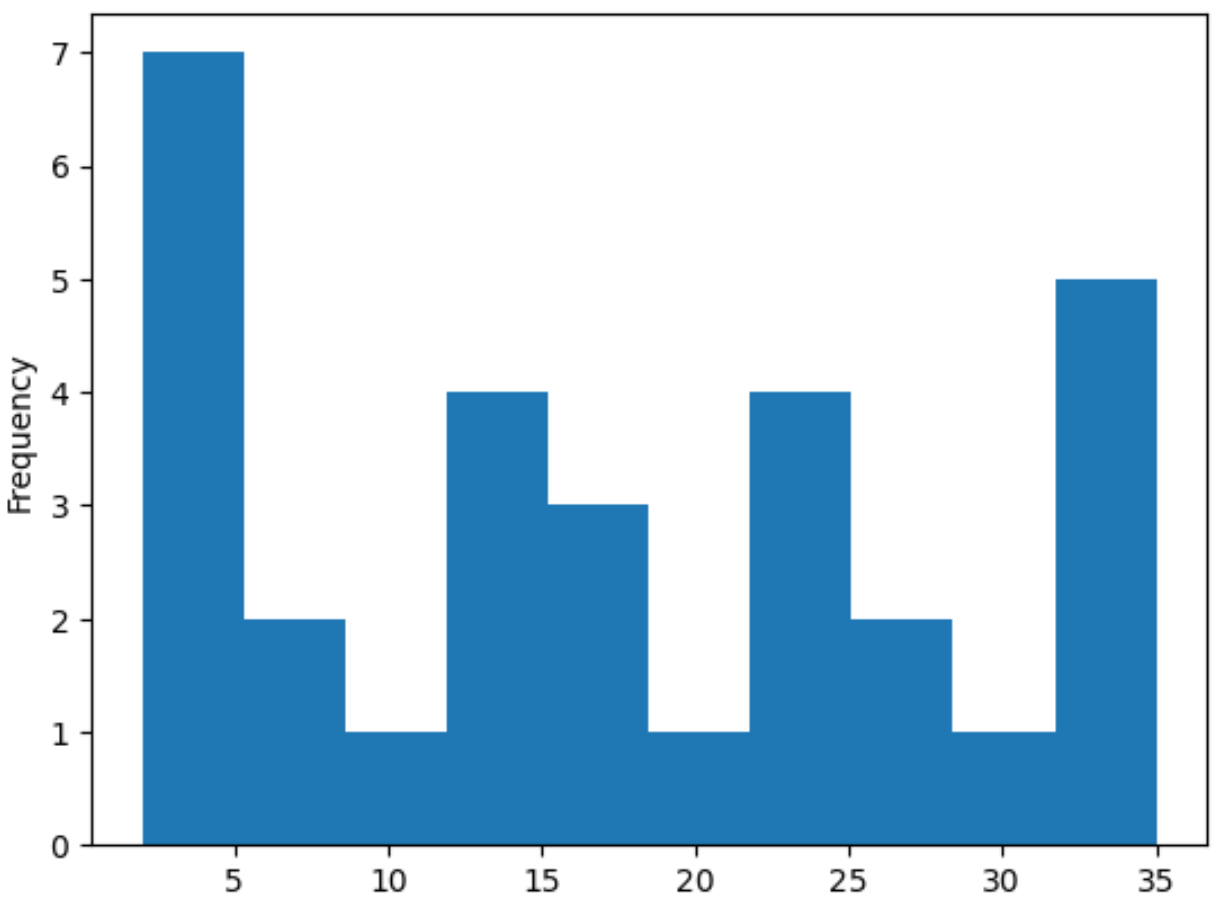
x축은 pandas 시리즈의 값을 나타내고 y축은 값의 빈도를 나타냅니다.
또한 다양한 pandas 및 matplotlib 함수를 사용하여 히스토그램의 모양과 히스토그램에 사용되는 빈 수를 사용자 정의할 수 있습니다.
 #create histogram with 15 bins
my_series. plot (kind=' hist ', edgecolor=' black ', color=' gold ', bins= 15 )

#add axis labels and title
plt. xlabel (' Values ')
plt. title (' Histogram of Pandas Series ')
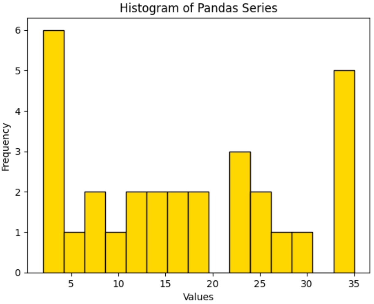
히스토그램에 사용되는 기본 그룹 수는 10개 입니다.
bins 인수를 사용하여 이 숫자를 늘려 더 많은 bin을 생성하거나 이 숫자를 줄여 더 적은 수의 bin을 생성할 수 있습니다.
추가 리소스
다음 튜토리얼에서는 Pandas에서 다른 일반적인 작업을 수행하는 방법을 설명합니다.
Pandas 시리즈를 값으로 필터링하는 방법
Pandas 시리즈를 DataFrame으로 변환하는 방법
Pandas 시리즈를 NumPy 배열로 변환하는 방법
저자 소개
벤자민 앤더슨
안녕하세요. 저는 통계학 교수를 퇴직하고 전임 통계 교사로 변신한 벤자민입니다. 통계 분야의 광범위한 경험과 전문 지식을 바탕으로 Statorials를 통해 학생들에게 힘을 실어주기 위해 지식을 공유하고 싶습니다. 더 알아보기