R에서 회귀선을 사용하여 산점도를 만드는 방법
간단한 선형 회귀를 수행할 때 종종 x와 y 값의 다양한 조합을 시각화하기 위해 산점도를 만들고 싶습니다.
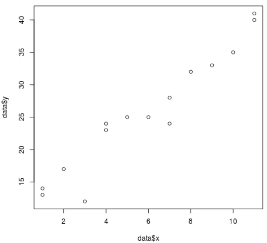
다행히 R에서는 플롯() 함수를 사용하여 포인트 클라우드를 쉽게 생성할 수 있습니다. 예를 들어:
 #create some fake data
data <- data.frame(x = c(1, 1, 2, 3, 4, 4, 5, 6, 7, 7, 8, 9, 10, 11, 11),
                   y = c(13, 14, 17, 12, 23, 24, 25, 25, 24, 28, 32, 33, 35, 40, 41))

#create scatterplot of data
plot(data$x, data$y)
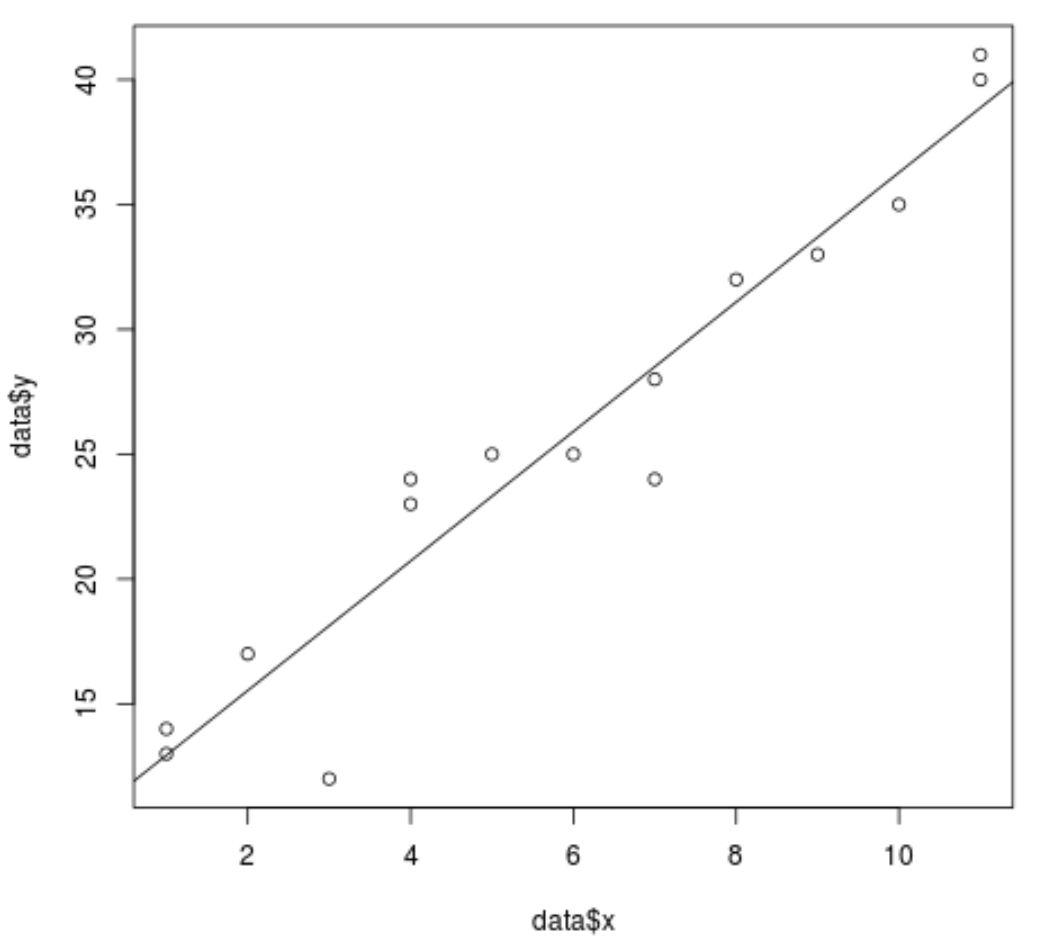
abline() 함수를 사용하여 산점도에 회귀선을 추가하는 것도 쉽습니다.
예를 들어:
 #fit a simple linear regression model
model <- lm(y ~ x, data = data)

#add the fitted regression line to the scatterplot
abline(model)
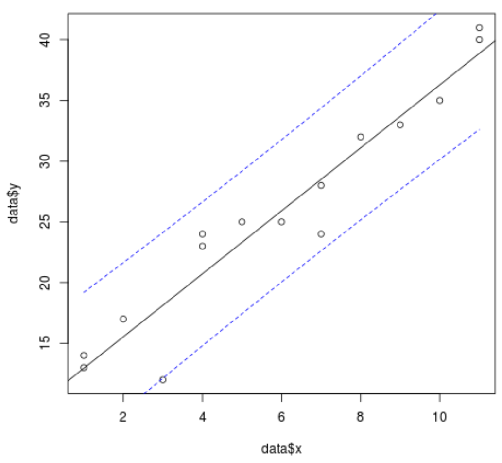
예측() 함수를 사용하여 플롯에 신뢰 구간 선을 추가할 수도 있습니다.
 #define range of x values
newx = seq(min(data$x),max(data$x),by = 1)

#find 95% confidence interval for the range of x values
conf_interval <- predict(model, newdata=data.frame(x=newx), interval="confidence",
                         level = 0.95)

#create scatterplot of values with regression line
plot(data$x, data$y)
abline(model)

#add dashed lines (lty=2) for the 95% confidence interval
lines(newx, conf_interval[,2], col="blue", lty=2)
lines(newx, conf_interval[,3], col="blue", lty=2)
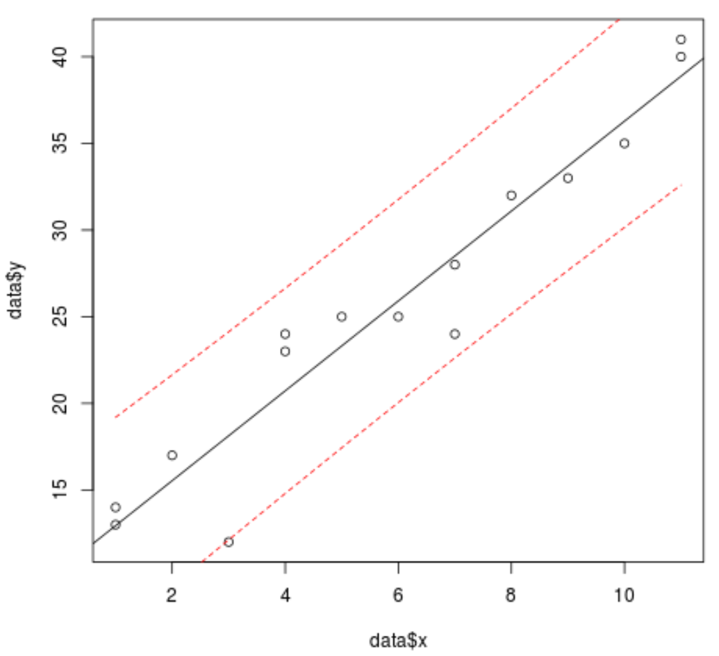
또는 예측() 함수에 구간 유형을 지정하여 플롯에 예측 구간 선을 추가할 수도 있습니다.
 #define range of x values
newx = seq(min(data$x),max(data$x),by = 1)

#find 95% prediction interval for the range of x values
pred_interval <- predict(model, newdata=data.frame(x=newx), interval="prediction" ,
                         level = 0.95)

#create scatterplot of values with regression line
plot(data$x, data$y)
abline(model)

#add dashed lines (lty=2) for the 95% confidence interval
lines(newx, pred_interval[,2], col="red", lty=2)
lines(newx, pred_interval[,3], col="red", lty=2)
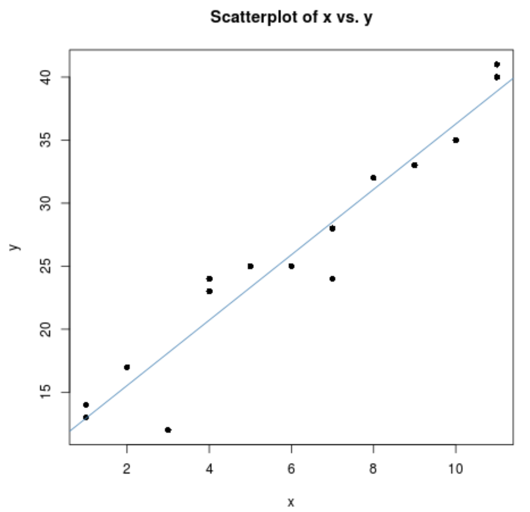
마지막으로 제목을 추가하고, 축 이름을 변경하고, 개별 플롯 포인트의 모양을 변경하여 플롯을 더욱 미적으로 보기 좋게 만들 수 있습니다.
 plot(data$x, data$y,
     main = "Scatterplot of x vs. y", #add title
     pch=16, #specify points to be filled in
     xlab='x', #change x-axis name
ylab='y') #change y-axis name

abline(model, col='steelblue') #specify color of regression line
추가 리소스
다음 튜토리얼에서는 R에서 다른 일반적인 작업을 수행하는 방법을 설명합니다.
R에서 산점도의 점에 레이블을 지정하는 방법
포인트 클라우드에 대해 R에서 Jitter 기능을 사용하는 방법
저자 소개
벤자민 앤더슨
안녕하세요. 저는 통계학 교수를 퇴직하고 전임 통계 교사로 변신한 벤자민입니다. 통계 분야의 광범위한 경험과 전문 지식을 바탕으로 Statorials를 통해 학생들에게 힘을 실어주기 위해 지식을 공유하고 싶습니다. 더 알아보기