Pandas- groupby နှင့် plot ကိုအသုံးပြုနည်း (ဥပမာများနှင့်အတူ)
ပန်ဒါ DataFrame ဖြင့် အုပ်စုဖွဲ့၍ ကြံစည်ရန် အောက်ပါနည်းလမ်းများကို သင်အသုံးပြုနိုင်ပါသည်။
နည်းလမ်း 1- လမ်းကြောင်းတစ်ခုတည်းတွင် စာကြောင်းများစွာကို အုပ်စုဖွဲ့ပြီး ဆွဲပါ။
 #define index column
df. set_index ('day', inplace= True )

#group data by product and display sales as line chart
df. groupby (' product ')[' sales ']. plot (legend= True )
နည်းလမ်း 2- အပိုင်းခွဲတစ်ခုစီတွင် မျဉ်းကြောင်းများအလိုက် အုပ်စုဖွဲ့ပြီး ဆွဲပါ။
 p.d. pivot_table ( df.reset_index (),
               index=' day ', columns=' product ', values=' sales '
              ). plot (subplots= True )
အောက်ဖော်ပြပါ ဥပမာသည် အောက်ပါ pandas DataFrame ဖြင့် လက်တွေ့တွင် နည်းလမ်းတစ်ခုစီကို အသုံးပြုနည်းကို ပြသသည်-
 import pandas as pd

#createDataFrame
df = pd. DataFrame ({' day ': [1, 2, 3, 4, 5, 1, 2, 3, 4, 5],
                   ' product ': ['A', 'A', 'A', 'A', 'A', 'B', 'B', 'B', 'B', 'B'],
                   ' sales ': [4, 7, 8, 12, 15, 8, 11, 14, 19, 20]})

#view DataFrame
df

	day product sales
0 1 A 4
1 2 To 7
2 3 To 8
3 4 A 12
4 5 To 15
5 1 B 8
6 2 B 11
7 3 B 14
8 4 B 19
9 5 B 20
နည်းလမ်း 1- လမ်းကြောင်းတစ်ခုတည်းတွင် စာကြောင်းများစွာကို အုပ်စုဖွဲ့ပြီး ဆွဲပါ။
အောက်ပါကုဒ်သည် ပြောင်းလဲနိုင်သော “ ထုတ်ကုန်” ဖြင့် DataFrame ကို မည်သို့အုပ်စုဖွဲ့ရမည်ကို ပြသပြီး ထုတ်ကုန်တစ်ခုစီ၏ “ ရောင်းချမှု” ကို ဇယားတစ်ခုတွင် ရေးဆွဲသည်-
 #define index column
df. set_index (' day ', inplace= True )

#group data by product and display sales as line chart
df. groupby (' product ')[' sales ']. plot (legend= True )
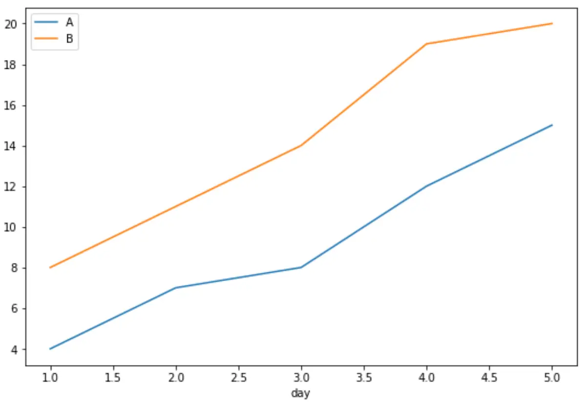
x-axis သည် နေ့ကိုပြသသည်၊ y-axis သည် ရောင်းအားကိုပြသသည်၊ အတန်းတစ်ခုစီသည် တစ်ခုချင်းစီထုတ်ကုန်များ၏ရောင်းအားကိုပြသသည်။
နည်းလမ်း 2- အပိုင်းခွဲတစ်ခုစီတွင် မျဉ်းကြောင်းများအလိုက် အုပ်စုဖွဲ့ပြီး ဆွဲပါ။
အောက်ပါကုဒ်သည် ပြောင်းလဲနိုင်သော “ ထုတ်ကုန်” ဖြင့် DataFrame ကို မည်သို့အုပ်စုဖွဲ့ရမည်ကို ပြသပြီး ထုတ်ကုန်တစ်ခုစီ၏ “ အရောင်း” ကို အပိုင်းခွဲတစ်ခုစီတွင် ကွက်ကွက်ပြသသည်-
 p.d. pivot_table ( df.reset_index (),
               index=' day ', columns=' product ', values=' sales '
              ). plot (subplots= True )
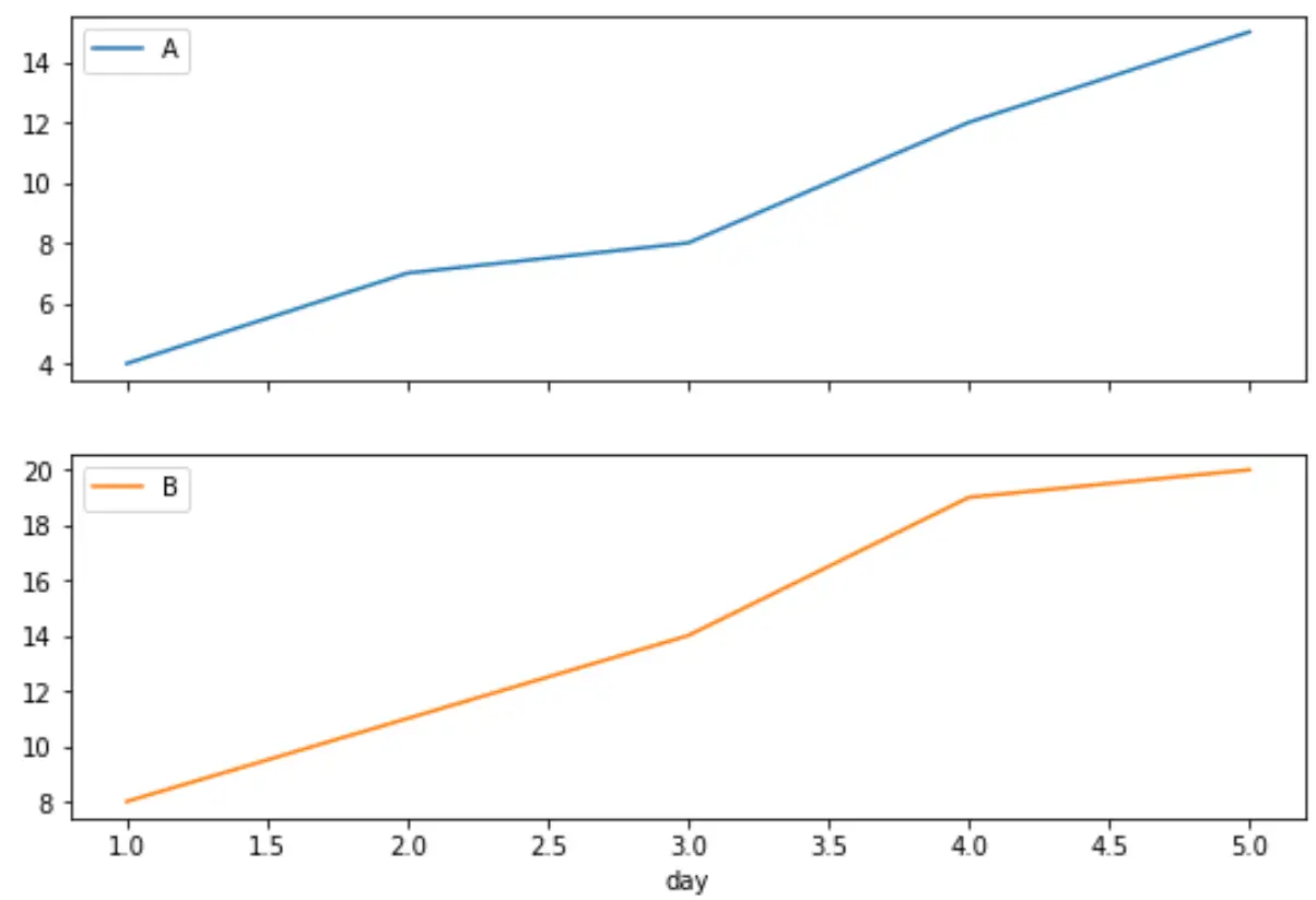
ပထမဂရပ်သည် ထုတ်ကုန် A ၏ရောင်းအားကိုပြသပြီး ဒုတိယဂရပ်သည် ထုတ်ကုန် B ၏ရောင်းချမှုကိုပြသသည်။
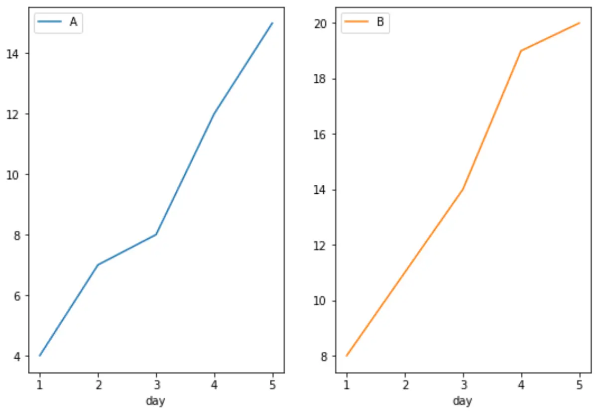
အပိုင်းခွဲများ၏ layout ကို သတ်မှတ်ရန် layout argument ကိုလည်း သုံးနိုင်သည်ကို သတိပြုပါ။
ဥပမာအားဖြင့်၊ အပိုင်းခွဲများသည် အတန်းတစ်ခုနှင့် ကော်လံနှစ်ခုပါသော ဇယားကွက်တစ်ခုတွင် ရှိနေကြောင်း ကျွန်ုပ်တို့ သတ်မှတ်နိုင်သည်-
 p.d. pivot_table ( df.reset_index (),
               index=' day ', columns=' product ', values=' sales '
              ). plot (subplots= True , layout=(1,2))
ထပ်လောင်းအရင်းအမြစ်များ
အောက်ဖော်ပြပါ သင်ခန်းစာများသည် ပန်ဒါများတွင် အခြားသော ဘုံအမြင်အာရုံများကို ဖန်တီးနည်းကို ရှင်းပြသည်-
Pandas DataFrame မှ boxplot တစ်ခုကို ဖန်တီးနည်း
Pandas DataFrame မှ Pie Chart ဖန်တီးနည်း
Pandas DataFrame မှ histogram တစ်ခုဖန်တီးနည်း
စာရေးသူအကြောင်း
Benjamin Anderson
မင်္ဂလာပါ၊ ကျွန်ုပ်သည် အငြိမ်းစား စာရင်းအင်း ပါမောက္ခ ဘင်ဂျမင်ဖြစ်ပြီး သီးသန့် Statorials ဆရာအဖြစ် လှည့်ပတ်ပါသည်။ စာရင်းဇယားနယ်ပယ်တွင် ကျယ်ပြန့်သောအတွေ့အကြုံနှင့် ကျွမ်းကျင်မှုနှင့်အတူ၊ Statorials မှတစ်ဆင့် ကျောင်းသားများကို ခွန်အားဖြစ်စေရန်အတွက် ကျွန်ုပ်၏အသိပညာကို မျှဝေလိုပါသည်။ ပိုသိတယ်။