Lm() ရလဒ် r ကို ဘယ်လိုဆွဲမလဲ။
R တွင် lm() function ၏ရလဒ်များကိုဆွဲရန် အောက်ပါနည်းလမ်းများကို အသုံးပြုနိုင်သည်။
နည်းလမ်း 1- Plot lm() သည် base R ရလဒ်
 #create scatterplot
plot(y ~ x, data=data)

#add fitted regression line to scatterplot
abline(fit)
Method 2- Plot lm() သည် ggplot2 တွင်ရလဒ်များဖြစ်သည်။
 library (ggplot2)

#create scatterplot with fitted regression line
ggplot(data, aes (x = x, y = y)) +
  geom_point() +
  stat_smooth(method = " lm ")
အောက်ဖော်ပြပါနမူနာများသည် R တွင်တည်ဆောက်ထားသော mtcars dataset ဖြင့် နည်းလမ်းတစ်ခုစီကို လက်တွေ့တွင်အသုံးပြုနည်းကိုပြသထားသည်။
ဥပမာ 1- plot lm() သည် base R ရလဒ်
အောက်ဖော်ပြပါ ကုဒ်သည် အခြေခံ R တွင် lm() လုပ်ဆောင်ချက်၏ ရလဒ်များကို ပုံဖော်နည်းကို ပြသသည် ။
 #fit regression model
fit <- lm(mpg ~ wt, data=mtcars)

#create scatterplot
plot(mpg ~ wt, data=mtcars)

#add fitted regression line to scatterplot
abline(fit)
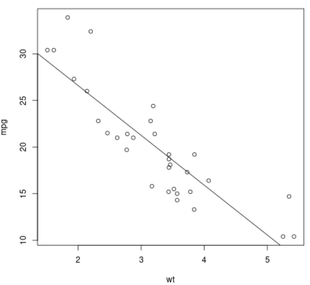
ဂရပ်ရှိ အမှတ်များသည် ကုန်ကြမ်းဒေတာတန်ဖိုးများကို ကိုယ်စားပြုပြီး ဖြောင့်ထောင့်ဖြတ်မျဉ်းသည် တပ်ဆင်ထားသော ဆုတ်ယုတ်မှုမျဉ်းကို ကိုယ်စားပြုသည်။
ဥပမာ 2- Plot lm() ggplot2 တွင် ရလဒ်များ
အောက်ဖော်ပြပါ ကုဒ်သည် ggplot2 data visualization package ကို အသုံးပြု၍ lm() လုပ်ဆောင်ချက်၏ ရလဒ်များကို ပုံဖော်နည်းကို ပြသသည်-
 library (ggplot2)

#fit regression model
fit <- lm(mpg ~ wt, data=mtcars)

#create scatterplot with fitted regression line
ggplot(mtcars, aes (x = x, y = y)) +
  geom_point() +
  stat_smooth(method = " lm ")
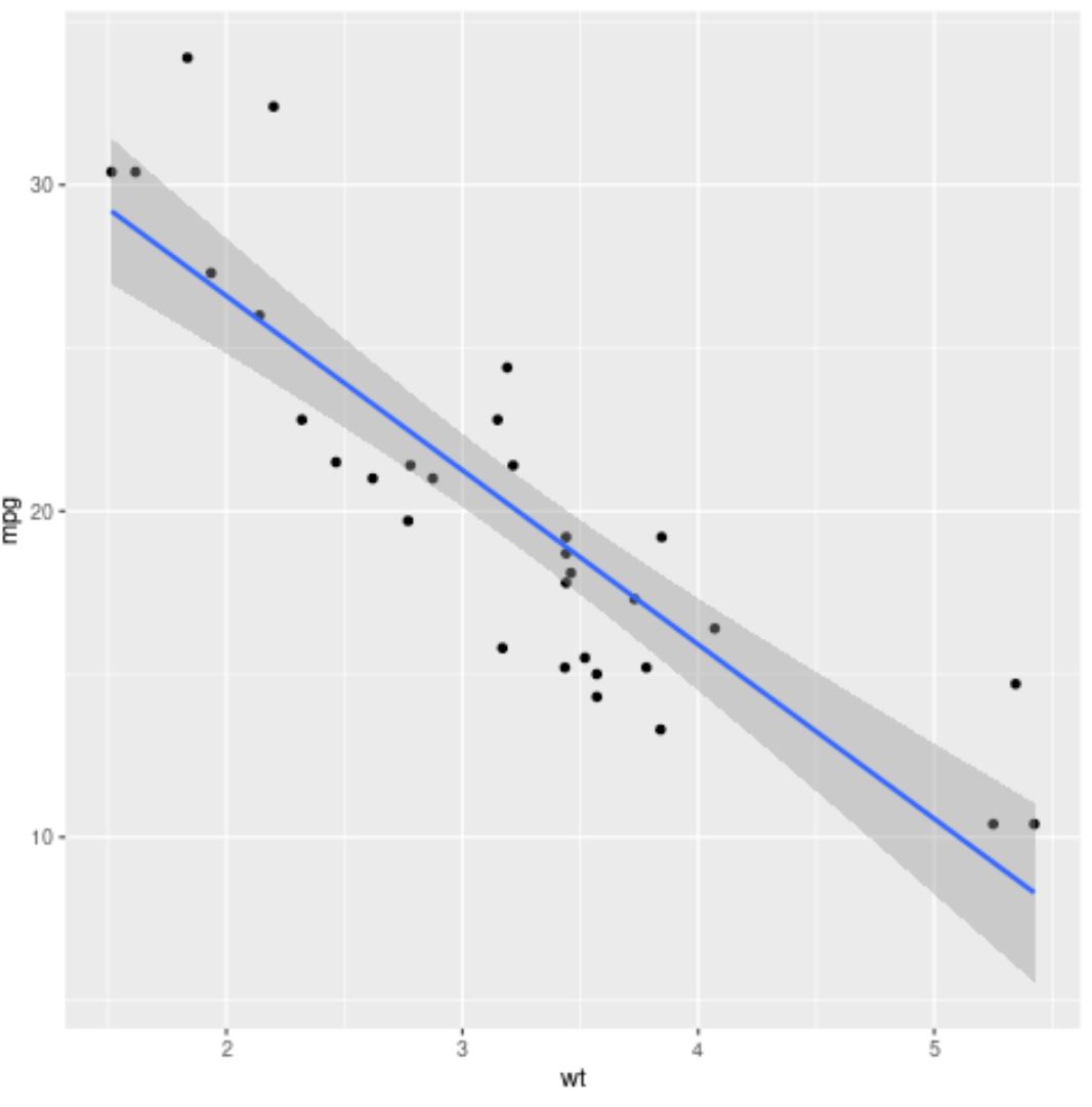
အပြာလိုင်းသည် တပ်ဆင်ထားသော ဆုတ်ယုတ်မှုမျဉ်းကို ကိုယ်စားပြုပြီး မီးခိုးရောင်ကြိုးများသည် 95% ယုံကြည်မှုကြားကာလ၏ ကန့်သတ်ချက်များကို ကိုယ်စားပြုသည်။
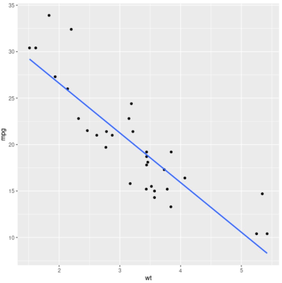
ယုံကြည်မှုကြားကာလဘောင်များကိုဖယ်ရှားရန်၊ stat_smooth() အငြင်းအခုံတွင် se=FALSE ကို ရိုးရှင်းစွာအသုံးပြုပါ။
 library (ggplot2)

#fit regression model
fit <- lm(mpg ~ wt, data=mtcars)

#create scatterplot with fitted regression line
ggplot(mtcars, aes (x = x, y = y)) +
  geom_point() +
  stat_smooth(method = “ lm ”, se= FALSE )
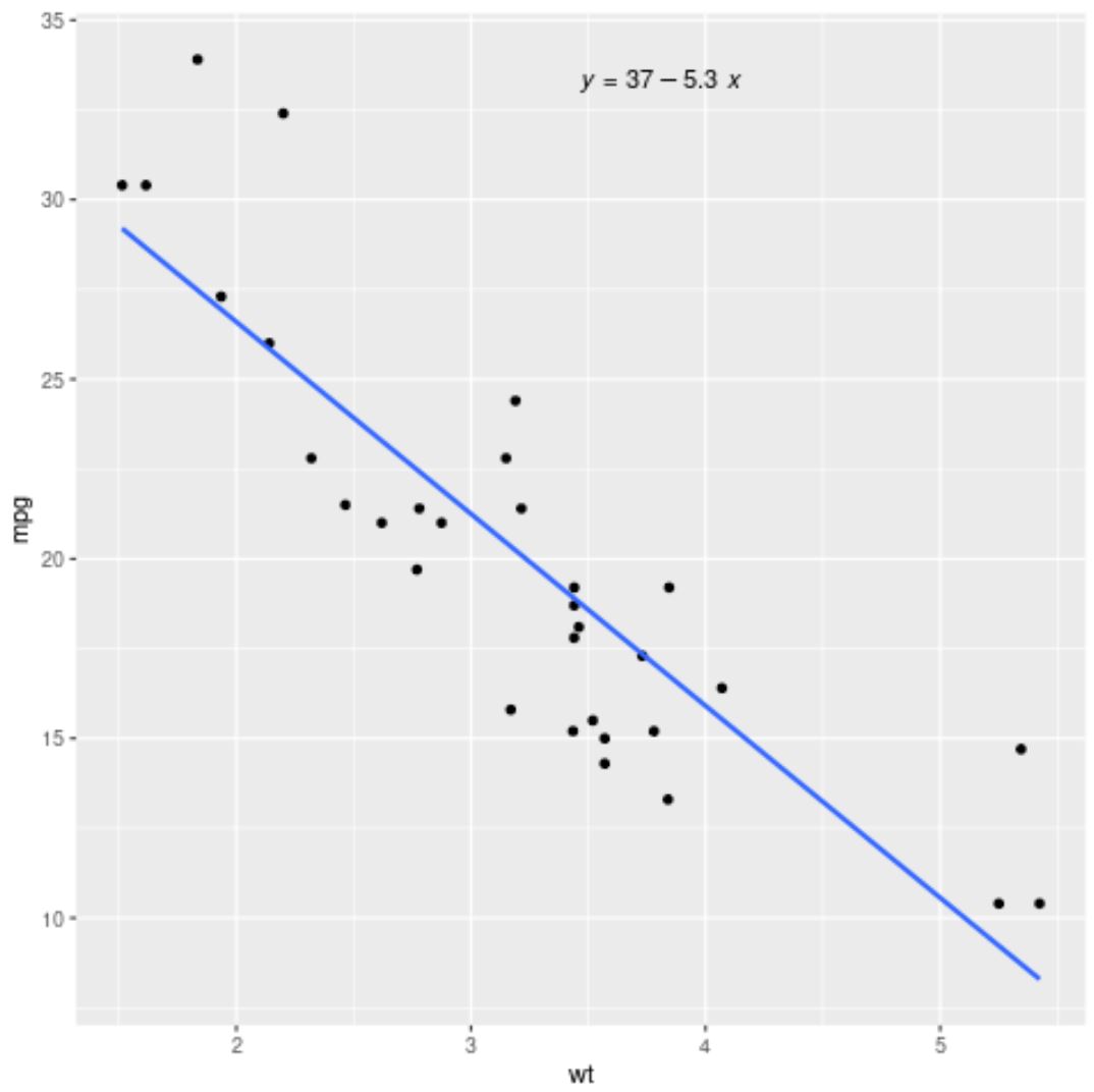
ggpubr ပက်ကေ့ဂျ်မှ stat_regline_equation() လုပ်ဆောင်ချက်ကို အသုံးပြု၍ ဂရပ်အတွင်း တပ်ဆင်ထားသော ဆုတ်ယုတ်မှုညီမျှခြင်းကိုလည်း ထည့်နိုင်သည်။
 library (ggplot2)
library (ggpubr)

#fit regression model
fit <- lm(mpg ~ wt, data=mtcars)

#create scatterplot with fitted regression line
ggplot(mtcars, aes (x = x, y = y)) +
  geom_point() +
  stat_smooth(method = “ lm ”, se= FALSE ) +
  stat_regline_equation(label.x.npc = “ center ”)
ထပ်လောင်းအရင်းအမြစ်များ
အောက်ဖော်ပြပါ သင်ခန်းစာများသည် R တွင် အခြားဘုံအလုပ်များကို မည်သို့လုပ်ဆောင်ရမည်ကို ရှင်းပြသည်-
R တွင် ရိုးရှင်းသော linear regression လုပ်နည်း
R တွင် regression output ကို အဓိပ္ပာယ်ဖွင့်ဆိုပုံ
R တွင် glm နှင့် lm ကွာခြားချက်
စာရေးသူအကြောင်း
Benjamin Anderson
မင်္ဂလာပါ၊ ကျွန်ုပ်သည် အငြိမ်းစား စာရင်းအင်း ပါမောက္ခ ဘင်ဂျမင်ဖြစ်ပြီး သီးသန့် Statorials ဆရာအဖြစ် လှည့်ပတ်ပါသည်။ စာရင်းဇယားနယ်ပယ်တွင် ကျယ်ပြန့်သောအတွေ့အကြုံနှင့် ကျွမ်းကျင်မှုနှင့်အတူ၊ Statorials မှတစ်ဆင့် ကျောင်းသားများကို ခွန်အားဖြစ်စေရန်အတွက် ကျွန်ုပ်၏အသိပညာကို မျှဝေလိုပါသည်။ ပိုသိတယ်။