R ဖြင့် histogram တွင် ပုံမှန်မျဉ်းကွေးတစ်ခုကို ထပ်တင်နည်း (ဥပမာ 2 ခု)
မကြာခဏဆိုသလို R ဖြင့် histogram တစ်ခုပေါ်တွင် ပုံမှန်မျဉ်းကွေးတစ်ခုကို ထပ်တင်လိုပေမည်။
အောက်ဖော်ပြပါနမူနာများသည် base R နှင့် ggplot2 တွင် ၎င်းကို မည်သို့လုပ်ဆောင်ရမည်ကို ပြသထားသည်။
ဥပမာ 1- အခြေခံ R histogram ပေါ်တွင် ပုံမှန်မျဉ်းကွေးတစ်ခုကို ခြုံငုံကြည့်ပါ။
အခြေခံ R တွင် ဟီစတိုဂရမ်တစ်ခုဖန်တီးရန် အောက်ပါကုဒ်ကို အသုံးပြု၍ သာမာန်မျဉ်းကွေးကို histogram ပေါ်တွင် ခြုံငုံသုံးသပ်နိုင်သည်-
 #make this example reproducible
set. seed ( 0 )

#define data
data <-rnorm( 1000 )

#create histogram
hist_data <- hist(data)

#define x and y values to use for normal curve
x_values <- seq(min(data), max(data), length = 100 )
y_values <- dnorm(x_values, mean = mean(data), sd = sd(data))
y_values <- y_values * diff(hist_data$mids[1:2]) * length(data)

#overlay normal curve on histogram
lines(x_values, y_values, lwd = 2 )
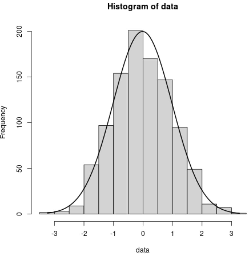
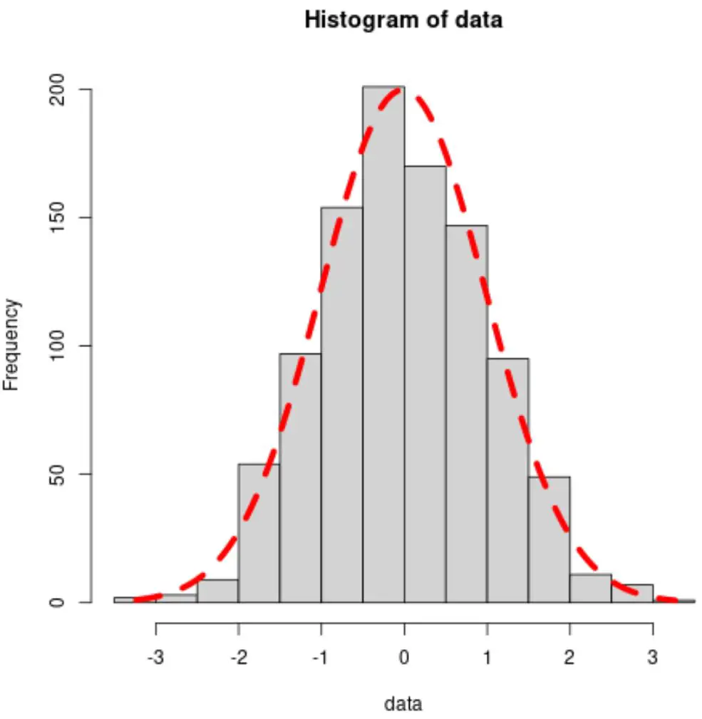
ကွက်လပ်ရှိ အနက်ရောင်မျဉ်းကွေးသည် ပုံမှန်မျဉ်းကွေးကို ကိုယ်စားပြုသည်။
အရောင်၊ အကျယ်နှင့် လိုင်းအမျိုးအစားတို့ကို အသီးသီးမွမ်းမံပြင်ဆင်ရန် col ၊ lwd နှင့် lty အငြင်းအခုံများကို လွတ်လပ်စွာ အသုံးပြုပါ။
 #overlay normal curve with custom aesthetics
lines(x_values, y_values, col=' red ', lwd= 5 , lty=' dashed ')
ဥပမာ 2- ggplot2 တွင် histogram ပေါ်တွင် ပုံမှန်မျဉ်းကွေးကို ခြုံကြည့်ပါ။
ggplot2 တွင် histogram တစ်ခုဖန်တီးရန်နှင့် histogram ပေါ်တွင် ပုံမှန်မျဉ်းကွေးတစ်ခုကို ထပ်တင်ရန် အောက်ပါကုဒ်ကို အသုံးပြုနိုင်သည်။
 library (ggplot2)

#make this example reproducible
set. seed ( 0 )

#define data
data <- data. frame (x=rnorm( 1000 ))

#create histogram and overlay normal curve
ggplot(data, aes(x)) +
  geom_histogram(aes(y = ..density..), fill=' lightgray ', col=' black ') +
  stat_function(fun = dnorm, args = list(mean=mean(data$x), sd=sd(data$x)))
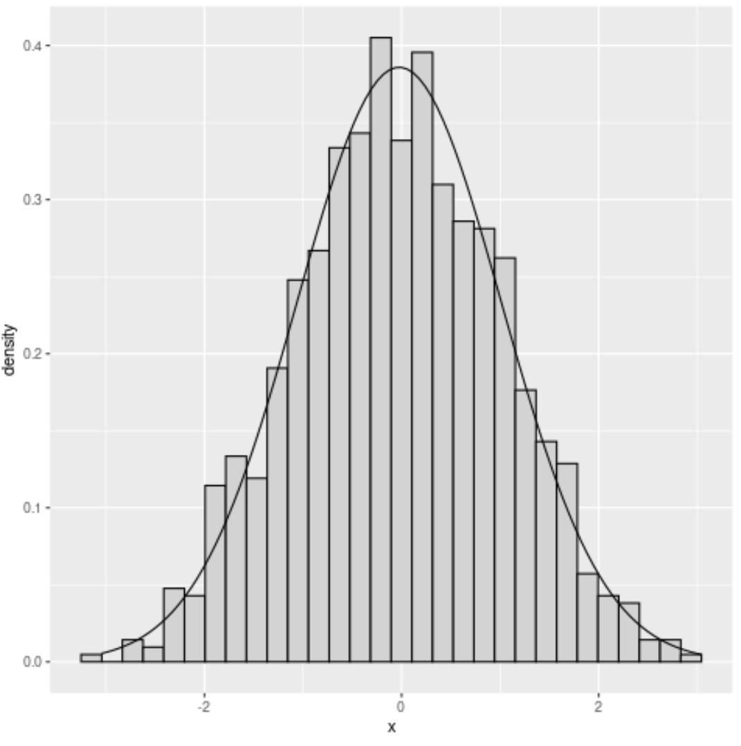
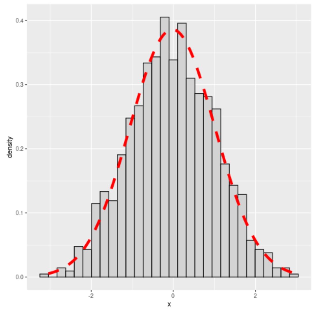
ကွက်လပ်ရှိ အနက်ရောင်မျဉ်းကွေးသည် ပုံမှန်မျဉ်းကွေးကို ကိုယ်စားပြုသည်။
အရောင်၊ အကျယ်နှင့် လိုင်းအမျိုးအစားတို့ကို အသီးသီးမွမ်းမံပြင်ဆင်ရန် col ၊ lwd နှင့် lty အငြင်းအခုံများကို လွတ်လပ်စွာ အသုံးပြုပါ။
 #overlay normal curve with custom aesthetics
ggplot(data, aes(x)) +
  geom_histogram(aes(y = ..density..), fill=' lightgray ', col=' black ') +
  stat_function(fun = dnorm, args = list(mean=mean(data$x), sd=sd(data$x)),
                col=' red ', lwd= 2 , lty=' dashed '))
မှတ်ချက် – stat_function အတွက် စာရွက်စာတမ်းအပြည့်အစုံကိုဤနေရာတွင် ရှာနိုင်သည်။
ထပ်လောင်းအရင်းအမြစ်များ
အောက်ဖော်ပြပါ သင်ခန်းစာများသည် R တွင် အခြားသော ဘုံလုပ်ဆောင်ချက်များကို မည်သို့လုပ်ဆောင်ရမည်ကို ရှင်းပြသည်-
R တွင် နှိုင်းရကြိမ်နှုန်း ဟီစတိုဂရမ် ဖန်တီးနည်း
R တွင် histogram breaks ကို သတ်မှတ်နည်း
စာရေးသူအကြောင်း
Benjamin Anderson
မင်္ဂလာပါ၊ ကျွန်ုပ်သည် အငြိမ်းစား စာရင်းအင်း ပါမောက္ခ ဘင်ဂျမင်ဖြစ်ပြီး သီးသန့် Statorials ဆရာအဖြစ် လှည့်ပတ်ပါသည်။ စာရင်းဇယားနယ်ပယ်တွင် ကျယ်ပြန့်သောအတွေ့အကြုံနှင့် ကျွမ်းကျင်မှုနှင့်အတူ၊ Statorials မှတစ်ဆင့် ကျောင်းသားများကို ခွန်အားဖြစ်စေရန်အတွက် ကျွန်ုပ်၏အသိပညာကို မျှဝေလိုပါသည်။ ပိုသိတယ်။