Sas- standard error bars ဖြင့် averages ကို ဘယ်လိုဆွဲမလဲ။
အုပ်စုအလိုက် စံအမှားဘားများဖြင့် ပျမ်းမျှတန်ဖိုးများကို ဖန်တီးရန် SAS တွင် အောက်ပါ syntax ကို သင်အသုံးပြုနိုင်သည်-
 /*calculate mean and standard error of points for each team*/
proc sql ;
create table groupPlot as
select
    team,
    mean(points) as meanPoints,
    mean(points) - stderr (points) as lowStdPoints,
    mean(points) + stderr (points) as highStdPoints
from my_data
group by team;
quit ;

/*create plot with mean and standard error bars of points for each team*/
proc sgplot data =groupPlot;
scatter x =team y =meanPoints /
    yerrorlower =lowStdPoints yerrorupper =highStdPoints group =team;
series x =team y =meanPoints / group =team;
run ;
ဤဥပမာသည် ဒေတာအစုံတွင် team variable ဖြင့် အုပ်စုဖွဲ့ထားသော အမှတ် မပြောင်းလဲနိုင်သော ပျမ်းမျှတန်ဖိုးကို တွက်ချက်ရန် ဤအထူးဥပမာသည် PROC SQL ကို အသုံးပြုသည်။
ထို့နောက် PROC SGPLOT ကို အသုံးပြုပြီး အဖွဲ့ ကွဲလွဲမှုဖြင့် အုပ်စုဖွဲ့ထားသော စံအမှားဘားများနှင့်အတူ အမှတ် များ၏ ပျမ်းမျှတန်ဖိုးကို ပြသသည့် ကွက်ကွက်တစ်ခုကို ဖန်တီးပါ။
အောက်ဖော်ပြပါ ဥပမာသည် ဤ syntax ကို လက်တွေ့တွင် မည်သို့အသုံးပြုရမည်ကို ပြသထားသည်။
ဥပမာ- SAS တွင် Standard Error Bars ဖြင့် Plotting Means
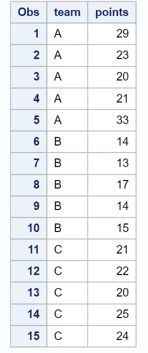
အသင်းအမျိုးမျိုးမှ ဘတ်စကက်ဘောကစားသမားများမှ ရမှတ်များအကြောင်း အချက်အလက်ပါရှိသော အောက်ပါဒေတာအတွဲကို ဆိုပါစို့။
 /*create dataset*/
data my_data;
    input team $points;
    datalines ;
At 29
At 23
At 20
At 21
At 33
B14
B 13
B17
B14
B15
C 21
C22
C 20
C25
C24
;
run ;

/*view dataset*/
proc print data =my_data;
အဖွဲ့ တစ်ခုစီအတွက် စံအမှားဘားများနှင့်အတူ ပျမ်းမျှ အမှတ် တန်ဖိုးကို ပြသသည့်ဇယားတစ်ခုကို ဖန်တီးလိုသည်ဆိုပါစို့။
ဒါကိုလုပ်ဖို့ အောက်ပါ syntax ကို သုံးနိုင်ပါတယ်။
 /*calculate mean and standard error of points for each team*/
proc sql ;
create table groupPlot as
select
    team,
    mean(points) as meanPoints,
    mean(points) - stderr (points) as lowStdPoints,
    mean(points) + stderr (points) as highStdPoints
from my_data
group by team;
quit ;

/*create plot with mean and standard error bars of points for each team*/
proc sgplot data =groupPlot;
scatter x =team y =meanPoints /
    yerrorlower =lowStdPoints yerrorupper =highStdPoints group =team;
series x =team y =meanPoints / group =team;
run ;
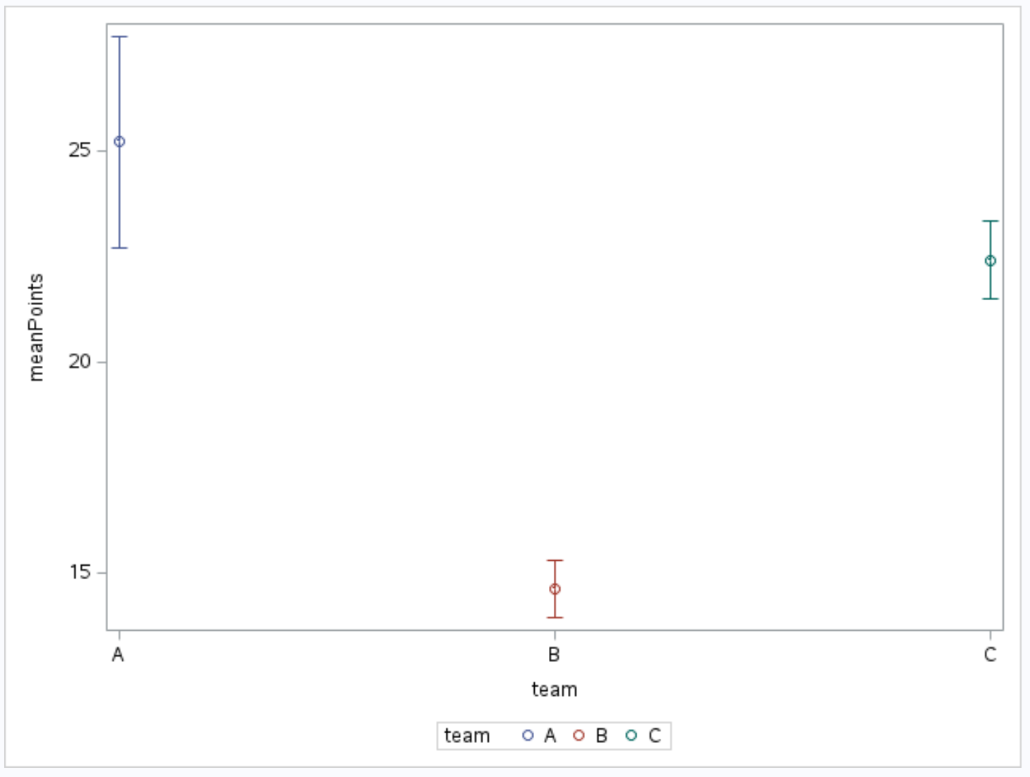
စက်ဝိုင်းငယ်များသည် အသင်း တစ်ခုစီအတွက် အမှတ်များ၏ ပျမ်းမျှတန်ဖိုးကို ပြသပြီး စက်ဝိုင်းများမှ တိုးချဲ့ထားသော ဘားများသည် အသင်း တစ်ခုစီအတွက် အမှတ် များ၏ စံအမှားကို ပြသသည်။
ပျမ်းမျှနှင့် စံအမှား၏ အမှန်တကယ်တန်ဖိုးများကို ကြည့်ရှုရန် PROC SQL ကို အသုံးပြု၍ ကျွန်ုပ်တို့ ဖန်တီးထားသော ဇယားကိုလည်း ပရင့်ထုတ်နိုင်သည်-
 /*print mean and standard error of points for each team*/
proc print data =groupPlot;
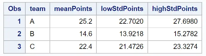
ဤဇယားရှိတန်ဖိုးများသည် အထက်ဖော်ပြပါဂရပ်တွင် ပြထားသည့်အရာများနှင့် ကိုက်ညီပါသည်။
ထပ်လောင်းအရင်းအမြစ်များ
အောက်ဖော်ပြပါ သင်ခန်းစာများသည် SAS တွင် အခြားဇယားများကို ဖန်တီးနည်းကို ရှင်းပြသည်-
SAS တွင် Line Plots ဖန်တီးနည်း
SAS တွင်အုပ်စုအလိုက် boxplots ဖန်တီးနည်း
SAS တွင် regression line ဖြင့် scatterplot တစ်ခုကို ဖန်တီးနည်း
စာရေးသူအကြောင်း
Benjamin Anderson
မင်္ဂလာပါ၊ ကျွန်ုပ်သည် အငြိမ်းစား စာရင်းအင်း ပါမောက္ခ ဘင်ဂျမင်ဖြစ်ပြီး သီးသန့် Statorials ဆရာအဖြစ် လှည့်ပတ်ပါသည်။ စာရင်းဇယားနယ်ပယ်တွင် ကျယ်ပြန့်သောအတွေ့အကြုံနှင့် ကျွမ်းကျင်မှုနှင့်အတူ၊ Statorials မှတစ်ဆင့် ကျောင်းသားများကို ခွန်အားဖြစ်စေရန်အတွက် ကျွန်ုပ်၏အသိပညာကို မျှဝေလိုပါသည်။ ပိုသိတယ်။