Python တွင် bell curve ဖန်တီးနည်း
“ ခေါင်းလောင်းမျဉ်းကွေး” သည် ကွဲပြားသော “ ခေါင်းလောင်း” ပုံသဏ္ဍာန်ရှိသည့် သာမန်ဖြန့်ဝေမှု ပုံစံအတွက် ပေးထားသည့် အမည်ပြောင်ဖြစ်သည် –
ဤသင်ခန်းစာတွင် Python တွင် ခေါင်းလောင်းမျဉ်းကွေးကို ဖန်တီးနည်းကို ရှင်းပြထားသည်။
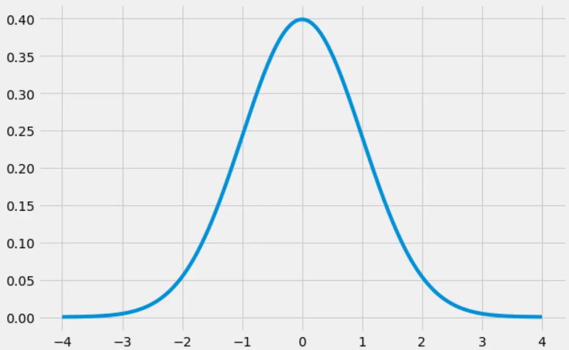
Python တွင် Bell Curve ဖန်တီးနည်း
အောက်ပါကုဒ်သည် numpy ၊ scipy နှင့် matplotlib စာကြည့်တိုက်များကို အသုံးပြု၍ ခေါင်းလောင်းမျဉ်းကွေးကို ဖန်တီးနည်းကို ပြသသည်-
 import numpy as np
import matplotlib.pyplot as plt
from scipy.stats import norm

#create range of x-values from -4 to 4 in increments of .001
x = np.arange(-4, 4, 0.001)

#create range of y-values that correspond to normal pdf with mean=0 and sd=1
y = norm.pdf(x,0,1)

#defineplot
fig, ax = plt.subplots(figsize=(9,6))
ax.plot(x,y)

#choose plot style and display the bell curve
plt.style.use('fivethirtyeight')
plt.show()
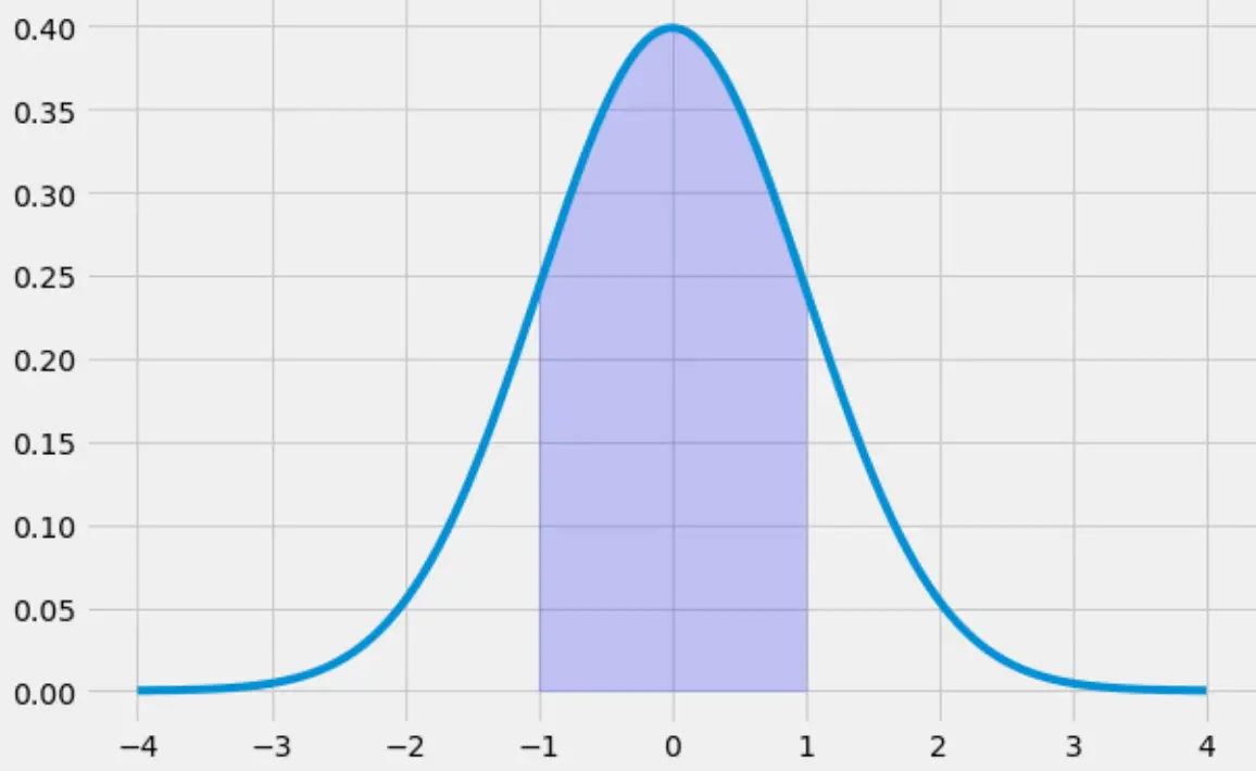
Python တွင် Bell Curve ဖြည့်နည်း
အောက်ပါကုဒ်သည် -1 မှ 1 သို့သွားသော ခေါင်းလောင်းမျဉ်းကွေးအောက်ရှိ ဧရိယာအား ဖြည့်နည်းကို ဖော်ပြသည်-
 x = np.arange(-4, 4, 0.001)
y = norm.pdf(x,0,1)

fig, ax = plt.subplots(figsize=(9,6))
ax.plot(x,y)

#specify the region of the bell curve to fill in
x_fill = np.arange(-1, 1, 0.001)
y_fill = norm.pdf(x_fill,0,1)
ax.fill_between(x_fill,y_fill,0, alpha=0.2, color='blue')

plt.style.use('fivethirtyeight')
plt.show()
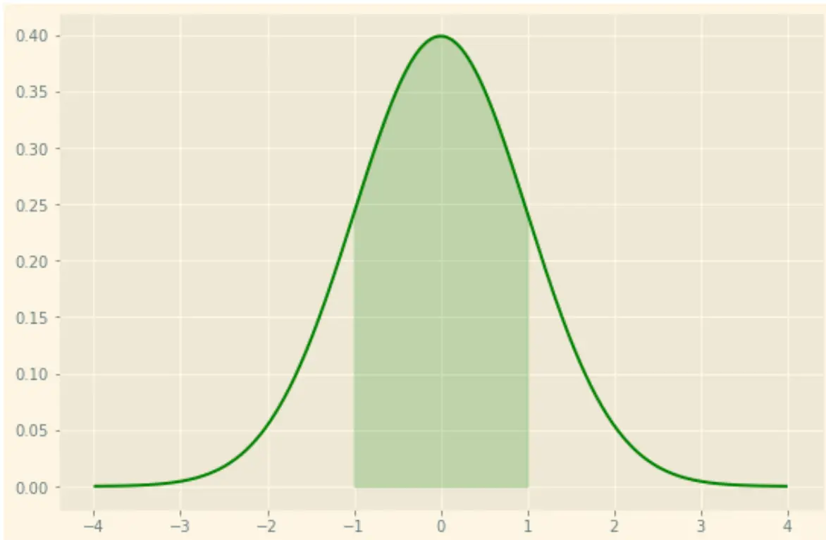
matplotlib ၏ စတိုင်လ်ရွေးချယ်စရာများစွာကို အသုံးပြု၍ သင်အလိုရှိသော ဇာတ်ကွက်ကိုလည်း ပုံစံချနိုင်သည်ကို သတိပြုပါ။ ဥပမာအားဖြင့်၊ သင်သည် အစိမ်းရောင်မျဉ်းနှင့် အစိမ်းရောင်အရိပ်များပါရှိသော “ နေရောင်” အပြင်အဆင်ကို အသုံးပြုနိုင်သည်။
 x = np.arange(-4, 4, 0.001)
y = norm.pdf(x,0,1)

fig, ax = plt.subplots(figsize=(9,6))
ax.plot(x,y, color=' green ')

#specify the region of the bell curve to fill in
x_fill = np.arange(-1, 1, 0.001)
y_fill = norm.pdf(x_fill,0,1)
ax.fill_between(x_fill,y_fill,0, alpha=0.2, color=' green ')

plt.style.use(' Solarize_Light2 ')
plt.show()
matplotlib အတွက် စတိုင်စာရွက် အကိုးအကား အပြည့်အစုံကို ဤနေရာတွင် ရှာတွေ့နိုင်ပါသည်။
ထပ်လောင်းအရင်းအမြစ်များ
စာရေးသူအကြောင်း
Benjamin Anderson
မင်္ဂလာပါ၊ ကျွန်ုပ်သည် အငြိမ်းစား စာရင်းအင်း ပါမောက္ခ ဘင်ဂျမင်ဖြစ်ပြီး သီးသန့် Statorials ဆရာအဖြစ် လှည့်ပတ်ပါသည်။ စာရင်းဇယားနယ်ပယ်တွင် ကျယ်ပြန့်သောအတွေ့အကြုံနှင့် ကျွမ်းကျင်မှုနှင့်အတူ၊ Statorials မှတစ်ဆင့် ကျောင်းသားများကို ခွန်အားဖြစ်စေရန်အတွက် ကျွန်ုပ်၏အသိပညာကို မျှဝေလိုပါသည်။ ပိုသိတယ်။