Ggplot2 တွင် histogram တွင် ရာခိုင်နှုန်းများကို မည်သို့ပြသမည်နည်း။
ggplot2 ရှိ histogram ၏ y ဝင်ရိုးပေါ်ရှိ ရာခိုင်နှုန်းများကိုပြသရန် အောက်ပါအခြေခံအထားအသိုကိုသုံးနိုင်သည်။
 library (ggplot2)
library (scales)

#create histogram with percentages
ggplot(data, aes (x = factor (team))) +
  geom_bar( aes (y = (..count..)/ sum (..count..))) +
  scale_y_continuous(labels=percent)
အောက်ပါဥပမာများသည် ဤ syntax ကိုလက်တွေ့တွင်မည်သို့အသုံးပြုရမည်ကိုပြသထားသည်။
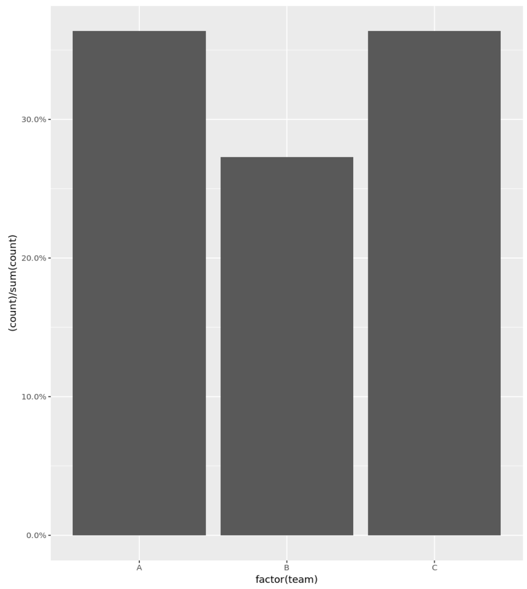
ဥပမာ 1- ရာခိုင်နှုန်းများဖြင့် အခြေခံ ဟီစတိုဂရမ်
အောက်ပါကုဒ်သည် Y ဝင်ရိုးပေါ်တွင် ပြသထားသော ရာခိုင်နှုန်းများဖြင့် အမျိုးအစားအလိုက် ကိန်းရှင်များအတွက် ဟီစတိုဂရမ်ကို ဖန်တီးနည်းကို ပြသသည်-
 library (ggplot2)
library (scales)

#define data frame
data <- data. frame (team = c('A', 'A', 'A', 'A', 'B', 'B', 'B', 'C', 'C', 'C', 'C') ,
                   points = c(77, 79, 93, 85, 89, 99, 90, 80, 68, 91, 92))

#create histogram with percentages
ggplot(data, aes (x = factor (team))) +
  geom_bar( aes (y = (..count..)/ sum (..count..))) +
  scale_y_continuous(labels=percent)
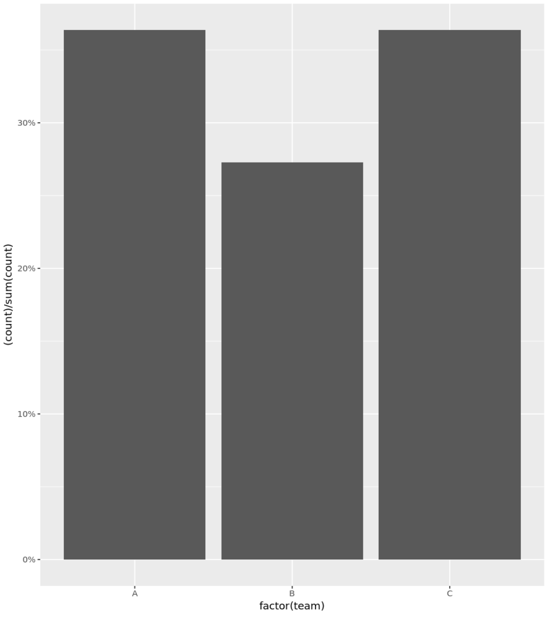
ဥပမာ 2- ရာခိုင်နှုန်းများပါသော ဟီစတိုဂရမ် (ဒဿမများကို ဖယ်ရှားပါ)
y-ဝင်ရိုးပေါ်ရှိ ရာခိုင်နှုန်းများအဖြစ် ကိန်းပြည့်များကိုသာပြသရန် တိကျသော အငြင်းအခုံကို သင်အသုံးပြုနိုင်သည်။
 library (ggplot2)
library (scales)

#define data frame
data <- data. frame (team = c('A', 'A', 'A', 'A', 'B', 'B', 'B', 'C', 'C', 'C', 'C') ,
                   points = c(77, 79, 93, 85, 89, 99, 90, 80, 68, 91, 92))

#create histogram with percentages
ggplot(data, aes (x = factor (team))) +
  geom_bar( aes (y = (..count..)/ sum (..count..))) +
  scale_y_continuous(labels = scales :: percent_format(accuracy = 1L ))
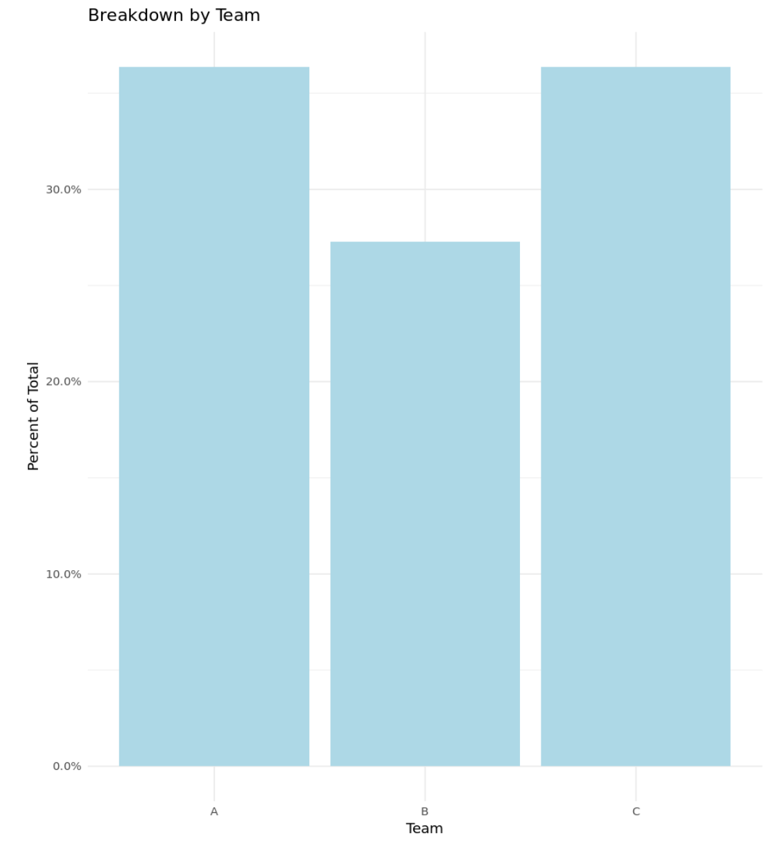
ဥပမာ 3- ရာခိုင်နှုန်းများဖြင့် စိတ်ကြိုက်ဟီစတိုဂရမ်
အောက်ပါကုဒ်သည် Y ဝင်ရိုးပေါ်တွင် ရာခိုင်နှုန်းများနှင့် စိတ်ကြိုက်ခေါင်းစဉ်၊ ဝင်ရိုးအညွှန်းများနှင့် အရောင်များပြသထားသည့် ဟီစတိုဂရမ်ကို ဖန်တီးနည်းကို ပြသသည်-
 library (ggplot2)
library (scales)

#define data frame
data <- data. frame (team = c('A', 'A', 'A', 'A', 'B', 'B', 'B', 'C', 'C', 'C', 'C') ,
                   points = c(77, 79, 93, 85, 89, 99, 90, 80, 68, 91, 92))

#create histogram with percentages and custom aesthetics
ggplot(data, aes (x = factor (team))) +
  geom_bar( aes (y = (..count..)/ sum (..count..)), fill = ' lightblue ') +
  scale_y_continuous(labels=percent) +
  labs(title = ' Breakdown by Team ', x = ' Team ', y = ' Percent of Total ') +
  theme_minimal()
ဆက်စပ်- အကောင်းဆုံး ggplot2 Themes အတွက် ပြီးပြည့်စုံသော လမ်းညွှန်
ထပ်လောင်းအရင်းအမြစ်များ
အောက်ဖော်ပြပါ သင်ခန်းစာများသည် R တွင် histogram ဖြင့် အခြားသော ဘုံလုပ်ဆောင်ချက်များကို မည်သို့လုပ်ဆောင်ရမည်ကို ရှင်းပြထားသည်။
R ဖြင့် histogram တွင် bins အရေအတွက်ကို မည်သို့ပြောင်းရမည်နည်း။
R တွင် များစွာသော ဟီစတိုဂရမ်များကို မည်သို့ဆွဲမည်နည်း။
R တွင် နှိုင်းရကြိမ်နှုန်း ဟီစတိုဂရမ် ဖန်တီးနည်း
စာရေးသူအကြောင်း
Benjamin Anderson
မင်္ဂလာပါ၊ ကျွန်ုပ်သည် အငြိမ်းစား စာရင်းအင်း ပါမောက္ခ ဘင်ဂျမင်ဖြစ်ပြီး သီးသန့် Statorials ဆရာအဖြစ် လှည့်ပတ်ပါသည်။ စာရင်းဇယားနယ်ပယ်တွင် ကျယ်ပြန့်သောအတွေ့အကြုံနှင့် ကျွမ်းကျင်မှုနှင့်အတူ၊ Statorials မှတစ်ဆင့် ကျောင်းသားများကို ခွန်အားဖြစ်စေရန်အတွက် ကျွန်ုပ်၏အသိပညာကို မျှဝေလိုပါသည်။ ပိုသိတယ်။