Ggplot2 တွင် ဇယားကွက်များ ထည့်သွင်းနည်း (ဥပမာ 2 ခု)
စာဖတ်သူများသည် ကွက်လပ်နှင့်အတူ အချက်အလက်ကြမ်းများကို မြင်ယောင်နိုင်စေရန် R တွင် ggplot2 တွင် ဖန်တီးထားသော ကွက်များသို့ ဇယားများကို မကြာခဏ ပေါင်းထည့်လိုပေမည်။
ကံကောင်းထောက်မစွာ၊ ggmisc ပက်ကေ့ဂျ်ကို အသုံးပြု၍ ဇယားများကို ကွက်ကွက်များထည့်ရန် လွယ်ကူသည်-
 install. packages (' ggpmisc ')
library (ggpmisc)
အောက်ပါနမူနာများသည် အောက်ပါဒေတာဘောင်ကို အသုံးပြု၍ barplot နှင့် scatterplot တွင်ဇယားတစ်ခုထည့်ရန် ဤပက်ကေ့ဂျ်ကိုအသုံးပြုပုံကိုပြသသည်-
 #create data frame
df <- data. frame (team=c('A', 'A', 'A', 'A', 'B', 'B', 'B', 'B'),
                 position=c('G', 'G', 'F', 'F', 'G', 'G', 'F', 'F'),
                 points=c(13, 23, 24, 20, 19, 14, 29, 31))

#view data frame
df

  team position points
1 AG 13
2 AG 23
3 AF 24
4 AF 20
5 BG 19
6 BG 14
7 BF 29
8 BF 31
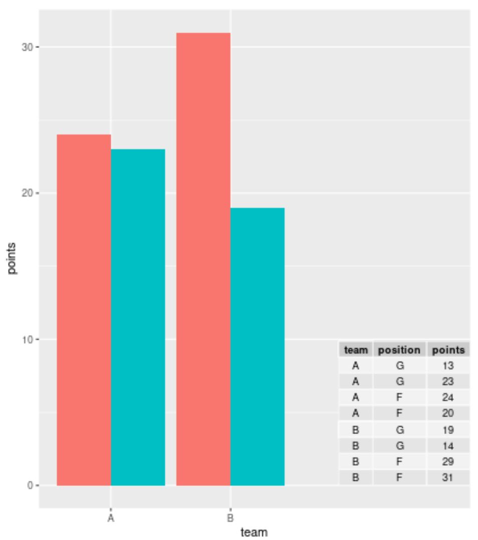
ဥပမာ 1- ggplot2 တွင် Barplot တွင် ဇယားတစ်ခုထည့်ပါ။
ggplot2 တွင် အုပ်စုဖွဲ့ထားသော barplot ကိုဖန်တီးရန် အောက်ပါကုဒ်ကို အသုံးပြု၍ ဒေတာဘောင်၏ အမှန်တကယ်တန်ဖိုးများကိုပြသရန် ကွက်ကွက်၏ညာဘက်အောက်ထောင့်ရှိ ဇယားတစ်ခုကို ပေါင်းထည့်နိုင်သည်-
 library (ggplo2)
library (ggpmisc)

#create barplot with table
ggplot(df, aes(x=team, y=points, fill=position)) +
    geom_bar(position=' dodge ', stat=' identity ') +
    annotate(geom = ' table ',
           x=4,
           y=0,
           label=list(df))
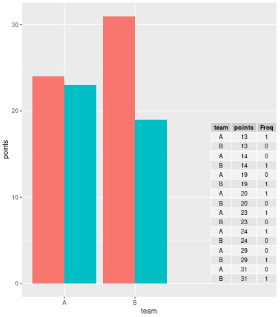
အကယ်၍ သင်သည် ကြီးမားသောဒေတာအတွဲတစ်ခုဖြင့် အလုပ်လုပ်နေပြီး အတန်းတစ်ခုစီကို မပြသလိုပါက၊ ggplot2 တွင် ဇယားကိုမဖန်တီးမီ ဒေတာကို အကျဉ်းချုပ်ရန် table() လုပ်ဆောင်ချက်ကို အသုံးပြုနိုင်သည်။
 library (ggplot2)
library (ggpmisc)

#summarize frequencies of team and points in table
my_table <- as. data . frame (table(df[, c(1, 3)]))

#create barplot with table
ggplot(df, aes(x=team, y=points, fill=position)) +
    geom_bar(position=' dodge ', stat=' identity ') +
    annotate(geom = ' table ',
           x=4,
           y=0,
           label=list(my_table))
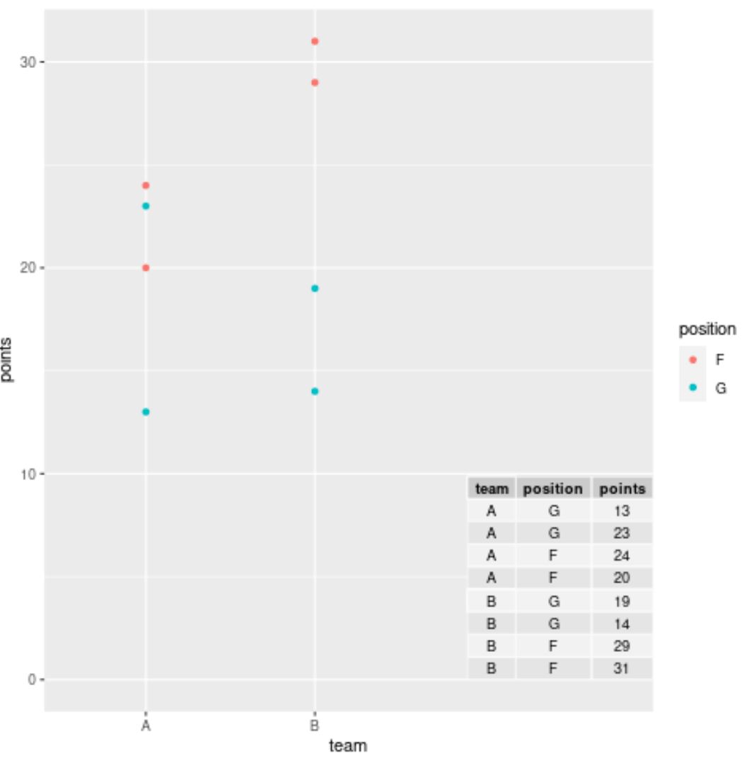
ဥပမာ 2- ggplot2 ရှိ scatterplot တွင် ဇယားတစ်ခုထည့်ပါ။
ggplot2 တွင် scatterplot တစ်ခုဖန်တီးရန် အောက်ဖော်ပြပါကုဒ်ကို ကျွန်ုပ်တို့အသုံးပြုနိုင်ပြီး data frame မှ အမှန်တကယ်တန်ဖိုးများကိုပြသရန် plot ၏အောက်ညာဘက်ထောင့်ရှိ ဇယားတစ်ခုကို ပေါင်းထည့်နိုင်သည်-
 library (ggplo2)
library (ggpmisc)

#create scatterplot with table
ggplot(df, aes(x=team, y=points)) +
    geom_point(aes(color=position)) +
    annotate(geom=' table ',
           x=4,
           y=0,
           label=list(df))
မှတ်ချက် – သင်အလိုရှိသော နေရာအတိအကျတွင် array ကို နေရာချရန် annotate() လုပ်ဆောင်ချက်ရှိ x နှင့် y တန်ဖိုးများကို လွတ်လပ်စွာ ကစားပါ။
ထပ်လောင်းအရင်းအမြစ်များ
အောက်ဖော်ပြပါ သင်ခန်းစာများသည် ggplot2 တွင် အခြားဘုံအလုပ်များကို မည်သို့လုပ်ဆောင်ရမည်ကို ရှင်းပြသည်-
ggplot2 ကွက်များသို့ စာသားထည့်နည်း
ggplot2 တွင် ခေါင်းစဉ်အနေအထားကို မည်သို့ပြောင်းရမည်နည်း။
ggplot2 ဒဏ္ဍာရီတွင် ပစ္စည်းများ အစီအစဥ်ပြောင်းနည်း
စာရေးသူအကြောင်း
Benjamin Anderson
မင်္ဂလာပါ၊ ကျွန်ုပ်သည် အငြိမ်းစား စာရင်းအင်း ပါမောက္ခ ဘင်ဂျမင်ဖြစ်ပြီး သီးသန့် Statorials ဆရာအဖြစ် လှည့်ပတ်ပါသည်။ စာရင်းဇယားနယ်ပယ်တွင် ကျယ်ပြန့်သောအတွေ့အကြုံနှင့် ကျွမ်းကျင်မှုနှင့်အတူ၊ Statorials မှတစ်ဆင့် ကျောင်းသားများကို ခွန်အားဖြစ်စေရန်အတွက် ကျွန်ုပ်၏အသိပညာကို မျှဝေလိုပါသည်။ ပိုသိတယ်။