Ggplot2 တွင် manual legend ဖန်တီးနည်း (ဥပမာများနှင့်အတူ)
စိတ်ကြိုက်အရောင်များ၊ အညွှန်းများ၊ ခေါင်းစဉ်များ၊ စသည်ဖြင့် ggplot2 ရှိ ကွက်ကွက်တစ်ခုသို့ သင်ကိုယ်တိုင် ဒဏ္ဍာရီကို မကြာခဏ ထည့်လိုပေမည်။
ကံကောင်းထောက်မစွာ၊ ၎င်းသည် scale_color_manual() လုပ်ဆောင်ချက်ကို အသုံးပြု၍ ပြုလုပ်ရန် ရိုးရှင်းပြီး ၎င်းကို ပြုလုပ်နည်းကို အောက်ပါ ဥပမာတွင် ပြသထားသည်။
ဥပမာ- ggplot2 တွင် manual legend ဖန်တီးခြင်း။
အောက်ပါကုဒ်သည် ggplot2 ရှိ ကွက်ကွက်တစ်ခုတွင် တပ်ဆင်ထားသော ဆုတ်ယုတ်မှုမျဥ်းသုံးကြောင်းကို စိတ်ကြိုက်လက်စွဲအသုံးအနှုန်းဖြင့် ပုံဖော်နည်းကို ပြသသည်-
 library (ggplot2)

#create data frame
df <- data. frame (x=c(1, 2, 2, 3, 5, 6, 8, 8, 9, 9, 10, 11, 12, 15, 15),
                 y=c(2, 3, 3, 4, 5, 5, 6, 7, 8, 8, 9, 10, 16, 19, 28))

#create plot with three fitted regression models
ggplot(df, aes(x, y)) +
  geom_point() +
  geom_smooth(se= FALSE , aes(color=' Linear ')) +
  geom_smooth(formula=y~poly(x, 2), se= FALSE , aes(color=' Quadratic ')) +
  geom_smooth(formula=y~poly(x, 3), se= FALSE , aes(color=' Cubic ')) +
  scale_color_manual(name=' Regression Model ',
                     breaks=c(' Linear ', ' Quadratic ', ' Cubic '),
                     values=c(' Cubic '=' pink ', ' Quadratic '=' blue ', ' Linear '=' purple '))
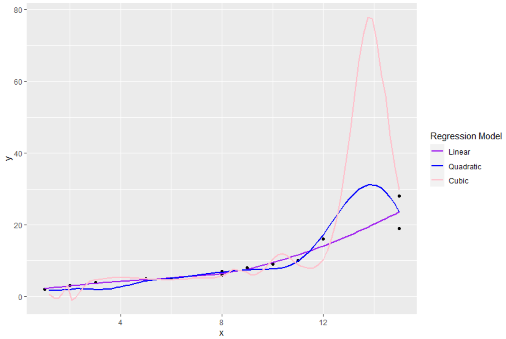
scale_color_manual() လုပ်ဆောင်ချက်ကို အသုံးပြုခြင်းဖြင့်၊ ကျွန်ုပ်တို့သည် ဒဏ္ဍာရီ၏ အောက်ပါရှုထောင့်များကို သတ်မှတ်နိုင်သည်-
- နာမည် : ဒဏ္ဍာရီ ခေါင်းစဉ်
- breaks : ဒဏ္ဍာရီထဲက အညွှန်းများ
- တန်ဖိုးများ – ဒဏ္ဍာရီထဲက အရောင်တွေ
ဒဏ္ဍာရီဒြပ်စင်များ၏ ဖောင့်အရွယ်အစားကို ပြောင်းလဲရန် theme() လုပ်ဆောင်ချက်ကိုလည်း အသုံးပြုနိုင်ကြောင်း သတိပြုပါ။
 library (ggplot2)

#create data frame
df <- data. frame (x=c(1, 2, 2, 3, 5, 6, 8, 8, 9, 9, 10, 11, 12, 15, 15),
                 y=c(2, 3, 3, 4, 5, 5, 6, 7, 8, 8, 9, 10, 16, 19, 28))

#create plot with three fitted regression models
ggplot(df, aes(x, y)) +
  geom_point() +
  geom_smooth(se= FALSE , aes(color=' Linear ')) +
  geom_smooth(formula=y~poly(x, 2), se= FALSE , aes(color=' Quadratic ')) +
  geom_smooth(formula=y~poly(x, 3), se= FALSE , aes(color=' Cubic ')) +
  scale_color_manual(name=' Regression Model ',
                     breaks=c(' Linear ', ' Quadratic ', ' Cubic '),
                     values=c(' Cubic '=' pink ', ' Quadratic '=' blue ', ' Linear '=' purple '))+
 theme(legend. title =element_text(size= 20 ),
       legend. text =element_text(size= 14 ))
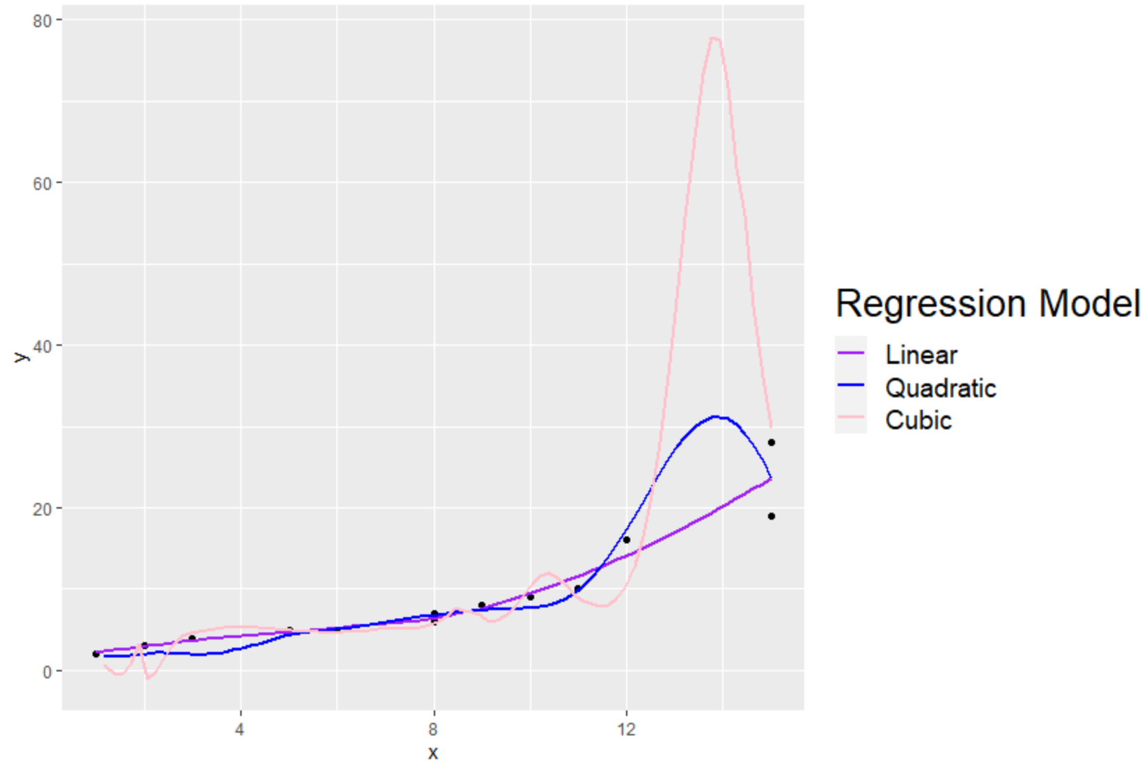
ခေါင်းစဉ်နှင့် စာတန်းအညွှန်းများ၏ ဖောင့်အရွယ်အစားကို တိုးမြှင့်ထားကြောင်း သတိပြုပါ။
ထပ်လောင်းအရင်းအမြစ်များ
အောက်ဖော်ပြပါ သင်ခန်းစာများသည် ggplot2 တွင် အခြားသော ဘုံလုပ်ဆောင်ချက်များကို မည်သို့လုပ်ဆောင်ရမည်ကို ရှင်းပြသည်-
ggplot2 တွင် ဒဏ္ဍာရီ အနေအထားကို ဘယ်လိုပြောင်းမလဲ။
ggplot2 တွင် ဒဏ္ဍာရီအရွယ်အစားကို မည်သို့ပြောင်းလဲမည်နည်း။
ggplot2 တွင်ဒဏ္ဍာရီခေါင်းစဉ်ကိုဘယ်လိုပြောင်းမလဲ။
ggplot2 တွင် ဒဏ္ဍာရီအညွှန်းများကို မည်သို့ပြောင်းရမည်နည်း။
စာရေးသူအကြောင်း
Benjamin Anderson
မင်္ဂလာပါ၊ ကျွန်ုပ်သည် အငြိမ်းစား စာရင်းအင်း ပါမောက္ခ ဘင်ဂျမင်ဖြစ်ပြီး သီးသန့် Statorials ဆရာအဖြစ် လှည့်ပတ်ပါသည်။ စာရင်းဇယားနယ်ပယ်တွင် ကျယ်ပြန့်သောအတွေ့အကြုံနှင့် ကျွမ်းကျင်မှုနှင့်အတူ၊ Statorials မှတစ်ဆင့် ကျောင်းသားများကို ခွန်အားဖြစ်စေရန်အတွက် ကျွန်ုပ်၏အသိပညာကို မျှဝေလိုပါသည်။ ပိုသိတယ်။