Ggplot2 တွင် pie charts ဖန်တီးနည်း (ဥပမာများနှင့်အတူ)
အဝိုင်းပုံဇယား သည် စက်ဝိုင်းပုံသဏ္ဍာန်ပုံစံဇယား အမျိုးအစားဖြစ်ပြီး တစ်ခုလုံး၏အချိုးအစားများကိုကိုယ်စားပြုရန် အချပ်များကို အသုံးပြုသည်။
ဤကျူတိုရီရယ်တွင် ggplot2 data visualization library ကို အသုံးပြု၍ R တွင် pie charts များ ဖန်တီးခြင်းနှင့် တည်းဖြတ်နည်းကို ရှင်းပြထားသည်။
အခြေခံ Pie Chart ဖန်တီးနည်း
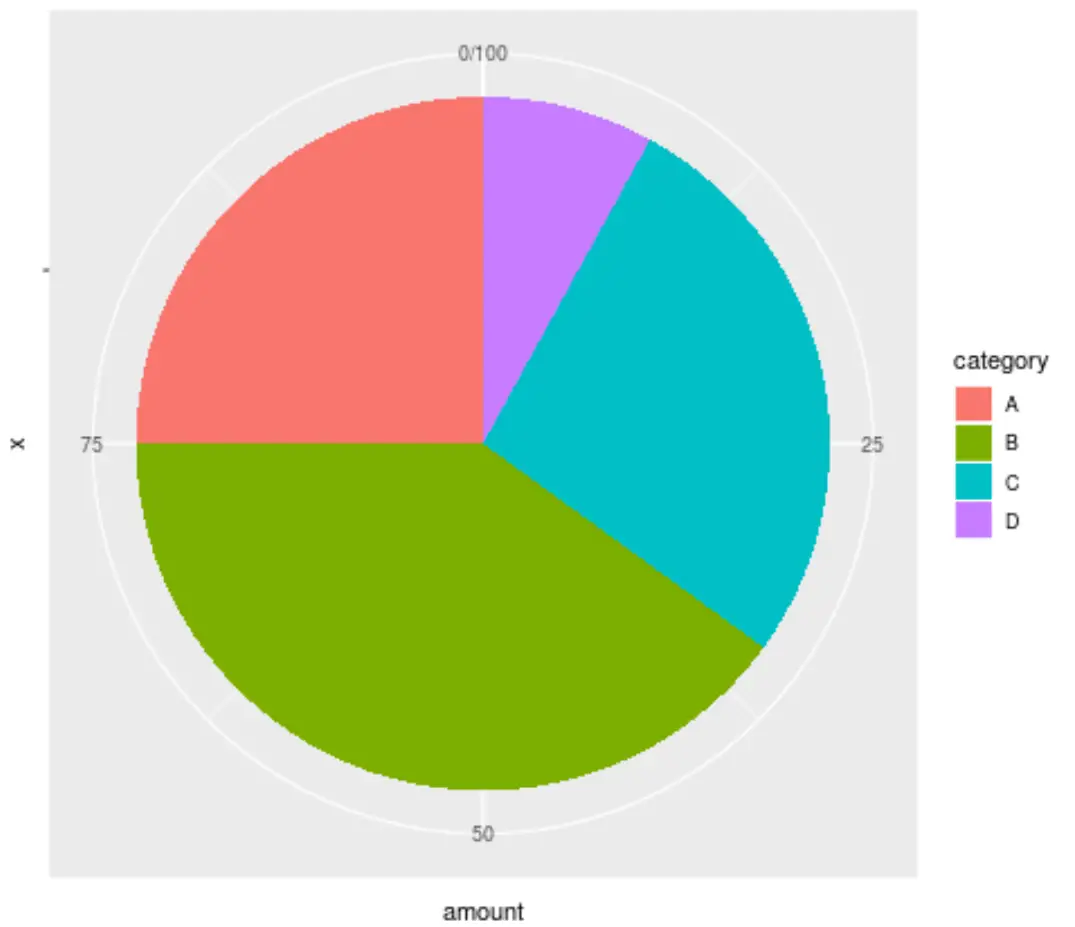
အောက်ပါကုဒ်သည် ggplot2 ကို အသုံးပြု၍ ဒေတာအတွဲတစ်ခုအတွက် အခြေခံအဝိုင်းပုံဇယားကို ဖန်တီးနည်းကို ပြသသည်-
 library (ggplot2)

#create data frame
data <- data.frame(" category " = c('A', 'B', 'C', 'D'),
                   " amount " = c(25, 40, 27, 8))

#create pie chart
ggplot(data, aes (x="", y=amount, fill=category)) +
  geom_bar(stat=" identity ", width= 1 ) +
  coord_polar(" y ", start= 0 )
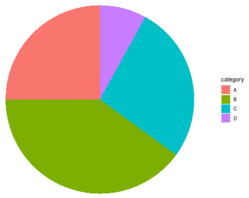
အဝိုင်းပုံဇယား၏အသွင်အပြင်ကို မည်သို့ပြောင်းလဲမည်နည်း။
ggplot2 ရှိ default pie chart သည် အလွန်ရုပ်ဆိုးသည်။ အသွင်အပြင်ကို မြှင့်တင်ရန် အလွယ်ဆုံးနည်းလမ်းမှာ နောက်ခံ၊ ဇယားကွက်နှင့် အညွှန်းများကို ဖယ်ရှားပေးသည့် theme_void() ကို အသုံးပြုရန်ဖြစ်သည်။
 ggplot(data, aes (x="", y=amount, fill=category)) +
  geom_bar(stat=" identity ", width= 1 ) +
  coord_polar(" y ", start= 0 ) +
  theme_void()
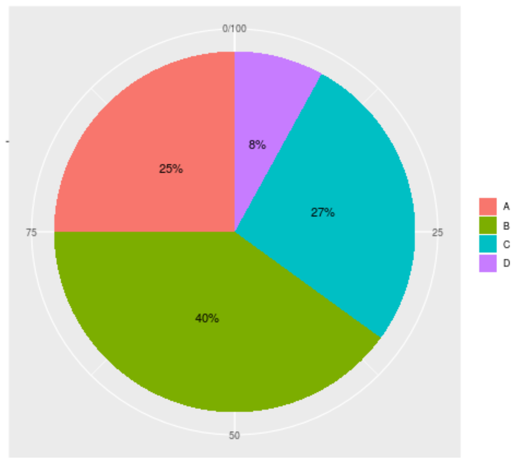
အချပ်များအတွင်း အညွှန်းများထည့်ခြင်းဖြင့် ဇယား၏အသွင်အပြင်ကို ပိုမိုတိုးတက်ကောင်းမွန်အောင် လုပ်ဆောင်နိုင်သည်-
 ggplot(data, aes (x="", y=amount, fill=category)) +
  geom_bar(stat=" identity ", width= 1 ) +
  coord_polar(" y ", start= 0 ) +
  geom_text( aes (label = paste0(amount, " % ")), position = position_stack(vjust= 0.5 )) +
  labs(x = NULL, y = NULL, fill = NULL)
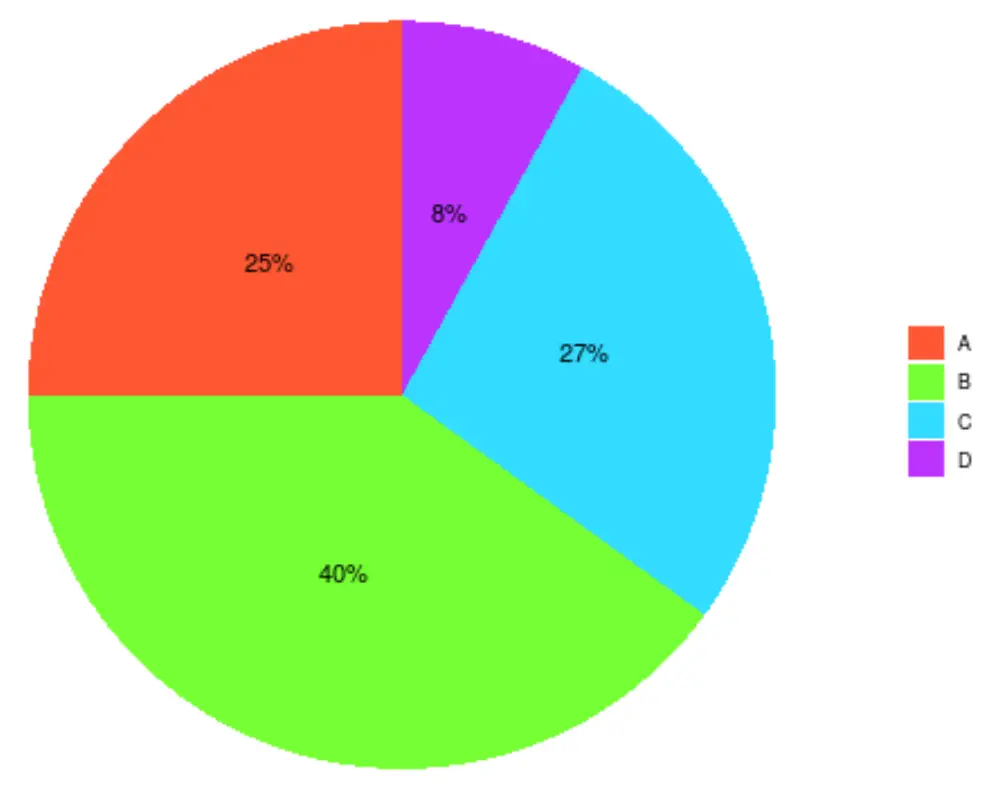
Scale_fill_manual() အကြောင်းပြချက်ဖြင့် အချပ်များအတွက် အသုံးပြုရန် ကျွန်ုပ်တို့၏ကိုယ်ပိုင် ဆယ်ဂဏန်းဂဏန်းအရောင်များကို သတ်မှတ်ခြင်းဖြင့် ဇယားကို စိတ်ကြိုက်ပြင်ဆင်နိုင်သည်-
 ggplot(data, aes (x="", y=amount, fill=category)) +
  geom_bar(stat=" identity ", width= 1 ) +
  coord_polar(" y ", start= 0 ) +
  geom_text( aes (label = paste0(amount, " % ")), position = position_stack(vjust= 0.5 )) +
  labs(x = NULL, y = NULL, fill = NULL) +
  theme_classic() +
  theme(axis.line = element_blank(),
          axis.text = element_blank(),
          axis.ticks = element_blank()) +
  scale_fill_manual(values=c(" #FF5733 ", " #75FF33 ", " #33DBFF ", " #BD33FF "))
အကြံပြုချက်- အတူတကွကောင်းမွန်သော hex အရောင်ကုဒ်များ ပေါင်းစပ်မှုများကို ရှာဖွေရန် ဤ hex အရောင်ရွေးချယ်မှုကို အသုံးပြုပါ။
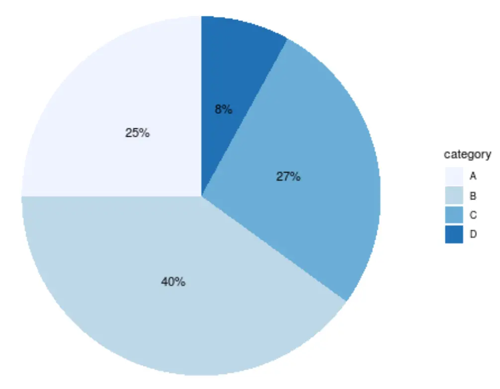
ဘီယာထုတ်လုပ်သူ၏ အရောင်စကေး များထဲမှ တစ်ခုကို ရွေးချယ်ရုံဖြင့် အချပ်အရောင်များကို စိတ်ကြိုက်ပြင်ဆင်နိုင်သည်။ ဥပမာအားဖြင့်၊ ဤသည်မှာ “ အပြာရောင်” အရောင်စကေးနှင့်တူသည်-
 ggplot(data, aes (x="", y=amount, fill=category)) +
  geom_bar(stat=" identity ", width= 1 ) +
  coord_polar(" y ", start= 0 ) +
  geom_text( aes (label = paste0(amount, " % ")), position = position_stack(vjust= 0.5 )) +
  labs(x = NULL, y = NULL) +
  theme_classic() +
  theme(axis.line = element_blank(),
          axis.text = element_blank(),
          axis.ticks = element_blank()) +
  scale_fill_brewer(palette=" Blues ")
ထပ်လောင်းအရင်းအမြစ်များ
ggplot2 ကို အသုံးပြု၍ R တွင် အုပ်စုဖွဲ့ထားသော boxplot တစ်ခုကို ဖန်တီးနည်း
ggplot2 ကို အသုံးပြု၍ R တွင် အပူမြေပုံဖန်တီးနည်း
ggplot2 ကိုအသုံးပြု၍ R တွင် Gantt Chart ကိုဖန်တီးနည်း
စာရေးသူအကြောင်း
Benjamin Anderson
မင်္ဂလာပါ၊ ကျွန်ုပ်သည် အငြိမ်းစား စာရင်းအင်း ပါမောက္ခ ဘင်ဂျမင်ဖြစ်ပြီး သီးသန့် Statorials ဆရာအဖြစ် လှည့်ပတ်ပါသည်။ စာရင်းဇယားနယ်ပယ်တွင် ကျယ်ပြန့်သောအတွေ့အကြုံနှင့် ကျွမ်းကျင်မှုနှင့်အတူ၊ Statorials မှတစ်ဆင့် ကျောင်းသားများကို ခွန်အားဖြစ်စေရန်အတွက် ကျွန်ုပ်၏အသိပညာကို မျှဝေလိုပါသည်။ ပိုသိတယ်။