R တွင် kernel density plots ဖန်တီးနည်း (ဥပမာများဖြင့်)
kernel density plot သည် စဉ်ဆက်မပြတ် မျဉ်းကွေးကို အသုံးပြု၍ ဒေတာအတွဲတစ်ခုတွင် တန်ဖိုးများ ဖြန့်ဝေမှုကို ပြသသည့် ကွက်ကွက်အမျိုးအစားတစ်ခုဖြစ်သည်။
kernel density plot သည် histogram နှင့် ဆင်တူသည်၊ သို့သော် histogram တွင်အသုံးပြုထားသော bins အရေအတွက်ကြောင့် မထိခိုက်သောကြောင့် ဖြန့်ဖြူးမှုပုံစံကိုပြသရာတွင် ပိုကောင်းပါသည်။
R တွင် kernel density plot ကိုဖန်တီးရန် အောက်ပါနည်းလမ်းများကို အသုံးပြုနိုင်ပါသည်။
နည်းလမ်း 1- one-kernel သိပ်သည်းဆကြံစည်မှု ဖန်တီးပါ။
 #define kernel density
kd <- density(data)

#create kernel density plot
plot(kd)
နည်းလမ်း 2- ဖြည့်ထားသော Kernel Density Plot တစ်ခုကို ဖန်တီးပါ။
 #define kernel density
kd <- density(data)

#create kernel density plot
plot(kd)

#fill in kernel density plot with specific color
polygon(kd, col=' blue ', border=' black ')
နည်းလမ်း 3- များစွာသော Kernel Density ကွက်များကို ဖန်တီးပါ။
 #plot first kernel density plot
kd1 <- density(data1)
plot(kd1, col=' blue ')

#plot second kernel density plot
kd2 <- density(data2)
lines(kd2, col=' red ')

#plot third kernel density plot
kd3 <- density(data3)
lines(kd3, col=' purple ')

...
အောက်ဖော်ပြပါ ဥပမာများသည် နည်းလမ်းတစ်ခုစီကို လက်တွေ့အသုံးချနည်းကို ပြသထားသည်။
နည်းလမ်း 1- one-kernel သိပ်သည်းဆကြံစည်မှု ဖန်တီးပါ။
အောက်ပါကုဒ်သည် R တွင် ဒေတာသတ်မှတ်မှုအတွက် kernel သိပ်သည်းဆကွက်ကွက်ဖန်တီးနည်းကို ပြသသည်-
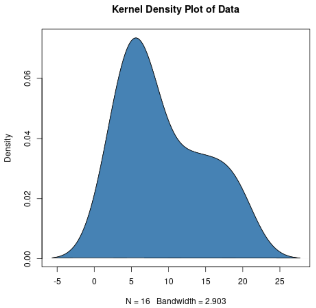
 #create data
data <- c(3, 3, 4, 4, 5, 6, 7, 7, 7, 8, 12, 13, 14, 17, 19, 19)

#define kernel density
kd <- density(data)

#create kernel density plot
plot(kd, main=' Kernel Density Plot of Data ')
x-axis သည် dataset ရှိတန်ဖိုးများကိုပြသပြီး y-axis သည် value တစ်ခုစီ၏ နှိုင်းရကြိမ်နှုန်းကိုပြသသည်။ ဇယားပေါ်ရှိ အမြင့်ဆုံးအမှတ်များသည် တန်ဖိုးများ မကြာခဏ ပေါ်လာသည့်နေရာကို ညွှန်ပြသည်။
နည်းလမ်း 2- ဖြည့်ထားသော Kernel Density Plot တစ်ခုကို ဖန်တီးပါ။
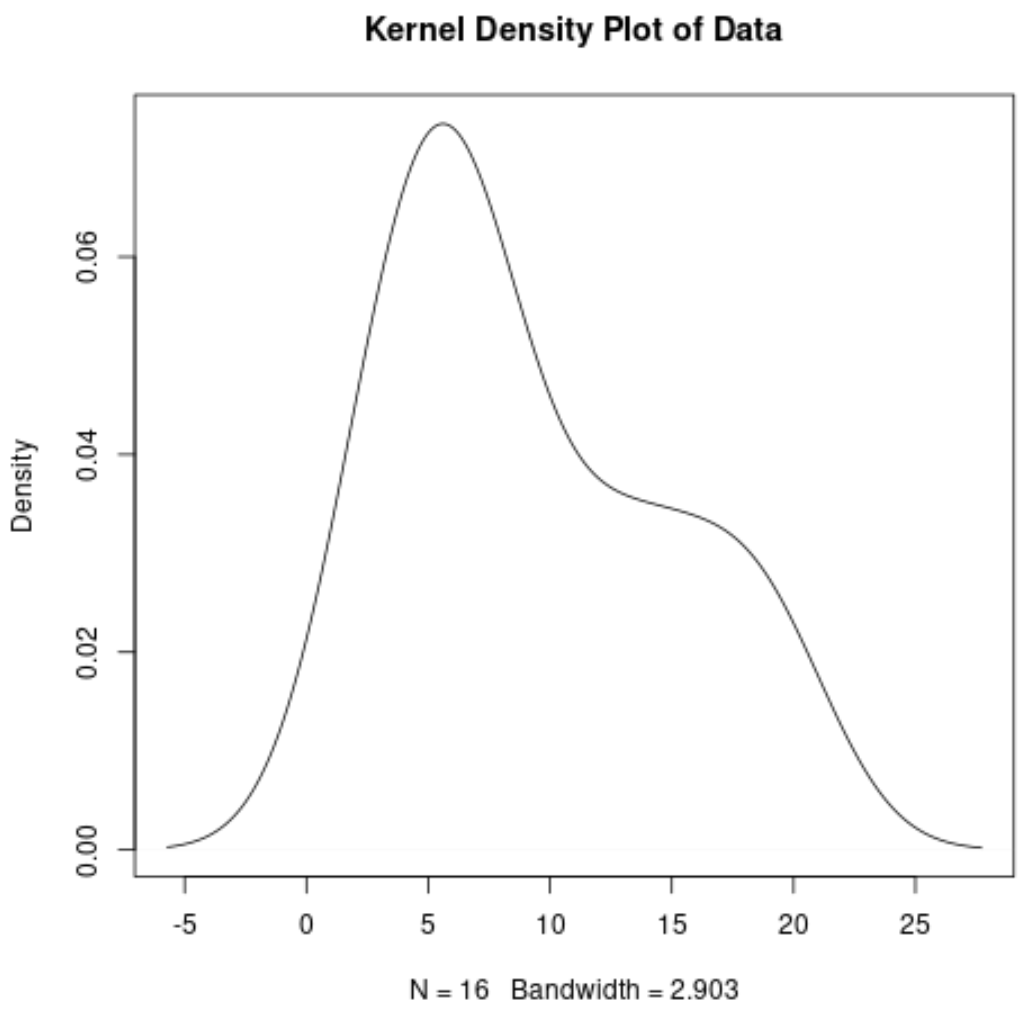
အောက်ဖော်ပြပါ ကုဒ်သည် သတ်မှတ်ထားသော ဘောင်အရောင်နှင့် ဖြည့်စွက်အရောင်ဖြင့် kernel သိပ်သည်းဆ ကွက်ကွက်ကို ဖန်တီးနည်းကို ပြသသည်-
 #create data
data <- c(3, 3, 4, 4, 5, 6, 7, 7, 7, 8, 12, 13, 14, 17, 19, 19)

#define kernel density
kd <- density(data)

#create kernel density plot
plot(kd)

#add color
polygon(kd, col=' steelblue ', border=' black ')
နည်းလမ်း 3- များစွာသော Kernel Density ကွက်များကို ဖန်တီးပါ။
အောက်ပါကုဒ်သည် R ရှိကွက်တစ်ခုတွင် kernel သိပ်သည်းဆကွက်များစွာကို ဖန်တီးနည်းကို ပြသသည်-
 #create datasets
data1 <- c(3, 3, 4, 4, 5, 6, 7, 7, 7, 8, 12, 13, 14, 17, 19, 19)
data2 <- c(12, 3, 14, 14, 4, 5, 6, 10, 14, 7, 7, 8, 10, 12, 17, 20)

#plot first kernel density plot
kd1 <- density(data1)
plot(kd1, col=' blue ', lwd= 2 )

#plot second kernel density plot
kd2 <- density(data2)
lines(kd2, col=' red ', lwd= 2 )
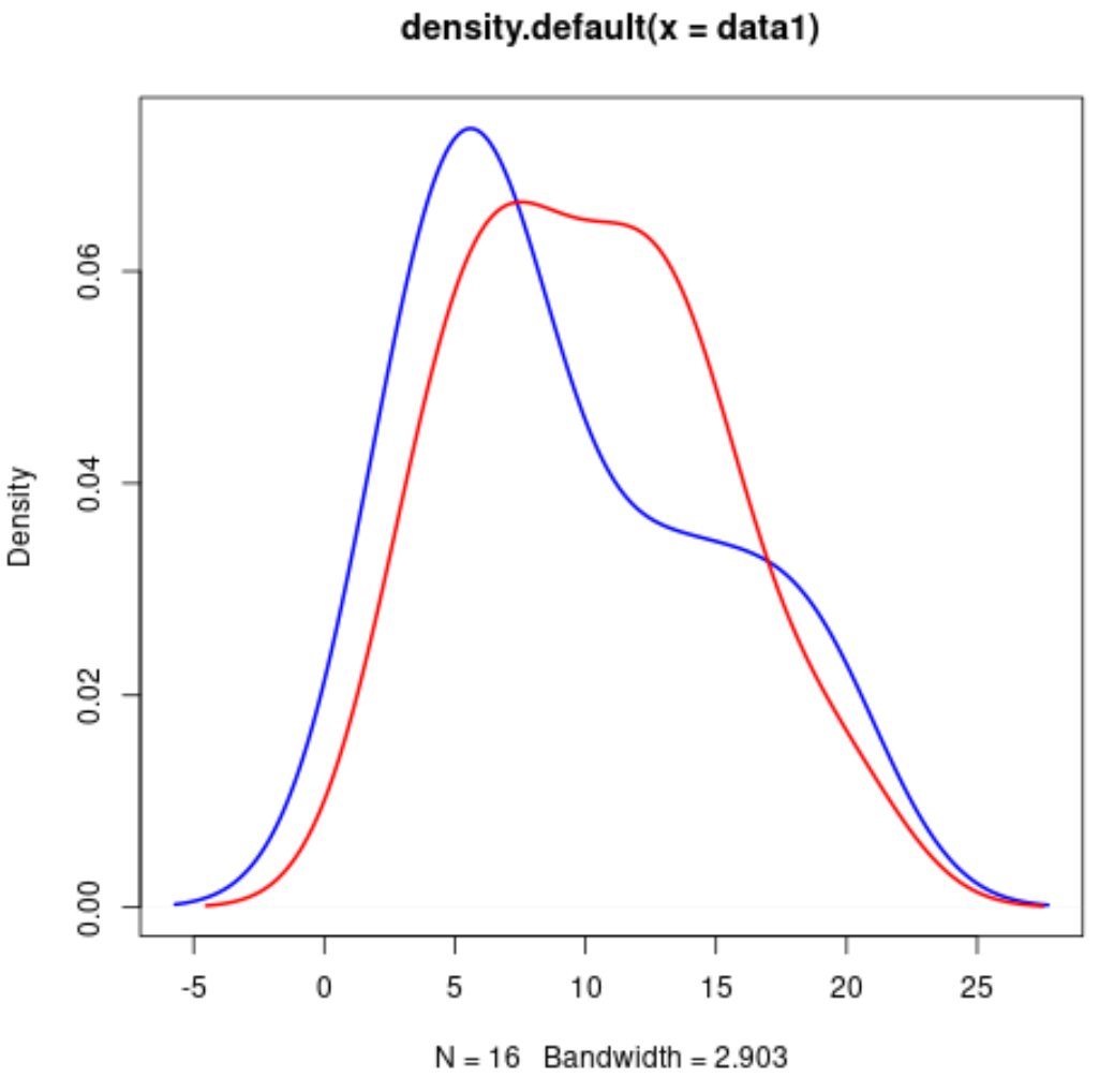
ဂရပ်တစ်ခုတည်းတွင် ကျွန်ုပ်တို့အလိုရှိသည့်အတိုင်း kernel သိပ်သည်းဆကွက်များကို ဖန်တီးရန် အလားတူအထားအသိုကို အသုံးပြုနိုင်ကြောင်း သတိပြုပါ။
ထပ်လောင်းအရင်းအမြစ်များ
အောက်ဖော်ပြပါ သင်ခန်းစာများသည် R တွင် အခြားဘုံကွက်များကို ဖန်တီးနည်းကို ရှင်းပြသည်-
R တွင် ကွက်ကွက်များစွာကို ဘယ်လိုဆွဲမလဲ။
R တွင် မျိုးစုံသော histogram များကို မည်သို့ဆွဲမည်နည်း။
R တွင် စာကြောင်းများစွာဆွဲနည်း
စာရေးသူအကြောင်း
Benjamin Anderson
မင်္ဂလာပါ၊ ကျွန်ုပ်သည် အငြိမ်းစား စာရင်းအင်း ပါမောက္ခ ဘင်ဂျမင်ဖြစ်ပြီး သီးသန့် Statorials ဆရာအဖြစ် လှည့်ပတ်ပါသည်။ စာရင်းဇယားနယ်ပယ်တွင် ကျယ်ပြန့်သောအတွေ့အကြုံနှင့် ကျွမ်းကျင်မှုနှင့်အတူ၊ Statorials မှတစ်ဆင့် ကျောင်းသားများကို ခွန်အားဖြစ်စေရန်အတွက် ကျွန်ုပ်၏အသိပညာကို မျှဝေလိုပါသည်။ ပိုသိတယ်။