Y axes နှစ်ခုပါသော matplotlib ကွက်ကွက်ကို ဖန်တီးနည်း
y-axes နှစ်ခုပါသော Matplotlib ကြံစည်မှုကို ဖန်တီးရန် အလွယ်ကူဆုံးနည်းလမ်းမှာ twinx() လုပ်ဆောင်ချက်ကို အသုံးပြုခြင်းဖြစ်သည်။
အောက်ဖော်ပြပါ ဥပမာသည် ဤလုပ်ဆောင်ချက်ကို လက်တွေ့အသုံးချနည်းကို ပြသထားသည်။
ဥပမာ- Y axes နှစ်ခုဖြင့် Matplotlib ကွက်ကွက်ကို ဖန်တီးပါ။
ကျွန်ုပ်တို့တွင် အောက်ပါ Panda DataFrames နှစ်ခုရှိသည်ဟု ယူဆကြပါစို့။
 import pandas as pd

#createDataFrames
df1 = pd. DataFrame ({' year ': [1, 2, 3, 4, 5, 6, 7, 8, 9, 10],
                    ' sales ': [14, 16, 19, 22, 24, 25, 24, 24, 27, 30]})

df2 = pd. DataFrame ({' year ': [1, 2, 3, 4, 5, 6, 7, 8, 9, 10],
                    ' leads ': [4, 4, 4, 5, 4, 5, 7, 8, 5, 3]})
DataFrames နှစ်ခုစလုံးသည် 1 မှ 10 အထိကွာဟသည့် “ တစ်နှစ်” variable ကို မျှဝေထားသော်လည်း ပထမ DataFrame သည် တစ်နှစ်လျှင် စုစုပေါင်းရောင်းအားကိုပြသပြီး ဒုတိယ DataFrame သည် နှစ်စဉ်စုစုပေါင်းဦးဆောင်မှုကိုပြသသည်။
အရောင်းပြပြီး Y axes နှစ်ချောင်းပါသည့် ဇယားတစ်ခုပေါ်တွင် ဦးဆောင်မည့် Matplotlib ကွက်ကို ဖန်တီးရန် အောက်ပါကုဒ်ကို အသုံးပြုနိုင်ပါသည်။
 import matplotlib. pyplot as plt

#define colors to use
col1 = ' steelblue '
col2 = ' red '

#define subplots
fig,ax = plt. subplots ()

#add first line to plot
ax. plot (df1. year , df1. sales , color=col1)

#add x-axis label
ax. set_xlabel (' Year ', fontsize= 14 )

#add y-axis label
ax. set_ylabel (' Sales ', color=col1, fontsize= 16 )

#define second y-axis that shares x-axis with current plot
ax2 = ax. twinx ()

#add second line to plot
ax2. plot (df2. year , df2. leads , color=col2)

#add second y-axis label
ax2. set_ylabel (' Leads ', color=col2, fontsize= 16 )
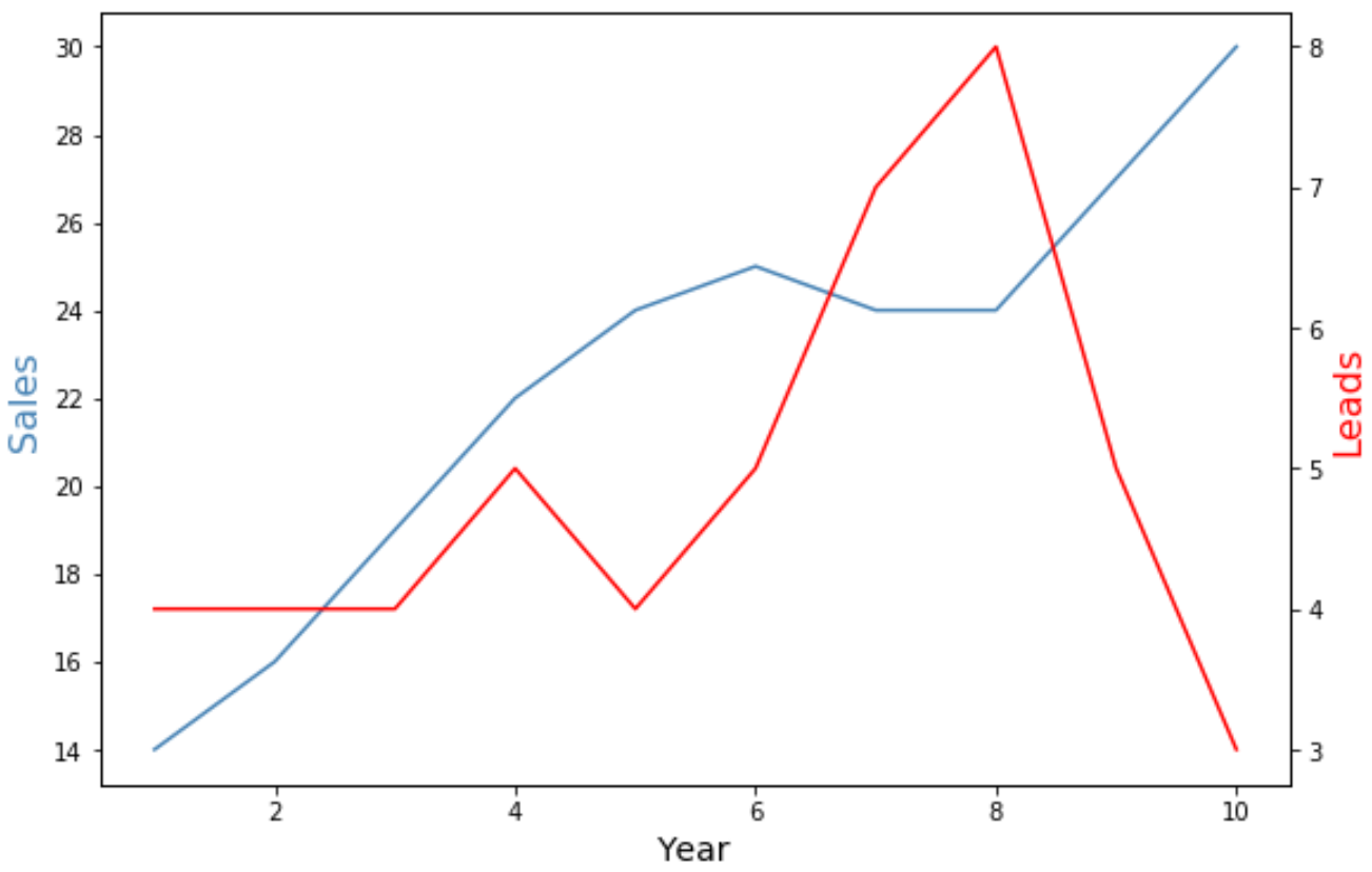
ဇယား၏ဘယ်ဘက်ရှိ y ဝင်ရိုးသည် တစ်နှစ်လျှင်စုစုပေါင်းရောင်းချမှုကိုပြသပြီး ဇယား၏ညာဘက်ခြမ်းရှိ y ဝင်ရိုးသည် တစ်နှစ်လျှင်စုစုပေါင်းဦးဆောင်လမ်းပြမှုကိုပြသသည်။
ဂရပ်ရှိ အပြာရောင်မျဉ်းသည် တစ်နှစ်လျှင် စုစုပေါင်းရောင်းအားကို ကိုယ်စားပြုပြီး အနီရောင်လိုင်းသည် တစ်နှစ်လျှင် စုစုပေါင်း ဦးဆောင်မှုများကို ကိုယ်စားပြုသည်။
ဇယားရှိ စာကြောင်းများ၏ အသွင်အပြင်ကို ပြောင်းလဲရန် အမှတ်အသား နှင့် မျဉ်းအကျယ် အငြင်းအခုံများကို အသုံးပြုရန် လွတ်လပ်စွာ ခံစားကြည့်ပါ-
 import matplotlib. pyplot as plt

#define colors to use
col1 = ' steelblue '
col2 = ' red '

#define subplots
fig,ax = plt. subplots ()

#add first line to plot
ax. plot (df1. year , df1. sales , color=col1, marker=' o ', linewidth= 3 )

#add x-axis label
ax. set_xlabel (' Year ', fontsize= 14 )

#add y-axis label
ax. set_ylabel (' Sales ', color=col1, fontsize= 16 )

#define second y-axis that shares x-axis with current plot
ax2 = ax. twinx ()

#add second line to plot
ax2. plot (df2. year , df2. leads , color=col2, marker=' o ', linewidth= 3 )

#add second y-axis label
ax2. set_ylabel (' Leads ', color=col2, fontsize= 16 )
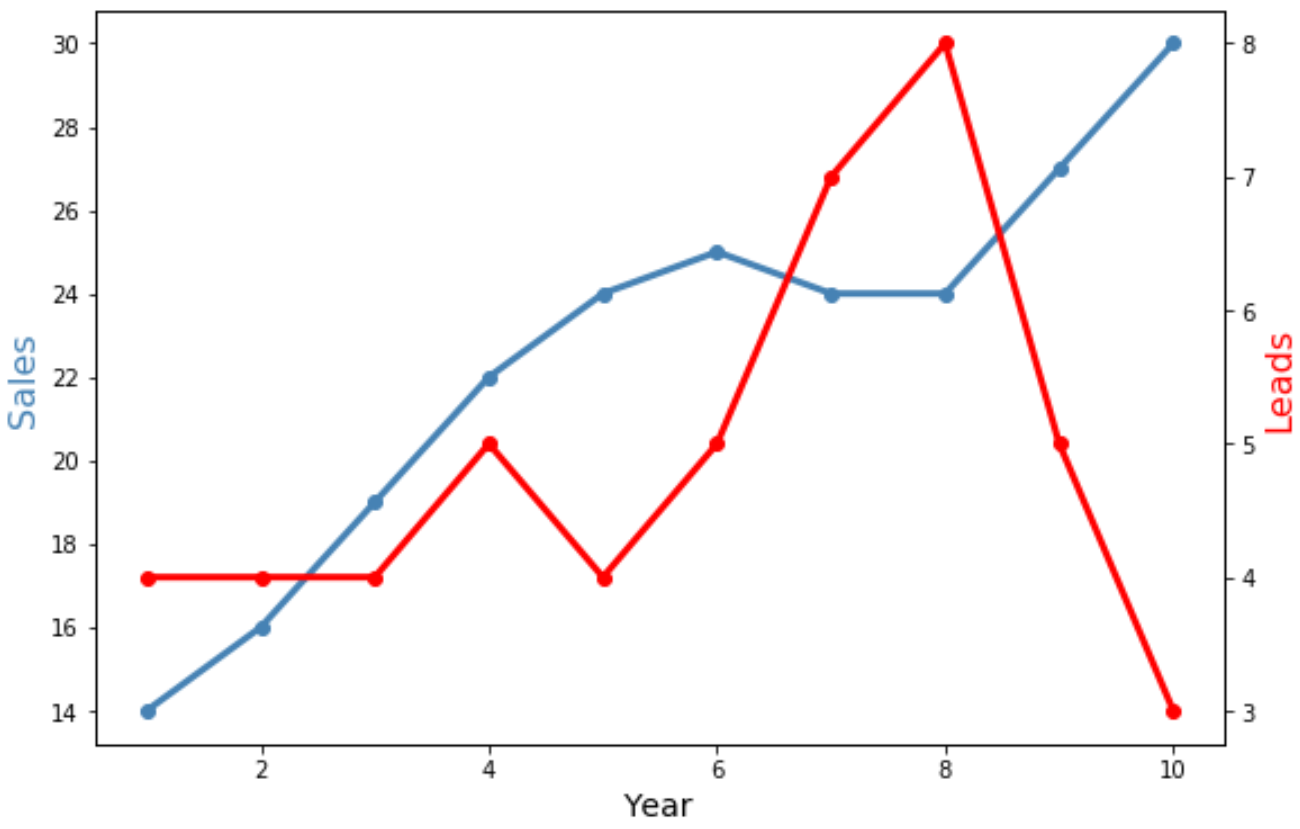
မျဉ်းနှစ်ကြောင်းစလုံးသည် ယခုပိုကျယ်လာပြီး အချက်အလက်တစ်ခုချင်းပြသရန် “ o” အမှတ်အသားများ ပါရှိသည်ကို သတိပြုပါ။
ထပ်လောင်းအရင်းအမြစ်များ
အောက်ဖော်ပြပါ သင်ခန်းစာများသည် Matplotlib ရှိ အခြားသော ဘုံလုပ်ဆောင်ချက်များကို မည်သို့လုပ်ဆောင်ရမည်ကို ရှင်းပြသည်-
Matplotlib ရှိ ဝင်ရိုးအညွှန်းတည်နေရာကို ချိန်ညှိနည်း
Matplotlib တွင် ဝင်ရိုးအပိုင်းအခြားများ သတ်မှတ်နည်း
Matplotlib တွင် X ဝင်ရိုးတန်ဖိုးများသတ်မှတ်နည်း
စာရေးသူအကြောင်း
Benjamin Anderson
မင်္ဂလာပါ၊ ကျွန်ုပ်သည် အငြိမ်းစား စာရင်းအင်း ပါမောက္ခ ဘင်ဂျမင်ဖြစ်ပြီး သီးသန့် Statorials ဆရာအဖြစ် လှည့်ပတ်ပါသည်။ စာရင်းဇယားနယ်ပယ်တွင် ကျယ်ပြန့်သောအတွေ့အကြုံနှင့် ကျွမ်းကျင်မှုနှင့်အတူ၊ Statorials မှတစ်ဆင့် ကျောင်းသားများကို ခွန်အားဖြစ်စေရန်အတွက် ကျွန်ုပ်၏အသိပညာကို မျှဝေလိုပါသည်။ ပိုသိတယ်။