Matplotlib တွင်ဖြန့်ဝေမှုအစီအစဉ်တစ်ခုဖန်တီးနည်း
Python တွင် ဖြန့်ဖြူးမှုပုံကြမ်းကို ဖန်တီးရန် ဘုံနည်းလမ်းနှစ်ခုရှိသည်။
နည်းလမ်း 1- Matplotlib ကို အသုံးပြု၍ Histogram ဖန်တီးပါ။
 import matplotlib. pyplot as plt

plt. hist (data, color=' lightgreen ', ec=' black ', bins= 15 )
အရောင် သည် ဘားများ၏ ဖြည့်စွက်အရောင်ကို ထိန်းချုပ်သည်၊ ec သည် ဘားအစွန်းများ၏အရောင်ကို ထိန်းချုပ်သည်၊ bins သည် histogram ရှိ bins အရေအတွက်ကို ထိန်းချုပ်ကြောင်း သတိပြုပါ။
နည်းလမ်း 2- Seaborn ကို အသုံးပြု၍ Density Curve ဖြင့် Histogram ဖန်တီးပါ။
 import seaborn as sns
sns. displot (data, kde= True , bins= 15 )
kde=True သည် သိပ်သည်းဆမျဉ်းကွေးကို histogram ပေါ်တွင် လွှမ်းခြုံထားသင့်ကြောင်း သတိပြုပါ။
ဖော်ပြပါနမူနာများသည် အောက်ပါ NumPy array တွင် တန်ဖိုးများ ဖြန့်ဖြူးမှုကို မြင်သာစေရန် လက်တွေ့တွင် နည်းလမ်းတစ်ခုစီကို အသုံးပြုနည်းကို ပြသသည်-
 import numpy as np

#make this example reproducible.
n.p. random . seed ( 1 )

#create numpy array with 1000 values that follows normal dist with mean=10 and sd=2
data = np. random . normal (size= 1000 , loc= 10 , scale= 2 )

#view first five values
data[: 5 ]

array([13.24869073, 8.77648717, 8.9436565, 7.85406276, 11.73081526])
ဥပမာ 1- Matplotlib ကို အသုံးပြု၍ Histogram ဖန်တီးပါ။
NumPy ခင်းကျင်းတွင် တန်ဖိုးများ ပျံ့နှံ့မှုကို မြင်သာစေရန် Matplotlib ရှိ histogram တစ်ခုဖန်တီးရန် အောက်ပါကုဒ်ကို အသုံးပြုနိုင်ပါသည်။
 import matplotlib. pyplot as plt

#create histogram
plt. hist (data, color=' lightgreen ', ec=' black ', bins= 15 )
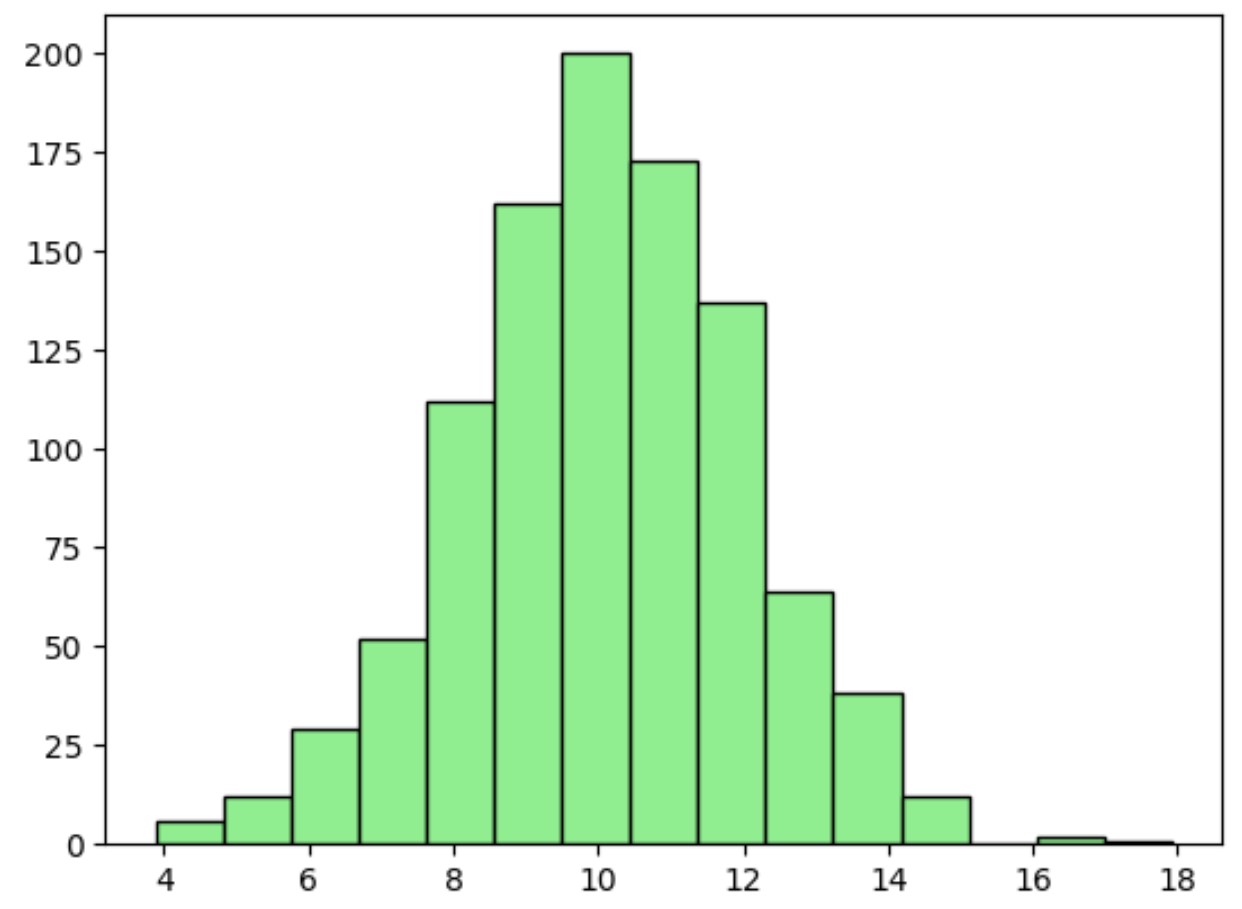
x-axis သည် NumPy array မှတန်ဖိုးများကိုပြသပြီး y-axis သည် အဆိုပါတန်ဖိုးများ၏ ကြိမ်နှုန်းကိုပြသသည်။
bins argument အတွက် သင်အသုံးပြုသော တန်ဖိုးပိုကြီးလေ၊ histogram တွင် bars များ ပိုများလာမည်ကို သတိပြုပါ။
ဥပမာ 2- Seaborn ကို အသုံးပြု၍ သိပ်သည်းဆမျဉ်းနှင့် ဟစ်စတိုဂရမ်တစ်ခုကို ဖန်တီးပါ။
seaborn data visualization စာကြည့်တိုက်ကို အသုံးပြု၍ သိပ်သည်းဆမျဉ်း ကို ထပ်ထားသော histogram တစ်ခုဖန်တီးရန် အောက်ပါကုဒ်ကို အသုံးပြုနိုင်ပါသည်။
 import seaborn as sns

#create histogram with density curve overlaid
sns. displot (data, kde= True , bins= 15 )
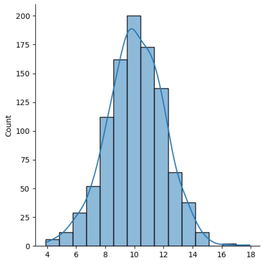
ရလဒ်မှာ သိပ်သည်းဆမျဉ်းကွေးကို လွှမ်းခြုံထားသည့် ဟစ်စတိုဂရမ်တစ်ခုဖြစ်သည်။
သိပ်သည်းဆမျဉ်းကွေးကို အသုံးပြုခြင်း၏ အားသာချက်မှာ အဆက်မပြတ် မျဉ်းကွေးတစ်ခုတည်းကို အသုံးပြု၍ ဖြန့်ဖြူးမှု၏ ပုံသဏ္ဍာန်ကို အကျဉ်းချုပ်ဖော်ပြခြင်းဖြစ်သည်။
မှတ်ချက် – seaborn displot() လုပ်ဆောင်ချက်အတွက် စာရွက်စာတမ်းအပြည့်အစုံကို ဤနေရာတွင် ရှာဖွေနိုင်ပါသည်။
ထပ်လောင်းအရင်းအမြစ်များ
အောက်ပါသင်ခန်းစာများသည် Python တွင် အခြားဘုံဇယားများကို ဖန်တီးနည်းကို ရှင်းပြသည်-
Matplotlib တွင် Stacked Bar Charts ဖန်တီးနည်း
Matplotlib တွင် နှိုင်းရကြိမ်နှုန်း ဟီစတိုဂရမ် ဖန်တီးနည်း
Seaborn တွင် အလျားလိုက် barplot ဖန်တီးနည်း
စာရေးသူအကြောင်း
Benjamin Anderson
မင်္ဂလာပါ၊ ကျွန်ုပ်သည် အငြိမ်းစား စာရင်းအင်း ပါမောက္ခ ဘင်ဂျမင်ဖြစ်ပြီး သီးသန့် Statorials ဆရာအဖြစ် လှည့်ပတ်ပါသည်။ စာရင်းဇယားနယ်ပယ်တွင် ကျယ်ပြန့်သောအတွေ့အကြုံနှင့် ကျွမ်းကျင်မှုနှင့်အတူ၊ Statorials မှတစ်ဆင့် ကျောင်းသားများကို ခွန်အားဖြစ်စေရန်အတွက် ကျွန်ုပ်၏အသိပညာကို မျှဝေလိုပါသည်။ ပိုသိတယ်။