Matplotlib တွင် time series တစ်ခုကို ဘယ်လိုဆွဲမလဲ (ဥပမာများဖြင့်)
Matplotlib တွင် အချိန်စီးရီးတစ်ခုဆွဲရန် အောက်ပါအထားအသိုကိုသုံးနိုင်သည်။
 import matplotlib. pyplot as plt

plt. plot (df. x , df. y )
၎င်းသည် variable x သည် datetime.datetime() class မှ ဖြစ်သည်ဟု ယူဆသည်။
အောက်ပါဥပမာများသည် Python တွင် time series data ကိုဆွဲရန် ဤ syntax ကိုအသုံးပြုပုံကိုပြသထားသည်။
ဥပမာ 1- Matplotlib တွင် အခြေခံအချိန်စီးရီးတစ်ခုကို စီစဉ်ပါ။
အောက်ပါကုဒ်သည် စီးပွားရေးလုပ်ငန်းတစ်ခုမှ 12 ရက်ဆက်တိုက်ရောင်းချမှုစုစုပေါင်းကိုပြသသည့် Matplotlib တွင် အချိန်စီးရီးတစ်ခုဆွဲနည်းကို ပြသသည်-
 import matplotlib. pyplot as plt
import datetime
import numpy as np
import pandas as pd

#define data
df = pd. DataFrame ({' date ': np. array ([datetime. datetime (2020, 1, i+1)
for i in range(12)]),
                   ' sales ': [3, 4, 4, 7, 8, 9, 14, 17, 12, 8, 8, 13]})

#plot time series
plt. plot (df. date , df. sales , linewidth= 3 )
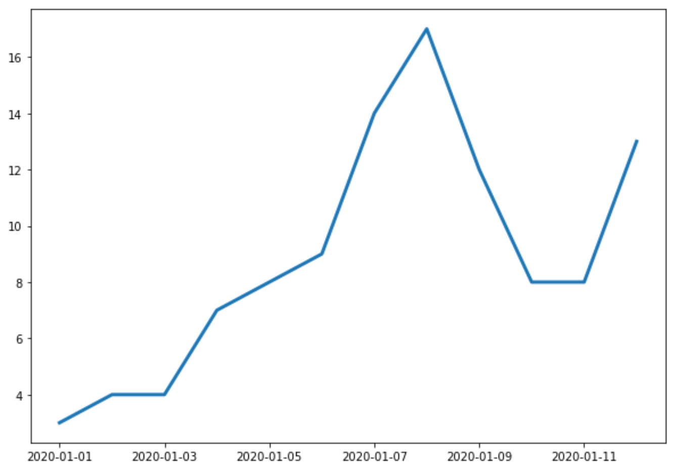
X-axis သည် ရက်စွဲကိုပြသပြီး Y-axis သည် ရက်စွဲတစ်ခုစီတွင် စုစုပေါင်းရောင်းချမှုကို ပြသသည်။
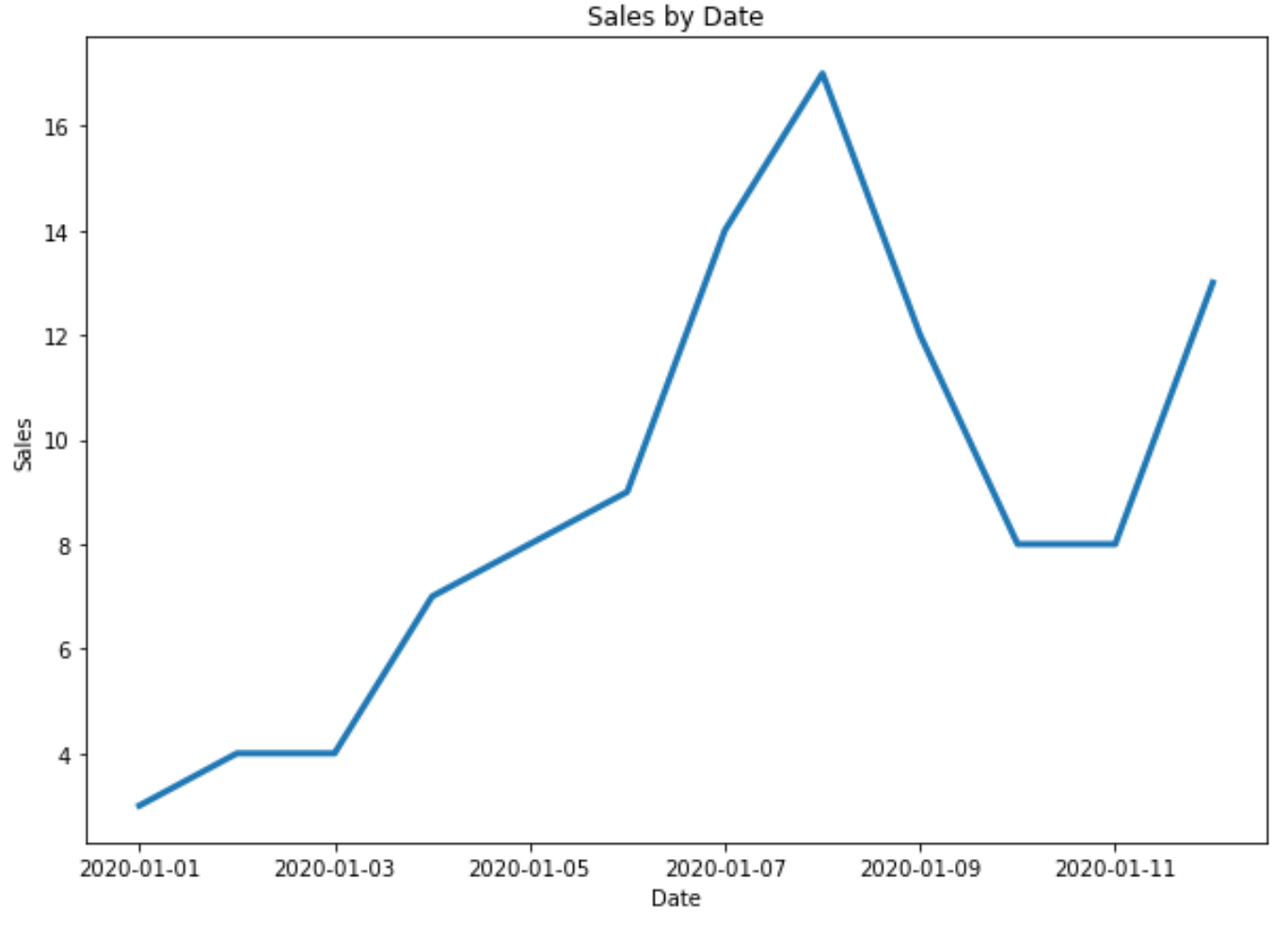
ဥပမာ 2- ခေါင်းစဉ်နှင့် ဝင်ရိုးအညွှန်းများကို စိတ်ကြိုက်ပြင်ဆင်ပါ။
ဇာတ်ကွက်သို့ ခေါင်းစဉ်နှင့် ဝင်ရိုးအညွှန်းများထည့်ရန် အောက်ပါကုဒ်ကို အသုံးပြုနိုင်သည်။
 import matplotlib. pyplot as plt
import datetime
import numpy as np
import pandas as pd

#define data
df = pd. DataFrame ({' date ': np. array ([datetime. datetime (2020, 1, i+1)
for i in range(12)]),
                   ' sales ': [3, 4, 4, 7, 8, 9, 14, 17, 12, 8, 8, 13]})

#plot time series
plt. plot (df. date , df. sales , linewidth= 3 )

#add title and axis labels
plt. title (' Sales by Date ')
plt. xlabel (' Date ')
plt. ylabel (' Sales ')
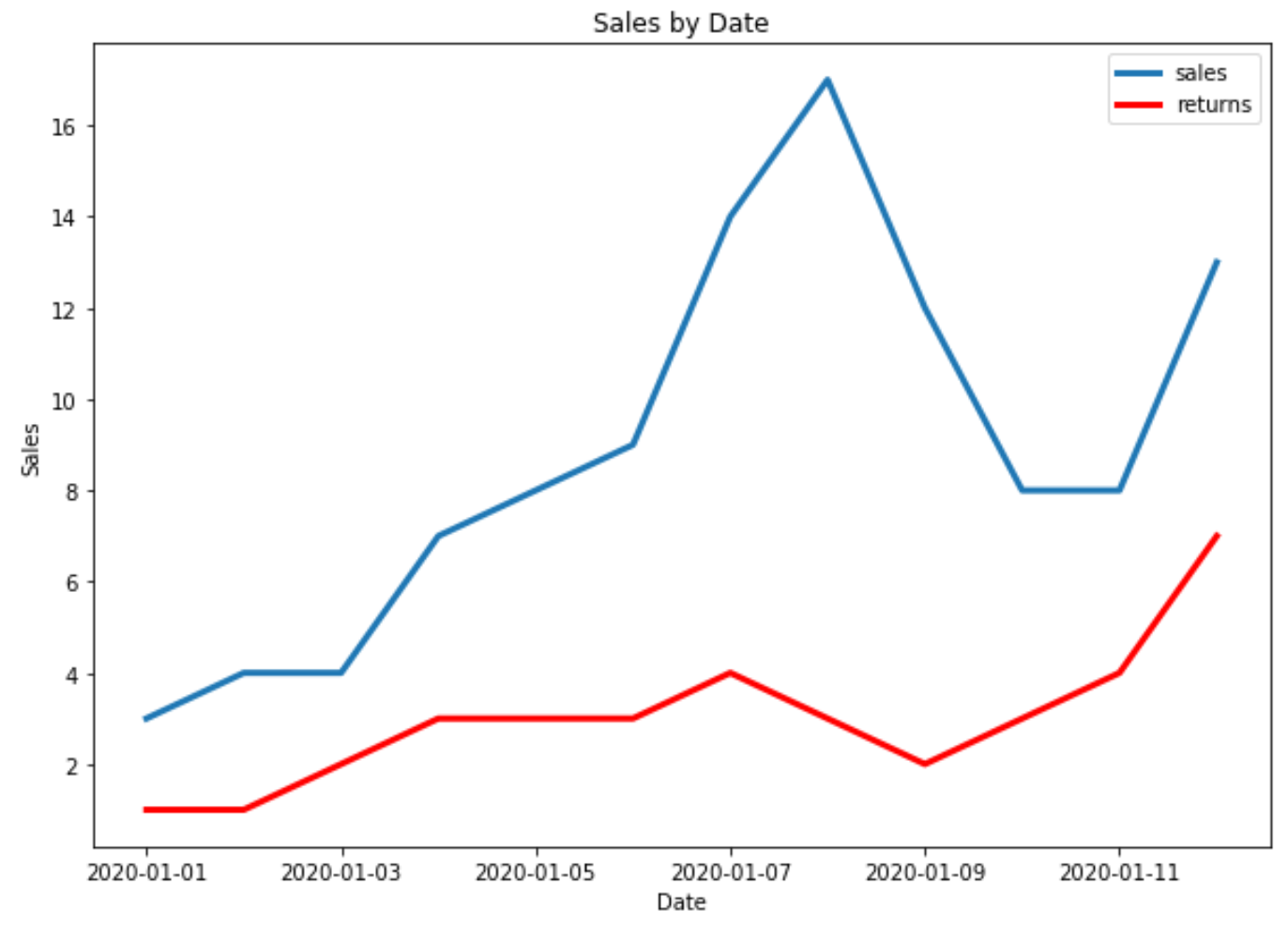
ဥပမာ 3- Matplotlib တွင် အချိန်စီးရီးများစွာကို ပုံဖော်ပါ။
အောက်ပါကုဒ်သည် Matplotlib ရှိ ကွက်ကွက်တစ်ခုတည်းတွင် အချိန်စီးရီးများစွာကို မည်သို့ဆွဲရမည်ကို ပြသသည်-
 import matplotlib. pyplot as plt
import datetime
import numpy as np
import pandas as pd

#define data
df = pd. DataFrame ({' date ': np. array ([datetime. datetime (2020, 1, i+1)
                                     for i in range(12)]),
                   ' sales ': [3, 4, 4, 7, 8, 9, 14, 17, 12, 8, 8, 13]})

df2 = pd. DataFrame ({' date ': np. array ([datetime. datetime (2020, 1, i+1)
                                      for i in range(12)]),
                   ' returns ': [1, 1, 2, 3, 3, 3, 4, 3, 2, 3, 4, 7]})

#plot both time series
plt. plot ( df.date , df.sales , label=' sales ', linewidth= 3 )
plt. plot ( df2.date , df2.returns , color=' red ', label=' returns ', linewidth= 3 )

#add title and axis labels
plt. title (' Sales by Date ')
plt. xlabel (' Date ')
plt. ylabel (' Sales ')

#add legend
plt. legend ()

#displayplot
plt. show ()
ထပ်လောင်းအရင်းအမြစ်များ
Matplotlib- အုပ်စုလိုက် ကွက်ကွက်များ ဖန်တီးနည်း
Matplotlib- Stacked Bar Charts ဖန်တီးနည်း
စာရေးသူအကြောင်း
Benjamin Anderson
မင်္ဂလာပါ၊ ကျွန်ုပ်သည် အငြိမ်းစား စာရင်းအင်း ပါမောက္ခ ဘင်ဂျမင်ဖြစ်ပြီး သီးသန့် Statorials ဆရာအဖြစ် လှည့်ပတ်ပါသည်။ စာရင်းဇယားနယ်ပယ်တွင် ကျယ်ပြန့်သောအတွေ့အကြုံနှင့် ကျွမ်းကျင်မှုနှင့်အတူ၊ Statorials မှတစ်ဆင့် ကျောင်းသားများကို ခွန်အားဖြစ်စေရန်အတွက် ကျွန်ုပ်၏အသိပညာကို မျှဝေလိုပါသည်။ ပိုသိတယ်။