Pandas histogram ၏ y ဝင်ရိုးပေါ်တွင် ရာခိုင်နှုန်းကို မည်သို့ဖော်ပြမည်နည်း။
ပန်ဒါဟီစတိုဂရမ်တစ်ခု၏ y ဝင်ရိုးပေါ်တွင် ရာခိုင်နှုန်းများကိုပြသရန် အောက်ပါအခြေခံအထားအသိုကိုသုံးနိုင်သည်။
 import pandas as pd
import numpy as np
import matplotlib. pyplot as plt
from matplotlib. ticker import PercentFormatter

#create histogram, using percentages instead of counts
plt. hist (df[' my_column '], weights= np.ones ( len (df)) / len (df))

#apply percentage format to y-axis
plt. gca (). yaxis . set_major_formatter (PercentFormatter(1))
plt. show ()
အောက်ဖော်ပြပါ ဥပမာသည် ဤ syntax ကို လက်တွေ့တွင် မည်သို့အသုံးပြုရမည်ကို ပြသထားသည်။
ဥပမာ- Pandas histogram ၏ Y ဝင်ရိုးပေါ်တွင် ရာခိုင်နှုန်းကို ပြပါ။
အမျိုးမျိုးသော ဘတ်စကတ်ဘောကစားသမားများအကြောင်း အချက်အလက်ပါရှိသော အောက်ပါပန်ဒါ DataFrame ရှိသည်ဆိုပါစို့။
 import pandas as pd
import numpy as np

#make this example reproducible
n.p. random . seeds (1)

#createDataFrame
df = pd. DataFrame ({' points ': np. random . normal (loc=20, scale=2, size=300),
                   ' assists ': np. random . normal (loc=14, scale=3, size=300),
                   ' rebounds ': np. random . normal (loc=12, scale=1, size=300)})

#view head of DataFrame
print ( df.head ())

      points assists rebounds
0 23.248691 20.197350 10.927036
1 18.776487 9.586529 12.495159
2 18.943656 11.509484 11.047938
3 17.854063 11.358267 11.481854
4 21.730815 13.162707 10.538596
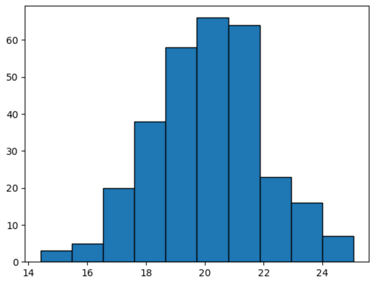
အကယ်၍ ကျွန်ုပ်တို့သည် အမှတ်များ ကော်လံရှိ တန်ဖိုးများခွဲဝေမှုကို မြင်သာစေရန် ဟစ်စတိုဂရမ်တစ်ခုကို ဖန်တီးပါက၊ y-axis သည် အရေအတွက်များကို ပုံသေဖြင့်ပြသပါမည်-
 import matplotlib. pyplot as plt

#create histogram for points columb
plt. hist (df[' points '], edgecolor=' black ')
ယင်းအစား y-ဝင်ရိုးပေါ်တွင် ရာခိုင်နှုန်းများကိုပြသရန် PercentFormatter လုပ်ဆောင်ချက်ကို ကျွန်ုပ်တို့အသုံးပြုနိုင်သည်-
 import numpy as np
import matplotlib. pyplot as plt
from matplotlib. ticker import PercentFormatter

#create histogram, using percentages instead of counts
plt. hist (df[' points '], weights=np. ones ( len (df)) / len (df), edgecolor=' black ')

#apply percentage format to y-axis
plt. gca (). yaxis . set_major_formatter (PercentFormatter(1))
plt. show ()
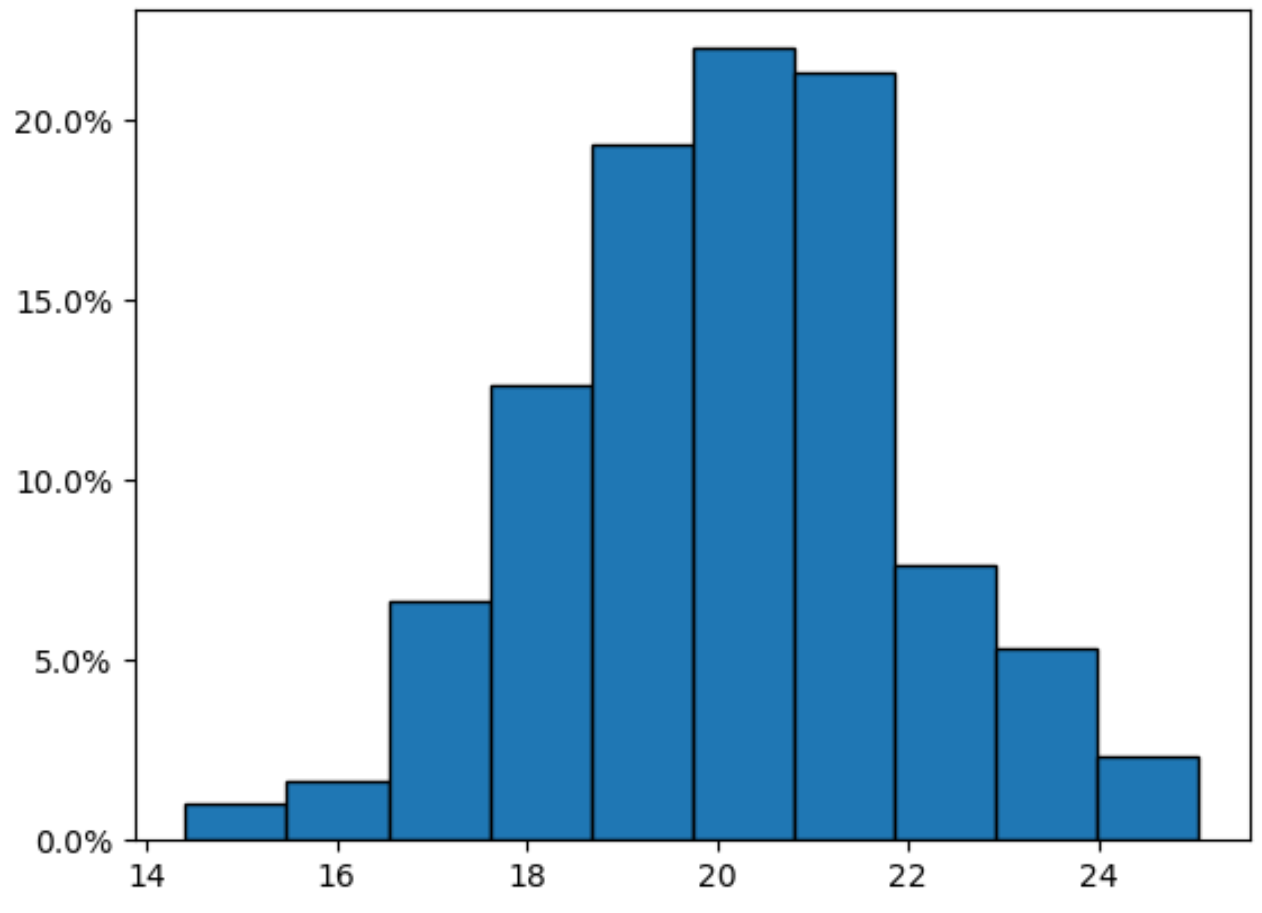
ယခု Y ဝင်ရိုးသည် ရာခိုင်နှုန်းများပြသသည်ကို သတိပြုပါ။
ရာခိုင်နှုန်းများမှ ဒဿမနေရာများကို ဖယ်ရှားလိုပါက PercentFormatter() လုပ်ဆောင်ချက်ရှိ decimals=0 အငြင်းအခုံကို အသုံးပြုပါ။
 import numpy as np
import matplotlib. pyplot as plt
from matplotlib. ticker import PercentFormatter

#create histogram, using percentages instead of counts
plt. hist (df[' points '], weights=np. ones ( len (df)) / len (df), edgecolor=' black ')

#apply percentage format to y-axis
plt. gca (). yaxis . set_major_formatter (PercentFormatter(1, decimals= 0 ))
plt. show ()
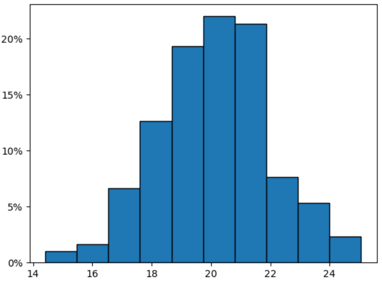
ယခု Y ဝင်ရိုးသည် ဒဿမနေရာများမပါဘဲ ရာခိုင်နှုန်းများကို ပြသသည်။
ထပ်လောင်းအရင်းအမြစ်များ
အောက်ဖော်ပြပါ သင်ခန်းစာများသည် ပန်ဒါများတွင် အခြားဘုံအလုပ်များကို မည်သို့လုပ်ဆောင်ရမည်ကို ရှင်းပြသည်-
Pandas histogram တွင်အသုံးပြုသော bins အရေအတွက်ကို မည်သို့ပြောင်းလဲမည်နည်း။
Pandas histogram ရှိ X ဝင်ရိုးအကွာအဝေးကို ဘယ်လိုပြောင်းမလဲ။
Pandas တွင် အုပ်စုအလိုက် ဟီစတိုဂရမ်ပုံဆွဲနည်း
စာရေးသူအကြောင်း
Benjamin Anderson
မင်္ဂလာပါ၊ ကျွန်ုပ်သည် အငြိမ်းစား စာရင်းအင်း ပါမောက္ခ ဘင်ဂျမင်ဖြစ်ပြီး သီးသန့် Statorials ဆရာအဖြစ် လှည့်ပတ်ပါသည်။ စာရင်းဇယားနယ်ပယ်တွင် ကျယ်ပြန့်သောအတွေ့အကြုံနှင့် ကျွမ်းကျင်မှုနှင့်အတူ၊ Statorials မှတစ်ဆင့် ကျောင်းသားများကို ခွန်အားဖြစ်စေရန်အတွက် ကျွန်ုပ်၏အသိပညာကို မျှဝေလိုပါသည်။ ပိုသိတယ်။