Pandas တွင် ကော်လံတန်ဖိုးများ ဖြန့်ချီပုံကို ကြံစည်ပုံ
Pandas DataFrame တွင် ကော်လံတန်ဖိုးများ ဖြန့်ချီရန် အောက်ပါနည်းလမ်းများကို သင်အသုံးပြုနိုင်ပါသည်။
Method 1: ကော်လံတစ်ခုတွင် တန်ဖိုးများ ဖြန့်ဖြူးမှုကို ကြံစည်ပါ။
df[' my_column ']. plot (kind=' kde ')
Method 2: ကော်လံတစ်ခုတွင် တန်ဖိုးများ ဖြန့်ဖြူးမှုကို အခြားကော်လံဖြင့် အုပ်စုဖွဲ့ပါ။
df. groupby (' group_column ')[' values_column ']. plot (kind=' kde ')
အောက်ဖော်ပြပါနမူနာများသည် အောက်ပါ pandas DataFrame ဖြင့် လက်တွေ့တွင် နည်းလမ်းတစ်ခုစီကို အသုံးပြုနည်းကို ပြသသည်-
 import pandas as pd

#createDataFrame
df = pd. DataFrame ({' team ': ['A', 'A', 'A', 'A', 'A', 'A', 'A', 'A', 'A', 'A',
                            'B', 'B', 'B', 'B', 'B', 'B', 'B', 'B', 'B', 'B'],
                   ' points ': [3, 3, 4, 5, 4, 7, 7, 7, 10, 11,
                              8, 7, 8, 9, 12, 12, 12, 14, 15, 17]})

#view DataFrame
print (df)

   team points
0 to 3
1 to 3
2 to 4
3 to 5
4 to 4
5 TO 7
6 to 7
7 to 7
8 to 10
9 to 11
10 B 8
11 B 7
12 B 8
13 B 9
14 B 12
15 B 12
16 B 12
17 B 14
18 B 15
19 B 17
ဥပမာ 1: ကော်လံတစ်ခုတွင် တန်ဖိုးများ ဖြန့်ဖြူးမှုကို ကြံစည်ပါ။
အောက်ဖော်ပြပါ ကုဒ်သည် အမှတ်များ ကော်လံတွင် တန်ဖိုးများ ဖြန့်ဖြူးပုံကို ကြံစည်ပုံကို ပြသည်-
 #plot distribution of values in points column
df[' points ']. plot (kind=' kde ')
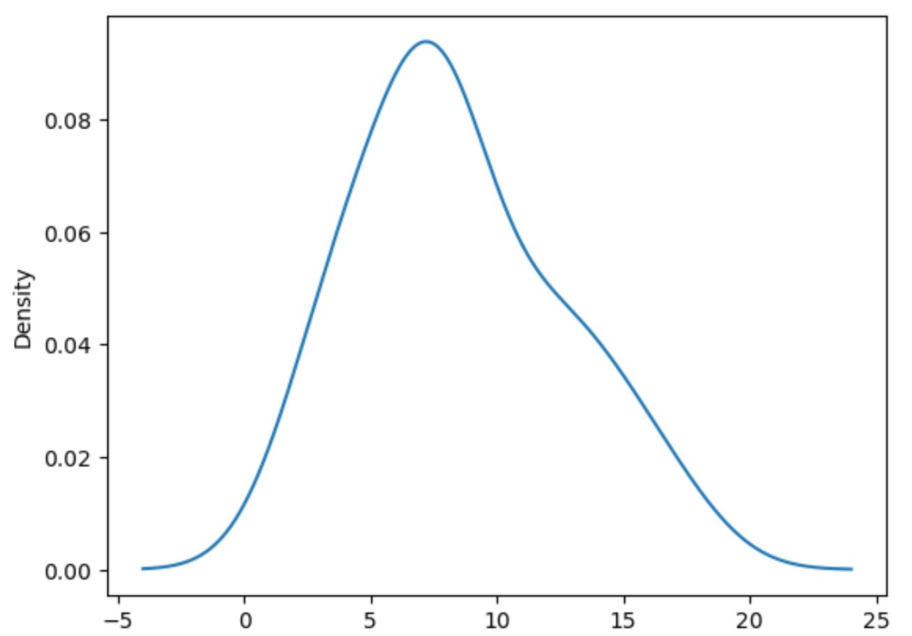
type=’kde’ သည် ပန်ဒါများကို kernel density ခန့်မှန်းချက်ကို အသုံးပြုရန် ညွှန်ပြသည်၊ ၎င်းသည် variable တစ်ခု၏ တန်ဖိုးများခွဲဝေမှုကို အကျဉ်းချုပ်ဖော်ပြသည့် ချောမွေ့သောမျဉ်းကွေးကို ထုတ်ပေးသည်။
၎င်းအစား ဟီစတိုဂရမ်တစ်ခုကို ဖန်တီးလိုပါက၊ အောက်ပါအတိုင်း kind=’hist’ ကို သတ်မှတ်နိုင်သည်။
 #plot distribution of values in points column using histogram
df[' points ']. plot (kind=' hist ', edgecolor=' black ')
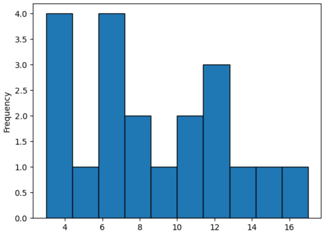
ဤနည်းလမ်းသည် ဖြန့်ဝေမှု၏ပုံသဏ္ဍာန်ကို အကျဉ်းချုပ်ဖော်ပြသည့် ချောမွေ့သောမျဉ်းနှင့် ဆန့်ကျင်ဘက်အနေဖြင့် အမှတ်များ ကော်လံရှိ တန်ဖိုးများ၏ ကြိမ်နှုန်းများကို ကိုယ်စားပြုရန် ဘားများကို အသုံးပြုသည်။
ဥပမာ 2- ကော်လံတစ်ခုတွင် တန်ဖိုးများ ဖြန့်ဖြူးမှုကို အခြားကော်လံတစ်ခုဖြင့် အုပ်စုဖွဲ့ပါ။
အောက်ပါကုဒ်သည် အဖွဲ့ ကော်လံဖြင့် အုပ်စုဖွဲ့ထားသော အမှတ်များ ကော်လံရှိ တန်ဖိုးများ ဖြန့်ဖြူးပုံကို ကြံစည်ပုံကို ပြသသည်-
 import matplotlib.pyplot as plt

#plot distribution of points by team
df. groupby (' team ')[' points ']. plot (kind=' kde ')

#add legend
plt. legend ([' A ',' B '], title=' Team ')

#add x-axis label
plt. xlabel (' Points ')
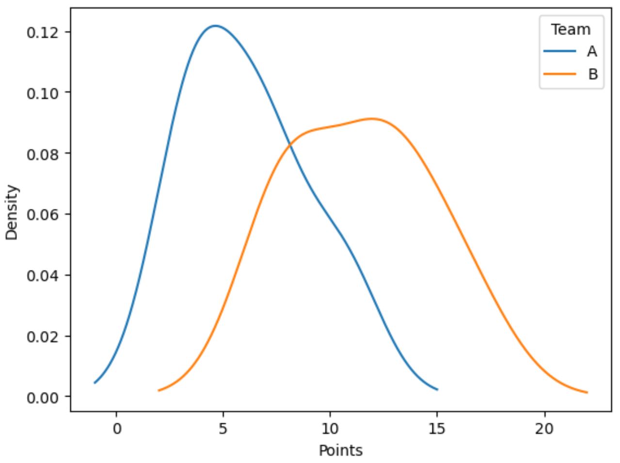
အပြာရောင်မျဉ်းသည် အသင်း A တွင် ကစားသမားများ၏ အမှတ်ခွဲဝေမှုကို ပြသပြီး လိမ္မော်ရောင်မျဉ်းသည် အသင်း B တွင် ကစားသမားများ၏ အမှတ်ခွဲဝေမှုကို ပြသသည်။
ထပ်လောင်းအရင်းအမြစ်များ
အောက်ဖော်ပြပါ သင်ခန်းစာများသည် ပန်ဒါများတွင် အခြားဘုံအလုပ်များကို မည်သို့လုပ်ဆောင်ရမည်ကို ရှင်းပြသည်-
Pandas ရှိ မြေကွက်များတွင် ခေါင်းစဉ်များထည့်နည်း
ပန်ဒါကွက်တစ်ခု၏ ပုံအရွယ်အစားကို ချိန်ညှိနည်း
Pandas DataFrames အများအပြားကို အပိုင်းခွဲများအတွင်း ဘယ်လိုဆွဲမလဲ။
Pandas ရှိ Plot Legends များကို ဖန်တီးပြီး စိတ်ကြိုက်လုပ်နည်း
စာရေးသူအကြောင်း
Benjamin Anderson
မင်္ဂလာပါ၊ ကျွန်ုပ်သည် အငြိမ်းစား စာရင်းအင်း ပါမောက္ခ ဘင်ဂျမင်ဖြစ်ပြီး သီးသန့် Statorials ဆရာအဖြစ် လှည့်ပတ်ပါသည်။ စာရင်းဇယားနယ်ပယ်တွင် ကျယ်ပြန့်သောအတွေ့အကြုံနှင့် ကျွမ်းကျင်မှုနှင့်အတူ၊ Statorials မှတစ်ဆင့် ကျောင်းသားများကို ခွန်အားဖြစ်စေရန်အတွက် ကျွန်ုပ်၏အသိပညာကို မျှဝေလိုပါသည်။ ပိုသိတယ်။