Pandas စီးရီးကို ဘယ်လိုဆွဲမလဲ (ဥပမာများဖြင့်)
ပန်ဒါစီးရီးတစ်ခုတွင် တန်ဖိုးများကို ပုံဖော်ရန် ဘုံနည်းလမ်းနှစ်ခုရှိသည်။
နည်းလမ်း 1- Pandas စီးရီးများမှ မျဉ်းကွက်တစ်ခု ဖန်တီးပါ။
 import pandas as pd
import matplotlib. pyplot as plt

plt. plot ( my_series.index , my_series.values )
နည်းလမ်း 2- Pandas Series မှ Histogram ဖန်တီးပါ။
 import pandas as pd
import matplotlib. pyplot as plt

my_series. plot (kind=' hist ')
အောက်ဖော်ပြပါ ဥပမာများသည် နည်းလမ်းတစ်ခုစီကို လက်တွေ့အသုံးချနည်းကို ပြသထားသည်။
ဥပမာ 1- ပန်ဒါစီးရီးတစ်ခုမှ မျဉ်းကြောင်းတစ်ခု ဖန်တီးပါ။
အောက်ဖော်ပြပါ ကုဒ်သည် ပန်ဒါစီးရီးတစ်ခုမှ လိုင်းကွက်တစ်ခု ဖန်တီးနည်းကို ပြသသည်-
 import pandas as pd
import matplotlib. pyplot as plt

#create pandas Series
my_series = pd. Series ([2, 2, 2, 3, 3, 4, 5, 7, 8, 9, 12, 12, 14, 15, 16, 16, 18,
                       19, 22, 22, 22, 25, 26, 27, 30, 33, 33, 33, 34, 35])

#create line plot to visualize values in Series
plt. plot ( my_series.index , my_series.values )
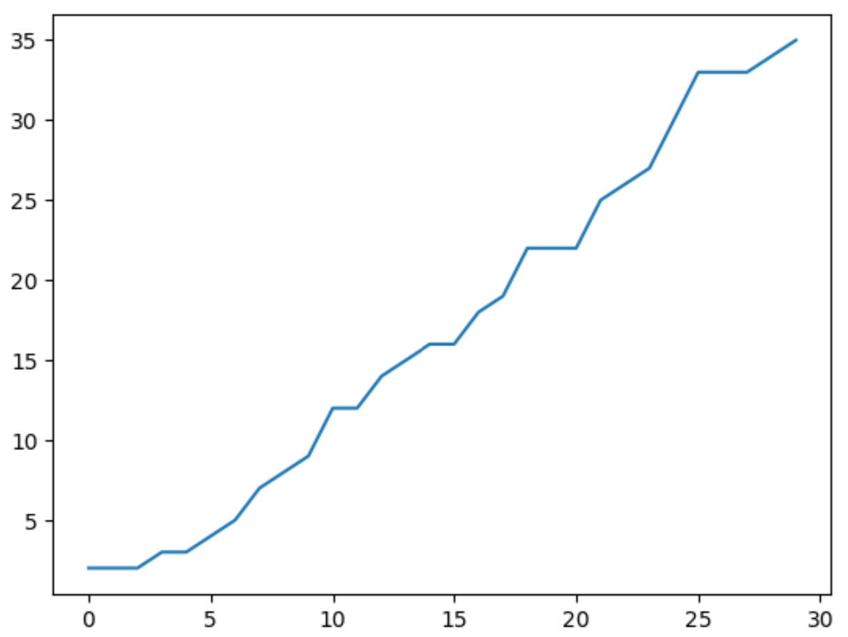
x-axis သည် pandas စီးရီးများ၏ အညွှန်းတန်ဖိုးများကို ပြသပြီး y-axis သည် စီးရီး၏ အမှန်တကယ်တန်ဖိုးများကို ပြသသည်။
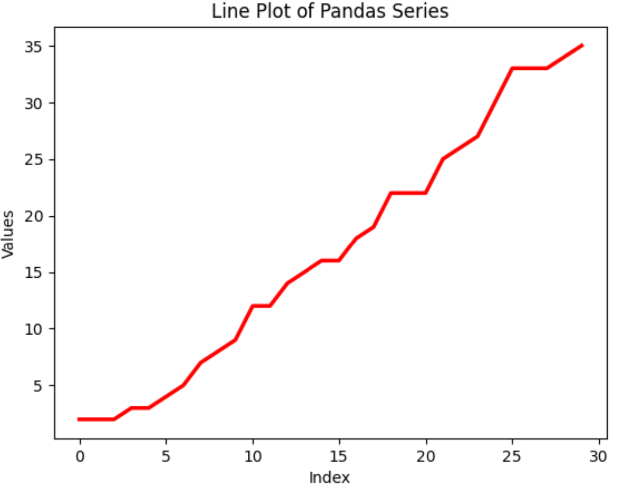
မျဉ်း၏အသွင်အပြင်အပြင် ဝင်ရိုးအညွှန်းများနှင့် ကွက်ကွက်ခေါင်းစဉ်တို့ကို စိတ်ကြိုက်ပြင်ဆင်ရန် ပန်ဒါအမျိုးမျိုးနှင့် matplotlib လုပ်ဆောင်ချက်များကိုလည်း သင်အသုံးပြုနိုင်သည်-
 #create customized line plot
plt. plot (my_series. index , my_series. values , color=' red ', linewidth= 2.5 )

#add axis labels and title
plt. xlabel (' Index ')
plt. ylabel (' Values ')
plt. title (' Line Plot of Pandas Series ')
ဥပမာ 2- ပန်ဒါအတွဲများမှ ဟီစတိုဂရမ်တစ်ခုကို ဖန်တီးပါ။
အောက်ပါကုဒ်သည် ပန်ဒါစီးရီးတစ်ခုမှ ဟီစတိုဂရမ်တစ်ခုကို ဖန်တီးနည်းကို ပြသသည်-
 import pandas as pd
import matplotlib. pyplot as plt

#create pandas Series
my_series = pd. Series ([2, 2, 2, 3, 3, 4, 5, 7, 8, 9, 12, 12, 14, 15, 16, 16, 18,
                       19, 22, 22, 22, 25, 26, 27, 30, 33, 33, 33, 34, 35])

#create histogram visualize distribution of values in Series
my_series. plot (kind=' hist ')
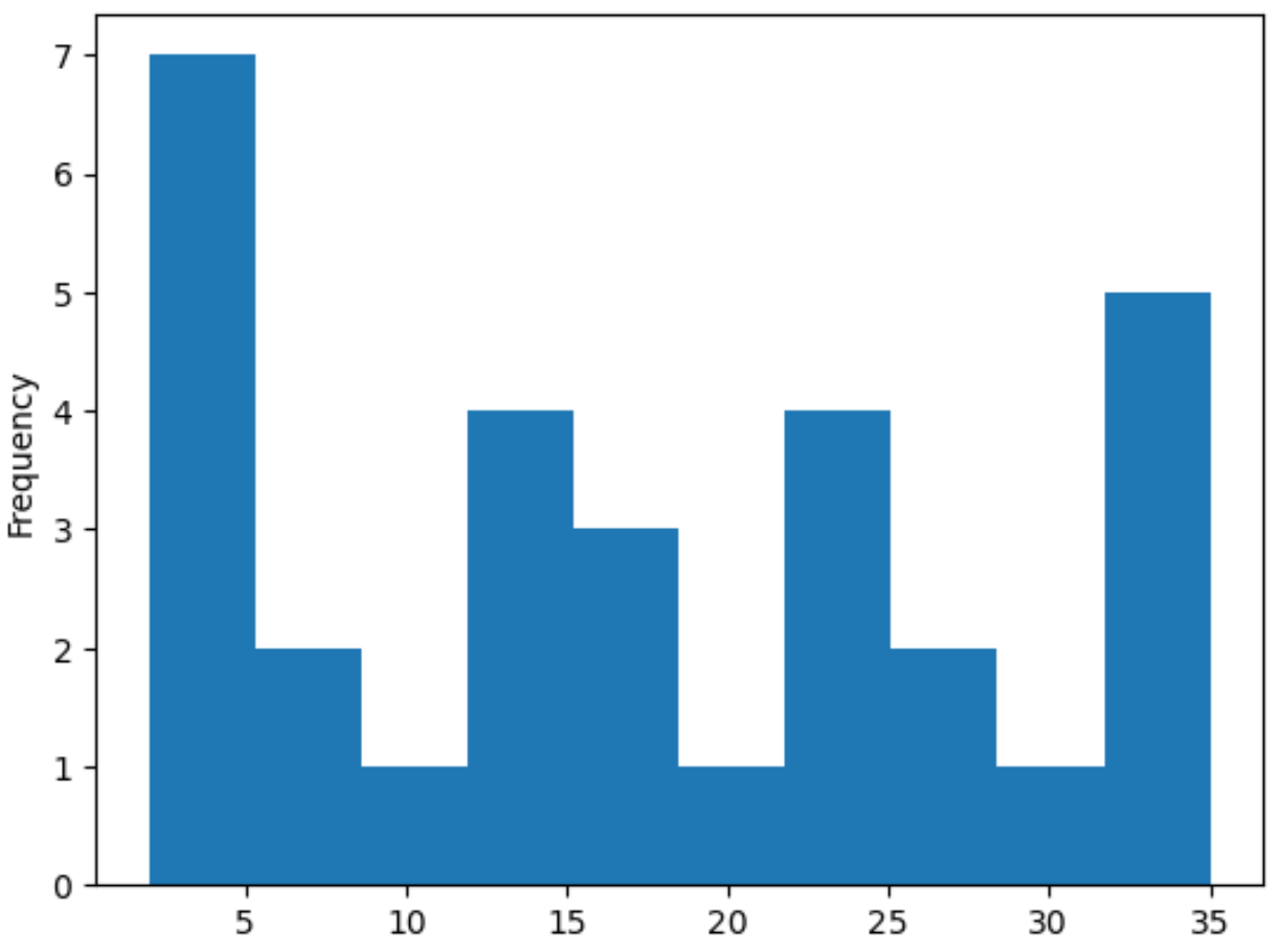
x-axis သည် pandas စီးရီးများ၏တန်ဖိုးများကိုပြသပြီး y-axis သည်တန်ဖိုးများ၏အကြိမ်ရေကိုပြသသည်။
Histogram ၏အသွင်အပြင်အပြင် histogram တွင်အသုံးပြုထားသော bins အရေအတွက်ကို စိတ်ကြိုက်ပြင်ဆင်ရန် ပန်ဒါအမျိုးမျိုးနှင့် matplotlib လုပ်ဆောင်ချက်များကိုလည်း အသုံးပြုနိုင်သည်။
 #create histogram with 15 bins
my_series. plot (kind=' hist ', edgecolor=' black ', color=' gold ', bins= 15 )

#add axis labels and title
plt. xlabel (' Values ')
plt. title (' Histogram of Pandas Series ')
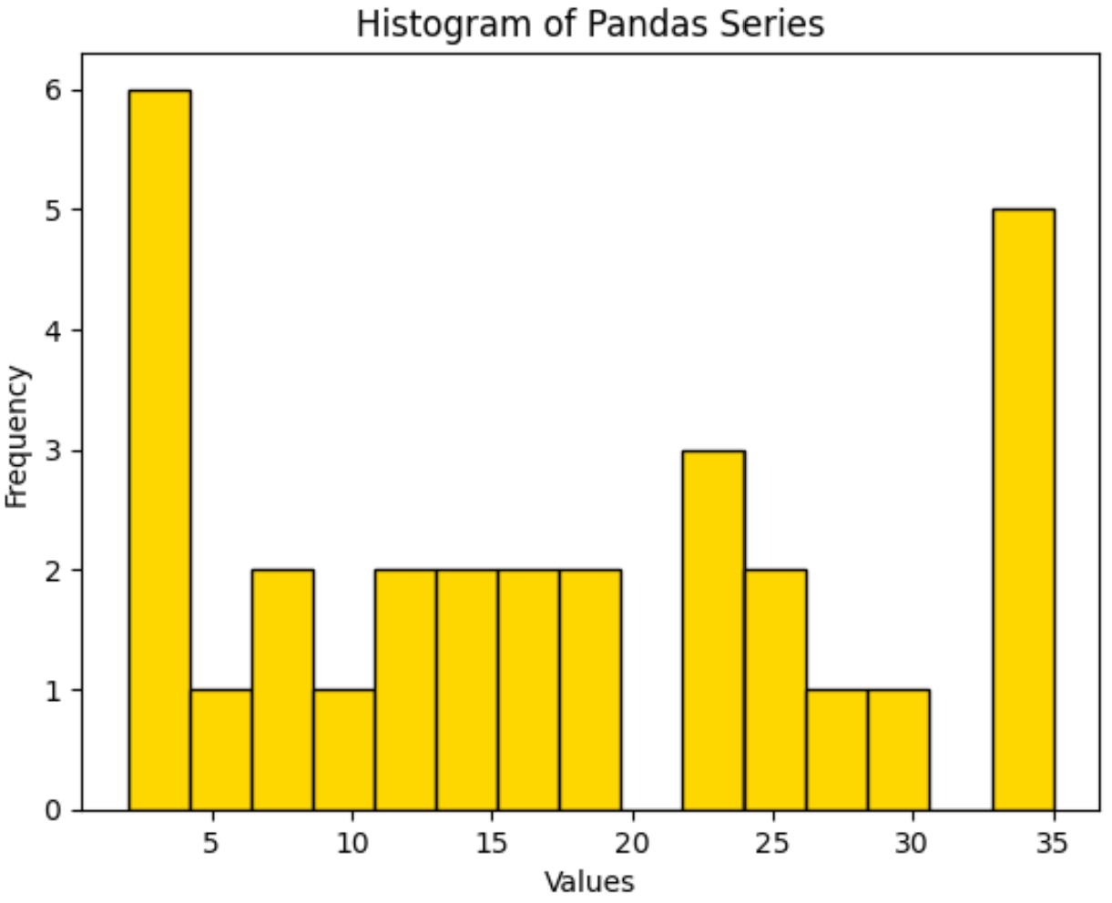
ဟီစတိုဂရမ်တွင် အသုံးပြုသည့် မူရင်းအုပ်စုအရေအတွက်မှာ 10 ဖြစ်ကြောင်း သတိပြုပါ။
bins များပိုမိုထုတ်လုပ်ရန် သို့မဟုတ် bins နည်းပါးလာစေရန် ဤနံပါတ်ကို လျှော့ချရန်အတွက် ဤနံပါတ်ကို တိုးမြှင့်ရန်အတွက် bins argument ကို အသုံးပြုပါ။
ထပ်လောင်းအရင်းအမြစ်များ
အောက်ဖော်ပြပါ သင်ခန်းစာများသည် ပန်ဒါများတွင် အခြားဘုံအလုပ်များကို မည်သို့လုပ်ဆောင်ရမည်ကို ရှင်းပြသည်-
တန်ဖိုးအလိုက် Pandas စီးရီးကို စစ်ထုတ်နည်း
Pandas Series ကို DataFrame သို့ ဘယ်လိုပြောင်းမလဲ။
Pandas စီးရီးကို NumPy array သို့ ဘယ်လိုပြောင်းမလဲ။
စာရေးသူအကြောင်း
Benjamin Anderson
မင်္ဂလာပါ၊ ကျွန်ုပ်သည် အငြိမ်းစား စာရင်းအင်း ပါမောက္ခ ဘင်ဂျမင်ဖြစ်ပြီး သီးသန့် Statorials ဆရာအဖြစ် လှည့်ပတ်ပါသည်။ စာရင်းဇယားနယ်ပယ်တွင် ကျယ်ပြန့်သောအတွေ့အကြုံနှင့် ကျွမ်းကျင်မှုနှင့်အတူ၊ Statorials မှတစ်ဆင့် ကျောင်းသားများကို ခွန်အားဖြစ်စေရန်အတွက် ကျွန်ုပ်၏အသိပညာကို မျှဝေလိုပါသည်။ ပိုသိတယ်။