Python တွင် pareto chart ဖန်တီးနည်း (အဆင့်ဆင့်)
Pareto ဇယား သည် အမျိုးအစားများ၏ ကြိမ်နှုန်းများနှင့် အမျိုးအစားများ၏ တိုးပွားလာသော ကြိမ်နှုန်းများကို ပြသသည့် ဇယားအမျိုးအစားတစ်ခုဖြစ်သည်။
ဤသင်ခန်းစာသည် Python ရှိ Pareto ဇယားကို ဖန်တီးခြင်း၏ အဆင့်ဆင့် ဥပမာကို ပေးသည်။
အဆင့် 1: ဒေတာကိုဖန်တီးပါ။
တံဆိပ် A၊ B၊ C၊ D နှင့် E တို့ကြားတွင် ၎င်းတို့၏ အကြိုက်ဆုံး သီးနှံအမှတ်တံဆိပ်ကို ခွဲခြားသတ်မှတ်ရန် မတူညီသော လူ ၃၅၀ ကို ကျွန်ုပ်တို့ တောင်းဆိုသည့် စစ်တမ်းတစ်ခု ပြုလုပ်သည်ဆိုပါစို့။
စစ်တမ်းရလဒ်များကို ထိန်းသိမ်းရန် အောက်ပါပန်ဒါ DataFrame ကို ကျွန်ုပ်တို့ ဖန်တီးနိုင်သည်-
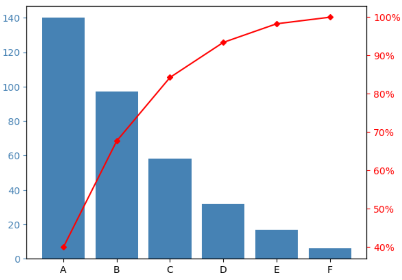
 import pandas as pd

#createDataFrame
df = pd. DataFrame ({' count ': [97, 140, 58, 6, 17, 32]})
df. index = ['B', 'A', 'C', 'F', 'E', 'D']

#sort DataFrame by count descending
df = df. sort_values (by=' count ', ascending= False )

#add column to display cumulative percentage
df[' cumperc '] = df[' count ']. cumsum ()/df[' count ']. sum ()*100

#view DataFrame
df

	count cumperc
At 140 40.000000
B 97 67.714286
C 58 84.285714
D 32 93.428571
E 17 98.285714
F 6 100.000000
အဆင့် 2- Pareto Chart ကိုဖန်တီးပါ။
Pareto ဇယားကိုဖန်တီးရန် အောက်ပါကုဒ်ကို ကျွန်ုပ်တို့အသုံးပြုနိုင်သည်-
 import matplotlib. pyplot as plt
from matplotlib. ticker import PercentFormatter

#define aesthetics for plot
color1 = ' steelblue '
color2 = ' red '
line_size = 4

#create basic bar plot
fig, ax = plt. subplots ()
ax. bar (df. index , df[' count '], color=color1)

#add cumulative percentage line to plot
ax2 = ax. twinx ()
ax2. plot ( df.index , df[' cumperc '], color=color2, marker=" D ", ms=line_size)
ax2. yaxis . set_major_formatter (PercentFormatter())

#specify axis colors
ax. tick_params (axis=' y ', colors=color1)
ax2. tick_params (axis=' y ', colors=color2)

#display Pareto chart
plt. show ()
X ဝင်ရိုးသည် ကြိမ်နှုန်းအမြင့်ဆုံးမှ အနိမ့်ဆုံးသို့ မှာယူထားသော မတူညီသောအမှတ်တံဆိပ်များကို ပြသသည်။
ဘယ်ဘက် y ဝင်ရိုးသည် အမှတ်တံဆိပ်တစ်ခုစီ၏ ကြိမ်နှုန်းကိုပြသပြီး ညာဘက် y ဝင်ရိုးသည် ကုန်အမှတ်တံဆိပ်များ၏ တိုးပွားလာသောအကြိမ်ရေကိုပြသသည်။
ဥပမာအားဖြင့်၊ ကျွန်ုပ်တို့ မြင်နိုင်သည်-
- Brand A သည် စစ်တမ်းဖြေဆိုမှုစုစုပေါင်း၏ 40% ခန့်ကို ကိုယ်စားပြုသည်။
- အမှတ်တံဆိပ် A နှင့် B သည် စစ်တမ်းဖြေဆိုမှုစုစုပေါင်း၏ 70% ခန့်ကို ကိုယ်စားပြုသည်။
- အမှတ်တံဆိပ် A၊ B နှင့် C သည် စုစုပေါင်းစစ်တမ်းဖြေဆိုမှု၏ 85% ခန့်ကို ကိုယ်စားပြုသည်။
နောက် … ပြီးတော့။
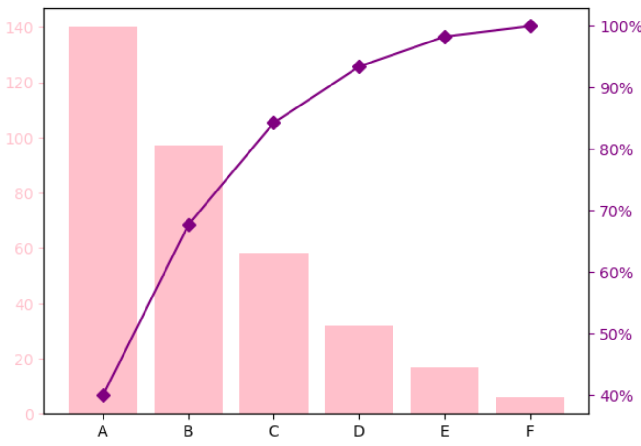
အဆင့် 3- Pareto ဇယားကို စိတ်ကြိုက်ပြင်ဆင်ပါ (ချန်လှပ်ထားနိုင်သည်)
Pareto ဇယားကို သင်လိုချင်သည့်ပုံစံဖြစ်အောင် ပြုလုပ်ရန် ဘားအရောင်များနှင့် စုစည်းရာခိုင်နှုန်းမျဉ်း၏ အရွယ်အစားကို သင်ပြောင်းလဲနိုင်သည်။
ဥပမာအားဖြင့်၊ ဘားများကို ပန်းရောင်အဖြစ်သို့ ပြောင်းနိုင်ပြီး မျဉ်းကြောင်းကို ခရမ်းရောင်နှင့် အနည်းငယ်ပိုထူအောင် ပြောင်းလဲနိုင်သည်-
 import matplotlib. pyplot as plt
from matplotlib. ticker import PercentFormatter

#define aesthetics for plot
color1 = ' pink '
color2 = ' purple '
line_size = 6

#create basic bar plot
fig, ax = plt. subplots ()
ax. bar (df. index , df[' count '], color=color1)

#add cumulative percentage line to plot
ax2 = ax. twinx ()
ax2. plot (df.index , df[' cumperc '], color=color2, marker=" D ", ms=line_size )
ax2. yaxis . set_major_formatter (PercentFormatter())

#specify axis colors
ax. tick_params (axis=' y ', colors=color1)
ax2. tick_params (axis=' y ', colors=color2)

#display Pareto chart
plt. show ()
ထပ်လောင်းအရင်းအမြစ်များ
အောက်ဖော်ပြပါ သင်ခန်းစာများသည် Python တွင် အခြားသော ဘုံမြင်ယောင်မှုများကို ဖန်တီးနည်းကို ရှင်းပြသည်-
Python တွင် Bell Curve ဖန်တီးနည်း
Python တွင် Ogive Chart ဖန်တီးနည်း
Python တွင် Stem and Leaf Plot တစ်ခုကို ဖန်တီးနည်း
စာရေးသူအကြောင်း
Benjamin Anderson
မင်္ဂလာပါ၊ ကျွန်ုပ်သည် အငြိမ်းစား စာရင်းအင်း ပါမောက္ခ ဘင်ဂျမင်ဖြစ်ပြီး သီးသန့် Statorials ဆရာအဖြစ် လှည့်ပတ်ပါသည်။ စာရင်းဇယားနယ်ပယ်တွင် ကျယ်ပြန့်သောအတွေ့အကြုံနှင့် ကျွမ်းကျင်မှုနှင့်အတူ၊ Statorials မှတစ်ဆင့် ကျောင်းသားများကို ခွန်အားဖြစ်စေရန်အတွက် ကျွန်ုပ်၏အသိပညာကို မျှဝေလိုပါသည်။ ပိုသိတယ်။