Python တွင် လူဦးရေပိရမစ်တစ်ခုကို ဖန်တီးနည်း
လူဦးရေပိရမစ် သည် ပေးထားသောလူဦးရေ၏ အသက်နှင့် လိင်ခွဲဝေမှုကို ပြသသည့် ဂရပ်တစ်ခုဖြစ်သည်။ ၎င်းသည် လူဦးရေဖွဲ့စည်းမှုနှင့် လူဦးရေတိုးပွားမှုလမ်းကြောင်းကို နားလည်ရန်အတွက် အသုံးဝင်သည်။
ဤသင်ခန်းစာတွင် Python တွင် အောက်ပါလူဦးရေပိရမစ်ကို ဖန်တီးနည်းကို ရှင်းပြထားသည်။
Python ရှိ ခေတ်ပိရမစ်
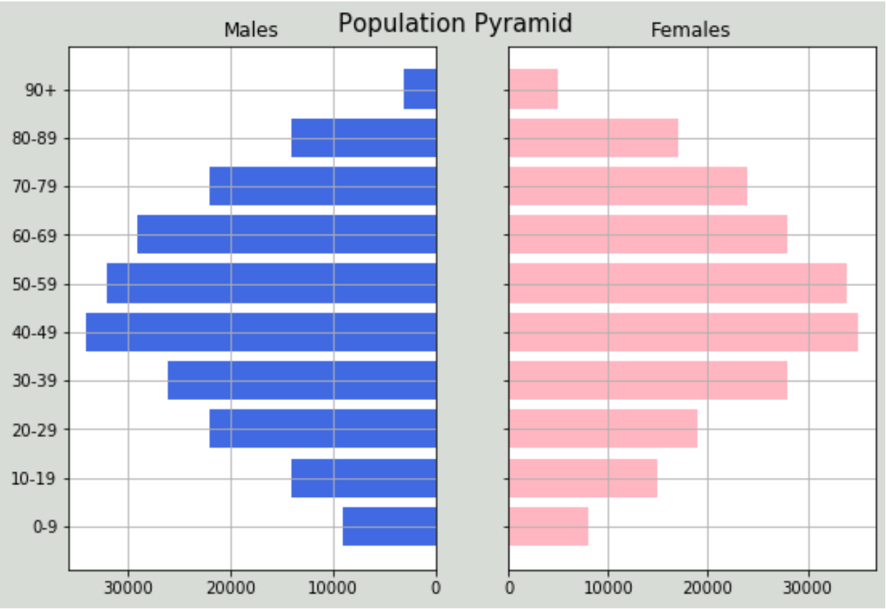
ပေးထားသောနိုင်ငံတစ်ခုအတွက် အသက်အုပ်စုအလိုက် အမျိုးသားနှင့်အမျိုးသမီး စုစုပေါင်းလူဦးရေကိုပြသသည့် အောက်ပါဒေတာအတွဲရှိသည်ဆိုပါစို့။
 #import libraries
import numpy as np
import pandas as pd
import matplotlib.pyplot as plt

#create dataframe
df = pd.DataFrame({'Age': ['0-9','10-19','20-29','30-39','40-49','50-59','60 -69','70-79','80-89','90+'],
                    'Male': [9000, 14000, 22000, 26000, 34000, 32000, 29000, 22000, 14000, 3000],
                    'Female': [8000, 15000, 19000, 28000, 35000, 34000, 28000, 24000, 17000, 5000]})
#view dataframe
df

    Age Male Female
0 0-9 9000 8000
1 10-19 14000 15000
2 20-29 22000 19000
3 30-39 26000 28000
4 40-49 34000 35000
5 50-59 32000 34000
6 60-69 29000 28000
7 70-79 22000 24000
8 80-89 14000 17000
9 90+ 3000 5000
ဒေတာအတွက် လူဦးရေပိရမစ်တစ်ခုကို ဖန်တီးရန် အောက်ပါကုဒ်ကို ကျွန်ုပ်တို့ အသုံးပြုနိုင်ပါသည်။
 #define x and y limits
y = range(0, len(df))
x_male = df['Male']
x_female = df['Female']

#define plot parameters
fig, axes = plt.subplots(ncols=2, sharey=True, figsize=(9, 6))

#specify background color and plot title
fig.patch.set_facecolor('xkcd:light grey')
plt.figtext(.5,.9,"Population Pyramid", fontsize=15, ha='center')

#define male and female bars
axes[0].barh(y, x_male, align='center', color='royalblue')
axes[0].set(title='Males')
axes[1].barh(y, x_female, align='center', color='lightpink')
axes[1].set(title='Females')

#adjust grid parameters and specify labels for y-axis
axes[1].grid()
axes[0].set(yticks=y, yticklabels=df['Age'])
axes[0].invert_xaxis()
axes[0].grid()

#displayplot
plt.show()
ဂရပ်ဖ်တွင် အမျိုးသားနှင့် အမျိုးသမီး ခွဲဝေမှုသည် မျှတစွာ အချိုးကျကြောင်း ပြသထားပြီး လူဦးရေအများစုသည် လူလတ်ပိုင်းအရွယ် ဘောင်သို့ ကျရောက်သွားကြောင်း ပြသသည်။ ဤဂရပ်ကိုကြည့်ရုံဖြင့်၊ ဤနိုင်ငံတစ်ခု၏ လူဦးရေပုံသဏ္ဍာန်ဆိုင်ရာ အကြံဥာဏ်ကောင်းကို ကျွန်ုပ်တို့ ရရှိနိုင်ပါသည်။
matplotlib အရောင်စာရင်းတွင် အရောင်များကို သတ်မှတ်ခြင်းဖြင့် သင်သည် ကွက်ကွက်နောက်ခံနှင့် ဘားတစ်ခုချင်းစီ၏ အရောင်များကို ချိန်ညှိနိုင်သည်ကို သတိပြုပါ။
ဥပမာအားဖြင့်၊ ကျွန်ုပ်တို့သည် “ အဝါနုရောင်ရှိသော” နောက်ခံဖြင့်အသုံးပြုရန် “ hotpink” နှင့် “ dodgerblue” ကို သတ်မှတ်နိုင်သည်-
 fig.patch.set_facecolor('xkcd: beige ')

axes[0].barh(y, x_male, align='center', color=' dodgerblue ')

axes[1].barh(y, x_female, align='center', color=' hotpink ')

plt.show()

သင့်အတွက် အသင့်တော်ဆုံးဖြစ်မည့်အရောင်ပေါ် မူတည်၍ အရောင် palette ကို လွတ်လပ်စွာပြောင်းပါ။
စာရေးသူအကြောင်း
Benjamin Anderson
မင်္ဂလာပါ၊ ကျွန်ုပ်သည် အငြိမ်းစား စာရင်းအင်း ပါမောက္ခ ဘင်ဂျမင်ဖြစ်ပြီး သီးသန့် Statorials ဆရာအဖြစ် လှည့်ပတ်ပါသည်။ စာရင်းဇယားနယ်ပယ်တွင် ကျယ်ပြန့်သောအတွေ့အကြုံနှင့် ကျွမ်းကျင်မှုနှင့်အတူ၊ Statorials မှတစ်ဆင့် ကျောင်းသားများကို ခွန်အားဖြစ်စေရန်အတွက် ကျွန်ုပ်၏အသိပညာကို မျှဝေလိုပါသည်။ ပိုသိတယ်။