Python တွင် chi-square ဖြန့်ချီပုံကို ဘယ်လိုဆွဲမလဲ။
Python တွင် Chi-square ဖြန့်ဝေမှုကို ကြံစည်ရန်၊ သင်သည် အောက်ပါ syntax ကို အသုံးပြုနိုင်သည်။
 #x-axis ranges from 0 to 20 with .001 steps
x = np. arange (0, 20, 0.001)

#plot Chi-square distribution with 4 degrees of freedom
plt. plot (x, chi2. pdf (x, df= 4 ))
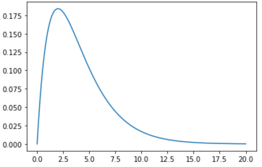
x- array သည် x-axis ၏ အကွာအဝေးကို သတ်မှတ်ပေးပြီး plt.plot() သည် သတ်မှတ်ထားသော ဒီဂရီလွတ်လပ်မှုဖြင့် chi-square ဖြန့်ဖြူးမှု၏ကွက်ကွက်ကို ထုတ်လုပ်သည်။
အောက်ဖော်ပြပါ ဥပမာများသည် ဤလုပ်ဆောင်ချက်များကို လက်တွေ့အသုံးချနည်းကို ပြသထားသည်။
ဥပမာ 1- တစ်ခုတည်းသော Chi-Square ဖြန့်ဝေမှုကို စီစဉ်ခြင်း။
အောက်ဖော်ပြပါကုဒ်သည် လွတ်လပ်မှု 4 ဒီဂရီဖြင့် Chi-square ဖြန့်ဝေမှုမျဉ်းကွေးတစ်ခုအား မည်သို့ဆွဲမည်ကို ပြသထားသည်။
 import numpy as np
import matplotlib. pyplot as plt
from scipy. stats import chi2

#x-axis ranges from 0 to 20 with .001 steps
x = np. arange (0, 20, 0.001)

#plot Chi-square distribution with 4 degrees of freedom
plt. plot (x, chi2. pdf (x, df= 4 ))
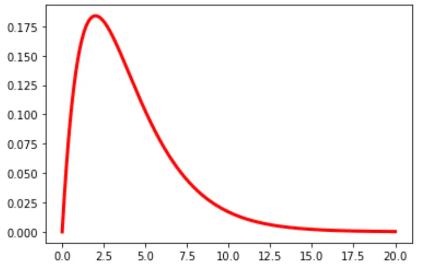
ဇယားရှိ စာကြောင်း၏အရောင်နှင့် အကျယ်ကိုလည်း သင်ပြောင်းနိုင်သည်-
plt. plot (x, chi2. pdf (x, df= 4 ), color=' red ', linewidth= 3 )
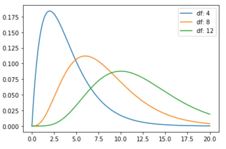
ဥပမာ 2- Chi-Square အများအပြားဖြန့်ဝေမှုများကို စီစဉ်ခြင်း။
အောက်ပါကုဒ်သည် လွတ်လပ်မှုဒီဂရီအမျိုးမျိုးဖြင့် ချီစတုရန်းဖြန့်ဝေမှုမျဉ်းကွေးများစွာကို မည်သို့ရေးဆွဲရမည်ကို ပြသသည်-
 import numpy as np
import matplotlib. pyplot as plt
from scipy. stats import chi2

#x-axis ranges from 0 to 20 with .001 steps
x = np. arange (0, 20, 0.001)

#define multiple Chi-square distributions
plt. plot (x, chi2. pdf (x, df= 4 ), label=' df: 4 ')
plt. plot (x, chi2. pdf (x, df= 8 ), label=' df: 8 ')
plt. plot (x, chi2. pdf (x, df= 12 ), label=' df: 12 ')

#add legend to plot
plt. legend ()
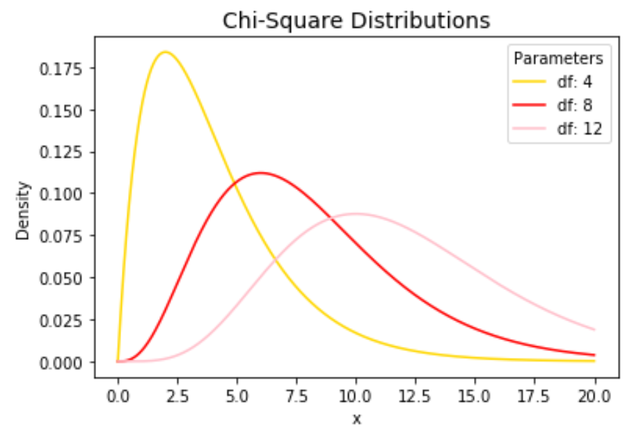
လိုင်းအရောင်များကို လွတ်လပ်စွာပြောင်းနိုင်ပြီး ဇယားကို အပြီးသတ်ရန် ခေါင်းစဉ်နှင့် ဝင်ရိုးအညွှန်းများ ထည့်ပါ-
 import numpy as np
import matplotlib. pyplot as plt
from scipy. stats import chi2

#x-axis ranges from 0 to 20 with .001 steps
x = np. arange (0, 20, 0.001)

#define multiple Chi-square distributions
plt. plot (x, chi2. pdf (x, df= 4 ), label=' df: 4 ', color=' gold ')
plt. plot (x, chi2. pdf (x, df= 8 ), label=' df: 8 ', color=' red ')
plt. plot (x, chi2. pdf (x, df= 12 ), label=' df: 12 ', color=' pink ')

#add legend to plot
plt. legend (title=' Parameters ')

#add axes labels and a title
plt. ylabel (' Density ')
plt. xlabel (' x ')
plt. title (' Chi-Square Distributions ', fontsize= 14 )
plt.plot() လုပ်ဆောင်ချက်၏ အသေးစိတ်ရှင်းလင်းချက်အတွက် matplotlib စာရွက်စာတမ်းကို ကိုးကားပါ။
စာရေးသူအကြောင်း
Benjamin Anderson
မင်္ဂလာပါ၊ ကျွန်ုပ်သည် အငြိမ်းစား စာရင်းအင်း ပါမောက္ခ ဘင်ဂျမင်ဖြစ်ပြီး သီးသန့် Statorials ဆရာအဖြစ် လှည့်ပတ်ပါသည်။ စာရင်းဇယားနယ်ပယ်တွင် ကျယ်ပြန့်သောအတွေ့အကြုံနှင့် ကျွမ်းကျင်မှုနှင့်အတူ၊ Statorials မှတစ်ဆင့် ကျောင်းသားများကို ခွန်အားဖြစ်စေရန်အတွက် ကျွန်ုပ်၏အသိပညာကို မျှဝေလိုပါသည်။ ပိုသိတယ်။