R တွင် regression line ဖြင့် scatterplot တစ်ခုကို ဖန်တီးနည်း
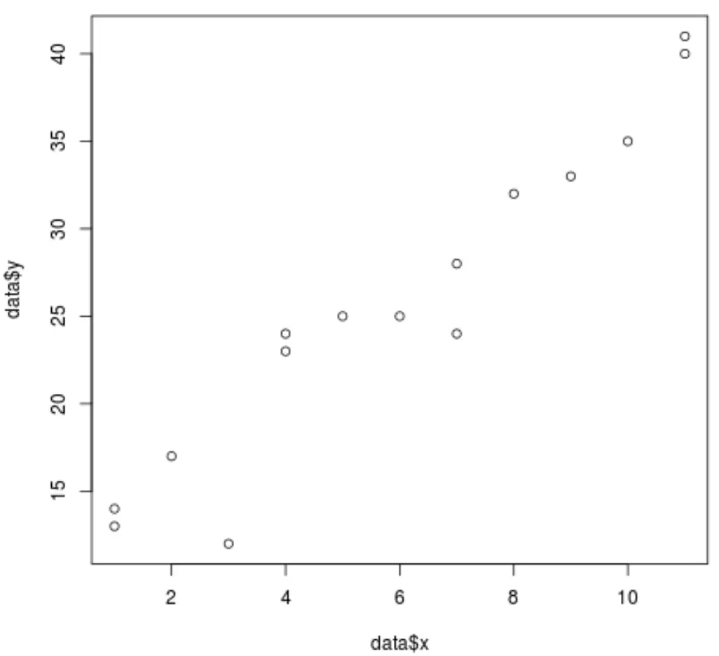
ကျွန်ုပ်တို့သည် ရိုးရှင်းသော မျဉ်းကြောင်းပြန်ဆုတ်ခြင်းကို လုပ်ဆောင်သောအခါတွင်၊ ကျွန်ုပ်တို့သည် မတူညီသော x နှင့် y တန်ဖိုးများ၏ ပေါင်းစပ်မှုများကို မြင်သာစေရန် scatterplot တစ်ခုကို ဖန်တီးလိုပါသည်။
ကံအားလျော်စွာ၊ R သည် plot() လုပ်ဆောင်ချက်ကို အသုံးပြု၍ point cloud များကိုဖန်တီးရန် လွယ်ကူစေသည်။ ဥပမာအားဖြင့်:
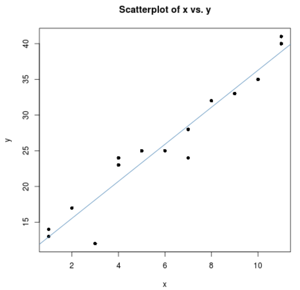
 #create some fake data
data <- data.frame(x = c(1, 1, 2, 3, 4, 4, 5, 6, 7, 7, 8, 9, 10, 11, 11),
                   y = c(13, 14, 17, 12, 23, 24, 25, 25, 24, 28, 32, 33, 35, 40, 41))

#create scatterplot of data
plot(data$x, data$y)
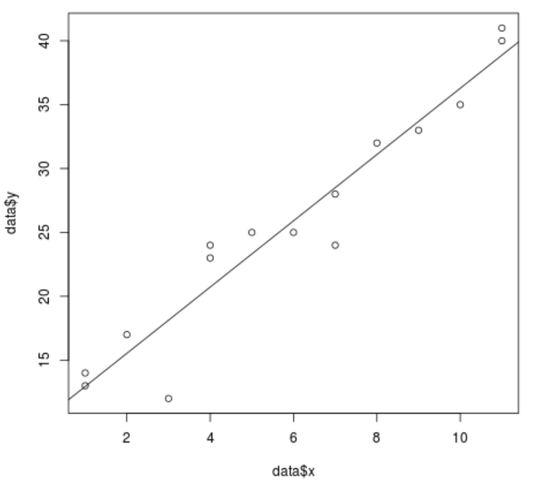
abline() လုပ်ဆောင်ချက်ကို အသုံးပြု၍ scatterplot တွင် regression line တစ်ခုထည့်ရန်လည်း လွယ်ကူပါသည်။
ဥပမာအားဖြင့်:
 #fit a simple linear regression model
model <- lm(y ~ x, data = data)

#add the fitted regression line to the scatterplot
abline(model)
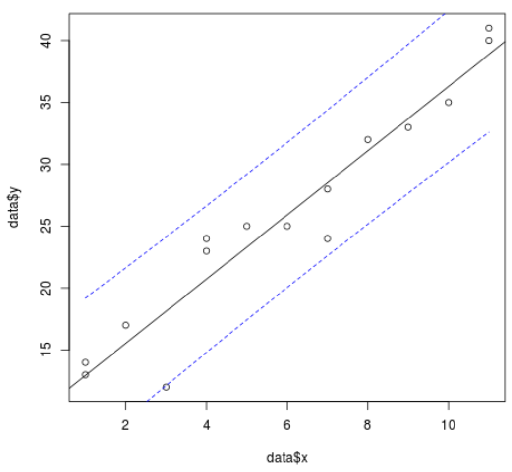
ကျွန်ုပ်တို့သည် ကြိုတင်ခန့်မှန်း() လုပ်ဆောင်ချက်ကို အသုံးပြု၍ ကြံစည်မှုသို့ ယုံကြည်မှုကြားကာလမျဥ်းများကို ပေါင်းထည့်နိုင်သည်-
 #define range of x values
newx = seq(min(data$x),max(data$x),by = 1)

#find 95% confidence interval for the range of x values
conf_interval <- predict(model, newdata=data.frame(x=newx), interval="confidence",
                         level = 0.95)

#create scatterplot of values with regression line
plot(data$x, data$y)
abline(model)

#add dashed lines (lty=2) for the 95% confidence interval
lines(newx, conf_interval[,2], col="blue", lty=2)
lines(newx, conf_interval[,3], col="blue", lty=2)
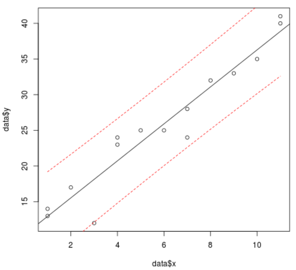
သို့မဟုတ် ခန့်မှန်းချက်() လုပ်ဆောင်ချက်ရှိ ကြားကာလအမျိုးအစားကို သတ်မှတ်ခြင်းဖြင့် ကွက်ကွက်သို့ ခန့်မှန်းသည့်ကြားကာလမျဥ်းများကို ထပ်ထည့်နိုင်သည်-
 #define range of x values
newx = seq(min(data$x),max(data$x),by = 1)

#find 95% prediction interval for the range of x values
pred_interval <- predict(model, newdata=data.frame(x=newx), interval="prediction" ,
                         level = 0.95)

#create scatterplot of values with regression line
plot(data$x, data$y)
abline(model)

#add dashed lines (lty=2) for the 95% confidence interval
lines(newx, pred_interval[,2], col="red", lty=2)
lines(newx, pred_interval[,3], col="red", lty=2)
နောက်ဆုံးတွင်၊ ခေါင်းစဉ်တစ်ခုထည့်ခြင်း၊ ဝင်ရိုးအမည်များကိုပြောင်းလဲခြင်းနှင့် တစ်ဦးချင်းဆွဲကွက်အမှတ်များ၏ပုံသဏ္ဍာန်ကိုပြောင်းလဲခြင်းဖြင့် ဇာတ်ကွက်ကို ပိုမိုသာယာလှပစေနိုင်ပါသည်။
 plot(data$x, data$y,
     main = "Scatterplot of x vs. y", #add title
     pch=16, #specify points to be filled in
     xlab='x', #change x-axis name
ylab='y') #change y-axis name

abline(model, col='steelblue') #specify color of regression line
ထပ်လောင်းအရင်းအမြစ်များ
အောက်ဖော်ပြပါ သင်ခန်းစာများသည် R တွင် အခြားဘုံအလုပ်များကို မည်သို့လုပ်ဆောင်ရမည်ကို ရှင်းပြသည်-
R ဖြင့် ခွဲခြမ်းစိတ်ဖြာမှုတစ်ခုတွင် အမှတ်အသားပြုနည်း
Point clouds အတွက် R တွင် Jitter လုပ်ဆောင်ချက်ကို အသုံးပြုနည်း
စာရေးသူအကြောင်း
Benjamin Anderson
မင်္ဂလာပါ၊ ကျွန်ုပ်သည် အငြိမ်းစား စာရင်းအင်း ပါမောက္ခ ဘင်ဂျမင်ဖြစ်ပြီး သီးသန့် Statorials ဆရာအဖြစ် လှည့်ပတ်ပါသည်။ စာရင်းဇယားနယ်ပယ်တွင် ကျယ်ပြန့်သောအတွေ့အကြုံနှင့် ကျွမ်းကျင်မှုနှင့်အတူ၊ Statorials မှတစ်ဆင့် ကျောင်းသားများကို ခွန်အားဖြစ်စေရန်အတွက် ကျွန်ုပ်၏အသိပညာကို မျှဝေလိုပါသည်။ ပိုသိတယ်။