Pandas စီးရီးမှ histogram တစ်ခုကို ဖန်တီးနည်း
ပန်ဒါစီးရီးတစ်ခုမှ ဟီစတိုဂရမ်တစ်ခုကို ဖန်တီးရန် အောက်ပါအခြေခံ syntax ကို သင်အသုံးပြုနိုင်သည်-
my_series. plot (kind=' hist ')
အောက်ပါဥပမာများသည် ဤ syntax ကိုလက်တွေ့တွင်မည်သို့အသုံးပြုရမည်ကိုပြသထားသည်။
မှတ်ချက် – အကယ်၍ သင်သည် အွန်လိုင်း Python မှတ်စုစာအုပ်ကို အသုံးပြုနေပြီး ဤအစီအစဥ်ကို အသုံးပြုပြီးနောက် histogram ပေါ်မလာပါက၊ သင်သည် %matplotlib အွန်လိုင်းတွင် ဦးစွာ သတ်မှတ်ရန် လိုအပ်နိုင်သည်။
ဥပမာ 1- ကြိမ်နှုန်း histogram ဖန်တီးပါ။
အောက်ဖော်ပြပါ ကုဒ်သည် ပန်ဒါစီးရီးတစ်ခုမှ ကြိမ်နှုန်း ဟီစတိုဂရမ် ဖန်တီးနည်းကို ပြသသည်-
 import pandas as pd

#createSeries
data = pd. Series ([2, 2, 2, 3, 3, 4, 5, 7, 8, 9, 12, 12, 14, 15, 16, 16, 18,
                    19, 22, 22, 22, 25, 26, 27, 30, 33, 33, 33, 34, 35])

#create histogram from Series
data. plot (kind=' hist ')
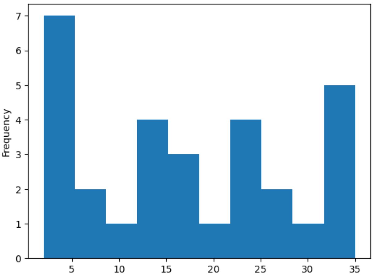
x-axis သည် pandas စီးရီး၏တန်ဖိုးများကိုပြသပြီး y-axis သည် တန်ဖိုးတစ်ခုစီ၏ကြိမ်နှုန်းကိုပြသသည်။
ဥပမာ 2- သိပ်သည်းဆ ဟီစတိုဂရမ် ဖန်တီးပါ။
ပန်ဒါစီးရီးတစ်ခုမှ သိပ်သည်းဆ ဟီစတိုဂရမ်တစ်ခုကို ဖန်တီးရန်၊ ကျွန်ုပ်တို့သည် density=True ကို plot() လုပ်ဆောင်ချက်တွင် သတ်မှတ်နိုင်သည်-
 import pandas as pd

#createSeries
data = pd. Series ([2, 2, 2, 3, 3, 4, 5, 7, 8, 9, 12, 12, 14, 15, 16, 16, 18,
                    19, 22, 22, 22, 25, 26, 27, 30, 33, 33, 33, 34, 35])

#create histogram from Series
data. plot (kind=' hist ', density= True )
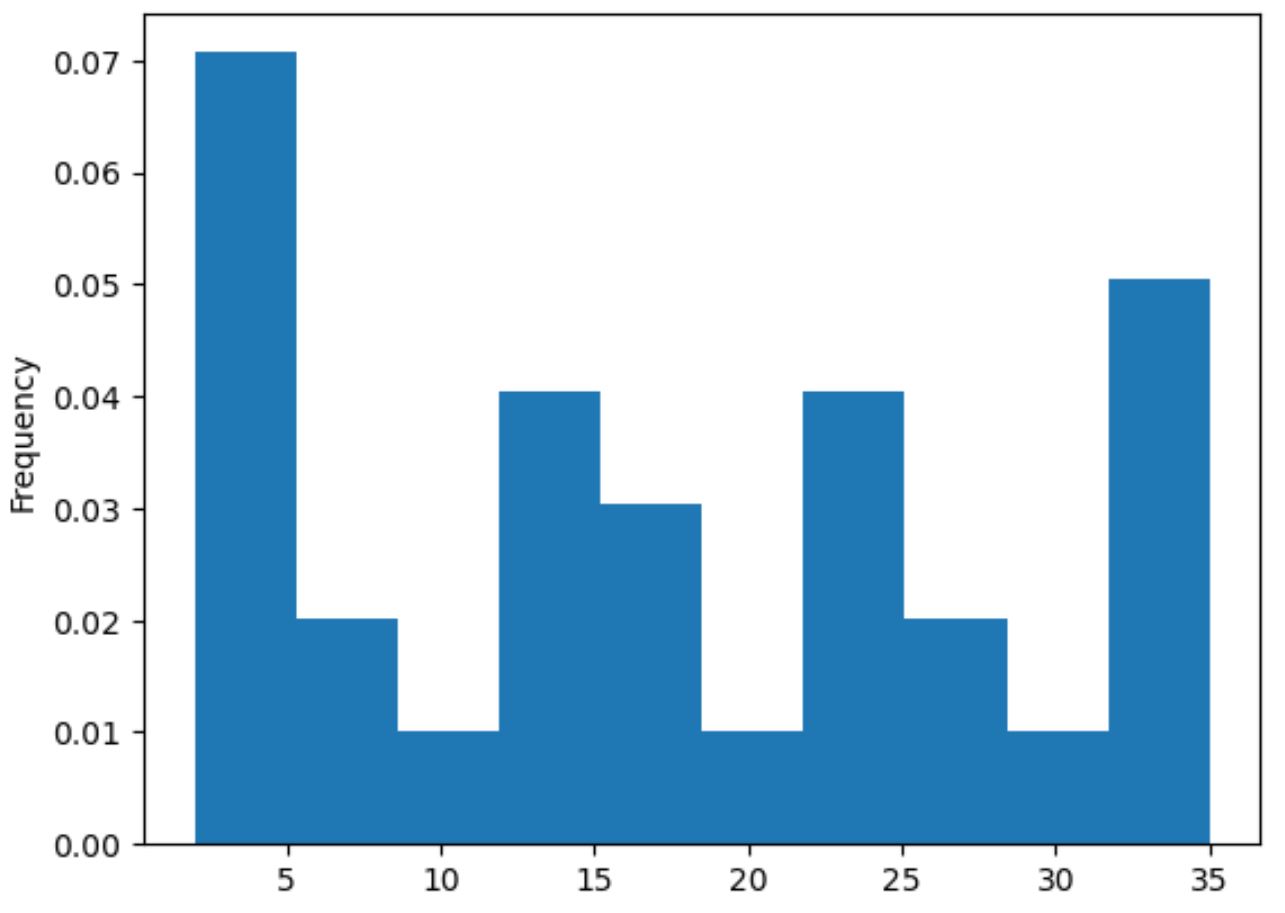
y-ဝင်ရိုးသည် သိပ်သည်းဆကိုပြသနေချိန်တွင် x-axis သည် pandas စီးရီးတန်ဖိုးများကိုပြသသည်။
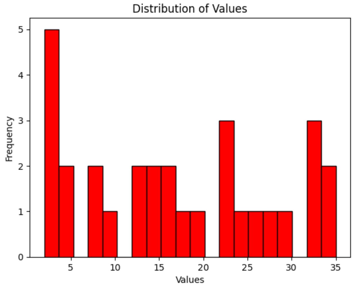
ဥပမာ 3- စိတ်ကြိုက် histogram ဖန်တီးပါ။
နောက်ဆုံးအနေဖြင့်၊ ကျွန်ုပ်တို့သည် ဟစ်စတိုဂရမ်ဘားများ၏အရောင်၊ အသုံးပြုထားသော bins အရေအတွက်၊ ဝင်ရိုးအညွှန်းများနှင့် ဇာတ်လမ်းခေါင်းစဉ်ကို စိတ်ကြိုက်ပြင်ဆင်ရန် အောက်ပါ syntax ကို အသုံးပြုနိုင်ပါသည်။
 import pandas as pd

#createSeries
data = pd. Series ([2, 2, 2, 3, 3, 4, 5, 7, 8, 9, 12, 12, 14, 15, 16, 16, 18,
                    19, 22, 22, 22, 25, 26, 27, 30, 33, 33, 33, 34, 35])

#create histogram with custom color, edgecolor, and number of bins
my_hist = data. plot (kind=' hist ', color=' red ', edgecolor=' black ', bins= 20 )

#add x-axis label
my_hist. set_xlabel (' Values ')

#add title
my_hist. set_title (' Distribution of Values ')
ထပ်လောင်းအရင်းအမြစ်များ
အောက်ပါသင်ခန်းစာများသည် Python တွင် အခြားဘုံကွက်ကွက်များဖန်တီးနည်းကို ရှင်းပြသည်-
Matplotlib တွင် စာကြောင်းများစွာကို ဘယ်လိုဆွဲမလဲ။
Pandas DataFrame မှ boxplot တစ်ခုကို ဖန်တီးနည်း
ဘားဇယားတစ်ခုပေါ်တွင် Pandas ကော်လံများစွာကို ဘယ်လိုဆွဲမလဲ။
စာရေးသူအကြောင်း
Benjamin Anderson
မင်္ဂလာပါ၊ ကျွန်ုပ်သည် အငြိမ်းစား စာရင်းအင်း ပါမောက္ခ ဘင်ဂျမင်ဖြစ်ပြီး သီးသန့် Statorials ဆရာအဖြစ် လှည့်ပတ်ပါသည်။ စာရင်းဇယားနယ်ပယ်တွင် ကျယ်ပြန့်သောအတွေ့အကြုံနှင့် ကျွမ်းကျင်မှုနှင့်အတူ၊ Statorials မှတစ်ဆင့် ကျောင်းသားများကို ခွန်အားဖြစ်စေရန်အတွက် ကျွန်ုပ်၏အသိပညာကို မျှဝေလိုပါသည်။ ပိုသိတယ်။