ပန်ဒါများ- ထိပ်တန်းတန်ဖိုး ၁၀ ခုကို မြင်ယောင်နိုင်ရန် ဘားဇယားကို ဖန်တီးနည်း
သတ်မှတ်ထားသော ကော်လံတစ်ခုတွင် မကြာခဏ အများဆုံးတန်ဖိုး 10 ခုသာပါဝင်သည့် ပန်ဒါများတွင် ဘားဇယားတစ်ခုဖန်တီးရန် အောက်ပါအခြေခံ syntax ကို သင်အသုံးပြုနိုင်သည်-
 import pandas as pd
import matplotlib. pyplot as plt

#find values with top 10 occurrences in 'my_column'
top_10 = (df[' my_column ']. value_counts ()). iloc [:10]

#create bar chart to visualize top 10 values
top_10. plot (kind='bar')
အောက်ဖော်ပြပါ ဥပမာသည် ဤ syntax ကို လက်တွေ့တွင် မည်သို့အသုံးပြုရမည်ကို ပြသထားသည်။
ဥပမာ- ထိပ်တန်းတန်ဖိုး ၁၀ ခုကို မြင်ယောင်နိုင်ရန် Pandas တွင် ဘားဇယားတစ်ခု ဖန်တီးပါ။
ကျွန်ုပ်တို့တွင် မတူညီသော ဘတ်စကတ်ဘောကစားသမား 500 မှ ရမှတ်များအသင်းအမည်နှင့် အမှတ်များအကြောင်း အချက်အလက်များပါရှိသော အောက်ပါပန်ဒါ DataFrame ရှိသည်ဆိုပါစို့။
 import pandas as pd
import numpy as np
from string import ascii_uppercase
import random
from random import choice

#make this example reproducible
random. seeds (1)
n.p. random . seeds (1)

#createDataFrame
df = pd. DataFrame ({' team ': [choice(ascii_uppercase) for _ in range(500)],
                   ' points ': np. random . uniform (0, 20, 500)})

#view first five rows of DataFrame
print ( df.head ())

  team points
0 E 8.340440
1 S 14.406490
2 Z 0.002287
3 Y 6.046651
4 C 2.935118
အဖွဲ့ ကော်လံရှိ မကြာခဏဆိုသလို တန်ဖိုး ၁၀ ခုကို ပြသသည့် ဘားကားချပ်တစ်ခု ဖန်တီးရန် အောက်ပါ syntax ကို အသုံးပြုနိုင်သည်။
 import matplotlib. pyplot as plt

#find teams with top 10 occurrences
top_10_teams = (df[' team ']. value_counts ()).[:10]

#create bar chart of top 10 teams
top_10_teams. plot (kind=' bar ')
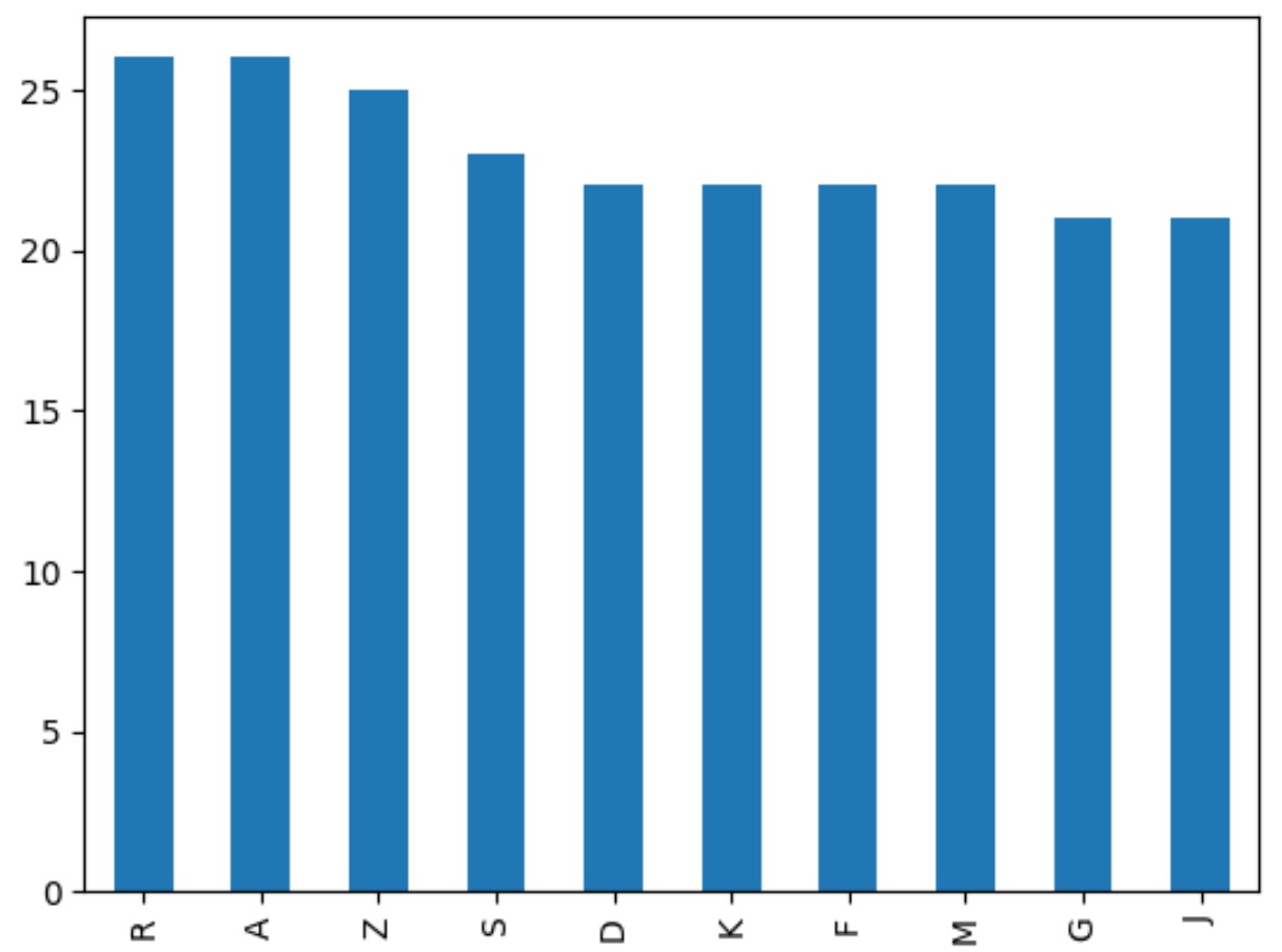
ဘားဂရပ်တွင် မကြာခဏ အများဆုံးအသင်း ၁၀ သင်း၏ အမည်များသာ ပါရှိသည်။
x-axis သည် team name ကိုပြသပြီး y-axis သည် frequency ကိုပြသသည်။
ပိုမိုသာယာလှပစေရန် ဇာတ်ကွက်ကိုလည်း စိတ်ကြိုက်ပြင်ဆင်နိုင်သည်ကို သတိပြုပါ။
 import matplotlib. pyplot as plt

#find teams with top 10 occurrences
top_10_teams = (df[' team ']. value_counts ()).[:10]

#create bar chart of top 10 teams
top_10_teams. plot (kind=' bar ', edgecolor=' black ', rot=0)

#add axis labels
plt. xlabel (' Team ')
plt. ylabel (' Frequency ')
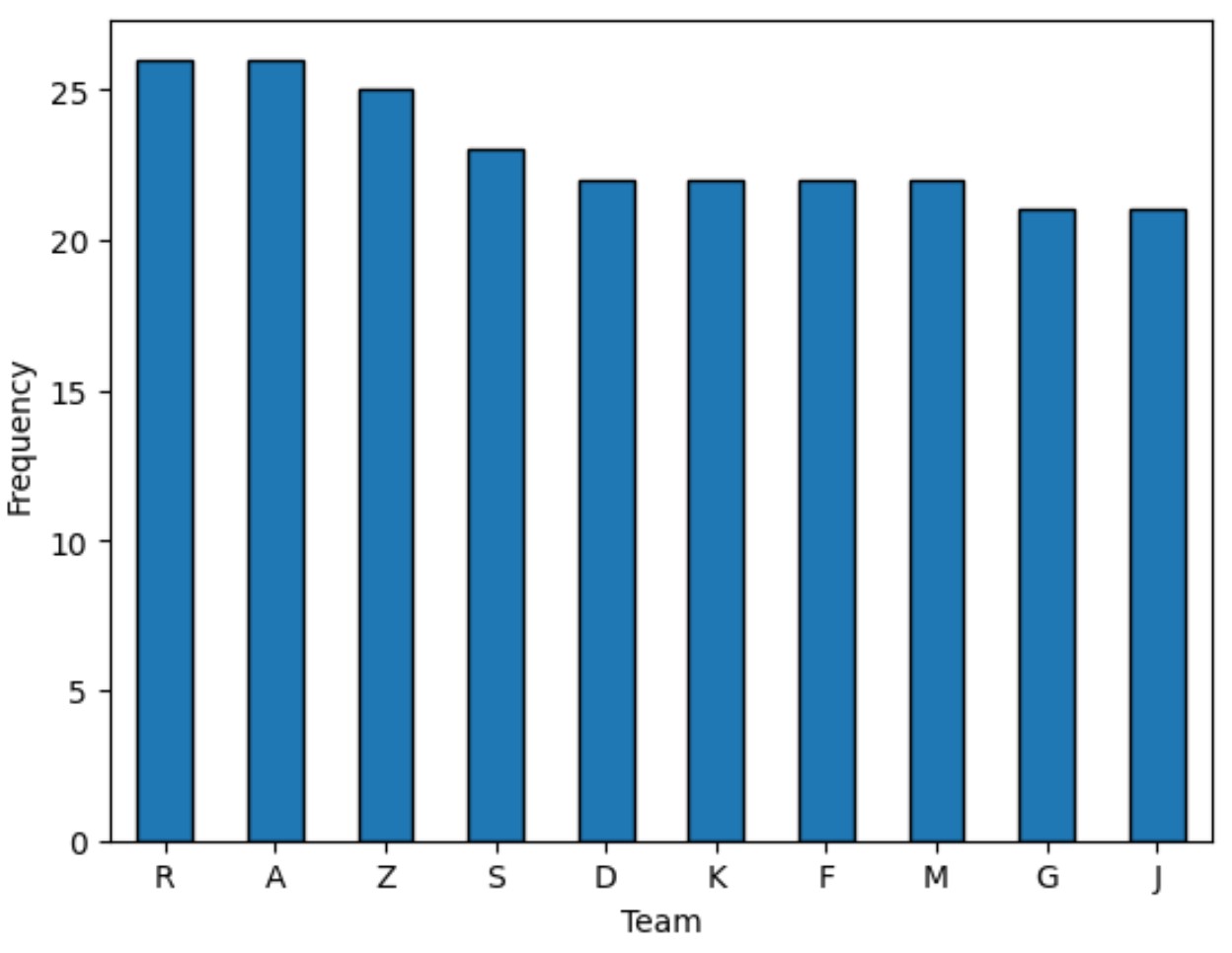
edgecolor argument သည် bar တစ်ခုစီတွင် အနက်ရောင်ဘောင်တစ်ခုကို ထည့်ထားပြီး rot argument သည် x-axis အညွှန်းများကို 90 ဒီဂရီ လှည့်၍ ဖတ်ရပိုမိုလွယ်ကူစေကြောင်း သတိပြုပါ။
ထပ်လောင်းအရင်းအမြစ်များ
အောက်ဖော်ပြပါ သင်ခန်းစာများသည် ပန်ဒါများတွင် အခြားဘုံအလုပ်များကို မည်သို့လုပ်ဆောင်ရမည်ကို ရှင်းပြသည်-
Pandas- Stacked Bar Chart ဖန်တီးနည်း
Pandas- ဘားကွက်တစ်ခုတွင် ဘားများကို မှတ်သားနည်း
Pandas- ဘားကားချပ်တစ်ခုပေါ်တွင် ကော်လံများစွာကို ဘယ်လိုဆွဲမလဲ။
စာရေးသူအကြောင်း
Benjamin Anderson
မင်္ဂလာပါ၊ ကျွန်ုပ်သည် အငြိမ်းစား စာရင်းအင်း ပါမောက္ခ ဘင်ဂျမင်ဖြစ်ပြီး သီးသန့် Statorials ဆရာအဖြစ် လှည့်ပတ်ပါသည်။ စာရင်းဇယားနယ်ပယ်တွင် ကျယ်ပြန့်သောအတွေ့အကြုံနှင့် ကျွမ်းကျင်မှုနှင့်အတူ၊ Statorials မှတစ်ဆင့် ကျောင်းသားများကို ခွန်အားဖြစ်စေရန်အတွက် ကျွန်ုပ်၏အသိပညာကို မျှဝေလိုပါသည်။ ပိုသိတယ်။