Como criar uma legenda manual em ggplot2 (com exemplos)
Muitas vezes você pode querer adicionar uma legenda manual a um gráfico no ggplot2 com cores, rótulos, título personalizados, etc.
Felizmente, isso é simples de fazer usando a função scale_color_manual() e o exemplo a seguir mostra como fazer isso.
Exemplo: criando uma legenda manual em ggplot2
O código a seguir mostra como traçar três linhas de regressão ajustadas em um gráfico em ggplot2 com uma legenda manual personalizada:
 library (ggplot2)

#create data frame
df <- data. frame (x=c(1, 2, 2, 3, 5, 6, 8, 8, 9, 9, 10, 11, 12, 15, 15),
                 y=c(2, 3, 3, 4, 5, 5, 6, 7, 8, 8, 9, 10, 16, 19, 28))

#create plot with three fitted regression models
ggplot(df, aes(x, y)) +
  geom_point() +
  geom_smooth(se= FALSE , aes(color=' Linear ')) +
  geom_smooth(formula=y~poly(x, 2), se= FALSE , aes(color=' Quadratic ')) +
  geom_smooth(formula=y~poly(x, 3), se= FALSE , aes(color=' Cubic ')) +
  scale_color_manual(name=' Regression Model ',
                     breaks=c(' Linear ', ' Quadratic ', ' Cubic '),
                     values=c(' Cubic '=' pink ', ' Quadratic '=' blue ', ' Linear '=' purple '))
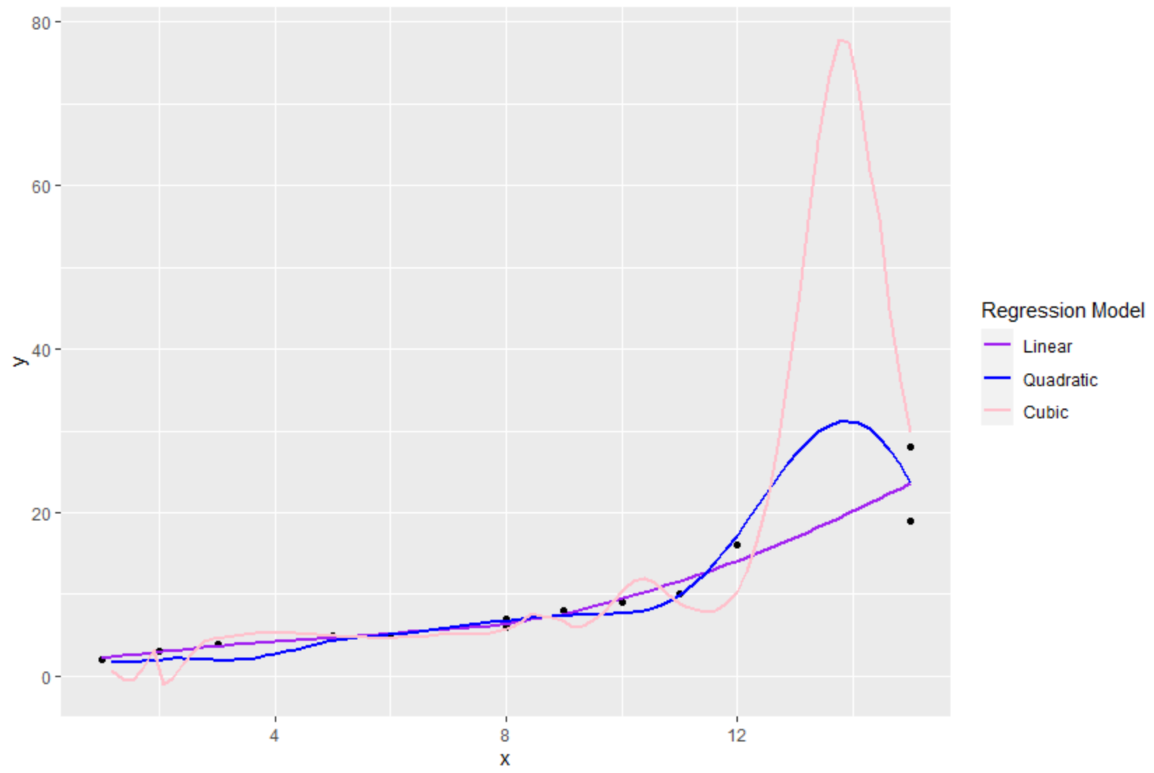
Usando a função scale_color_manual() , pudemos especificar os seguintes aspectos da legenda:
- nome : O título da legenda
- breaks : rótulos na legenda
- valores : as cores na legenda
Observe que também podemos usar a função theme() para alterar o tamanho da fonte dos elementos da legenda:
 library (ggplot2)

#create data frame
df <- data. frame (x=c(1, 2, 2, 3, 5, 6, 8, 8, 9, 9, 10, 11, 12, 15, 15),
                 y=c(2, 3, 3, 4, 5, 5, 6, 7, 8, 8, 9, 10, 16, 19, 28))

#create plot with three fitted regression models
ggplot(df, aes(x, y)) +
  geom_point() +
  geom_smooth(se= FALSE , aes(color=' Linear ')) +
  geom_smooth(formula=y~poly(x, 2), se= FALSE , aes(color=' Quadratic ')) +
  geom_smooth(formula=y~poly(x, 3), se= FALSE , aes(color=' Cubic ')) +
  scale_color_manual(name=' Regression Model ',
                     breaks=c(' Linear ', ' Quadratic ', ' Cubic '),
                     values=c(' Cubic '=' pink ', ' Quadratic '=' blue ', ' Linear '=' purple '))+
 theme(legend. title =element_text(size= 20 ),
       legend. text =element_text(size= 14 ))
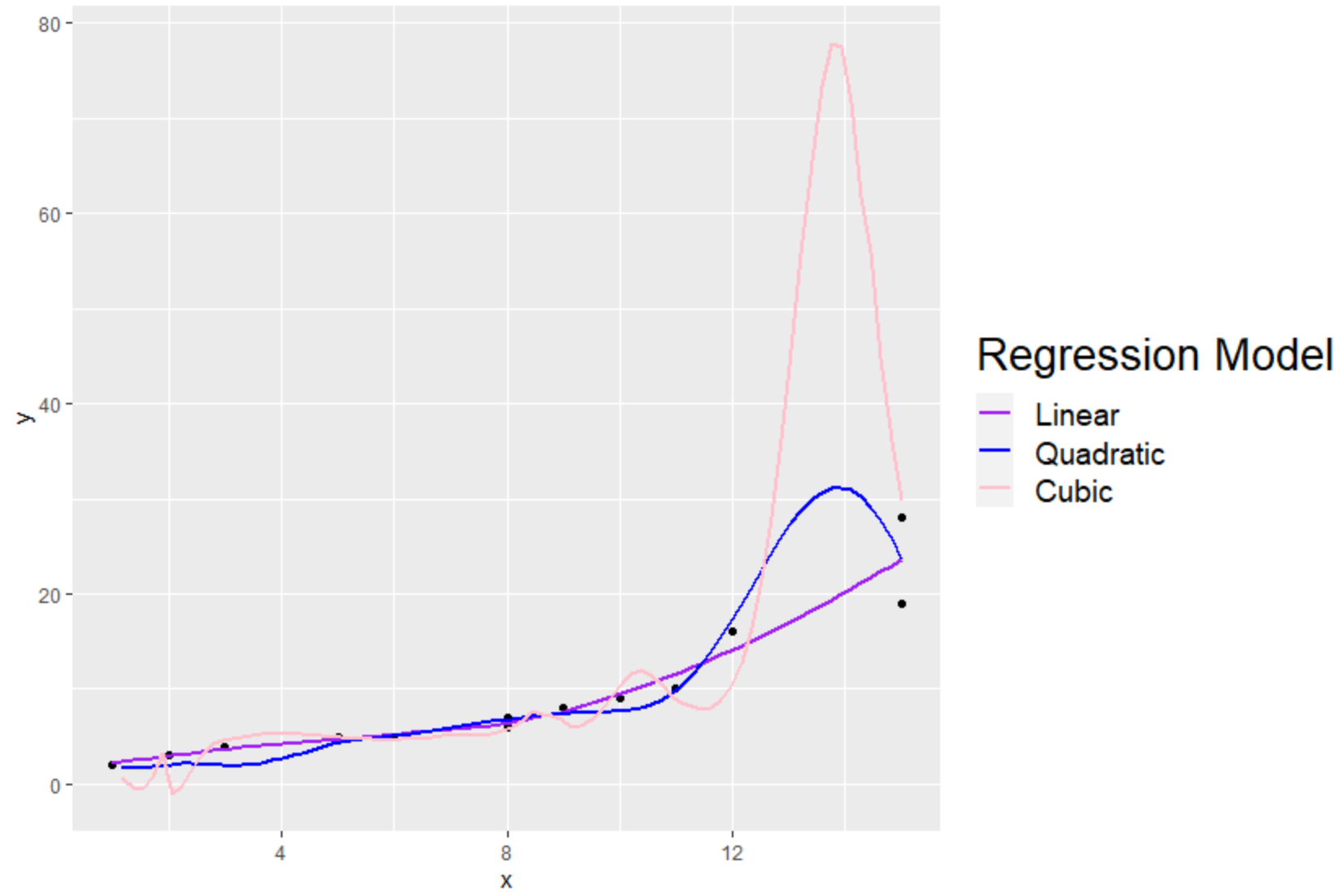
Observe que o tamanho da fonte dos rótulos de título e legenda foi aumentado.
Recursos adicionais
Os tutoriais a seguir explicam como realizar outras operações comuns no ggplot2:
Como alterar a posição da legenda no ggplot2
Como alterar o tamanho da legenda no ggplot2
Como alterar o título da legenda no ggplot2
Como alterar os rótulos das legendas no ggplot2
About Author
Dr. benjamim anderson
Olá, sou Benjamin, um professor aposentado de estatística que se tornou professor dedicado na Statorials. Com vasta experiência e conhecimento na área de estatística, estou empenhado em compartilhar meu conhecimento para capacitar os alunos por meio de Statorials. Saber mais