Как построить временной ряд в matplotlib (с примерами)
Вы можете использовать следующий синтаксис для построения временного ряда в Matplotlib:
 import matplotlib. pyplot as plt

plt. plot (df. x , df. y )
Предполагается, что переменная x принадлежит классу datetime.datetime() .
В следующих примерах показано, как использовать этот синтаксис для построения графика данных временных рядов в Python.
Пример 1. Постройте базовый временной ряд в Matplotlib.
Следующий код показывает, как построить в Matplotlib временной ряд, показывающий общий объем продаж компании за 12 дней подряд:
 import matplotlib. pyplot as plt
import datetime
import numpy as np
import pandas as pd

#define data
df = pd. DataFrame ({' date ': np. array ([datetime. datetime (2020, 1, i+1)
for i in range(12)]),
                   ' sales ': [3, 4, 4, 7, 8, 9, 14, 17, 12, 8, 8, 13]})

#plot time series
plt. plot (df. date , df. sales , linewidth= 3 )
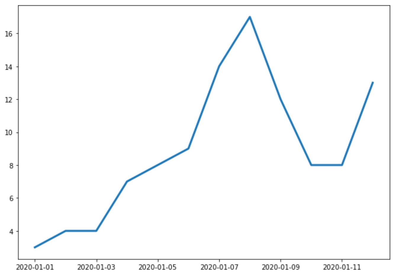
Ось X показывает дату, а ось Y показывает общий объем продаж на каждую дату.
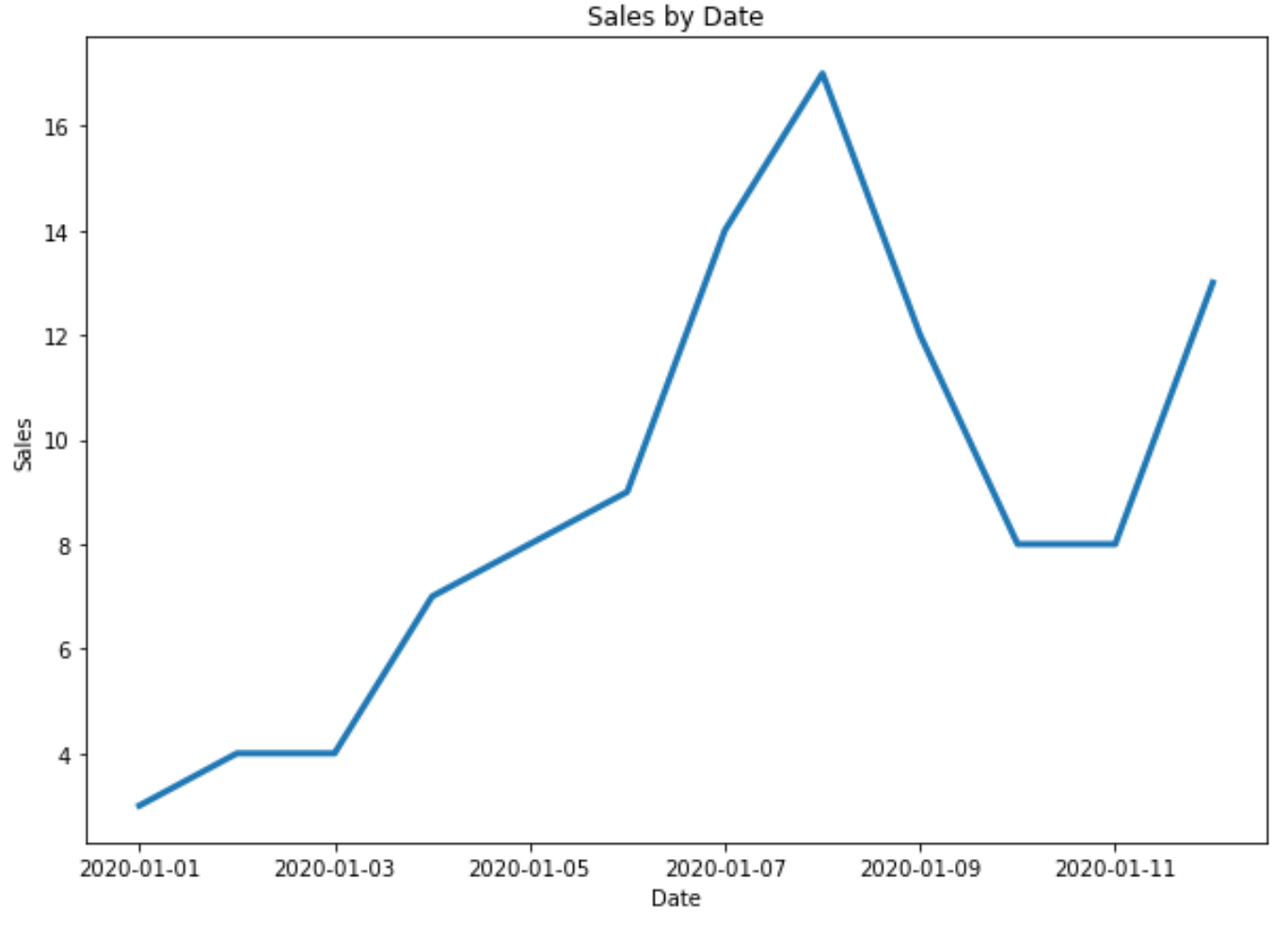
Пример 2. Настройка названий и меток осей
Вы можете использовать следующий код, чтобы добавить к графику заголовок и метки осей:
 import matplotlib. pyplot as plt
import datetime
import numpy as np
import pandas as pd

#define data
df = pd. DataFrame ({' date ': np. array ([datetime. datetime (2020, 1, i+1)
for i in range(12)]),
                   ' sales ': [3, 4, 4, 7, 8, 9, 14, 17, 12, 8, 8, 13]})

#plot time series
plt. plot (df. date , df. sales , linewidth= 3 )

#add title and axis labels
plt. title (' Sales by Date ')
plt. xlabel (' Date ')
plt. ylabel (' Sales ')
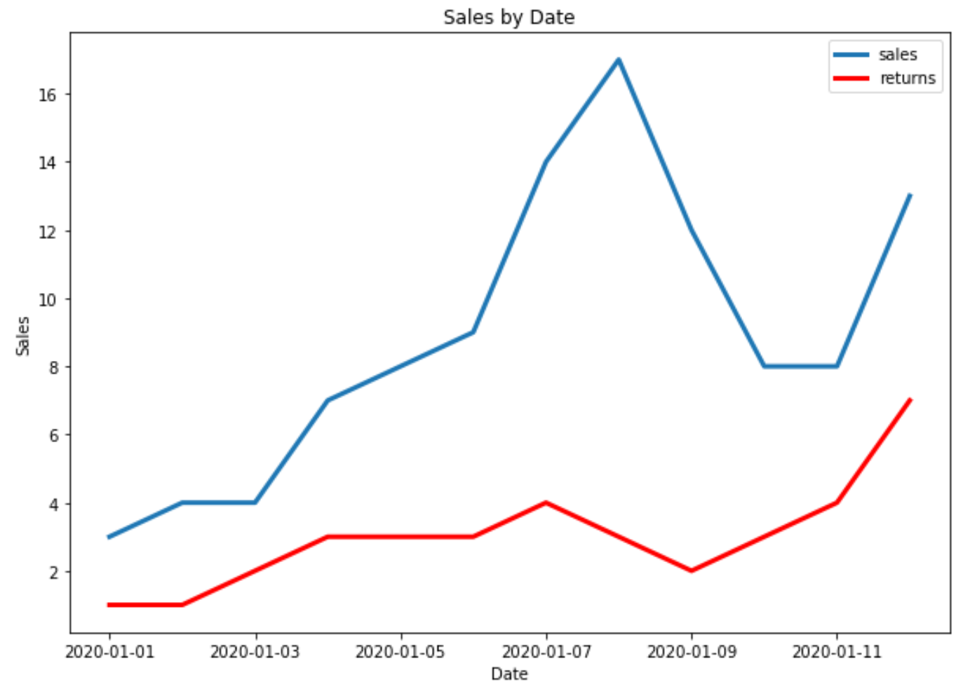
Пример 3: построение нескольких временных рядов в Matplotlib
Следующий код показывает, как построить несколько временных рядов на одном графике в Matplotlib:
 import matplotlib. pyplot as plt
import datetime
import numpy as np
import pandas as pd

#define data
df = pd. DataFrame ({' date ': np. array ([datetime. datetime (2020, 1, i+1)
                                     for i in range(12)]),
                   ' sales ': [3, 4, 4, 7, 8, 9, 14, 17, 12, 8, 8, 13]})

df2 = pd. DataFrame ({' date ': np. array ([datetime. datetime (2020, 1, i+1)
                                      for i in range(12)]),
                   ' returns ': [1, 1, 2, 3, 3, 3, 4, 3, 2, 3, 4, 7]})

#plot both time series
plt. plot ( df.date , df.sales , label=' sales ', linewidth= 3 )
plt. plot ( df2.date , df2.returns , color=' red ', label=' returns ', linewidth= 3 )

#add title and axis labels
plt. title (' Sales by Date ')
plt. xlabel (' Date ')
plt. ylabel (' Sales ')

#add legend
plt. legend ()

#displayplot
plt. show ()
Дополнительные ресурсы
Matplotlib: как создавать коробчатые диаграммы по группам
Matplotlib: как создавать гистограммы с накоплением
Об авторе
бенджамин андерсон
Здравствуйте, я Бенджамин, профессор статистики на пенсии, ставший преданным преподавателем Statorials. Имея обширный опыт и знания в области статистики, я хочу поделиться своими знаниями, чтобы расширить возможности студентов с помощью Statorials. Узнать больше