วิธีพล็อตการแจกแจงแบบปกติใน python: พร้อมตัวอย่าง
หากต้องการพล็อต การแจกแจงแบบปกติ ใน Python คุณสามารถใช้ไวยากรณ์ต่อไปนี้:
 #x-axis ranges from -3 and 3 with .001 steps
x = np. arange (-3, 3, 0.001)

#plot normal distribution with mean 0 and standard deviation 1
plt. plot (x, norm. pdf (x, 0, 1))
อาร์เรย์ x กำหนดช่วงของแกน x และ plt.plot() จะสร้างเส้นโค้งของการแจกแจงแบบปกติด้วยค่าเฉลี่ยและส่วนเบี่ยงเบนมาตรฐานที่ระบุ
ตัวอย่างต่อไปนี้แสดงวิธีใช้ฟังก์ชันเหล่านี้ในทางปฏิบัติ
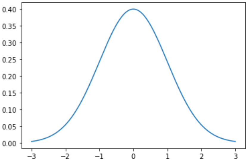
ตัวอย่างที่ 1: พล็อตการแจกแจงแบบปกติเดี่ยว
รหัสต่อไปนี้แสดงวิธีการพล็อตกราฟการแจกแจงแบบปกติเส้นเดียวโดยมีค่าเฉลี่ยเป็น 0 และค่าเบี่ยงเบนมาตรฐานเป็น 1:
 import numpy as np
import matplotlib. pyplot as plt
from scipy. stats import norm

#x-axis ranges from -3 and 3 with .001 steps
x = np. arange (-3, 3, 0.001)

#plot normal distribution with mean 0 and standard deviation 1
plt. plot (x, norm. pdf (x, 0, 1))
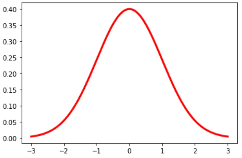
คุณยังสามารถเปลี่ยนสีและความกว้างของเส้นในแผนภูมิได้:
plt. plot (x, norm. pdf (x, 0, 1), color=' red ', linewidth= 3 )
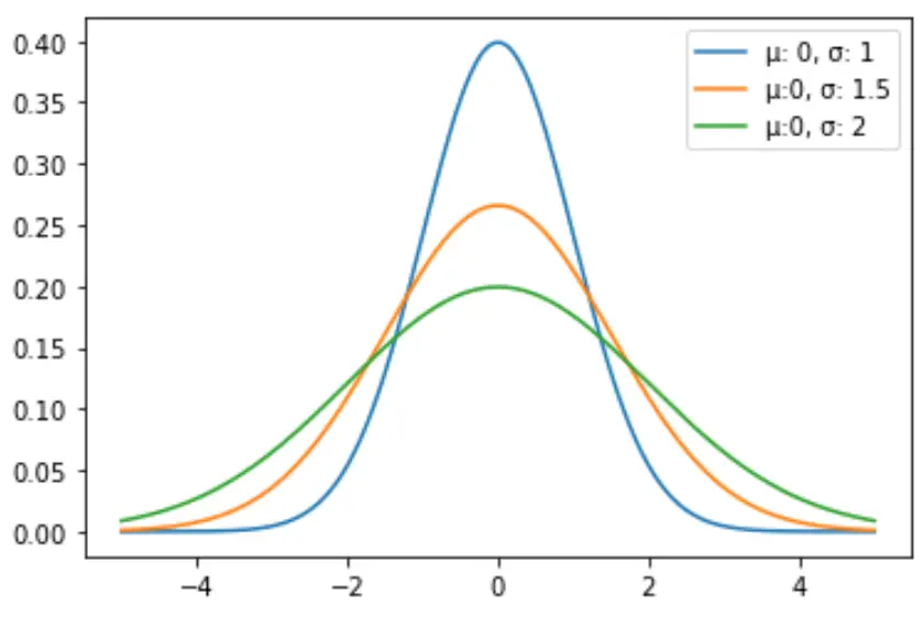
ตัวอย่างที่ 2: พล็อตการแจกแจงแบบปกติหลายรายการ
รหัสต่อไปนี้แสดงวิธีการลงจุดเส้นโค้งการแจกแจงแบบปกติหลายเส้นด้วยวิธีการและส่วนเบี่ยงเบนมาตรฐานที่แตกต่างกัน:
 import numpy as np
import matplotlib. pyplot as plt
from scipy. stats import norm

#x-axis ranges from -5 and 5 with .001 steps
x = np. arange (-5, 5, 0.001)

#define multiple normal distributions
plt. plot (x, norm. pdf (x, 0, 1), label=' μ: 0, σ: 1 ')
plt. plot (x, norm. pdf (x, 0, 1.5), label=' μ:0, σ: 1.5 ')
plt. plot (x, norm. pdf (x, 0, 2), label=' μ:0, σ: 2 ')

#add legend to plot
plt. legend ()
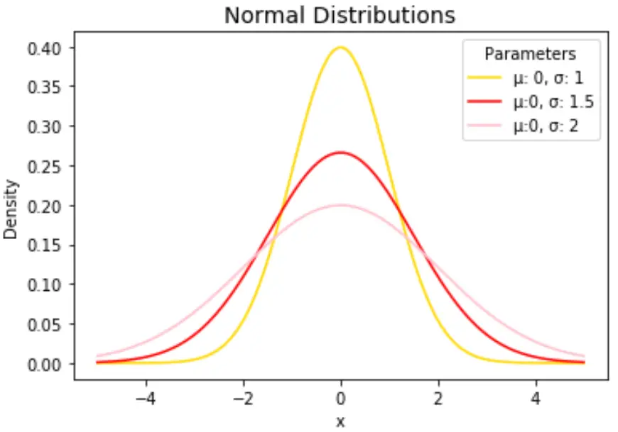
เปลี่ยนสีเส้นและเพิ่มชื่อและป้ายกำกับแกนได้ตามใจชอบเพื่อทำให้แผนภูมิสมบูรณ์:
 import numpy as np
import matplotlib. pyplot as plt
from scipy. stats import norm

#x-axis ranges from -5 and 5 with .001 steps
x = np. arange (-5, 5, 0.001)

#define multiple normal distributions
plt. plot (x, norm. pdf (x, 0, 1), label=' μ: 0, σ: 1 ', color=' gold ')
plt. plot (x, norm. pdf (x, 0, 1.5), label=' μ:0, σ: 1.5 ', color=' red ')
plt. plot (x, norm. pdf (x, 0, 2), label=' μ:0, σ: 2 ', color=' pink ')

#add legend to plot
plt. legend (title=' Parameters ')

#add axes labels and a title
plt. ylabel (' Density ')
plt. xlabel (' x ')
plt. title (' Normal Distributions ', fontsize= 14 )
โปรดดู เอกสารประกอบของ matplotlib สำหรับคำอธิบายโดยละเอียดของฟังก์ชัน plt.plot()
เกี่ยวกับผู้แต่ง
ดร.เบนจามิน แอนเดอร์สัน
สวัสดี ฉันชื่อเบนจามิน ศาสตราจารย์สถิติเกษียณอายุแล้ว และผันตัวมาเป็นครูสอนสถิติโดยเฉพาะ ด้วยประสบการณ์และความเชี่ยวชาญที่กว้างขวางในสาขาสถิติ ฉันกระตือรือร้นที่จะแบ่งปันความรู้ของฉันเพื่อเสริมศักยภาพนักเรียนผ่าน Statorials. รู้เพิ่มเติม