วิธีการพล็อตการกระจายไคสแควร์ใน python
หากต้องการพล็อตการแจกแจงไคสแควร์ใน Python คุณสามารถใช้ไวยากรณ์ต่อไปนี้:
 #x-axis ranges from 0 to 20 with .001 steps
x = np. arange (0, 20, 0.001)

#plot Chi-square distribution with 4 degrees of freedom
plt. plot (x, chi2. pdf (x, df= 4 ))
อาร์เรย์ x กำหนดช่วงของแกน x และ plt.plot() สร้างพล็อตของการแจกแจงไคสแควร์ด้วยระดับความอิสระที่ระบุ
ตัวอย่างต่อไปนี้แสดงวิธีใช้ฟังก์ชันเหล่านี้ในทางปฏิบัติ
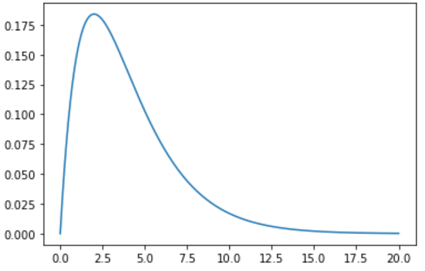
ตัวอย่างที่ 1: พล็อตการกระจายไคสแควร์เดี่ยว
รหัสต่อไปนี้แสดงวิธีการพล็อตเส้นโค้งการกระจายไคสแควร์เส้นเดียวด้วยระดับอิสระ 4 องศา
 import numpy as np
import matplotlib. pyplot as plt
from scipy. stats import chi2

#x-axis ranges from 0 to 20 with .001 steps
x = np. arange (0, 20, 0.001)

#plot Chi-square distribution with 4 degrees of freedom
plt. plot (x, chi2. pdf (x, df= 4 ))
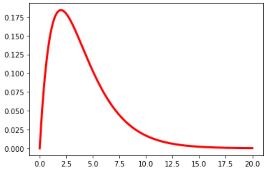
คุณยังสามารถเปลี่ยนสีและความกว้างของเส้นในแผนภูมิได้:
plt. plot (x, chi2. pdf (x, df= 4 ), color=' red ', linewidth= 3 )
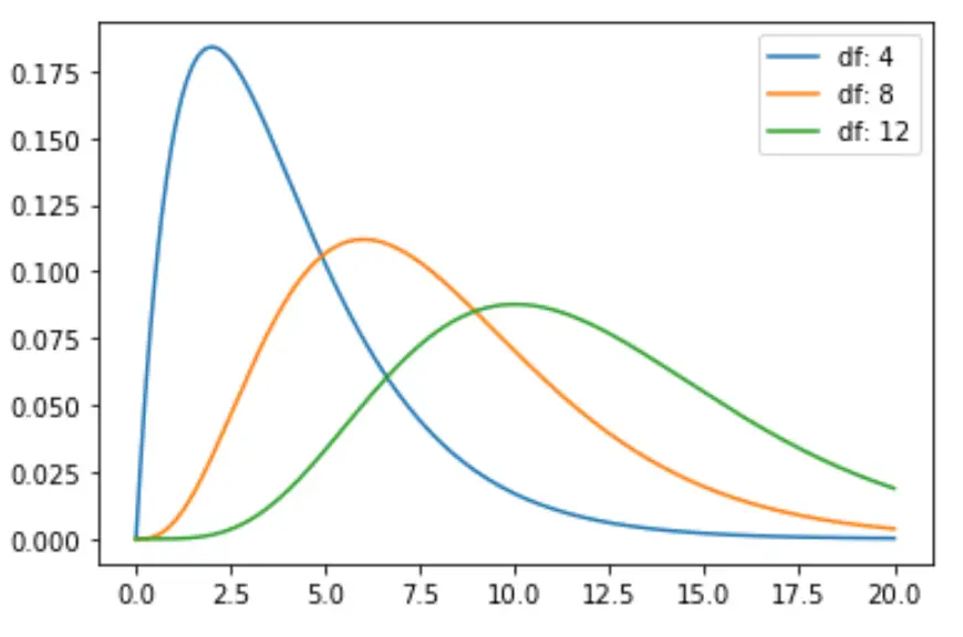
ตัวอย่างที่ 2: พล็อตการแจกแจงไคสแควร์หลายรายการ
รหัสต่อไปนี้แสดงวิธีการพล็อตเส้นโค้งการกระจายไคสแควร์หลายเส้นด้วยระดับความอิสระที่แตกต่างกัน:
 import numpy as np
import matplotlib. pyplot as plt
from scipy. stats import chi2

#x-axis ranges from 0 to 20 with .001 steps
x = np. arange (0, 20, 0.001)

#define multiple Chi-square distributions
plt. plot (x, chi2. pdf (x, df= 4 ), label=' df: 4 ')
plt. plot (x, chi2. pdf (x, df= 8 ), label=' df: 8 ')
plt. plot (x, chi2. pdf (x, df= 12 ), label=' df: 12 ')

#add legend to plot
plt. legend ()
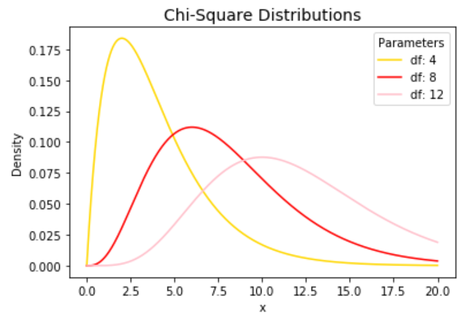
เปลี่ยนสีเส้นและเพิ่มชื่อและป้ายกำกับแกนได้ตามใจชอบเพื่อทำให้แผนภูมิสมบูรณ์:
 import numpy as np
import matplotlib. pyplot as plt
from scipy. stats import chi2

#x-axis ranges from 0 to 20 with .001 steps
x = np. arange (0, 20, 0.001)

#define multiple Chi-square distributions
plt. plot (x, chi2. pdf (x, df= 4 ), label=' df: 4 ', color=' gold ')
plt. plot (x, chi2. pdf (x, df= 8 ), label=' df: 8 ', color=' red ')
plt. plot (x, chi2. pdf (x, df= 12 ), label=' df: 12 ', color=' pink ')

#add legend to plot
plt. legend (title=' Parameters ')

#add axes labels and a title
plt. ylabel (' Density ')
plt. xlabel (' x ')
plt. title (' Chi-Square Distributions ', fontsize= 14 )
โปรดดู เอกสารประกอบของ matplotlib สำหรับคำอธิบายโดยละเอียดของฟังก์ชัน plt.plot()
เกี่ยวกับผู้แต่ง
ดร.เบนจามิน แอนเดอร์สัน
สวัสดี ฉันชื่อเบนจามิน ศาสตราจารย์สถิติเกษียณอายุแล้ว และผันตัวมาเป็นครูสอนสถิติโดยเฉพาะ ด้วยประสบการณ์และความเชี่ยวชาญที่กว้างขวางในสาขาสถิติ ฉันกระตือรือร้นที่จะแบ่งปันความรู้ของฉันเพื่อเสริมศักยภาพนักเรียนผ่าน Statorials. รู้เพิ่มเติม