วิธีเปลี่ยนสีของแถบในแผนภูมิ stacked bart ใน ggplot2
คุณสามารถใช้ไวยากรณ์พื้นฐานต่อไปนี้เพื่อเปลี่ยนสีของแท่งในแผนภูมิแท่งแบบเรียงซ้อนใน ggplot2:
 #create stacked bar chart
ggplot(df, aes(x=x_var, y=y_var, fill=fill_var)) +
  geom_bar(position=' stack ', stat=' identity ') +
  scale_fill_manual(values=c(' red ', ' purple ', ' pink ', ...))
ตัวอย่างต่อไปนี้แสดงวิธีใช้ไวยากรณ์นี้ในทางปฏิบัติ
ตัวอย่าง: เปลี่ยนสีของแท่งในแผนภูมิแท่งแบบเรียงซ้อนใน ggplot2
สมมติว่าเรามีกรอบข้อมูลต่อไปนี้ใน R ที่แสดงคะแนนที่ทำโดยผู้เล่นบาสเกตบอลที่แตกต่างกัน:
 #create data frame
df <- data. frame (team=c('A', 'A', 'A', 'B', 'B', 'B', 'C', 'C', 'C'),
                 position=c('G', 'F', 'C', 'G', 'F', 'C', 'G', 'F', 'C'),
                 points=c(22, 12, 10, 30, 12, 17, 28, 23, 20))

#view data frame
df

  team position points
1 AG 22
2 AF12
3 AC 10
4 BG 30
5 BF 12
6 BC 17
7 GC 28
8 CF 23
9 CC 20
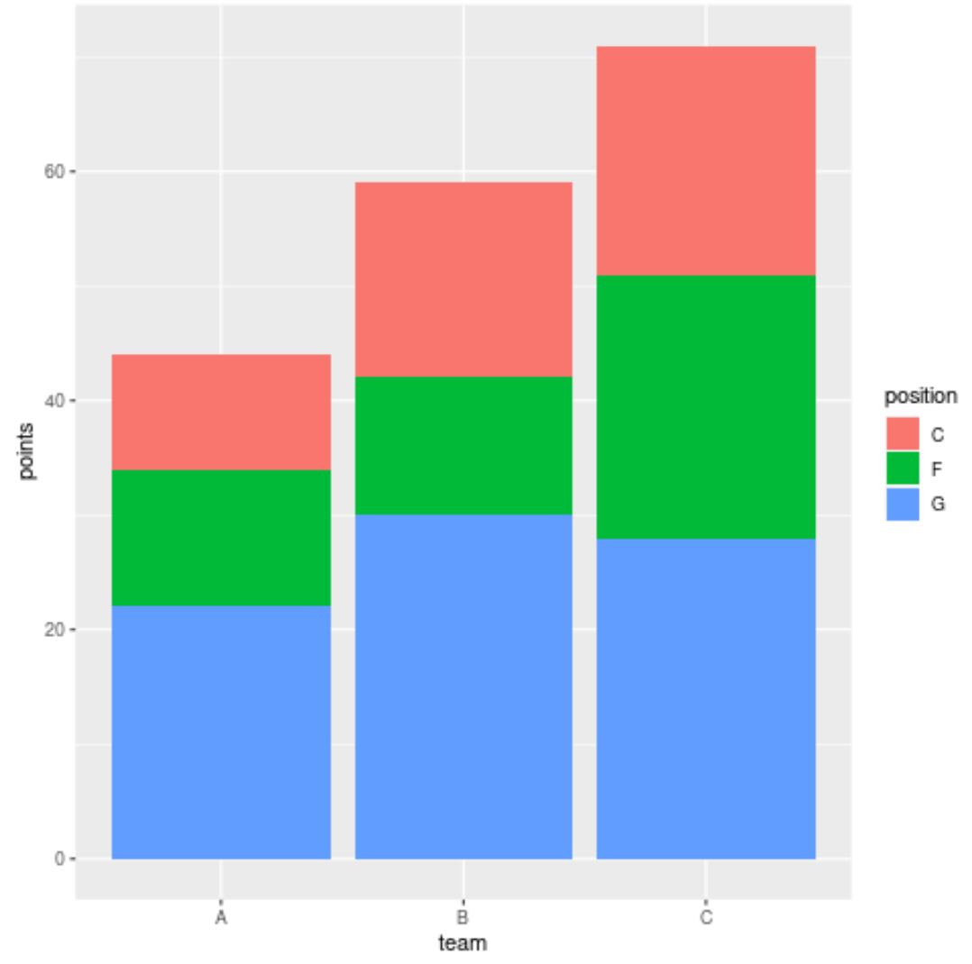
หากเราสร้างแผนภูมิแท่งแบบซ้อนเพื่อให้เห็นภาพคะแนนที่ผู้เล่นในแต่ละทีมทำได้ ggplot2 จะใช้ ชุดสีเริ่มต้น เพื่อเติมแถบ:
 library (ggplot2)

#create stacked bar chart
ggplot(df, aes(x=team, y=points, fill=position)) +
  geom_bar(position=' stack ', stat=' identity ')
อย่างไรก็ตาม เราสามารถใช้อาร์กิวเมนต์ scale_fill_manual() เพื่อระบุสีที่แน่นอนที่ ggplot2 ควรใช้สำหรับแท่ง:
 library (ggplot2)

#create stacked bar chart with custom colors
ggplot(df, aes(x=team, y=points, fill=position)) +
  geom_bar(position=' stack ', stat=' identity ') +
  scale_fill_manual(values=c(' red ', ' purple ', ' pink '))
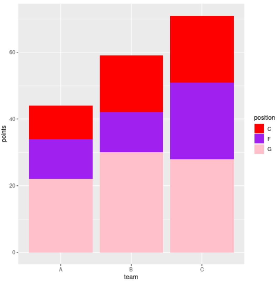
ตอนนี้แถบมีสีที่แน่นอน (เรียงจากบนลงล่าง) ที่เราระบุไว้ในฟังก์ชัน scale_fill_manual()
โปรดทราบว่าเราสามารถใช้รหัสสีเลขฐานสิบหกในฟังก์ชัน scale_fill_manual() ได้:
 library (ggplot2)

#create stacked bar chart with custom hex color codes
ggplot(df, aes(x=team, y=points, fill=position)) +
  geom_bar(position=' stack ', stat=' identity ') +
  scale_fill_manual(values=c(' #2596BE ', ' #8225BE ', ' #D4C443 '))
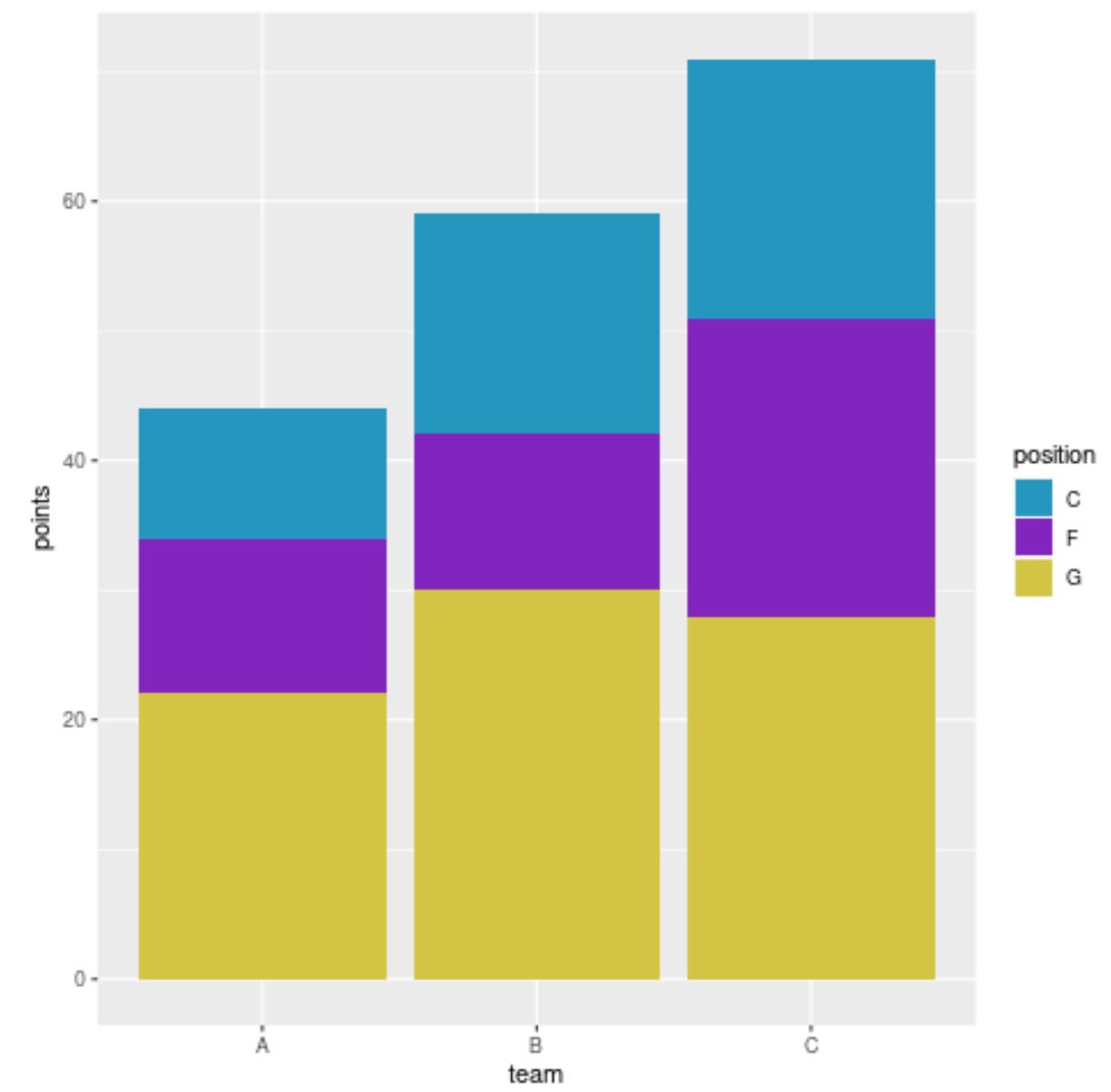
ขณะนี้แถบมีรหัสสีเลขฐานสิบหกที่เราระบุไว้
แหล่งข้อมูลเพิ่มเติม
บทช่วยสอนต่อไปนี้จะอธิบายวิธีดำเนินการงานทั่วไปอื่นๆ ใน ggplot2:
วิธีจัดเรียงแท่งใหม่ในแผนภูมิแท่งแบบเรียงซ้อนใน ggplot2
วิธีสร้าง Barplot ใน ggplot2 ด้วยตัวแปรหลายตัว
วิธีจัดเรียงแท่งในแผนภูมิแท่ง ggplot2
เกี่ยวกับผู้แต่ง
ดร.เบนจามิน แอนเดอร์สัน
สวัสดี ฉันชื่อเบนจามิน ศาสตราจารย์สถิติเกษียณอายุแล้ว และผันตัวมาเป็นครูสอนสถิติโดยเฉพาะ ด้วยประสบการณ์และความเชี่ยวชาญที่กว้างขวางในสาขาสถิติ ฉันกระตือรือร้นที่จะแบ่งปันความรู้ของฉันเพื่อเสริมศักยภาพนักเรียนผ่าน Statorials. รู้เพิ่มเติม