Matplotlib กับ ggplot2: คุณควรใช้อันไหน
ไลบรารีการแสดงภาพข้อมูลที่ได้รับความนิยมมากที่สุดสองแห่งในวิทยาศาสตร์ข้อมูลทั้งหมด ได้แก่ ggplot2 และ Matplotlib
ไลบรารี ggplot2 ใช้ในภาษาการเขียนโปรแกรมเชิงสถิติ R ในขณะที่ Matplotlib ใช้ใน Python
แม้ว่าทั้งสองไลบรารีจะอนุญาตให้คุณสร้างการแสดงภาพข้อมูลที่ปรับแต่งได้สูง แต่โดยทั่วไปแล้ว ggplot2 จะช่วยให้คุณทำเช่นนั้นได้โดยใช้โค้ดน้อยกว่าบรรทัดเมื่อเทียบกับ Matplotlib
เพื่ออธิบายประเด็นนี้ เราจะแสดงวิธีสร้างแผนภูมิประเภทเดียวกันโดยใช้ทั้งสองไลบรารี
แผนภูมิเส้น: ggplot2 กับ Matplotlib
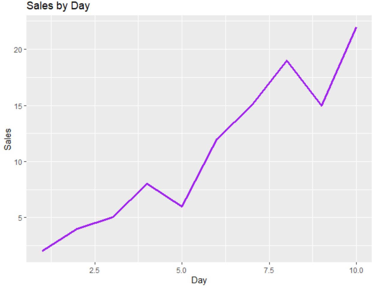
รหัสต่อไปนี้แสดงวิธีสร้างแผนภูมิเส้นโดยใช้ ggplot2 :
 library (ggplot2)

#create data frame
df <- data. frame (day=c(1, 2, 3, 4, 5, 6, 7, 8, 9, 10),
                 sales=c(2, 4, 5, 8, 6, 12, 15, 19, 15, 22))

#create line chart
ggplot(df, aes(x=day, y=sales)) +
  geom_line(size= 1.2 , col=' purple ') +
  ggtitle(' Sales by Day ') +
  xlab(' Day ') +
  ylab(' Sales ')
และรหัสต่อไปนี้แสดงวิธีสร้างแผนภูมิเส้นเดียวกันโดยใช้ Matplotlib :
 import pandas as pd
import matplotlib. pyplot as plt

#createDataFrame
df = pd. DataFrame ({' day ': [1, 2, 3, 4, 5, 6, 7, 8, 9, 10],
                   ' sales ': [2, 4, 5, 8, 6, 12, 15, 19, 15, 22]})

#create line chart
plt. plot (df. day , df. sales , color=' purple ')
plt. title (' Sales by Day ', loc=' left ')
plt. ylabel (' Sales ')
plt. xlabel (' Day ')
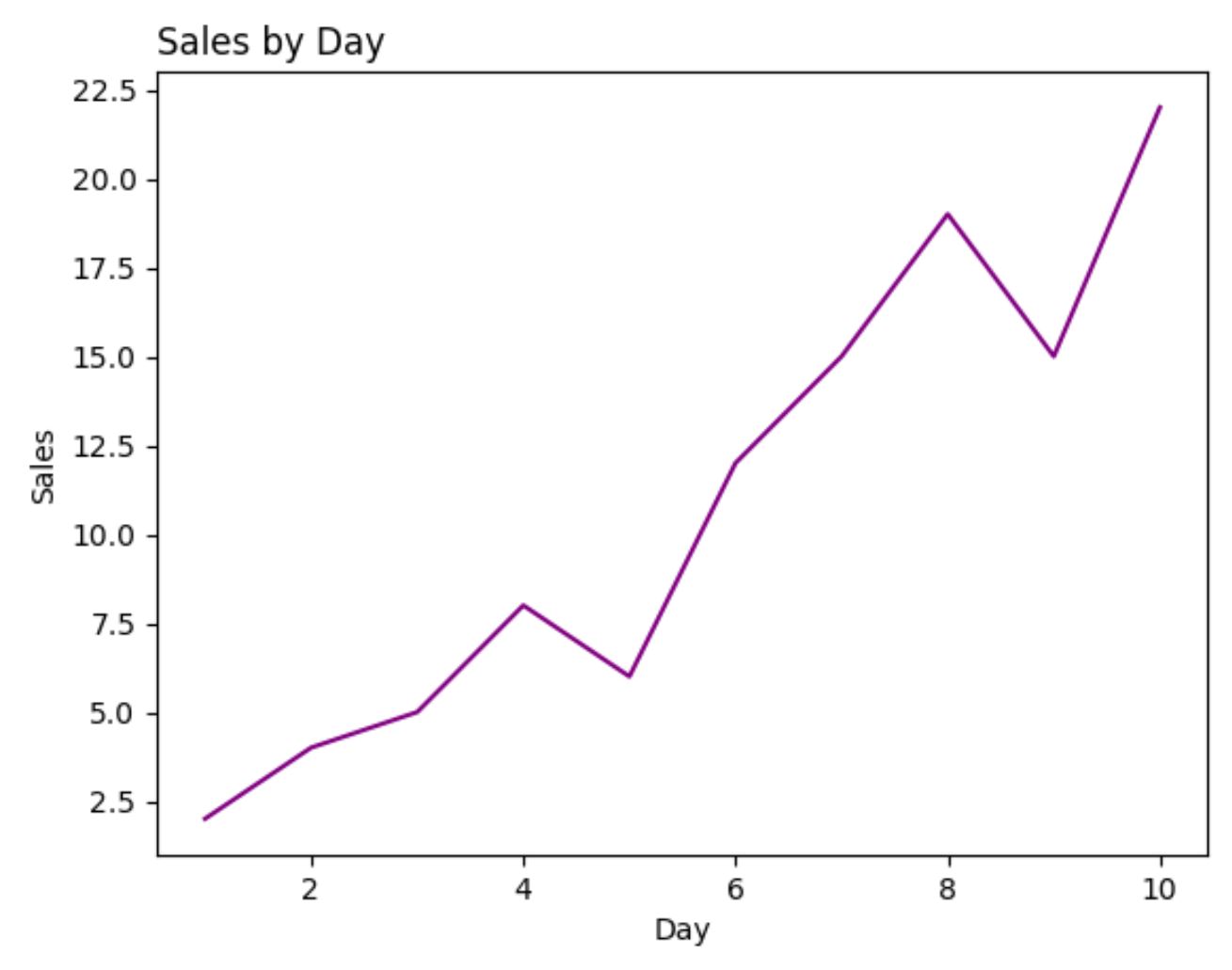
สำหรับตัวอย่างนี้ จำนวนบรรทัดของโค้ดที่จำเป็นในการสร้างแต่ละพล็อตจะเท่ากันโดยประมาณระหว่าง ggplot2 และ Matplotlib
Scatterplots: ggplot2 กับ Matplotlib
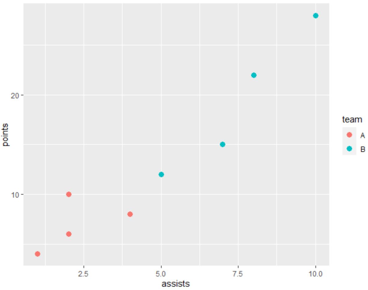
รหัสต่อไปนี้แสดงวิธีสร้าง Scatterplot ใน ggplot2 ซึ่งมีการระบายสีจุดตามหมวดหมู่:
 library (ggplot2)

#create data frame
df <- data. frame (team=c('A', 'A', 'A', 'A', 'B', 'B', 'B', 'B'),
                 assists=c(1, 2, 2, 4, 5, 7, 8, 10),
                 points=c(4, 6, 10, 8, 12, 15, 22, 28))

#create scatterplot
ggplot(df, aes(x=assists, y=points)) +
  geom_point(aes(col=team), size= 3 )
และโค้ดต่อไปนี้แสดงวิธีสร้าง Scatterplot เดียวกันโดยใช้ Matplotlib :
 import pandas as pd
import matplotlib. pyplot as plt

#createDataFrame
df = pd. DataFrame ({' team ': ['A', 'A', 'A', 'A', 'B', 'B', 'B', 'B'],
                   ' assists ': [1, 2, 2, 4, 5, 7, 8, 10],
                   ' points ': [4, 6, 10, 8, 12, 15, 22, 28]})

#define colors to use
color_list = []
for x in df[' team ']:
    if x == ' A ': color_list. append (' #F8766D ')
    else : color_list. append (' #00BFC4 ')

#create scatterplot
plt. scatter (df. assists , df. points , c=color_list)
plt. ylabel (' points ')
plt. xlabel (' assists ')
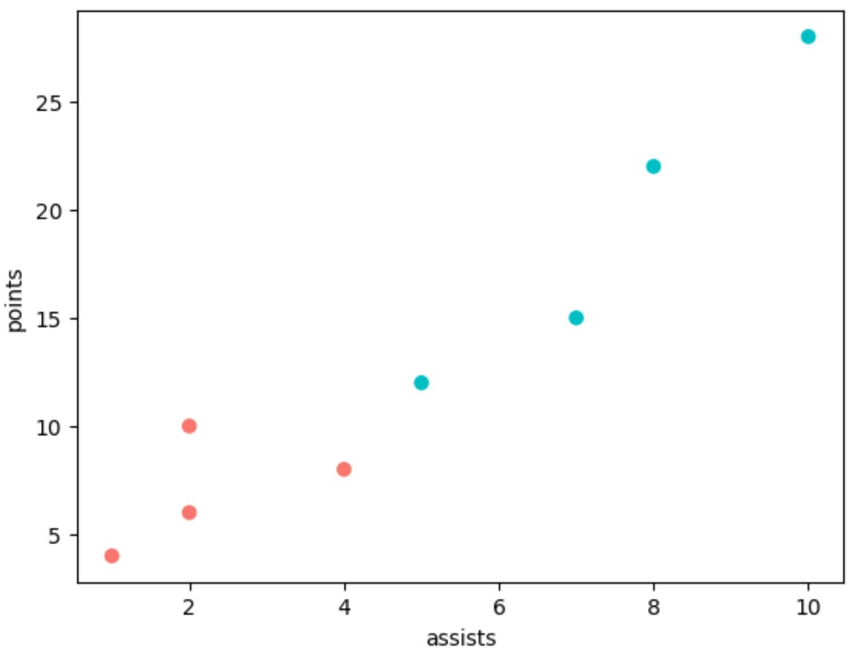
โปรดทราบว่าเราต้องใช้โค้ดอีกหลายบรรทัดใน Matplotlib เพื่อสร้างพล็อตเดียวกันกับ ggplot2
ฮิสโตแกรม: ggplot2 กับ Matplotlib
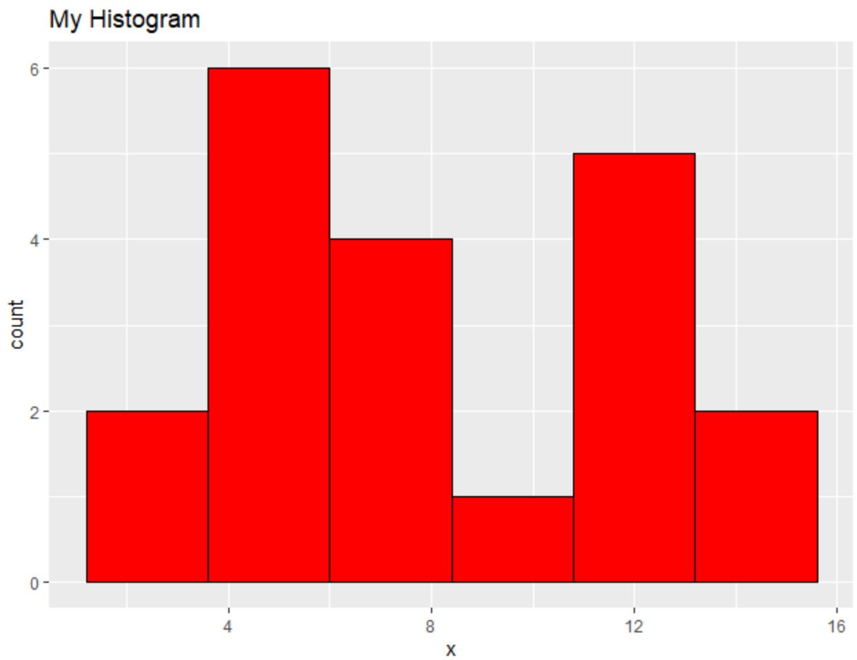
รหัสต่อไปนี้แสดงวิธีสร้างฮิสโตแกรมใน ggplot2 :
 library (ggplot2)

#create data frame
df <- data. frame (x=c(2, 2, 4, 4, 4, 5, 5, 6, 7, 7, 8, 8,
                     10, 11, 11, 11, 12, 13, 14, 14))

#create scatterplot
ggplot(df, aes(x=x)) +
  geom_histogram(bins= 6 , fill=' red ', color=' black ') +
  ggtitle(' My Histogram ')
และรหัสต่อไปนี้แสดงวิธีสร้างฮิสโตแกรมที่คล้ายกันโดยใช้ Matplotlib :
 import pandas as pd
import matplotlib. pyplot as plt

#createDataFrame
df = pd. DataFrame ({' x ': [2, 2, 4, 4, 4, 5, 5, 6, 7, 7, 8, 8,
                         10, 11, 11, 11, 12, 13, 14, 14]})

#create histogram
plt. hist (df[' x '], bins= 6 , color=' red ', ec=' black ')
plt. title (' My Histogram ', loc=' left ')
plt. xlabel (' x ')
plt. ylabel (' Count ')
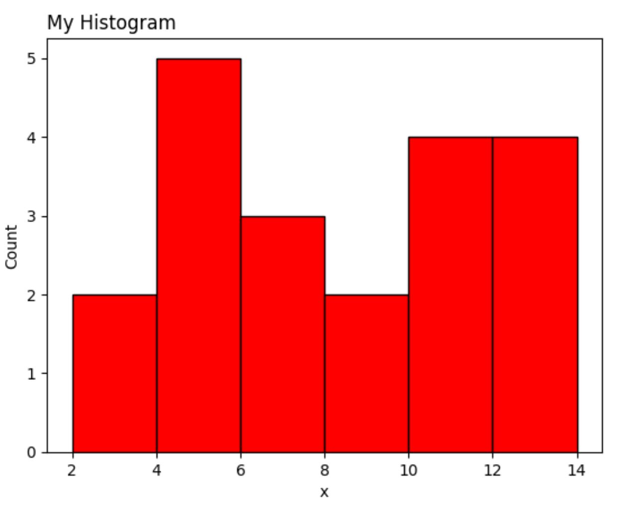
เป็นอีกครั้งที่เวอร์ชัน Matplotlib ต้องการโค้ดหลายบรรทัดมากกว่า ggplot2
บทสรุป
ggplot2 และ Matplotlib ช่วยให้คุณสร้างการแสดงข้อมูลที่ปรับแต่งได้สูง แต่ ggplot2 มีแนวโน้มที่จะใช้โค้ดน้อยลง
บ่อยครั้งที่การตั้งค่าระหว่าง ggplot2 และ Matplotlib ขึ้นอยู่กับภาษาการเขียนโปรแกรมที่คุณใช้สำหรับการวิเคราะห์ข้อมูล
ผู้ที่ใช้ Python มักจะใช้ Matplotlib เนื่องจากสามารถวิเคราะห์ข้อมูลและสร้างการแสดงภาพข้อมูลโดยใช้ภาษาการเขียนโปรแกรมเดียว
ในทางกลับกัน ผู้ที่ใช้ R มักจะใช้ ggplot2 เนื่องจากช่วยให้พวกเขาสามารถวิเคราะห์ข้อมูลและการแสดงภาพทั้งหมดได้ในภาษาโปรแกรมเดียว
เกี่ยวกับผู้แต่ง
ดร.เบนจามิน แอนเดอร์สัน
สวัสดี ฉันชื่อเบนจามิน ศาสตราจารย์สถิติเกษียณอายุแล้ว และผันตัวมาเป็นครูสอนสถิติโดยเฉพาะ ด้วยประสบการณ์และความเชี่ยวชาญที่กว้างขวางในสาขาสถิติ ฉันกระตือรือร้นที่จะแบ่งปันความรู้ของฉันเพื่อเสริมศักยภาพนักเรียนผ่าน Statorials. รู้เพิ่มเติม