วิธีสร้างพล็อต matplotlib ด้วยแกน y สองแกน
วิธีที่ง่ายที่สุดในการสร้างพล็อต Matplotlib ด้วยแกน y สองแกนคือการใช้ฟังก์ชัน twinx()
ตัวอย่างต่อไปนี้แสดงวิธีใช้ฟังก์ชันนี้ในทางปฏิบัติ
ตัวอย่าง: สร้างพล็อต Matplotlib ด้วยแกน Y สองแกน
สมมติว่าเรามี DataFrames แพนด้าสองตัวต่อไปนี้:
 import pandas as pd

#createDataFrames
df1 = pd. DataFrame ({' year ': [1, 2, 3, 4, 5, 6, 7, 8, 9, 10],
                    ' sales ': [14, 16, 19, 22, 24, 25, 24, 24, 27, 30]})

df2 = pd. DataFrame ({' year ': [1, 2, 3, 4, 5, 6, 7, 8, 9, 10],
                    ' leads ': [4, 4, 4, 5, 4, 5, 7, 8, 5, 3]})
DataFrame ทั้งสองใช้ตัวแปร “ปี” ร่วมกันซึ่งมีตั้งแต่ 1 ถึง 10 แต่ DataFrame แรกแสดงยอดขายรวมในแต่ละปี ในขณะที่ DataFrame ตัวที่สองแสดงโอกาสในการขายทั้งหมดในแต่ละปี
เราสามารถใช้โค้ดต่อไปนี้เพื่อสร้างพล็อต Matplotlib ที่แสดงยอดขายและโอกาสในการขายบนแผนภูมิที่มีแกน Y สองแกน:
 import matplotlib. pyplot as plt

#define colors to use
col1 = ' steelblue '
col2 = ' red '

#define subplots
fig,ax = plt. subplots ()

#add first line to plot
ax. plot (df1. year , df1. sales , color=col1)

#add x-axis label
ax. set_xlabel (' Year ', fontsize= 14 )

#add y-axis label
ax. set_ylabel (' Sales ', color=col1, fontsize= 16 )

#define second y-axis that shares x-axis with current plot
ax2 = ax. twinx ()

#add second line to plot
ax2. plot (df2. year , df2. leads , color=col2)

#add second y-axis label
ax2. set_ylabel (' Leads ', color=col2, fontsize= 16 )
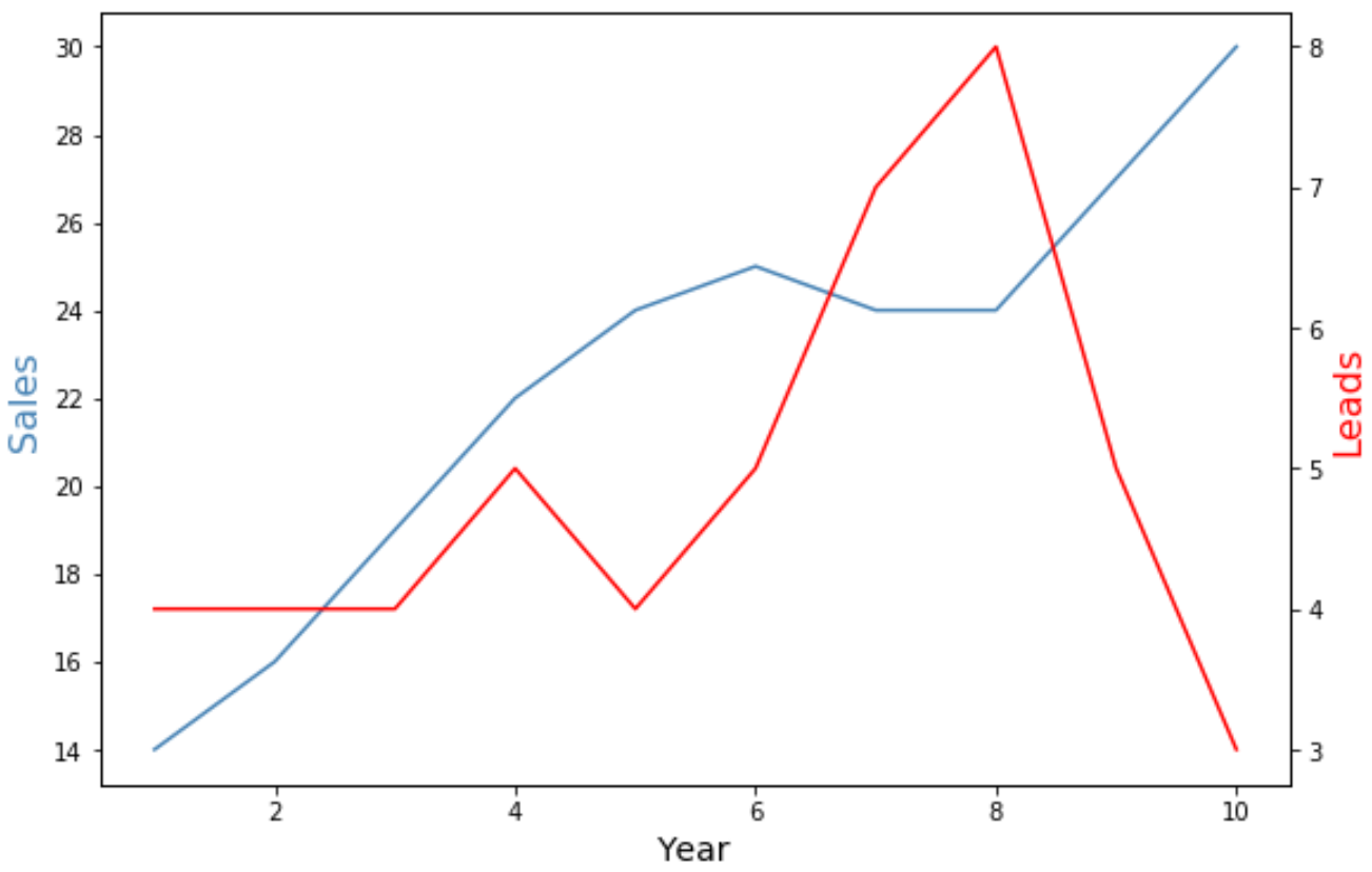
แกน y ทางด้านซ้ายของแผนภูมิแสดงยอดขายรวมต่อปี และแกน y ทางด้านขวาของแผนภูมิแสดงจำนวนลูกค้าเป้าหมายทั้งหมดต่อปี
เส้นสีน้ำเงินในกราฟแสดงถึงยอดขายรวมต่อปี และเส้นสีแดงแสดงถึงโอกาสในการขายทั้งหมดต่อปี
คุณสามารถใช้อาร์กิวเมนต์ เครื่องหมาย และ ความกว้างของเส้น เพื่อเปลี่ยนลักษณะที่ปรากฏของเส้นในแผนภูมิได้:
 import matplotlib. pyplot as plt

#define colors to use
col1 = ' steelblue '
col2 = ' red '

#define subplots
fig,ax = plt. subplots ()

#add first line to plot
ax. plot (df1. year , df1. sales , color=col1, marker=' o ', linewidth= 3 )

#add x-axis label
ax. set_xlabel (' Year ', fontsize= 14 )

#add y-axis label
ax. set_ylabel (' Sales ', color=col1, fontsize= 16 )

#define second y-axis that shares x-axis with current plot
ax2 = ax. twinx ()

#add second line to plot
ax2. plot (df2. year , df2. leads , color=col2, marker=' o ', linewidth= 3 )

#add second y-axis label
ax2. set_ylabel (' Leads ', color=col2, fontsize= 16 )
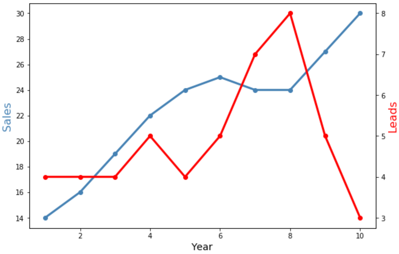
โปรดทราบว่าขณะนี้ทั้งสองบรรทัดกว้างขึ้นและมีเครื่องหมาย “o” เพื่อแสดงจุดข้อมูลแต่ละจุด
แหล่งข้อมูลเพิ่มเติม
บทช่วยสอนต่อไปนี้จะอธิบายวิธีดำเนินการทั่วไปอื่นๆ ใน Matplotlib:
วิธีปรับตำแหน่งป้ายกำกับแกนใน Matplotlib
วิธีการตั้งค่าช่วงแกนใน Matplotlib
วิธีการตั้งค่าแกน X ใน Matplotlib
เกี่ยวกับผู้แต่ง
ดร.เบนจามิน แอนเดอร์สัน
สวัสดี ฉันชื่อเบนจามิน ศาสตราจารย์สถิติเกษียณอายุแล้ว และผันตัวมาเป็นครูสอนสถิติโดยเฉพาะ ด้วยประสบการณ์และความเชี่ยวชาญที่กว้างขวางในสาขาสถิติ ฉันกระตือรือร้นที่จะแบ่งปันความรู้ของฉันเพื่อเสริมศักยภาพนักเรียนผ่าน Statorials. รู้เพิ่มเติม