Sas: วิธีการพล็อตค่าเฉลี่ยด้วยแถบค่าคลาดเคลื่อนมาตรฐาน
คุณสามารถใช้ไวยากรณ์ต่อไปนี้ใน SAS เพื่อสร้างพล็อตค่าเฉลี่ยพร้อมแถบข้อผิดพลาดมาตรฐานตามกลุ่ม:
 /*calculate mean and standard error of points for each team*/
proc sql ;
create table groupPlot as
select
    team,
    mean(points) as meanPoints,
    mean(points) - stderr (points) as lowStdPoints,
    mean(points) + stderr (points) as highStdPoints
from my_data
group by team;
quit ;

/*create plot with mean and standard error bars of points for each team*/
proc sgplot data =groupPlot;
scatter x =team y =meanPoints /
    yerrorlower =lowStdPoints yerrorupper =highStdPoints group =team;
series x =team y =meanPoints / group =team;
run ;
ตัวอย่างเฉพาะนี้ใช้ PROC SQL เพื่อคำนวณค่าเฉลี่ยของตัวแปร จุด ซึ่งจัดกลุ่มตามตัวแปร ทีม ในชุดข้อมูล
จากนั้นเราใช้ PROC SGPLOT เพื่อสร้างพล็อตที่แสดงค่าเฉลี่ยของ ตัวแปรคะแนน พร้อมกับแถบข้อผิดพลาดมาตรฐาน ซึ่งจัดกลุ่มตามตัวแปร ทีม
ตัวอย่างต่อไปนี้แสดงวิธีใช้ไวยากรณ์นี้ในทางปฏิบัติ
ตัวอย่าง: การลงจุดหมายถึงด้วยแถบค่าคลาดเคลื่อนมาตรฐานใน SAS
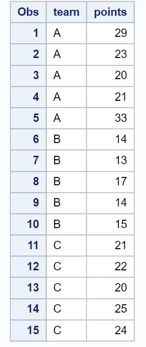
สมมติว่าเรามีชุดข้อมูลต่อไปนี้ซึ่งมีข้อมูลเกี่ยวกับคะแนนที่ผู้เล่นบาสเก็ตบอลจากทีมต่างๆ ทำไว้:
 /*create dataset*/
data my_data;
    input team $points;
    datalines ;
At 29
At 23
At 20
At 21
At 33
B14
B 13
B17
B14
B15
C 21
C22
C 20
C25
C24
;
run ;

/*view dataset*/
proc print data =my_data;
สมมติว่าเราต้องการสร้างแผนภูมิที่แสดงค่า คะแนน เฉลี่ยพร้อมกับแถบข้อผิดพลาดมาตรฐานสำหรับแต่ละ ทีม
เราสามารถใช้ไวยากรณ์ต่อไปนี้เพื่อทำสิ่งนี้:
 /*calculate mean and standard error of points for each team*/
proc sql ;
create table groupPlot as
select
    team,
    mean(points) as meanPoints,
    mean(points) - stderr (points) as lowStdPoints,
    mean(points) + stderr (points) as highStdPoints
from my_data
group by team;
quit ;

/*create plot with mean and standard error bars of points for each team*/
proc sgplot data =groupPlot;
scatter x =team y =meanPoints /
    yerrorlower =lowStdPoints yerrorupper =highStdPoints group =team;
series x =team y =meanPoints / group =team;
run ;
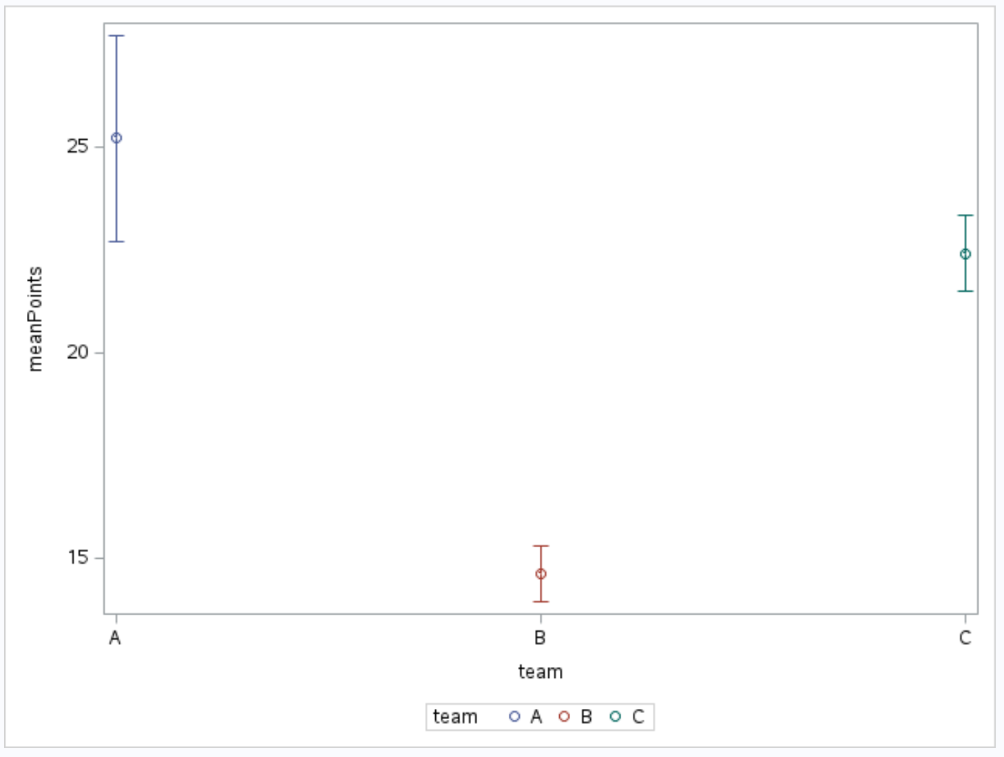
วงกลมเล็กๆ จะแสดงค่าเฉลี่ย ของคะแนน สำหรับแต่ละ ทีม และแถบที่ยื่นออกมาจากวงกลมจะแสดงค่าความผิดพลาดมาตรฐานของ คะแนน สำหรับแต่ละ ทีม
นอกจากนี้เรายังสามารถพิมพ์ตารางที่เราสร้างขึ้นโดยใช้ PROC SQL เพื่อดูค่าจริงของค่าเฉลี่ยและข้อผิดพลาดมาตรฐาน:
 /*print mean and standard error of points for each team*/
proc print data =groupPlot;
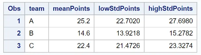
ค่าในตารางนี้สอดคล้องกับค่าที่แสดงในกราฟด้านบน
แหล่งข้อมูลเพิ่มเติม
บทช่วยสอนต่อไปนี้จะอธิบายวิธีสร้างแผนภูมิอื่นๆ ใน SAS:
วิธีสร้างพล็อตเส้นใน SAS
วิธีสร้าง boxplots ตามกลุ่มใน SAS
วิธีสร้าง Scatterplot ด้วยเส้นการถดถอยใน SAS
เกี่ยวกับผู้แต่ง
ดร.เบนจามิน แอนเดอร์สัน
สวัสดี ฉันชื่อเบนจามิน ศาสตราจารย์สถิติเกษียณอายุแล้ว และผันตัวมาเป็นครูสอนสถิติโดยเฉพาะ ด้วยประสบการณ์และความเชี่ยวชาญที่กว้างขวางในสาขาสถิติ ฉันกระตือรือร้นที่จะแบ่งปันความรู้ของฉันเพื่อเสริมศักยภาพนักเรียนผ่าน Statorials. รู้เพิ่มเติม