การปรับเส้นโค้งใน r (พร้อมตัวอย่าง)
บ่อยครั้งคุณอาจต้องการหาสมการที่เหมาะกับเส้นโค้งของ R มากที่สุด
ตัวอย่างทีละขั้นตอนต่อไปนี้จะอธิบายวิธีจัดเส้นโค้งให้พอดีกับข้อมูลใน R โดยใช้ฟังก์ชัน poly() และวิธีการกำหนดว่าเส้นโค้งใดที่เหมาะกับข้อมูลมากที่สุด
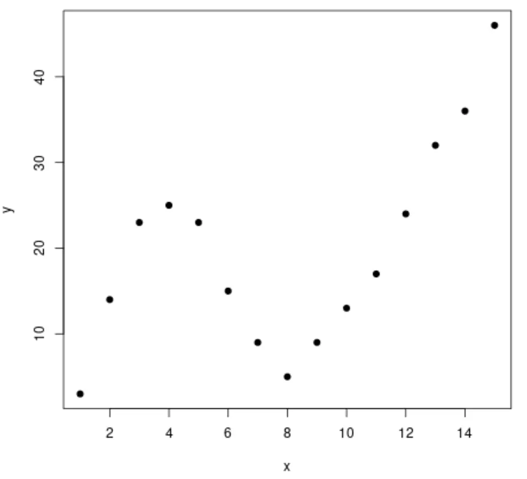
ขั้นตอนที่ 1: สร้างและแสดงภาพข้อมูล
เริ่มต้นด้วยการสร้างชุดข้อมูลปลอม จากนั้นสร้าง Scatterplot เพื่อแสดงภาพข้อมูล:
 #create data frame
df <- data. frame (x=1:15,
                 y=c(3, 14, 23, 25, 23, 15, 9, 5, 9, 13, 17, 24, 32, 36, 46))

#create a scatterplot of x vs. y
plot(df$x, df$y, pch= 19 , xlab=' x ', ylab=' y ')
ขั้นตอนที่ 2: ปรับหลายเส้นโค้ง
จากนั้นลองใส่โมเดลการถดถอยพหุนามหลายตัวเข้ากับข้อมูลและแสดงภาพเส้นโค้งของแต่ละโมเดลในพล็อตเดียวกัน:
 #fit polynomial regression models up to degree 5
fit1 <- lm(y~x, data=df)
fit2 <- lm(y~poly(x,2,raw= TRUE ), data=df)
fit3 <- lm(y~poly(x,3,raw= TRUE ), data=df)
fit4 <- lm(y~poly(x,4,raw= TRUE ), data=df)
fit5 <- lm(y~poly(x,5,raw= TRUE ), data=df)

#create a scatterplot of x vs. y
plot(df$x, df$y, pch=19, xlab=' x ', ylab=' y ')

#define x-axis values
x_axis <- seq(1, 15, length= 15 )

#add curve of each model to plot
lines(x_axis, predict(fit1, data. frame (x=x_axis)), col=' green ')
lines(x_axis, predict(fit2, data. frame (x=x_axis)), col=' red ')
lines(x_axis, predict(fit3, data. frame (x=x_axis)), col=' purple ')
lines(x_axis, predict(fit4, data. frame (x=x_axis)), col=' blue ')
lines(x_axis, predict(fit5, data. frame (x=x_axis)), col=' orange ')
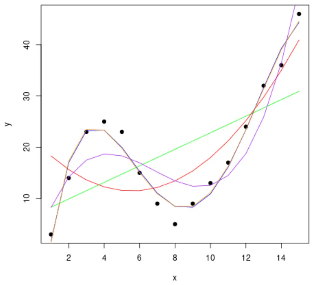
เพื่อพิจารณาว่าเส้นโค้งใดที่เหมาะกับข้อมูลมากที่สุด เราสามารถดูค่า R Square ที่ปรับแล้ว ของแต่ละรุ่นได้
ค่านี้บอกเราถึงเปอร์เซ็นต์ของการแปรผันในตัวแปรตอบสนองที่สามารถอธิบายได้ด้วยตัวแปรทำนายในแบบจำลอง ปรับตามจำนวนตัวแปรทำนาย
 #calculated adjusted R-squared of each model
summary(fit1)$adj. r . squared
summary(fit2)$adj. r . squared
summary(fit3)$adj. r . squared
summary(fit4)$adj. r . squared
summary(fit5)$adj. r . squared

[1] 0.3144819
[1] 0.5186706
[1] 0.7842864
[1] 0.9590276
[1] 0.9549709
จากผลลัพธ์ เราจะเห็นว่าแบบจำลองที่มี R-squared ที่ปรับสูงสุดคือพหุนามดีกรีที่ 4 ซึ่งมี R-squared ที่ปรับแล้วเป็น 0.959
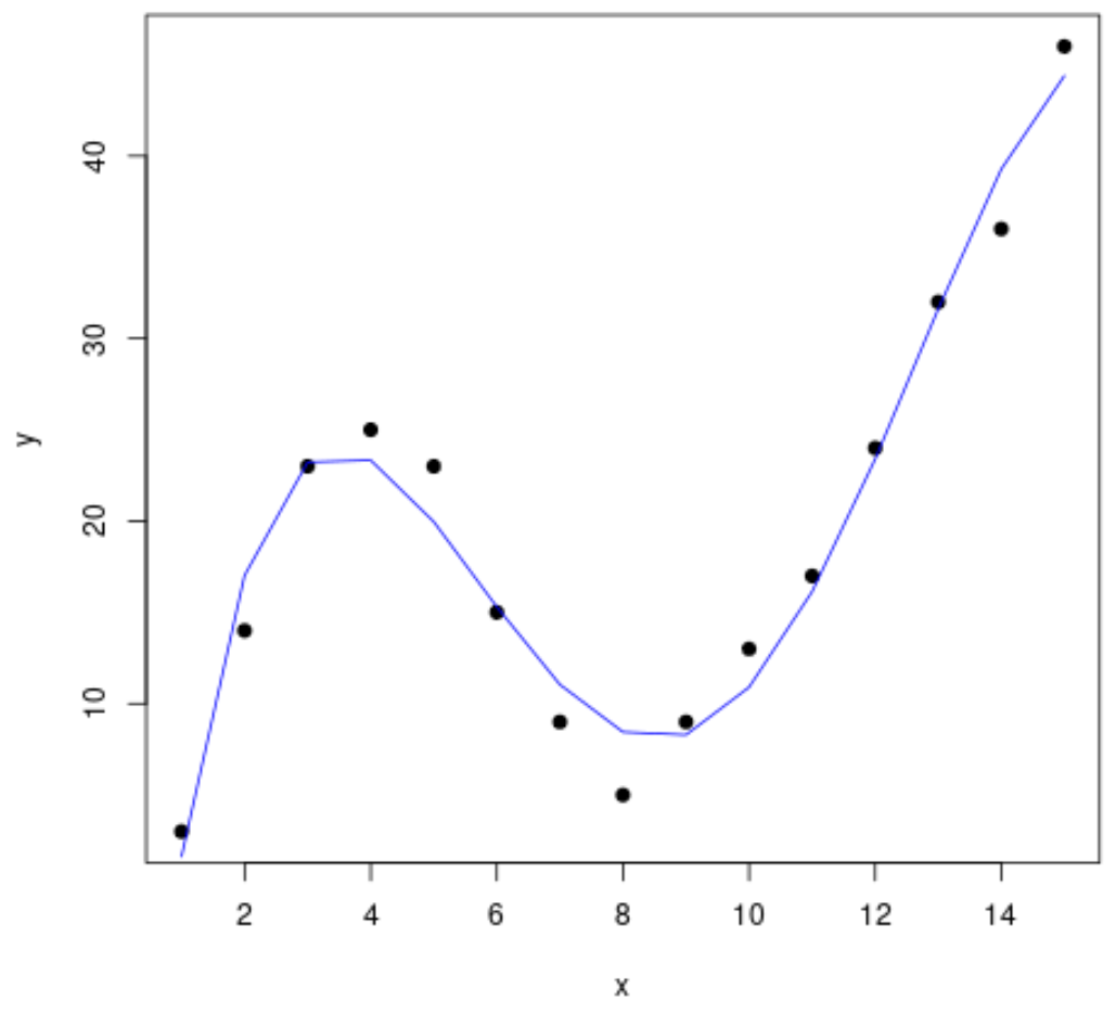
ขั้นตอนที่ 3: เห็นภาพเส้นโค้งสุดท้าย
สุดท้ายนี้ เราสามารถสร้างพล็อตกระจายด้วยเส้นโค้งของแบบจำลองพหุนามดีกรีที่ 4 ได้:
 #create a scatterplot of x vs. y
plot(df$x, df$y, pch=19, xlab=' x ', ylab=' y ')

#define x-axis values
x_axis <- seq(1, 15, length= 15 )

#add curve of fourth-degree polynomial model
lines(x_axis, predict(fit4, data. frame (x=x_axis)), col=' blue ')
เรายังสามารถรับสมการของบรรทัดนี้ได้โดยใช้ฟังก์ชัน summary() :
 summary(fit4)

Call:
lm(formula = y ~ poly(x, 4, raw = TRUE), data = df)

Residuals:
    Min 1Q Median 3Q Max
-3.4490 -1.1732 0.6023 1.4899 3.0351

Coefficients:
                         Estimate Std. Error t value Pr(>|t|)
(Intercept) -26.51615 4.94555 -5.362 0.000318 ***
poly(x, 4, raw = TRUE)1 35.82311 3.98204 8.996 4.15e-06 ***
poly(x, 4, raw = TRUE)2 -8.36486 0.96791 -8.642 5.95e-06 ***
poly(x, 4, raw = TRUE)3 0.70812 0.08954 7.908 1.30e-05 ***
poly(x, 4, raw = TRUE)4 -0.01924 0.00278 -6.922 4.08e-05 ***
---
Significant. codes: 0 '***' 0.001 '**' 0.01 '*' 0.05 '.' 0.1 ' ' 1

Residual standard error: 2.424 on 10 degrees of freedom
Multiple R-squared: 0.9707, Adjusted R-squared: 0.959
F-statistic: 82.92 on 4 and 10 DF, p-value: 1.257e-07
สมการของเส้นโค้งมีดังนี้:
y = -0.0192x 4 + 0.7081x 3 – 8.3649x 2 + 35.823x – 26.516
เราสามารถใช้สมการนี้เพื่อทำนายค่าของ ตัวแปรตอบสนอง ตามตัวแปรทำนายในแบบจำลอง ตัวอย่างเช่น ถ้า x = 4 เราก็จะทำนายว่า y = 23.34 :
y = -0.0192(4) 4 + 0.7081(4) 3 – 8.3649(4) 2 + 35.823(4) – 26.516 = 23.34
แหล่งข้อมูลเพิ่มเติม
ความรู้เบื้องต้นเกี่ยวกับการถดถอยพหุนาม
การถดถอยพหุนามใน R (ทีละขั้นตอน)
วิธีใช้ฟังก์ชัน seq ใน R
เกี่ยวกับผู้แต่ง
ดร.เบนจามิน แอนเดอร์สัน
สวัสดี ฉันชื่อเบนจามิน ศาสตราจารย์สถิติเกษียณอายุแล้ว และผันตัวมาเป็นครูสอนสถิติโดยเฉพาะ ด้วยประสบการณ์และความเชี่ยวชาญที่กว้างขวางในสาขาสถิติ ฉันกระตือรือร้นที่จะแบ่งปันความรู้ของฉันเพื่อเสริมศักยภาพนักเรียนผ่าน Statorials. รู้เพิ่มเติม