วิธีปรับตำแหน่งของแถบสี matplotlib
แถบสี คือแถบที่อยู่ด้านข้างของแผนภูมิ Matplotlib และทำหน้าที่เป็นคำอธิบายสำหรับสีที่แสดงในแผนภูมิ
Matplotlib จะแสดงแถบสีทางด้านขวาของแผนภูมิตามค่าเริ่มต้น แต่คุณสามารถเปลี่ยนได้อย่างง่ายดายโดยใช้ฟังก์ชันใน ชุดเครื่องมือ Matplotlib AxesGrid
บทช่วยสอนนี้แสดงตัวอย่างวิธีใช้ฟังก์ชันเหล่านี้ในทางปฏิบัติ
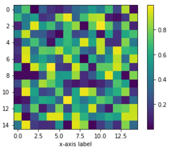
ตัวอย่างที่ 1: วางตำแหน่งแถบสีทางด้านขวาของแผนภูมิ
รหัสต่อไปนี้แสดงวิธีสร้างแผนภูมิ Matplotlib และวิธีการวางแถบสีทางด้านขวาของแผนภูมิ:
 import numpy as np
import matplotlib.pyplot as plt
from mpl_toolkits.axes_grid1 import make_axes_locatable

#make this example reproducible
np.random.seed(1)

#create chart
fig, ax = plt. subplots ()
im = ax. imshow (np.random.rand(15,15))
ax. set_xlabel (' x-axis label ')

#add color bar
fig. colorbar (im)

plt. show ()
ตัวอย่างที่ 2: วางตำแหน่งแถบสีด้านล่างกราฟ
รหัสต่อไปนี้แสดงวิธีวางแถบสีใต้แผนภูมิ Matplotlib:
 import numpy as np
import matplotlib.pyplot as plt
from mpl_toolkits.axes_grid1 import make_axes_locatable

#make this example reproducible
np.random.seed(1)

#create chart
fig, ax = plt. subplots ()
im = ax. imshow (np.random.rand(15,15))
ax. set_xlabel (' x-axis label ')

#add color bar below chart
divider = make_axes_locatable (ax)
cax = divider. new_vertical (size=' 5% ', pad=0.6, pack_start= True )
fig. add_axes (cax)
fig. colorbar (im, cax=cax, orientation=' horizontal ')

plt. show ()
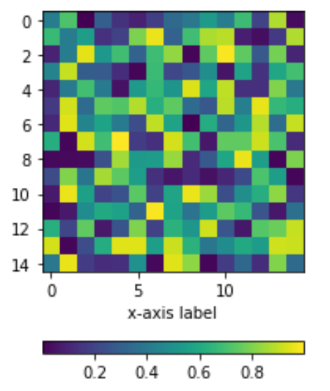
โปรดทราบว่าอาร์กิวเมนต์ แผ่น สร้างช่องว่างภายในระหว่างแกน x ของแผนภูมิและแถบสี ยิ่งค่าแพดสูง แถบสีก็จะอยู่ห่างจากแกน x มากขึ้น
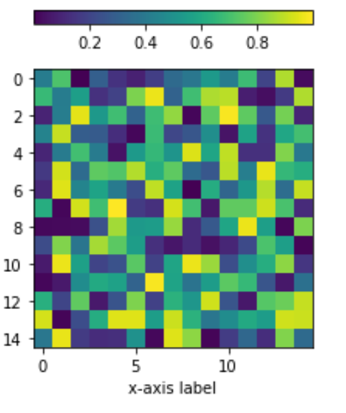
ตัวอย่างที่ 3: วางตำแหน่งแถบสีไว้เหนือแผนภูมิ
รหัสต่อไปนี้แสดงวิธีวางแถบสีเหนือแผนภูมิ Matplotlib:
 import numpy as np
import matplotlib.pyplot as plt
from mpl_toolkits.axes_grid1 import make_axes_locatable

#make this example reproducible
np.random.seed(1)

#create chart
fig, ax = plt. subplots ()
im = ax. imshow (np.random.rand(15,15))
ax. set_xlabel (' x-axis label ')

#add color bar below chart
divider = make_axes_locatable (ax)
cax = divider. new_vertical (size=' 5% ', pad=0.4)
fig. add_axes (cax)
fig. colorbar (im, cax=cax, orientation=' horizontal ')

plt. show ()
คุณสามารถค้นหาบทช่วยสอน Matplotlib เพิ่มเติม ได้ที่นี่
เกี่ยวกับผู้แต่ง
ดร.เบนจามิน แอนเดอร์สัน
สวัสดี ฉันชื่อเบนจามิน ศาสตราจารย์สถิติเกษียณอายุแล้ว และผันตัวมาเป็นครูสอนสถิติโดยเฉพาะ ด้วยประสบการณ์และความเชี่ยวชาญที่กว้างขวางในสาขาสถิติ ฉันกระตือรือร้นที่จะแบ่งปันความรู้ของฉันเพื่อเสริมศักยภาพนักเรียนผ่าน Statorials. รู้เพิ่มเติม