วิธีสร้างแผนภูมิวงกลมใน seaborn
ไลบรารีการแสดงภาพข้อมูล Seaborn Python ไม่มีฟังก์ชันเริ่มต้นสำหรับการสร้างแผนภูมิวงกลม แต่คุณสามารถใช้ไวยากรณ์ต่อไปนี้ใน Matplotlib เพื่อสร้างแผนภูมิวงกลมและเพิ่มชุดสี Seaborn:
 import matplotlib. pyplot as plt
import seaborn as sns

#define data
data = [value1, value2, value3, ...]
labels = ['label1', 'label2', 'label3', ...]

#define Seaborn color palette to use
colors = sns. color_palette (' pastel ')[ 0:5 ]

#create pie chart
plt. pie (data, labels = labels, colors = colors, autopct=' %.0f%% ')
plt. show ()
โปรดดู เอกสารประกอบของ Seaborn สำหรับรายการชุดสีทั้งหมด
ตัวอย่างต่อไปนี้แสดงวิธีใช้ไวยากรณ์นี้ในทางปฏิบัติ
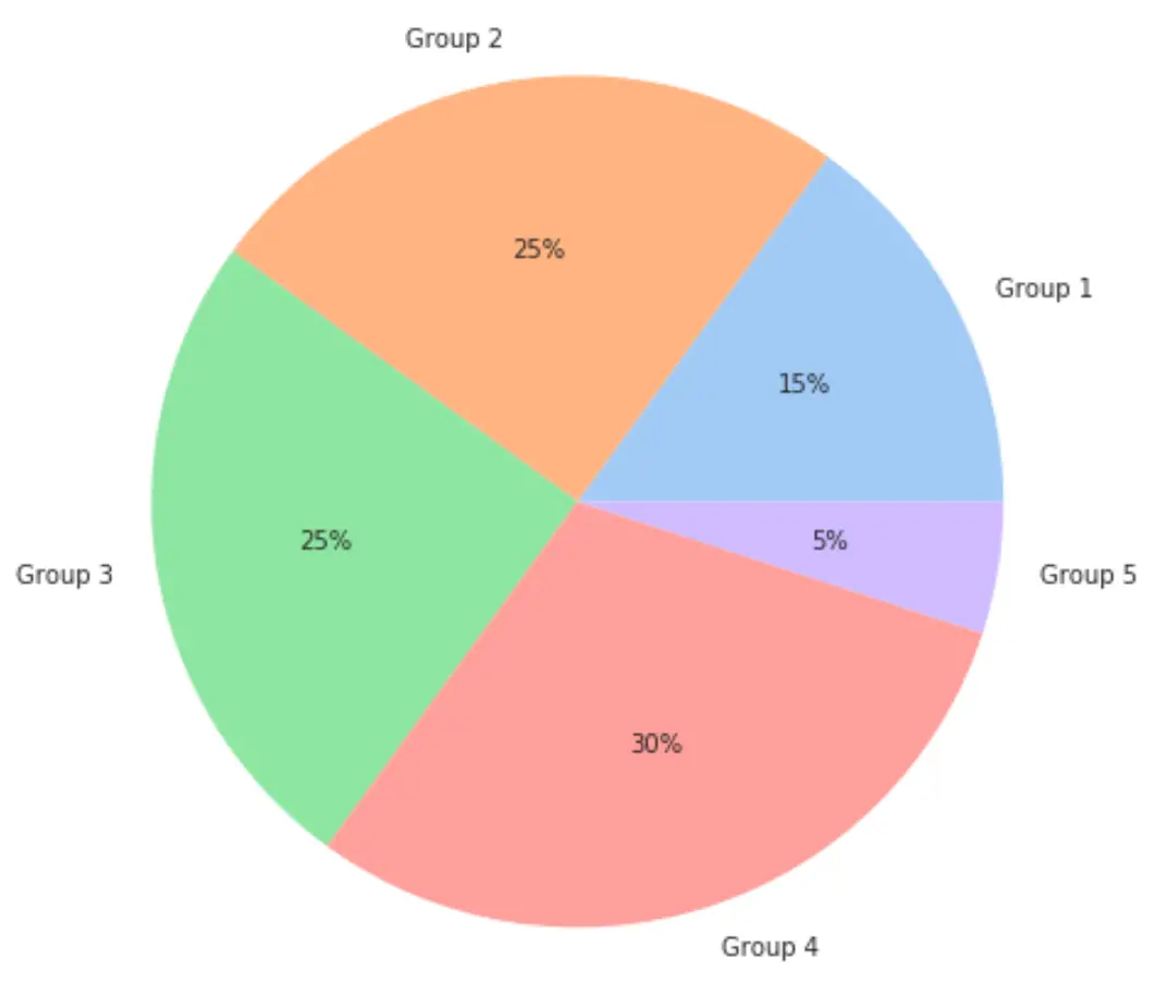
ตัวอย่างที่ 1: แผนภูมิวงกลมพร้อมจานสีพาสเทลซีบอร์น
รหัสต่อไปนี้แสดงวิธีสร้างแผนภูมิวงกลมโดยใช้จานสี ” พาสเทล ” ของ Seaborn:
 import matplotlib. pyplot as plt
import seaborn as sns

#define data
data = [15, 25, 25, 30, 5]
labels = ['Group 1', 'Group 2', 'Group 3', 'Group 4', 'Group 5']

#define Seaborn color palette to use
colors = sns. color_palette (' pastel ')[ 0:5 ]

#create pie chart
plt. pie (data, labels = labels, colors = colors, autopct=' %.0f%% ')
plt. show ()
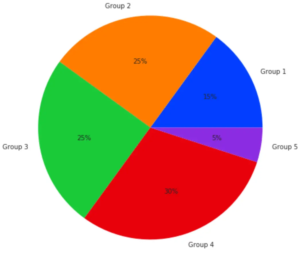
ตัวอย่างที่ 2: แผนภูมิวงกลมพร้อมชุดสี Bright Seaborn
รหัสต่อไปนี้แสดงวิธีสร้างแผนภูมิวงกลมโดยใช้ชุดสี Seaborn “ สดใส ”:
 import matplotlib. pyplot as plt
import seaborn as sns

#define data
data = [15, 25, 25, 30, 5]
labels = ['Group 1', 'Group 2', 'Group 3', 'Group 4', 'Group 5']

#define Seaborn color palette to use
colors = sns. color_palette (' bright ')[ 0:5 ]

#create pie chart
plt. pie (data, labels = labels, colors = colors, autopct=' %.0f%% ')
plt. show ()
ตัวอย่างทั้งสองนี้แสดงวิธีสร้างแผนภูมิวงกลมด้วยชุดสี Seaborn สองชุด
อย่างไรก็ตาม ยังมีสไตล์อื่นๆ อีกมากมายที่คุณสามารถใช้ได้ โปรดดู เอกสารออนไลน์ เพื่อดูรายการชุดสีทั้งหมด
แหล่งข้อมูลเพิ่มเติม
วิธีสร้างแผนที่ความร้อนใน Seaborn
วิธีสร้าง barplots ใน Seaborn
วิธีเพิ่มชื่อเรื่องให้กับแปลงทะเล
เกี่ยวกับผู้แต่ง
ดร.เบนจามิน แอนเดอร์สัน
สวัสดี ฉันชื่อเบนจามิน ศาสตราจารย์สถิติเกษียณอายุแล้ว และผันตัวมาเป็นครูสอนสถิติโดยเฉพาะ ด้วยประสบการณ์และความเชี่ยวชาญที่กว้างขวางในสาขาสถิติ ฉันกระตือรือร้นที่จะแบ่งปันความรู้ของฉันเพื่อเสริมศักยภาพนักเรียนผ่าน Statorials. รู้เพิ่มเติม