วิธีพล็อตอนุกรมเวลาใน matplotlib (พร้อมตัวอย่าง)
คุณสามารถใช้ไวยากรณ์ต่อไปนี้เพื่อพล็อตอนุกรมเวลาใน Matplotlib:
 import matplotlib. pyplot as plt

plt. plot (df. x , df. y )
นี่ถือว่าตัวแปร x อยู่ในคลาส datetime.datetime()
ตัวอย่างต่อไปนี้แสดงวิธีใช้ไวยากรณ์นี้เพื่อลงจุดข้อมูลอนุกรมเวลาใน Python
ตัวอย่างที่ 1: พล็อตอนุกรมเวลาพื้นฐานใน Matplotlib
รหัสต่อไปนี้แสดงวิธีการพล็อตอนุกรมเวลาใน Matplotlib ที่แสดงยอดขายรวมของธุรกิจเป็นเวลา 12 วันติดต่อกัน:
 import matplotlib. pyplot as plt
import datetime
import numpy as np
import pandas as pd

#define data
df = pd. DataFrame ({' date ': np. array ([datetime. datetime (2020, 1, i+1)
for i in range(12)]),
                   ' sales ': [3, 4, 4, 7, 8, 9, 14, 17, 12, 8, 8, 13]})

#plot time series
plt. plot (df. date , df. sales , linewidth= 3 )
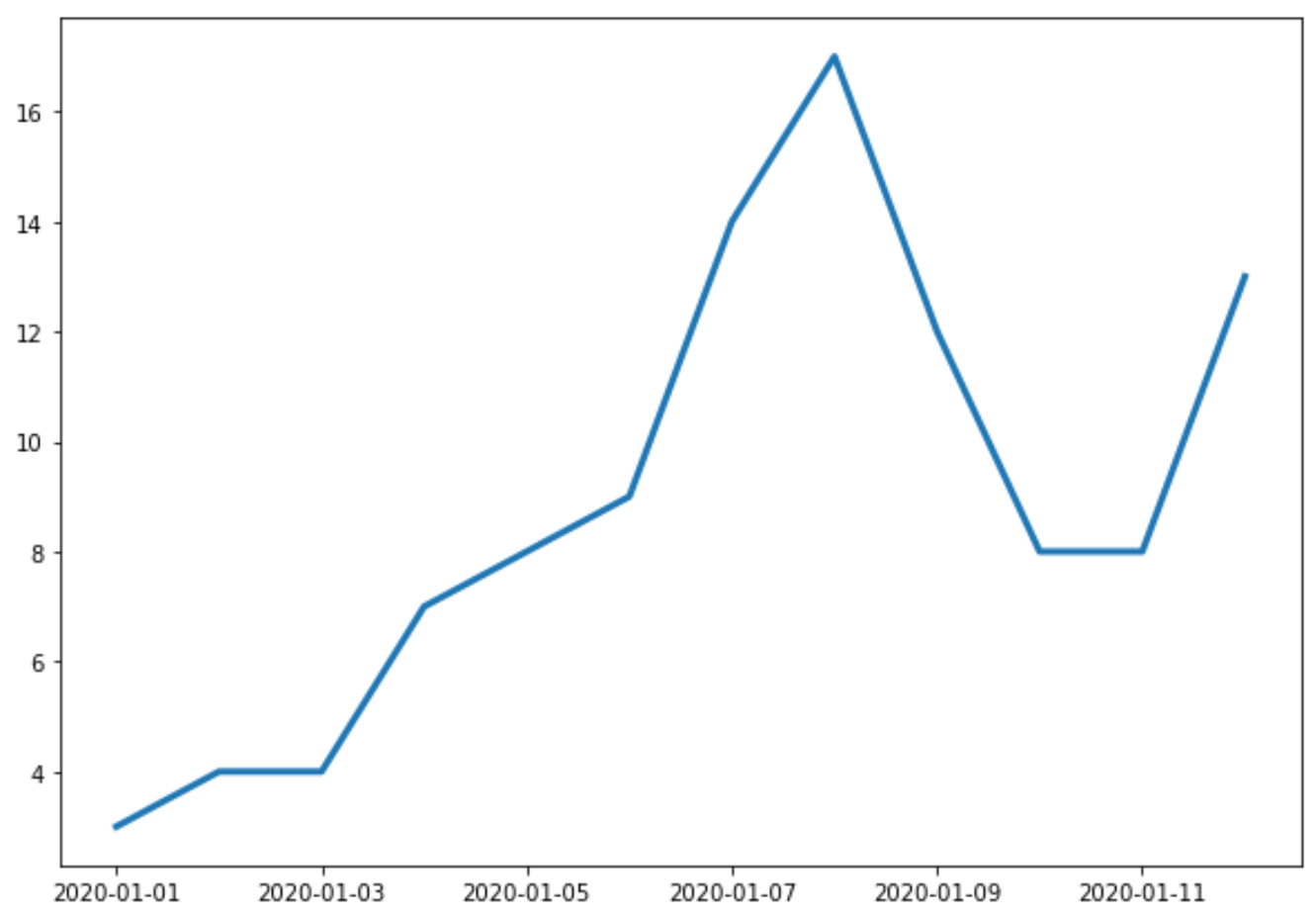
แกน X แสดงวันที่ และแกน Y แสดงยอดขายรวมในแต่ละวัน
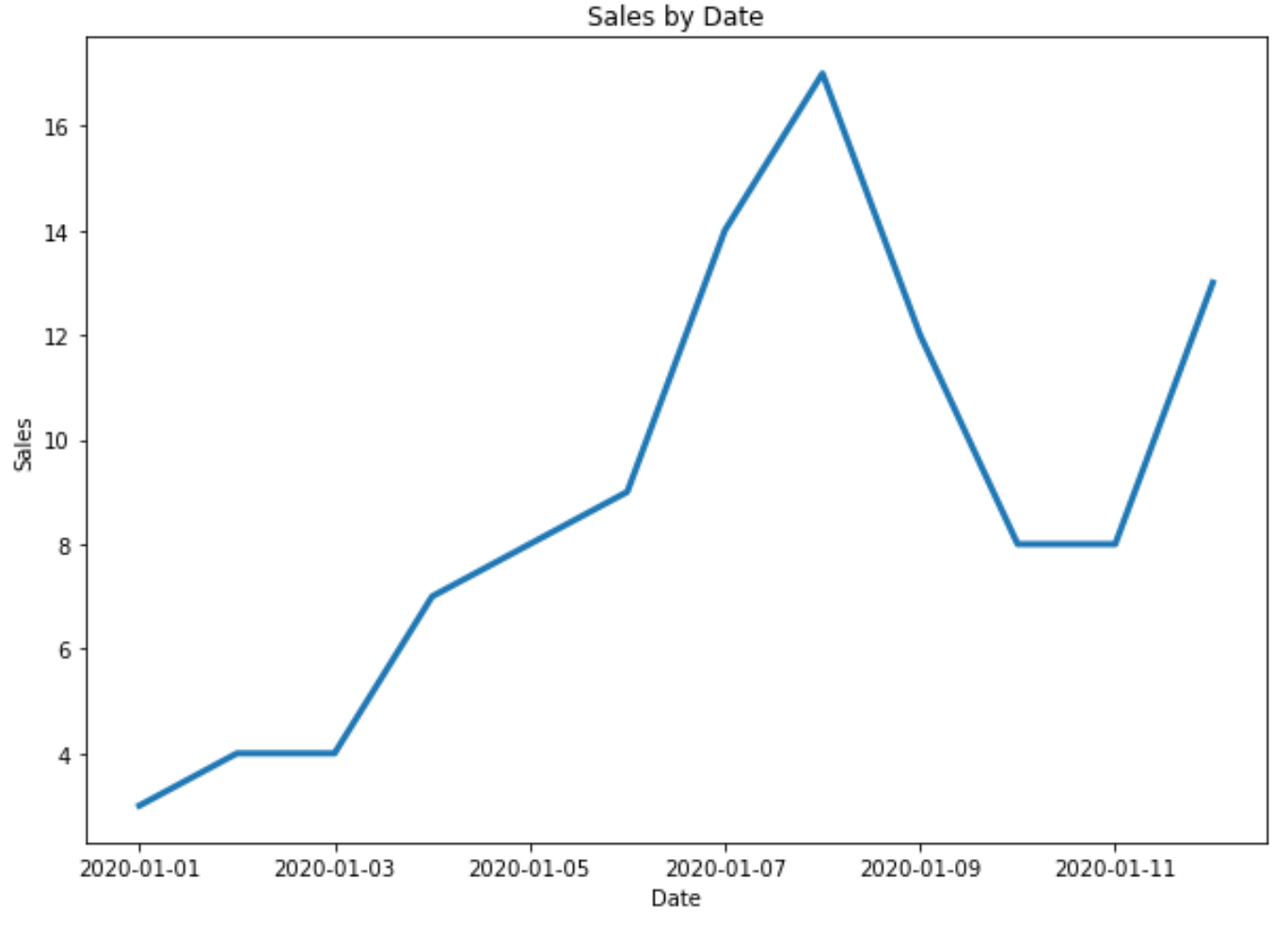
ตัวอย่างที่ 2: ปรับแต่งป้ายกำกับชื่อและแกน
คุณสามารถใช้โค้ดต่อไปนี้เพื่อเพิ่มป้ายกำกับชื่อและแกนลงในพล็อต:
 import matplotlib. pyplot as plt
import datetime
import numpy as np
import pandas as pd

#define data
df = pd. DataFrame ({' date ': np. array ([datetime. datetime (2020, 1, i+1)
for i in range(12)]),
                   ' sales ': [3, 4, 4, 7, 8, 9, 14, 17, 12, 8, 8, 13]})

#plot time series
plt. plot (df. date , df. sales , linewidth= 3 )

#add title and axis labels
plt. title (' Sales by Date ')
plt. xlabel (' Date ')
plt. ylabel (' Sales ')
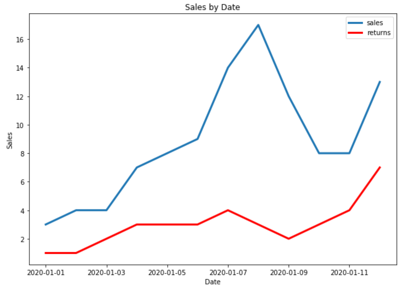
ตัวอย่างที่ 3: พล็อตอนุกรมเวลาหลายรายการใน Matplotlib
รหัสต่อไปนี้แสดงวิธีการลงจุดอนุกรมเวลาหลายรายการในจุดเดียวใน Matplotlib:
 import matplotlib. pyplot as plt
import datetime
import numpy as np
import pandas as pd

#define data
df = pd. DataFrame ({' date ': np. array ([datetime. datetime (2020, 1, i+1)
                                     for i in range(12)]),
                   ' sales ': [3, 4, 4, 7, 8, 9, 14, 17, 12, 8, 8, 13]})

df2 = pd. DataFrame ({' date ': np. array ([datetime. datetime (2020, 1, i+1)
                                      for i in range(12)]),
                   ' returns ': [1, 1, 2, 3, 3, 3, 4, 3, 2, 3, 4, 7]})

#plot both time series
plt. plot ( df.date , df.sales , label=' sales ', linewidth= 3 )
plt. plot ( df2.date , df2.returns , color=' red ', label=' returns ', linewidth= 3 )

#add title and axis labels
plt. title (' Sales by Date ')
plt. xlabel (' Date ')
plt. ylabel (' Sales ')

#add legend
plt. legend ()

#displayplot
plt. show ()
แหล่งข้อมูลเพิ่มเติม
Matplotlib: วิธีสร้าง boxplots ตามกลุ่ม
Matplotlib: วิธีสร้างแผนภูมิแท่งแบบเรียงซ้อน
เกี่ยวกับผู้แต่ง
ดร.เบนจามิน แอนเดอร์สัน
สวัสดี ฉันชื่อเบนจามิน ศาสตราจารย์สถิติเกษียณอายุแล้ว และผันตัวมาเป็นครูสอนสถิติโดยเฉพาะ ด้วยประสบการณ์และความเชี่ยวชาญที่กว้างขวางในสาขาสถิติ ฉันกระตือรือร้นที่จะแบ่งปันความรู้ของฉันเพื่อเสริมศักยภาพนักเรียนผ่าน Statorials. รู้เพิ่มเติม