วิธีสร้างแผนภูมิ pareto ใน python (ทีละขั้นตอน)
แผนภูมิพาเรโต เป็นแผนภูมิประเภทหนึ่งที่แสดงความถี่เรียงลำดับของหมวดหมู่ตลอดจนความถี่สะสมของหมวดหมู่
บทช่วยสอนนี้ให้ตัวอย่างทีละขั้นตอนของการสร้างแผนภูมิ Pareto ใน Python
ขั้นตอนที่ 1: สร้างข้อมูล
สมมติว่าเราทำการสำรวจโดยขอให้ผู้คน 350 คนระบุแบรนด์ซีเรียลที่พวกเขาชื่นชอบระหว่างแบรนด์ A, B, C, D และ E
เราสามารถสร้าง DataFrame แพนด้าต่อไปนี้เพื่อเก็บผลการสำรวจ:
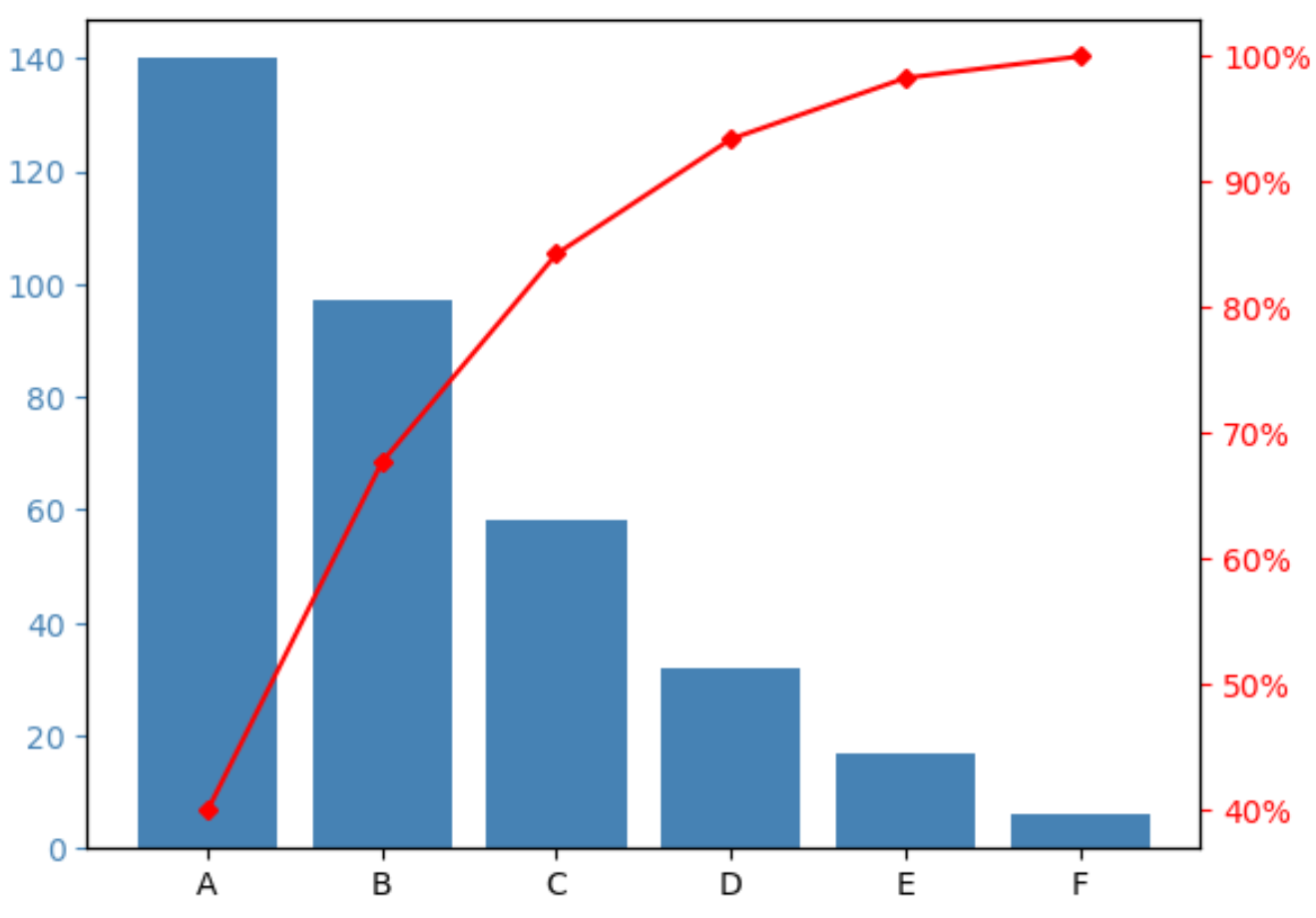
 import pandas as pd

#createDataFrame
df = pd. DataFrame ({' count ': [97, 140, 58, 6, 17, 32]})
df. index = ['B', 'A', 'C', 'F', 'E', 'D']

#sort DataFrame by count descending
df = df. sort_values (by=' count ', ascending= False )

#add column to display cumulative percentage
df[' cumperc '] = df[' count ']. cumsum ()/df[' count ']. sum ()*100

#view DataFrame
df

	count cumperc
At 140 40.000000
B 97 67.714286
C 58 84.285714
D 32 93.428571
E 17 98.285714
F 6 100.000000
ขั้นตอนที่ 2: สร้างแผนภูมิ Pareto
เราสามารถใช้โค้ดต่อไปนี้เพื่อสร้างแผนภูมิ Pareto:
 import matplotlib. pyplot as plt
from matplotlib. ticker import PercentFormatter

#define aesthetics for plot
color1 = ' steelblue '
color2 = ' red '
line_size = 4

#create basic bar plot
fig, ax = plt. subplots ()
ax. bar (df. index , df[' count '], color=color1)

#add cumulative percentage line to plot
ax2 = ax. twinx ()
ax2. plot ( df.index , df[' cumperc '], color=color2, marker=" D ", ms=line_size)
ax2. yaxis . set_major_formatter (PercentFormatter())

#specify axis colors
ax. tick_params (axis=' y ', colors=color1)
ax2. tick_params (axis=' y ', colors=color2)

#display Pareto chart
plt. show ()
แกน X แสดงยี่ห้อต่างๆ เรียงจากความถี่สูงสุดไปต่ำที่สุด
แกน y ด้านซ้ายแสดงความถี่ของแต่ละแบรนด์ และแกน y ด้านขวาแสดงความถี่สะสมของแบรนด์
ตัวอย่างเช่น เราเห็น:
- แบรนด์ A คิดเป็นประมาณ 40% ของการตอบแบบสำรวจทั้งหมด
- แบรนด์ A และ B คิดเป็นประมาณ 70% ของการตอบแบบสำรวจทั้งหมด
- แบรนด์ A, B และ C คิดเป็นประมาณ 85% ของการตอบแบบสำรวจทั้งหมด
และอื่นๆ
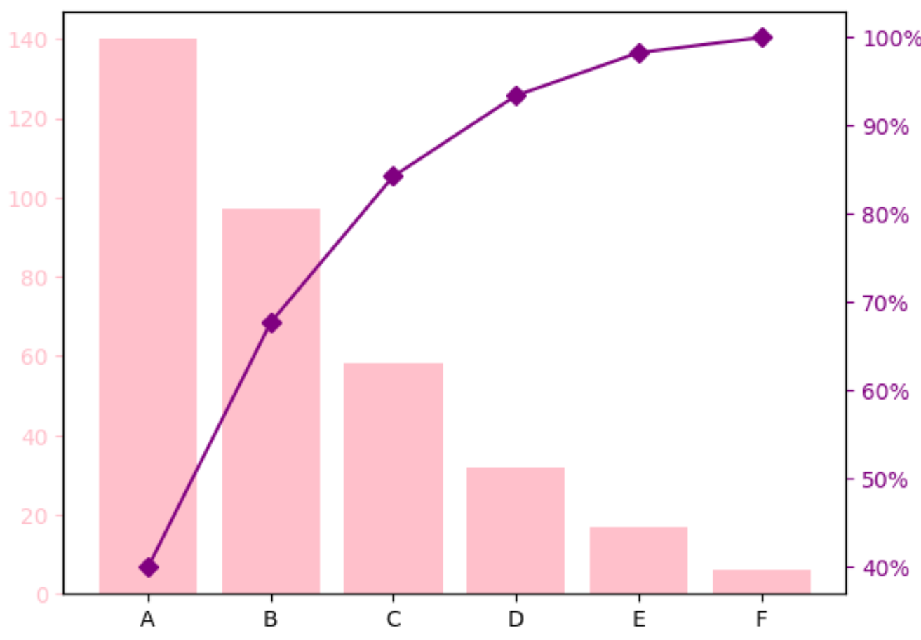
ขั้นตอนที่ 3: ปรับแต่งแผนภูมิ Pareto (ไม่บังคับ)
คุณสามารถเปลี่ยนสีแถบและขนาดของเส้นเปอร์เซ็นต์สะสมเพื่อทำให้แผนภูมิ Pareto มีลักษณะตามที่คุณต้องการได้
ตัวอย่างเช่น เราสามารถเปลี่ยนแถบเป็นสีชมพู และเส้นเป็นสีม่วงและหนาขึ้นเล็กน้อย:
 import matplotlib. pyplot as plt
from matplotlib. ticker import PercentFormatter

#define aesthetics for plot
color1 = ' pink '
color2 = ' purple '
line_size = 6

#create basic bar plot
fig, ax = plt. subplots ()
ax. bar (df. index , df[' count '], color=color1)

#add cumulative percentage line to plot
ax2 = ax. twinx ()
ax2. plot (df.index , df[' cumperc '], color=color2, marker=" D ", ms=line_size )
ax2. yaxis . set_major_formatter (PercentFormatter())

#specify axis colors
ax. tick_params (axis=' y ', colors=color1)
ax2. tick_params (axis=' y ', colors=color2)

#display Pareto chart
plt. show ()
แหล่งข้อมูลเพิ่มเติม
บทช่วยสอนต่อไปนี้จะอธิบายวิธีสร้างการแสดงภาพข้อมูลทั่วไปอื่นๆ ใน Python:
วิธีสร้าง Bell Curve ใน Python
วิธีสร้างแผนภูมิ Ogive ใน Python
วิธีสร้างแปลงต้นกำเนิดและใบใน Python
เกี่ยวกับผู้แต่ง
ดร.เบนจามิน แอนเดอร์สัน
สวัสดี ฉันชื่อเบนจามิน ศาสตราจารย์สถิติเกษียณอายุแล้ว และผันตัวมาเป็นครูสอนสถิติโดยเฉพาะ ด้วยประสบการณ์และความเชี่ยวชาญที่กว้างขวางในสาขาสถิติ ฉันกระตือรือร้นที่จะแบ่งปันความรู้ของฉันเพื่อเสริมศักยภาพนักเรียนผ่าน Statorials. รู้เพิ่มเติม