Як змінити позначки осей на схемі seaborn (з прикладами)
Є два способи змінити мітки осей на морській діаграмі.
Перший спосіб полягає у використанні функції ax.set() , яка використовує такий синтаксис:
ax. set (xlabel=' x-axis label ', ylabel=' y-axis label ')
Другий спосіб полягає у використанні функцій matplotlib, які використовують такий синтаксис:
 plt. xlabel (' x-axis label ')
plt. ylabel (' y-axis label ')
Наступні приклади показують, як використовувати кожен із цих методів на практиці.
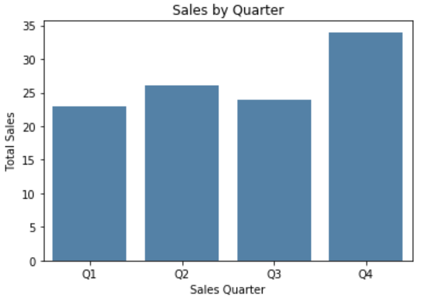
Спосіб 1: Змініть мітки осей за допомогою ax.set()
Наступний код показує, як створити бардіаграму Seaborn і використати ax.set() для вказівки міток осей:
 import pandas as pd
import seaborn as sns
import matplotlib. pyplot as plt

#create some fake data
df = pd. DataFrame ({' quarter ': ['Q1', 'Q2', 'Q3', 'Q4'],
                   ' sales ': [23, 26, 24, 34]})

#create seaborn barplot
ax = sns. barplot (x=' quarter ', y=' sales ',
                 data = df,
                 color=' steelblue ')

#specfiy axis labels
ax. set (xlabel=' Sales Quarter ',
       ylabel=' Total Sales ',
       title=' Sales by Quarter ')

#display barplot
plt. show ()
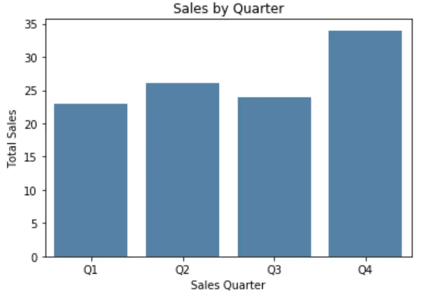
Спосіб 2: змінення міток осей за допомогою функцій Matplotlib
У наведеному нижче коді показано, як створити бардіаграму Seaborn і використовувати функції matplotlib для визначення міток осей:
 import pandas as pd
import seaborn as sns
import matplotlib. pyplot as plt

#create some fake data
df = pd. DataFrame ({' quarter ': ['Q1', 'Q2', 'Q3', 'Q4'],
                   ' sales ': [23, 26, 24, 34]})

#create seaborn barplot
ax = sns. barplot (x=' quarter ', y=' sales ',
                 data = df,
                 color=' steelblue ')

#specify axis labels
plt. xlabel (' Sales Quarter ')
plt. ylabel (' Total Sales ')
plt. title (' Sales by Quarter ')

#display barplot
plt. show ()
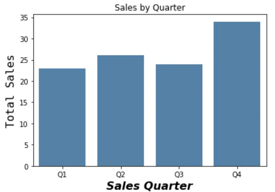
Зверніть увагу, що ви також можете вказати розмір шрифту, стиль шрифту, сімейство шрифтів та інші функції шрифту за допомогою цього методу:
 #specify axis labels
plt. xlabel (' Sales Quarter ', size= 16 , fontstyle=' italic ', weight= 900 )
plt. ylabel (' Total Sales ', size= 16 , family=' minivan ')
plt. title (' Sales by Quarter ')

#display barplot
plt. show ()
Зверніться до документації matplotlib , щоб отримати повний список способів налаштування шрифту на мітках осей.
Про автора
Редакція
Привіт, я Бенджамін, професор статистики на пенсії, який став викладачем статистики. Маючи великий досвід і знання в галузі статистики, я готовий поділитися своїми знаннями, щоб розширити можливості студентів через Statorials. Дізнайтеся більше