R에서 신뢰 구간을 그리는 방법
신뢰구간은 일정 수준의 신뢰도를 갖는 모집단 매개변수가 포함될 가능성이 있는 값의 범위입니다.
이 튜토리얼에서는 R에서 데이터 세트에 대한 신뢰 구간을 그리는 방법을 설명합니다.
예: R에서 신뢰 구간 그리기
R에 100개의 행과 2개의 열이 있는 다음과 같은 데이터 세트가 있다고 가정합니다.
 #make this example reproducible
set.seed(0)

#create dataset
x <- rnorm(100)
y <- x*2 + rnorm(100)
df <- data.frame(x = x, y = y)

#view first six rows of dataset
head(df)

           xy
1 1.2629543 3.3077678
2 -0.3262334 -1.4292433
3 1.3297993 2.0436086
4 1.2724293 2.5914389
5 0.4146414 -0.3011029
6 -1.5399500 -2.5031813
x와 y 사이의 관계에 대한 그래프를 만들기 위해 먼저 선형 회귀 모델을 적용할 수 있습니다.
model <- lm(y ~ x, data = df)
다음으로, 실제 신뢰 구간을 생성하기 위해 abline() 함수와 line() 함수를 사용하여 추정된 선형 회귀선의 플롯을 생성할 수 있습니다.
 #get predicted y values using regression equation
newx <- seq(min(df$x), max(df$x), length.out=100)
preds <- predict(model, newdata = data.frame(x=newx), interval = 'confidence')

#create plot of x vs. y, but don't display individual points (type='n')
plot(y ~ x, data = df, type = 'n')

#add fitted regression line
abline(model)

#add dashed lines for confidence bands
lines(newx, preds[,3], lty = 'dashed', col = 'blue')
lines(newx, preds[,2], lty = 'dashed', col = 'blue')
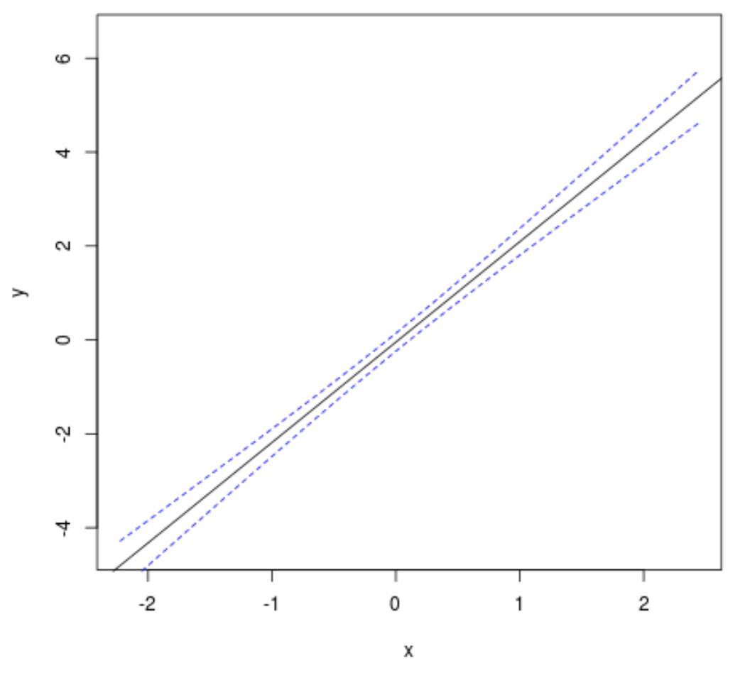
검은색 선은 적합 선형 회귀선을 표시하고 두 개의 파란색 점선은 신뢰 구간을 표시합니다.
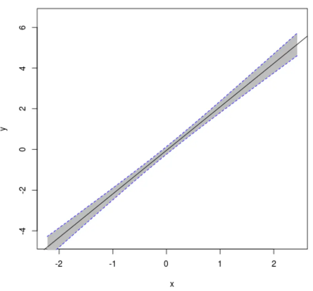
선택적으로 다음 코드를 사용하여 신뢰 구간 선과 추정 선형 회귀 선 사이의 영역을 채울 수도 있습니다.
 #create plot of x vs. y
plot(y ~ x, data = df, type = 'n')

#fill in area between regression line and confidence interval
polygon(c(rev(newx), newx), c(rev(preds[,3]), preds[,2]), col = 'grey', border = NA)

#add fitted regression line
abline(model)

#add dashed lines for confidence bands
lines(newx, preds[,3], lty = 'dashed', col = 'blue')
lines(newx, preds[,2], lty = 'dashed', col = 'blue')
처음부터 끝까지 전체 코드는 다음과 같습니다.
 #make this example reproducible
set.seed(0)

#create dataset
x <- rnorm(100)
y <- x*2 + rnorm(100)
df <- data.frame(x = x, y = y)

#fit linear regression model
model <- lm(y ~ x, data = df)

#get predicted y values using regression equation
newx <- seq(min(df$x), max(df$x), length.out=100)
preds <- predict(model, newdata = data.frame(x=newx), interval = 'confidence')

#create plot of x vs. y
plot(y ~ x, data = df, type = 'n')

#fill in area between regression line and confidence interval
polygon(c(rev(newx), newx), c(rev(preds[,3]), preds[,2]), col = 'grey', border = NA)

#add fitted regression line
abline(model)

#add dashed lines for confidence bands
lines(newx, preds[,3], lty = 'dashed', col = 'blue')
lines(newx, preds[,2], lty = 'dashed', col = 'blue')
추가 리소스
신뢰 구간이란 무엇입니까?
R에서 abline() 함수를 사용하여 플롯에 직선을 추가하는 방법
저자 소개
벤자민 앤더슨
안녕하세요. 저는 통계학 교수를 퇴직하고 전임 통계 교사로 변신한 벤자민입니다. 통계 분야의 광범위한 경험과 전문 지식을 바탕으로 Statorials를 통해 학생들에게 힘을 실어주기 위해 지식을 공유하고 싶습니다. 더 알아보기