Pandas dataframe에서 여러 계열을 그리는 방법
다음 구문을 사용하여 단일 Pandas DataFrame에서 여러 계열을 그릴 수 있습니다.
 plt. plot (df[' series1 '])
plt. plot (df[' series2 '])
plt. plot (df[' series3 '])
다음 단계별 예제에서는 이 구문을 실제로 사용하는 방법을 보여줍니다.
1단계: 데이터 생성
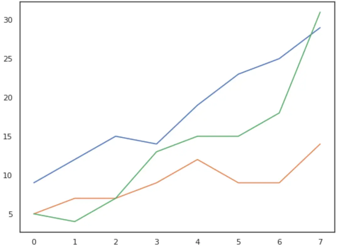
먼저 8주 동안 세 회사의 총 매출이 포함된 pandas DataFrame을 만들어 보겠습니다.
 import pandas as pd

#create data
df = pd. DataFrame ({' A ': [9, 12, 15, 14, 19, 23, 25, 29],
                   ' B ': [5, 7, 7, 9, 12, 9, 9, 14],
                   ' C ': [5, 4, 7, 13, 15, 15, 18, 31]})
#view data
print(df)

    ABC
0 9 5 5
1 12 7 4
2 15 7 7
3 14 9 13
4 19 12 15
5 23 9 15
6 25 9 18
7 29 14 31
2단계: 여러 계열 플롯
다음으로, 동일한 그래프에 각 회사의 매출을 그려보겠습니다.
 import matplotlib. pyplot as plt

#plot each series
plt. plot (df[' A '])
plt. plot (df[' B '])
plt. plot (df[' C '])

#displayplot
plt. show ()
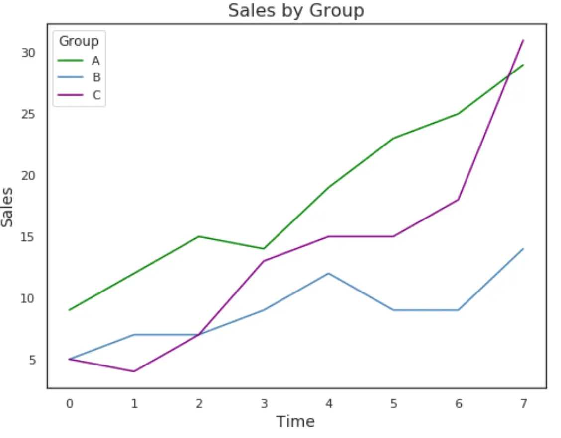
3단계: 범례 및 레이블 추가
다음으로, 플롯을 더 쉽게 읽을 수 있도록 범례와 일부 축 레이블을 추가해 보겠습니다.
 #plot individual lines with custom colors and labels
plt. plot (df[' A '], label=' A ', color=' green ')
plt. plot (df[' B '], label=' B ', color=' steelblue ')
plt. plot (df[' C '], label=' C ', color=' purple ')

#add legend
plt. legend (title=' Group ')

#add axes labels and a title
plt. ylabel (' Sales ', fontsize= 14 )
plt. xlabel (' Time ', fontsize= 14 )
plt. title (' Sales by Group ', fontsize= 16 )

#displayplot
plt. show ()
이 페이지 에서 더 많은 팬더 튜토리얼을 찾을 수 있습니다.
저자 소개
벤자민 앤더슨
안녕하세요. 저는 통계학 교수를 퇴직하고 전임 통계 교사로 변신한 벤자민입니다. 통계 분야의 광범위한 경험과 전문 지식을 바탕으로 Statorials를 통해 학생들에게 힘을 실어주기 위해 지식을 공유하고 싶습니다. 더 알아보기