Python에서 카이제곱 분포를 그리는 방법
Python에서 카이제곱 분포를 그리려면 다음 구문을 사용할 수 있습니다.
 #x-axis ranges from 0 to 20 with .001 steps
x = np. arange (0, 20, 0.001)

#plot Chi-square distribution with 4 degrees of freedom
plt. plot (x, chi2. pdf (x, df= 4 ))
x 배열은 x축의 범위를 정의하고 plt.plot()은 지정된 자유도를 사용하여 카이제곱 분포의 플롯을 생성합니다.
다음 예에서는 이러한 기능을 실제로 사용하는 방법을 보여줍니다.
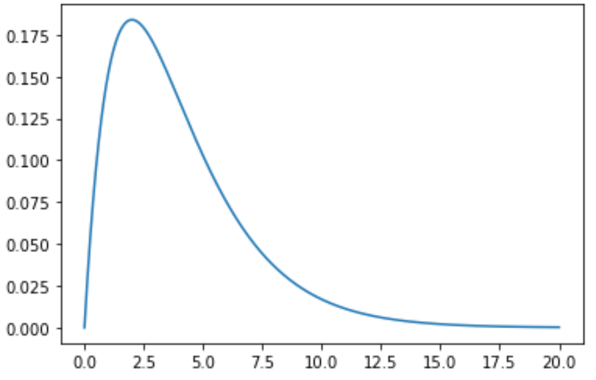
예 1: 단일 카이제곱 분포 그리기
다음 코드는 자유도가 4인 단일 카이제곱 분포 곡선을 그리는 방법을 보여줍니다.
 import numpy as np
import matplotlib. pyplot as plt
from scipy. stats import chi2

#x-axis ranges from 0 to 20 with .001 steps
x = np. arange (0, 20, 0.001)

#plot Chi-square distribution with 4 degrees of freedom
plt. plot (x, chi2. pdf (x, df= 4 ))
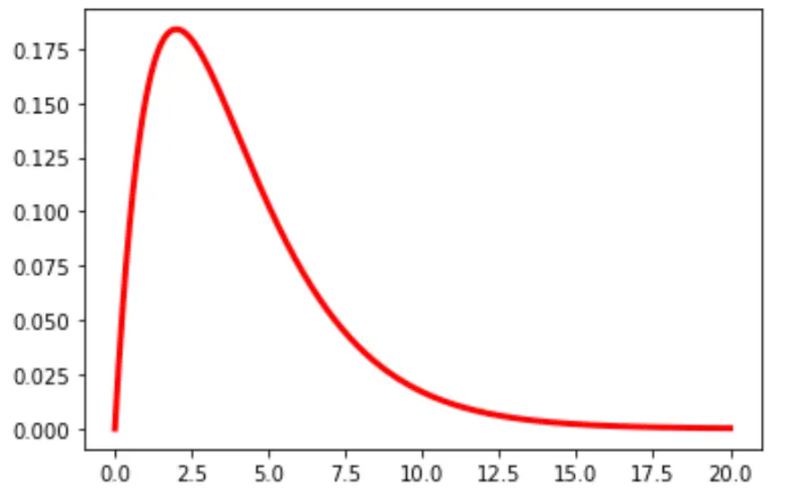
차트에서 선의 색상과 너비를 변경할 수도 있습니다.
plt. plot (x, chi2. pdf (x, df= 4 ), color=' red ', linewidth= 3 )
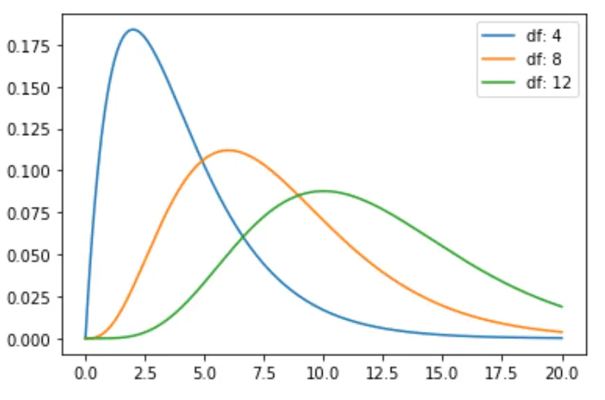
예 2: 여러 카이제곱 분포 도표화
다음 코드는 다양한 자유도로 여러 카이제곱 분포 곡선을 그리는 방법을 보여줍니다.
 import numpy as np
import matplotlib. pyplot as plt
from scipy. stats import chi2

#x-axis ranges from 0 to 20 with .001 steps
x = np. arange (0, 20, 0.001)

#define multiple Chi-square distributions
plt. plot (x, chi2. pdf (x, df= 4 ), label=' df: 4 ')
plt. plot (x, chi2. pdf (x, df= 8 ), label=' df: 8 ')
plt. plot (x, chi2. pdf (x, df= 12 ), label=' df: 12 ')

#add legend to plot
plt. legend ()
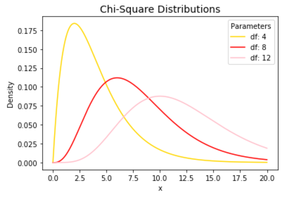
자유롭게 선 색상을 변경하고 제목과 축 레이블을 추가하여 차트를 완성하세요.
 import numpy as np
import matplotlib. pyplot as plt
from scipy. stats import chi2

#x-axis ranges from 0 to 20 with .001 steps
x = np. arange (0, 20, 0.001)

#define multiple Chi-square distributions
plt. plot (x, chi2. pdf (x, df= 4 ), label=' df: 4 ', color=' gold ')
plt. plot (x, chi2. pdf (x, df= 8 ), label=' df: 8 ', color=' red ')
plt. plot (x, chi2. pdf (x, df= 12 ), label=' df: 12 ', color=' pink ')

#add legend to plot
plt. legend (title=' Parameters ')

#add axes labels and a title
plt. ylabel (' Density ')
plt. xlabel (' x ')
plt. title (' Chi-Square Distributions ', fontsize= 14 )
plt.plot() 함수에 대한 자세한 설명은 matplotlib 설명서를 참조하세요.
저자 소개
벤자민 앤더슨
안녕하세요. 저는 통계학 교수를 퇴직하고 전임 통계 교사로 변신한 벤자민입니다. 통계 분야의 광범위한 경험과 전문 지식을 바탕으로 Statorials를 통해 학생들에게 힘을 실어주기 위해 지식을 공유하고 싶습니다. 더 알아보기