Ggplot2에서 x축 레이블을 변경하는 방법
scale_x_discrete() 함수를 사용하여 ggplot2의 플롯에서 x축 레이블을 변경할 수 있습니다.
p + scale_x_discrete(labels=c(' label1 ', ' label2 ', ' label3 ', ...))
다음 예에서는 실제로 이 구문을 사용하는 방법을 보여줍니다.
예: ggplot2에서 X축 레이블 변경
서로 다른 농구팀이 득점한 점수를 보여주는 다음과 같은 데이터 프레임이 R에 있다고 가정해 보겠습니다.
 #create data frame
df <- data. frame (team=c('Mavs', 'Heat', 'Nets', 'Lakers'),
                 dots=c(100, 122, 104, 109))

#view data frame
df

    team points
1 Mavs 100
2 Heat 122
3 Nets 104
4 Lakers 109
각 팀이 득점한 점수를 시각화하기 위해 막대 차트를 생성하면 ggplot2는 자동으로 x축에 배치할 레이블을 생성합니다.
 library (ggplot2)

#create bar plot
ggplot(df, aes(x=team, y=points)) +
  geom_col()

X축 레이블을 다른 것으로 변경하려면 scale_x_discrete() 함수를 사용할 수 있습니다.
 library (ggplot2)

#create bar plot with specific axis order
ggplot(df, aes(x=team, y=points)) +
  geom_col() +
  scale_x_discrete(labels=c(' label1 ', ' label2 ', ' label3 ', ' label4 '))
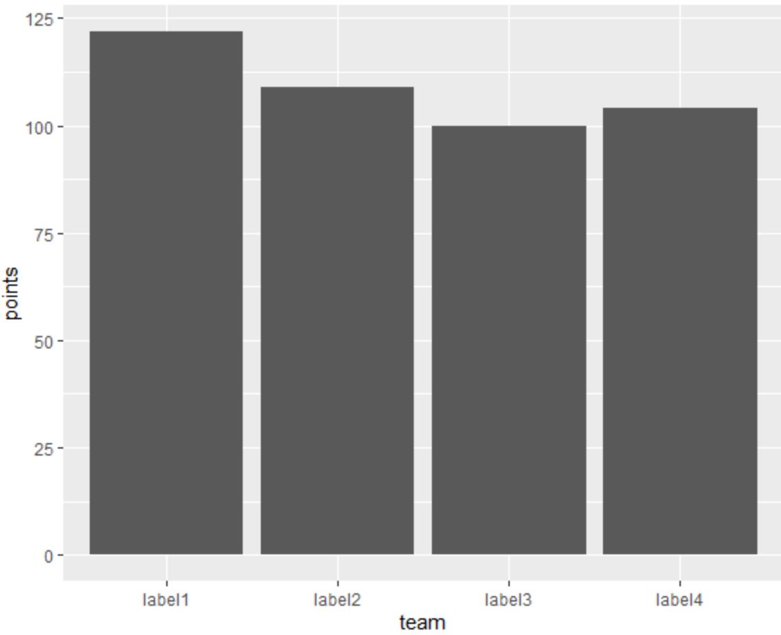
이제 X축 레이블은 scale_x_discrete() 함수를 사용하여 지정한 레이블과 일치합니다.
원하는 경우 scale_discrete() 함수 외부의 벡터에 레이블을 지정할 수도 있습니다.
 library (ggplot2)

#specify labels for plot
my_labels <- c(' label1 ', ' label2 ', ' label3 ', ' label4 ')

#create bar plot with specific axis order
ggplot(df, aes(x=team, y=points)) +
  geom_col() +
  scale_x_discrete(labels=my_labels)
이는 이전 플롯과 일치합니다.
추가 리소스
다음 튜토리얼에서는 ggplot2에서 다른 일반적인 작업을 수행하는 방법을 설명합니다.
ggplot2에서 축 레이블을 회전하는 방법
ggplot2에서 축 나누기를 설정하는 방법
ggplot2에서 축 제한을 설정하는 방법
ggplot2에서 범례 레이블을 변경하는 방법
저자 소개
벤자민 앤더슨
안녕하세요. 저는 통계학 교수를 퇴직하고 전임 통계 교사로 변신한 벤자민입니다. 통계 분야의 광범위한 경험과 전문 지식을 바탕으로 Statorials를 통해 학생들에게 힘을 실어주기 위해 지식을 공유하고 싶습니다. 더 알아보기