R에서 두 변수의 히스토그램을 만드는 방법
히스토그램은 주어진 변수에 대한 값의 분포를 시각화하는 유용한 방법입니다.
R에서 변수에 대한 히스토그램을 만들려면 hist() 함수를 사용할 수 있습니다. R에서 두 변수에 대한 히스토그램을 만들려면 다음 구문을 사용할 수 있습니다.
 hist(variable1, col=' red ')
hist(variable2, col=' blue ', add= TRUE )
다음 예에서는 실제로 이 구문을 사용하는 방법을 보여줍니다.
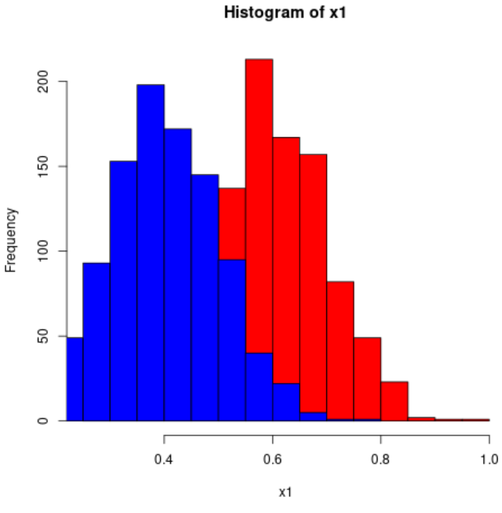
예: R에서 두 변수의 히스토그램 생성
다음 코드는 R에서 두 변수의 히스토그램을 만드는 방법을 보여줍니다.
 #make this example reproducible
set. seeds (1)

#define data
x1 = rnorm(1000, mean=0.6, sd=0.1)
x2 = rnorm(1000, mean=0.4, sd=0.1)

#plot two histograms in same graph
hist(x1, col=' red ')
hist(x2, col=' blue ', add= TRUE )
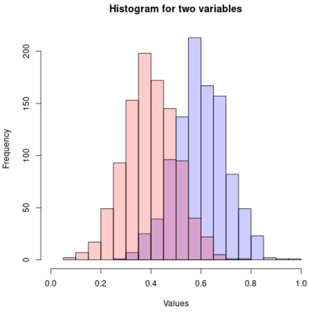
히스토그램 값이 겹치기 때문에 투명도가 향상된 rgb() 색상을 사용하는 것이 좋습니다.
 #make this example reproducible
set. seeds (1)

#define data
x1 = rnorm(1000, mean=0.6, sd=0.1)
x2 = rnorm(1000, mean=0.4, sd=0.1)

#plot two histograms in same graph
hist(x1, col=rgb(0,0,1,0.2), xlim=c(0, 1),
     xlab=' Values ', ylab=' Frequency ', main=' Histogram for two variables ')
hist(x2, col=rgb(1,0,0,0.2), add= TRUE )
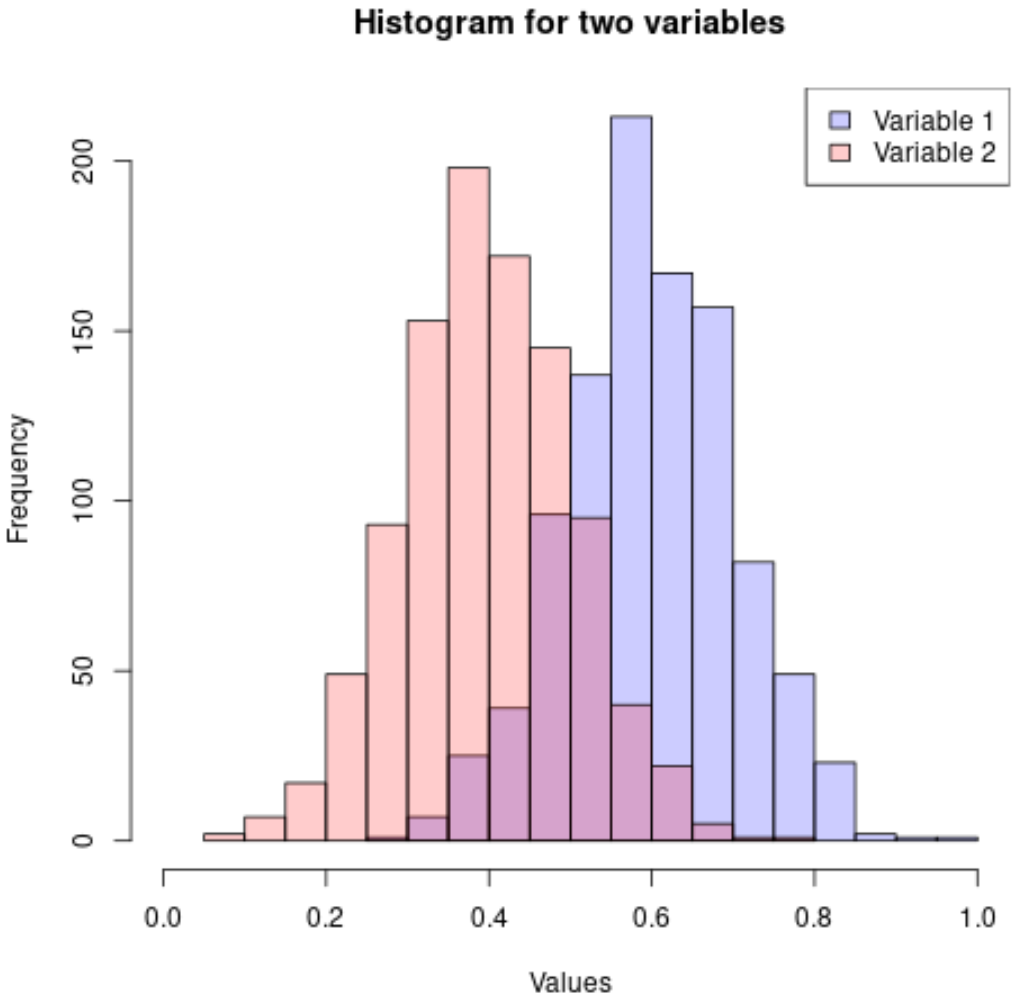
히스토그램을 더 쉽게 해석할 수 있도록 범례를 추가할 수도 있습니다.
 #make this example reproducible
set. seeds (1)

#define data
x1 = rnorm(1000, mean=0.6, sd=0.1)
x2 = rnorm(1000, mean=0.4, sd=0.1)

#plot two histograms in same graph
hist(x1, col=rgb(0,0,1,0.2), xlim=c(0, 1),
     xlab=' Values ', ylab=' Frequency ', main=' Histogram for two variables ')
hist(x2, col=rgb(1,0,0,0.2), add= TRUE )

#add legend
legend(' topright ', c(' Variable 1 ', ' Variable 2 '),
       fill=c(rgb(0,0,1,0.2), rgb(1,0,0,0.2)))
이 페이지 에서 더 많은 R 튜토리얼을 찾을 수 있습니다.
저자 소개
벤자민 앤더슨
안녕하세요. 저는 통계학 교수를 퇴직하고 전임 통계 교사로 변신한 벤자민입니다. 통계 분야의 광범위한 경험과 전문 지식을 바탕으로 Statorials를 통해 학생들에게 힘을 실어주기 위해 지식을 공유하고 싶습니다. 더 알아보기