Matplotlib vs ggplot2 – ဘယ်ဟာသုံးသင့်လဲ။
ဒေတာသိပ္ပံအားလုံးတွင် ရေပန်းအစားဆုံး data visualization libraries နှစ်ခုမှာ ggplot2 နှင့် Matplotlib ဖြစ်သည်။
ggplot2 စာကြည့်တိုက်ကို R statistical programming language တွင်အသုံးပြုထားပြီး Matplotlib ကို Python တွင်အသုံးပြုသည်။
စာကြည့်တိုက်နှစ်ခုလုံးသည် သင့်အား စိတ်ကြိုက်ပြင်ဆင်ထားသော ဒေတာအမြင်ပုံဖော်မှုများကို ဖန်တီးနိုင်သော်လည်း ggplot2 သည် Matplotlib နှင့် နှိုင်းယှဉ်ပါက ကုဒ်စာကြောင်းအနည်းငယ်ဖြင့် ပြုလုပ်နိုင်မည်ဖြစ်သည်။
ဤအချက်ကို သရုပ်ဖော်ရန်၊ ကျွန်ုပ်တို့သည် စာကြည့်တိုက်နှစ်ခုလုံးကို အသုံးပြု၍ တူညီသောဇယားအမျိုးအစားများကို မည်သို့ဖန်တီးရမည်ကို ပြသပါမည်။
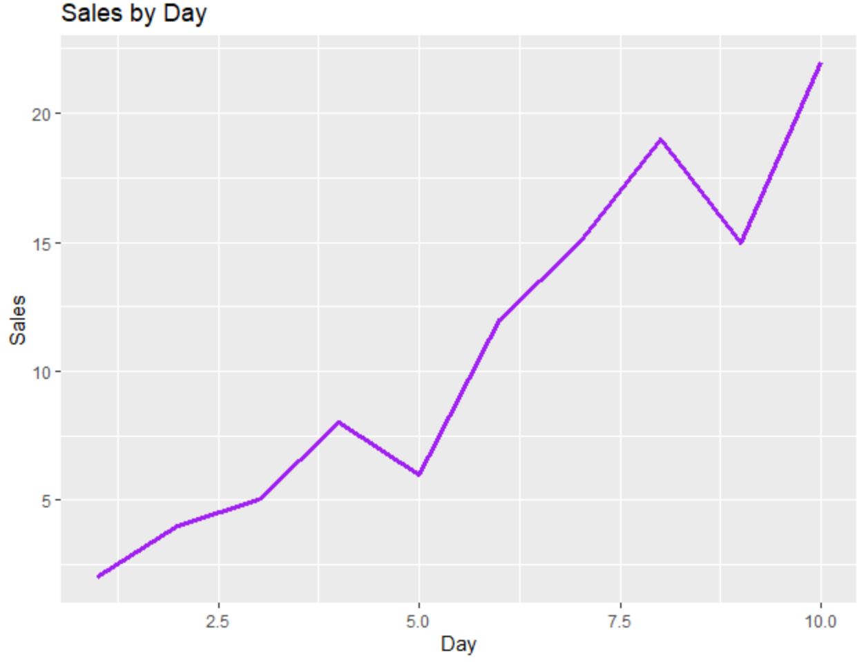
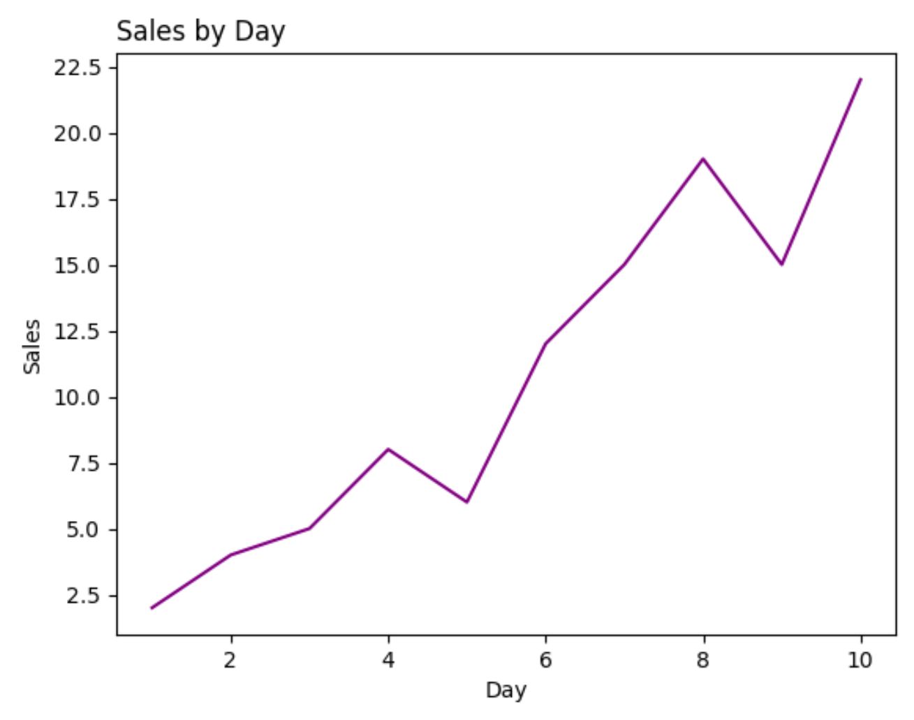
လိုင်းဇယားများ- ggplot2 နှင့် Matplotlib
အောက်ဖော်ပြပါကုဒ်သည် ggplot2 ကိုအသုံးပြု၍ မျဉ်းဇယားကိုဖန်တီးနည်းကိုပြသသည် ။
 library (ggplot2)

#create data frame
df <- data. frame (day=c(1, 2, 3, 4, 5, 6, 7, 8, 9, 10),
                 sales=c(2, 4, 5, 8, 6, 12, 15, 19, 15, 22))

#create line chart
ggplot(df, aes(x=day, y=sales)) +
  geom_line(size= 1.2 , col=' purple ') +
  ggtitle(' Sales by Day ') +
  xlab(' Day ') +
  ylab(' Sales ')
အောက်ဖော်ပြပါကုဒ်သည် Matplotlib ကို အသုံးပြု၍ တူညီသောမျဉ်းဇယားကို ဖန်တီးနည်းကို ပြသသည် ။
 import pandas as pd
import matplotlib. pyplot as plt

#createDataFrame
df = pd. DataFrame ({' day ': [1, 2, 3, 4, 5, 6, 7, 8, 9, 10],
                   ' sales ': [2, 4, 5, 8, 6, 12, 15, 19, 15, 22]})

#create line chart
plt. plot (df. day , df. sales , color=' purple ')
plt. title (' Sales by Day ', loc=' left ')
plt. ylabel (' Sales ')
plt. xlabel (' Day ')
ဤဥပမာအတွက်၊ plot တစ်ခုစီကိုထုတ်လုပ်ရန် လိုအပ်သော ကုဒ်လိုင်းအရေအတွက်သည် ggplot2 နှင့် Matplotlib အကြား ခန့်မှန်းခြေအားဖြင့် တူညီပါသည်။
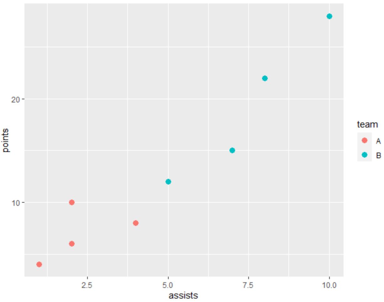
ကွက်လပ်များ- ggplot2 နှင့် Matplotlib
အောက်ပါကုဒ်သည် အမှတ်များကို အမျိုးအစားအလိုက် အရောင်ခြယ်ထားသော ggplot2 တွင် scatterplot ဖန်တီးနည်းကို ပြသသည်-
 library (ggplot2)

#create data frame
df <- data. frame (team=c('A', 'A', 'A', 'A', 'B', 'B', 'B', 'B'),
                 assists=c(1, 2, 2, 4, 5, 7, 8, 10),
                 points=c(4, 6, 10, 8, 12, 15, 22, 28))

#create scatterplot
ggplot(df, aes(x=assists, y=points)) +
  geom_point(aes(col=team), size= 3 )
အောက်ဖော်ပြပါကုဒ်သည် Matplotlib ကို အသုံးပြု၍ တူညီသော scatterplot ဖန်တီးနည်းကို ပြသသည် ။
 import pandas as pd
import matplotlib. pyplot as plt

#createDataFrame
df = pd. DataFrame ({' team ': ['A', 'A', 'A', 'A', 'B', 'B', 'B', 'B'],
                   ' assists ': [1, 2, 2, 4, 5, 7, 8, 10],
                   ' points ': [4, 6, 10, 8, 12, 15, 22, 28]})

#define colors to use
color_list = []
for x in df[' team ']:
    if x == ' A ': color_list. append (' #F8766D ')
    else : color_list. append (' #00BFC4 ')

#create scatterplot
plt. scatter (df. assists , df. points , c=color_list)
plt. ylabel (' points ')
plt. xlabel (' assists ')
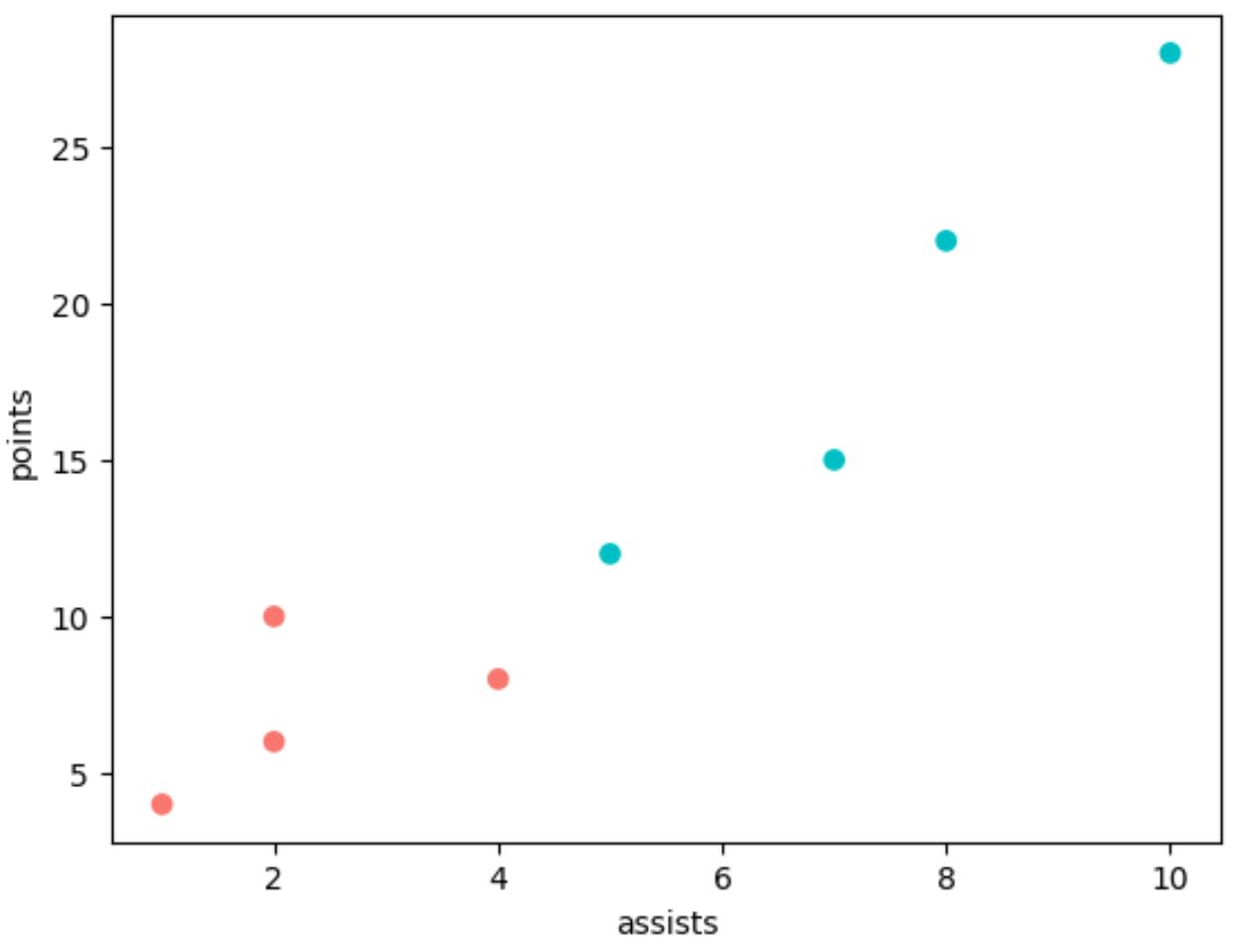
ggplot2 ကဲ့သို့တူညီသောကွက်ကွက်ကိုထုတ်လုပ်ရန် Matplotlib တွင် နောက်ထပ်ကုဒ်လိုင်းများစွာကို အသုံးပြုရကြောင်း သတိပြုပါ။
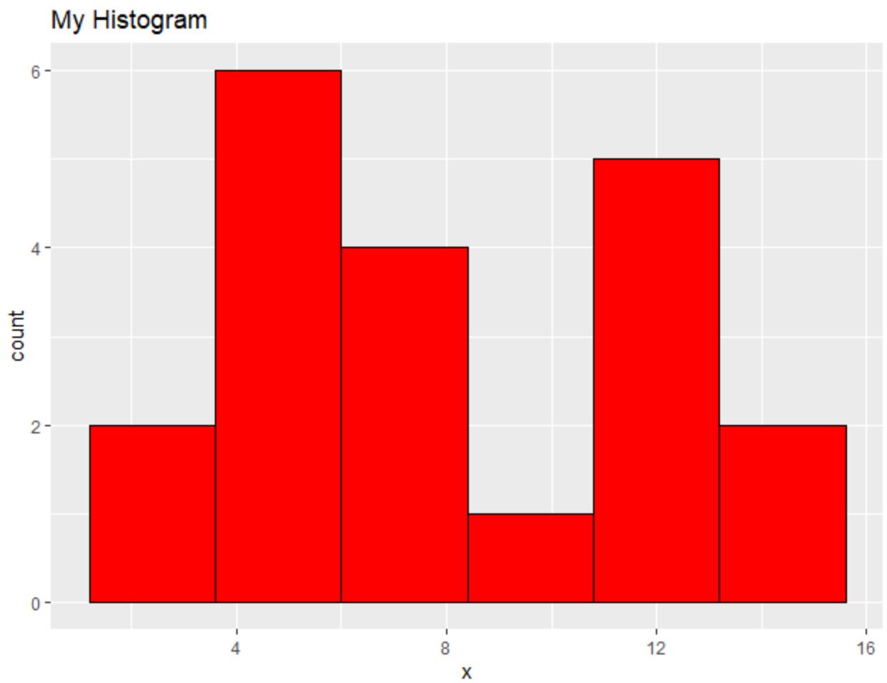
ဟစ်စတိုဂရမ်များ- ggplot2 နှင့် Matplotlib
အောက်ပါကုဒ်သည် ggplot2 တွင် histogram တစ်ခုကို ဖန်တီးနည်းကို ပြသသည် ။
 library (ggplot2)

#create data frame
df <- data. frame (x=c(2, 2, 4, 4, 4, 5, 5, 6, 7, 7, 8, 8,
                     10, 11, 11, 11, 12, 13, 14, 14))

#create scatterplot
ggplot(df, aes(x=x)) +
  geom_histogram(bins= 6 , fill=' red ', color=' black ') +
  ggtitle(' My Histogram ')
Matplotlib ကို အသုံးပြု၍ အလားတူ histogram ဖန်တီးနည်းကို အောက်ပါကုဒ်က ပြသည် ။
 import pandas as pd
import matplotlib. pyplot as plt

#createDataFrame
df = pd. DataFrame ({' x ': [2, 2, 4, 4, 4, 5, 5, 6, 7, 7, 8, 8,
                         10, 11, 11, 11, 12, 13, 14, 14]})

#create histogram
plt. hist (df[' x '], bins= 6 , color=' red ', ec=' black ')
plt. title (' My Histogram ', loc=' left ')
plt. xlabel (' x ')
plt. ylabel (' Count ')
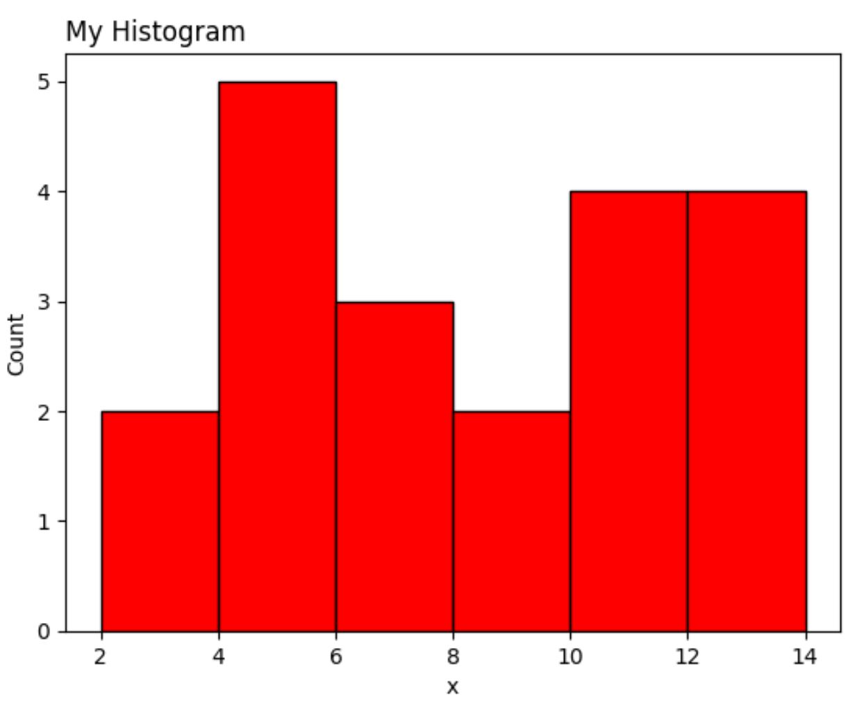
တစ်ဖန် Matplotlib ဗားရှင်းသည် ggplot2 ထက် ကုဒ်လိုင်းများ ပိုမိုလိုအပ်သည်။
နိဂုံး
ggplot2 နှင့် Matplotlib သည် သင့်အား စိတ်ကြိုက်ပြင်ဆင်နိုင်သော ဒေတာအမြင်ပုံဖော်မှုများကို ဖန်တီးနိုင်စေသော်လည်း ggplot2 သည် ကုဒ်ကို လျှော့သုံးလေ့ရှိသည်။
မကြာခဏဆိုသလို ggplot2 နှင့် Matplotlib အကြား ဦးစားပေးသည် ဒေတာခွဲခြမ်းစိတ်ဖြာမှုအတွက် သင်အသုံးပြုသည့် ပရိုဂရမ်းမင်းဘာသာစကားပေါ်တွင် မူတည်ပါသည်။
Python ကိုအသုံးပြုသူများသည် ၎င်းတို့၏ ဒေတာခွဲခြမ်းစိတ်ဖြာမှုကို လုပ်ဆောင်နိုင်ပြီး ပရိုဂရမ်းမင်းဘာသာစကားတစ်ခုတည်းဖြင့် ဒေတာမြင်ယောင်မှုများကို ဖန်တီးနိုင်သောကြောင့် Matplotlib ကို အသုံးပြုလေ့ရှိသည်။
အပြန်အလှန်အားဖြင့် R သုံးသူများသည် ပရိုဂရမ်းမင်းဘာသာစကားတစ်ခုတည်းတွင် ၎င်းတို့၏ဒေတာခွဲခြမ်းစိတ်ဖြာမှုနှင့် မြင်သာမြင်သာမှုအားလုံးကို လုပ်ဆောင်နိုင်သောကြောင့် ggplot2 ကို အသုံးပြုလေ့ရှိသည်။
စာရေးသူအကြောင်း
Benjamin Anderson
မင်္ဂလာပါ၊ ကျွန်ုပ်သည် အငြိမ်းစား စာရင်းအင်း ပါမောက္ခ ဘင်ဂျမင်ဖြစ်ပြီး သီးသန့် Statorials ဆရာအဖြစ် လှည့်ပတ်ပါသည်။ စာရင်းဇယားနယ်ပယ်တွင် ကျယ်ပြန့်သောအတွေ့အကြုံနှင့် ကျွမ်းကျင်မှုနှင့်အတူ၊ Statorials မှတစ်ဆင့် ကျောင်းသားများကို ခွန်အားဖြစ်စေရန်အတွက် ကျွန်ုပ်၏အသိပညာကို မျှဝေလိုပါသည်။ ပိုသိတယ်။