Ggplot2 တွင် linear regression line ကို ဘယ်လိုဆွဲမလဲ (ဥပမာများနှင့်အတူ)
အောက်ဖော်ပြပါ အခြေခံအထားအသိုကိုအသုံးပြု၍ တပ်ဆင်ထားသော linear regression model တစ်ခုကိုဆွဲရန် R visualization library ggplot2 ကိုသုံးနိုင်သည်။
 ggplot(data,aes(x, y)) +
  geom_point() +
  geom_smooth(method=' lm ')
အောက်ဖော်ပြပါ ဥပမာသည် ဤ syntax ကို လက်တွေ့တွင် မည်သို့အသုံးပြုရမည်ကို ပြသထားသည်။
ဥပမာ- ggplot2 တွင် linear regression line တစ်ခုကို ဆွဲခြင်း။
အောက်ဖော်ပြပါ ဒေတာအစုံတွင် ရိုးရှင်းသော မျဉ်းကြောင်းပြန်ဆုတ်မှု ပုံစံကို ကျွန်ုပ်တို့ တပ်ဆင်ထားသည်ဆိုပါစို့။
 #create dataset
data <- data.frame(y=c(6, 7, 7, 9, 12, 13, 13, 15, 16, 19, 22, 23, 23, 25, 26),
                   x=c(1, 2, 2, 3, 4, 4, 5, 6, 6, 8, 9, 9, 11, 12, 12))

#fit linear regression model to dataset and view model summary
model <- lm(y~x, data=data)
summary(model)

Call:
lm(formula = y ~ x, data = data)

Residuals:
    Min 1Q Median 3Q Max
-1.4444 -0.8013 -0.2426 0.5978 2.2363

Coefficients:
            Estimate Std. Error t value Pr(>|t|)
(Intercept) 4.20041 0.56730 7.404 5.16e-06 ***
x 1.84036 0.07857 23.423 5.13e-12 ***
---
Significant. codes: 0 '***' 0.001 '**' 0.01 '*' 0.05 '.' 0.1 ' ' 1

Residual standard error: 1.091 on 13 degrees of freedom
Multiple R-squared: 0.9769, Adjusted R-squared: 0.9751
F-statistic: 548.7 on 1 and 13 DF, p-value: 5.13e-12
အောက်ဖော်ပြပါ ကုဒ်သည် တပ်ဆင်ထားသော မျဉ်းဖြောင့်ဆုတ်ယုတ်မှုပုံစံကို မြင်သာအောင် မည်သို့မြင်ရမည်ကို ပြသသည်-
 library (ggplot2)

#create plot to visualize fitted linear regression model
ggplot(data,aes(x, y)) +
  geom_point() +
  geom_smooth(method=' lm ')
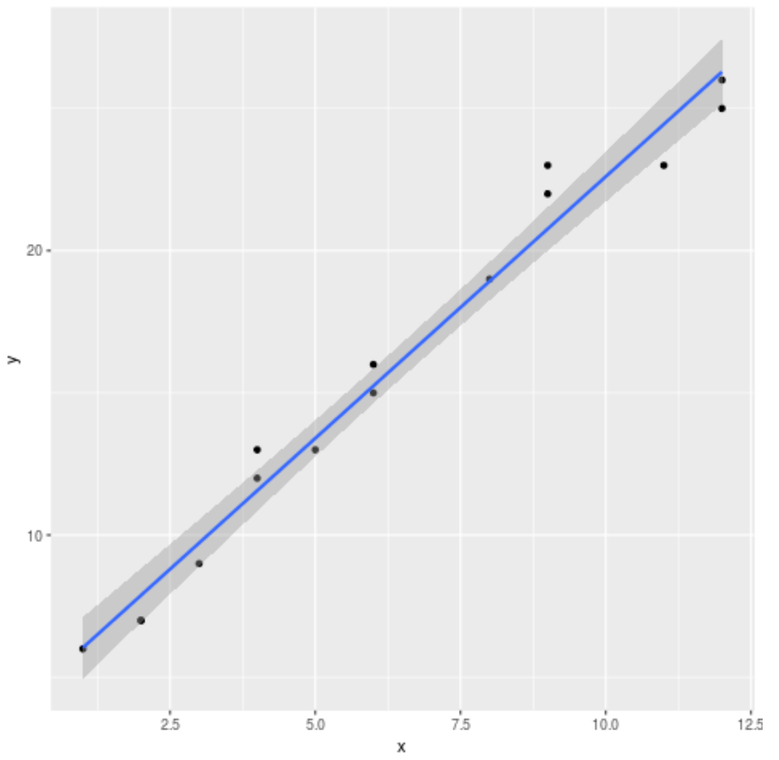
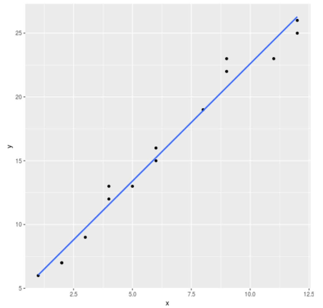
ပုံမှန်အားဖြင့်၊ ggplot2 သည် ဂရပ်သို့ စံအမှားလိုင်းများကို ပေါင်းထည့်သည်။ se=FALSE အငြင်းအခုံကို အောက်ပါအတိုင်း အသုံးပြု၍ ၎င်းတို့အား သင်ပိတ်ထားနိုင်သည်။
 library (ggplot2)

#create regression plot with no standard error lines
ggplot(data,aes(x, y)) +
  geom_point() +
  geom_smooth(method=' lm ', se= FALSE )
နောက်ဆုံးတွင်၊ ကျွန်ုပ်တို့သည် ၎င်းကို ပိုမိုဆွဲဆောင်မှုဖြစ်စေရန်အတွက် ဇယား၏အချို့သောကဏ္ဍများကို စိတ်ကြိုက်ပြင်ဆင်နိုင်သည်-
 library (ggplot2)

#create regression plot with customized style
ggplot(data,aes(x, y)) +
  geom_point() +
  geom_smooth(method=' lm ', se= FALSE , color=' turquoise4 ') +
  theme_minimal() +
  labs(x=' X Values ', y=' Y Values ', title=' Linear Regression Plot ') +
  theme(plot.title = element_text(hjust=0.5, size=20, face=' bold '))
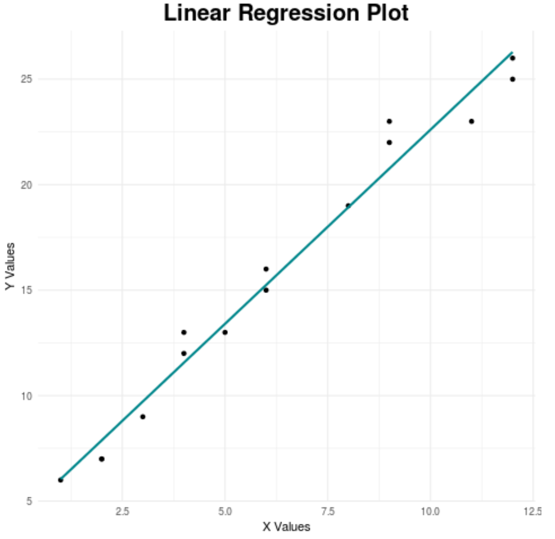
အကောင်းဆုံး ggplot2 အပြင်အဆင်များအတွက် လမ်းညွှန်ချက်အပြည့်အစုံအတွက် ဤဆောင်းပါးကို ကိုးကားပါ။
ထပ်လောင်းအရင်းအမြစ်များ
R တွင် multi linear regression အကြောင်း နိဒါန်း
R တွင် ယုံကြည်မှုကြားကာလကို မည်သို့ဆွဲမည်နည်း။
စာရေးသူအကြောင်း
Benjamin Anderson
မင်္ဂလာပါ၊ ကျွန်ုပ်သည် အငြိမ်းစား စာရင်းအင်း ပါမောက္ခ ဘင်ဂျမင်ဖြစ်ပြီး သီးသန့် Statorials ဆရာအဖြစ် လှည့်ပတ်ပါသည်။ စာရင်းဇယားနယ်ပယ်တွင် ကျယ်ပြန့်သောအတွေ့အကြုံနှင့် ကျွမ်းကျင်မှုနှင့်အတူ၊ Statorials မှတစ်ဆင့် ကျောင်းသားများကို ခွန်အားဖြစ်စေရန်အတွက် ကျွန်ုပ်၏အသိပညာကို မျှဝေလိုပါသည်။ ပိုသိတယ်။