Matplotlib ရှိ နှိုင်းရကြိမ်နှုန်း ဟီစတိုဂရမ် ဖန်တီးနည်း
နှိုင်းရကြိမ်နှုန်း ဟီစတိုဂရမ် သည် ဒေတာအတွဲတစ်ခုတွင် တန်ဖိုးများ၏ နှိုင်းရကြိမ်နှုန်းများကို ပြသသည့် ဂရပ်တစ်ခုဖြစ်သည်။
Python ရှိ Matplotlib တွင် နှိုင်းရကြိမ်နှုန်းဟစ်စတိုဂရမ်တစ်ခုဖန်တီးရန် အောက်ပါအထားအသိုကိုသုံးနိုင်သည်။
 import matplotlib. pyplot as plt
import numpy as np

#define plotting area
fig = plt. figure ()
ax = fig. add_subplot (111)

#create relative frequency histogram
ax. hist (data, edgecolor=' black ', weights=np. ones_like (data) / len (data))
အောက်ဖော်ပြပါ ဥပမာသည် ဤ syntax ကို လက်တွေ့တွင် မည်သို့အသုံးပြုရမည်ကို ပြသထားသည်။
ဥပမာ- Matplotlib တွင် Relative Frequency Histogram ဖန်တီးပါ။
အောက်ပါကုဒ်သည် Matplotlib တွင် ပုံမှန်ကြိမ်နှုန်းဟစ်စတိုဂရမ်ကို ဖန်တီးနည်းကို ပြသသည်-
 import numpy as np
import matplotlib. pyplot as plt

#define data values
data = [8, 8, 9, 12, 13, 13, 14, 14, 15, 18, 22, 23, 24, 25, 30]

#create frequency histogram
fig = plt. figure ()
ax = fig. add_subplot (111)
ax. hist (data, edgecolor=' black ')
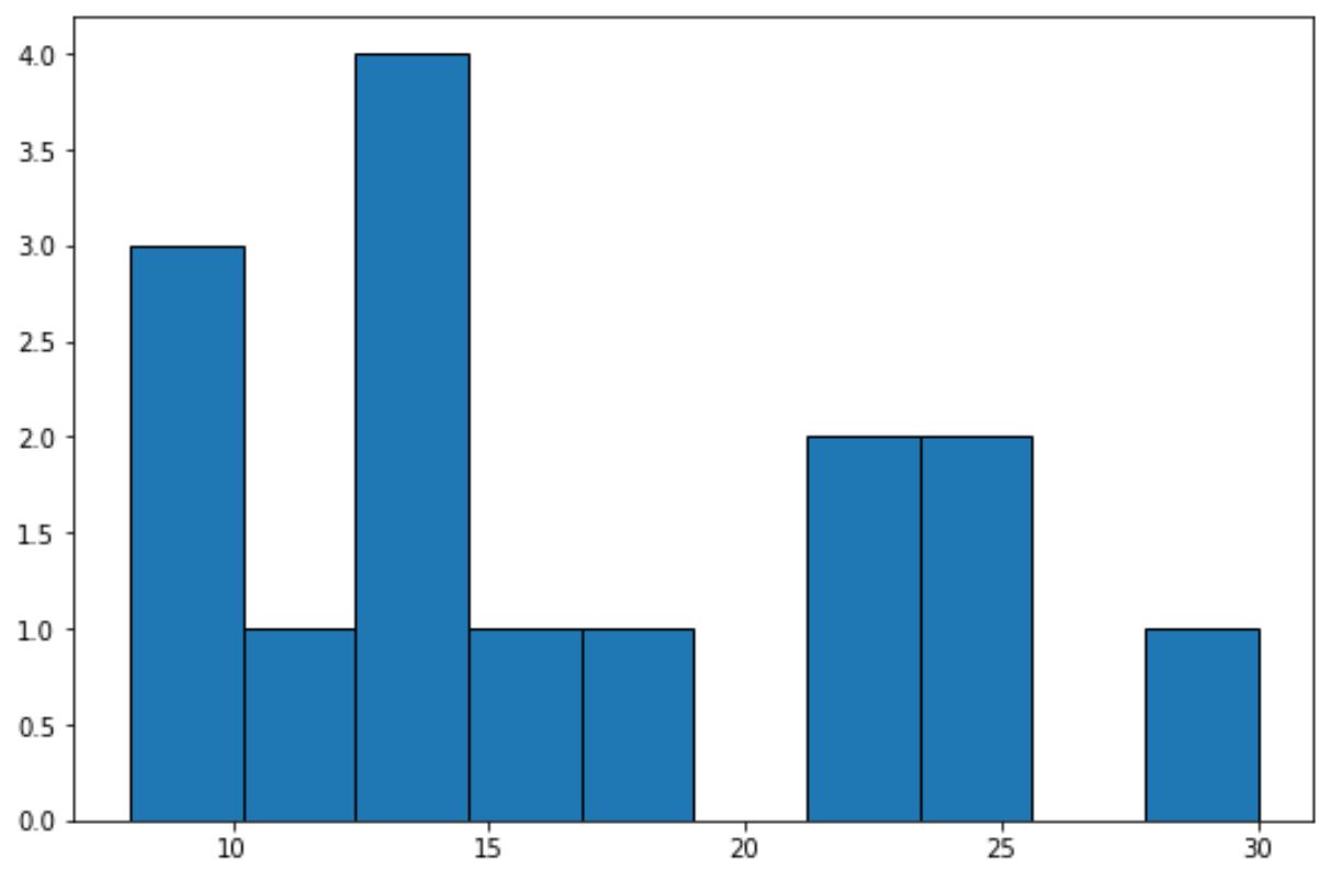
x-axis သည် data တန်ဖိုးများအတွက် bins များကိုပြသပြီး y-axis သည် bin တစ်ခုစီ၏ frequency ကိုပြသသည်။
y-ဝင်ရိုးပေါ်တွင် ဆွေမျိုးကြိမ်နှုန်းများကို ပြသရန် အောက်ပါကုဒ်ကို အသုံးပြုနိုင်သည်။
 import numpy as np
import matplotlib. pyplot as plt

#define data values
data = [8, 8, 9, 12, 13, 13, 14, 14, 15, 18, 22, 23, 24, 25, 30]

#create relative frequency histogram
fig = plt. figure ()
ax = fig. add_subplot (111)
ax. hist (data, edgecolor=' black ', weights=np. ones_like (data) / len (data))
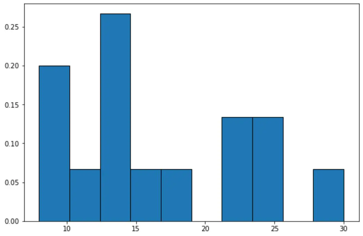
ယခု y-axis သည် နှိုင်းရကြိမ်နှုန်းများကို ပြသသည်။
ဥပမာအားဖြင့်၊ dataset တွင် စုစုပေါင်းတန်ဖိုး 15 ခု ရှိပါသည်။
ထို့ကြောင့် ဂရပ်၏အမြင့်ဆုံးဘားအတွက် y ဝင်ရိုးပေါ်တွင် 4 ကြိမ်နှုန်းကိုပြသမည့်အစား y-axis သည် 4/15 = 0.2667 ကိုပြသသည်။
ကျွန်ုပ်တို့သည် y-ဝင်ရိုးပေါ်ရှိတန်ဖိုးများကို ရာခိုင်နှုန်းများအဖြစ်ပြသရန် Matplotlib ၏ PercentFormatter() လုပ်ဆောင်ချက်ကိုလည်း အသုံးပြုနိုင်သည်။
import numpy as np
import matplotlib. pyplot as plt
from matplotlib. ticker import PercentFormatter

#define data values
data = [8, 8, 9, 12, 13, 13, 14, 14, 15, 18, 22, 23, 24, 25, 30]

#create relative frequency histogram with percentages on y-axis
fig = plt. figure ()
ax = fig. add_subplot (111)
ax. hist (data, edgecolor=' black ', weights=np. ones_like (data)* 100 / len (data))
ax. yaxis . set_major_formatter (PercentFormatter())
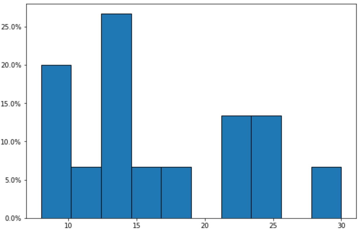
ယခုအခါ y-ဝင်ရိုးသည် နှိုင်းရကြိမ်နှုန်းများကို ရာခိုင်နှုန်းများအဖြစ် ပြသသည်ကို သတိပြုပါ။
ထပ်လောင်းအရင်းအမြစ်များ
အောက်ဖော်ပြပါ သင်ခန်းစာများသည် Matplotlib တွင် အခြားသော အသုံးများသော ဂရပ်များကို ဖန်တီးနည်းကို ရှင်းပြသည်-
Matplotlib histogram ၏အရောင်ကိုဘယ်လိုပြောင်းမလဲ။
Matplotlib histograms တွင် ဘင်အရွယ်အစားကို ချိန်ညှိနည်း
Pandas DataFrame မှ histogram တစ်ခုဖန်တီးနည်း
စာရေးသူအကြောင်း
Benjamin Anderson
မင်္ဂလာပါ၊ ကျွန်ုပ်သည် အငြိမ်းစား စာရင်းအင်း ပါမောက္ခ ဘင်ဂျမင်ဖြစ်ပြီး သီးသန့် Statorials ဆရာအဖြစ် လှည့်ပတ်ပါသည်။ စာရင်းဇယားနယ်ပယ်တွင် ကျယ်ပြန့်သောအတွေ့အကြုံနှင့် ကျွမ်းကျင်မှုနှင့်အတူ၊ Statorials မှတစ်ဆင့် ကျောင်းသားများကို ခွန်အားဖြစ်စေရန်အတွက် ကျွန်ုပ်၏အသိပညာကို မျှဝေလိုပါသည်။ ပိုသိတယ်။